
Hello! Welcome back to our journey in financial data visualization.
In the last lesson, you learned how to enrich your clean data by calculating key financial metrics like simple returns and moving averages. Your spreadsheet is no longer just a list of prices; it's a table containing valuable analytical data. However, it's still just a sea of numbers.
Today, we'll bridge the gap between raw numbers and visual insight by exploring conditional formatting. This powerful Excel feature allows you to automatically change the appearance of cells—their color, font, or by adding icons—based on the data they contain. It’s an essential skill for making data tables immediately understandable, allowing you to spot trends, outliers, and key patterns at a glance.
By the end of this lesson, you will be able to apply conditional formatting to instantly highlight key data patterns in your financial tables, such as differentiating positive and negative returns or identifying top-performing assets.
1. What is Conditional Formatting?
Before diving into the "how," let's understand the "what" and "why." Conditional formatting transforms a static table of numbers into a dynamic visual report. For financial analysis, this means you can instantly see which stocks are up or down, which assets make up the largest part of a portfolio, or which metrics are hitting a critical threshold.
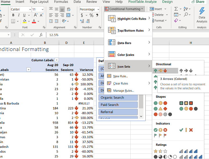
The feature is located on the Home tab in the Styles group in Excel.
To get a foundational understanding from a financial analyst's perspective, please read the introductory sections of the following article.
Excel Conditional Formatting: Mastering Dynamic Data Visualization for Financial Analysis
This article, written by a CFO and financial analyst, provides an excellent overview of what conditional formatting is and why it's so valuable for financial analysis.
Please read the section 'Understanding Conditional Formatting'. Focus on the 'Fundamentals' and 'Key Takeaways' to grasp the core concept.
2. Core Conditional Formatting Techniques
Excel offers a wide range of conditional formatting rules. We'll focus on the most useful ones for financial market data. The following in-depth video will be our main guide. We will go through it section by section.
Excel Conditional Formatting in Depth
This comprehensive video from the 'Technology for Teachers and Students' channel provides a clear, step-by-step walkthrough of Excel's conditional formatting features. We will use it to learn the mechanics of applying different rules.
You don't need to watch this all at once. I will refer you to specific parts of this video as we cover each technique below.
A. Highlight Cells Rules
This is the most straightforward type of rule. It's perfect for flagging data that meets a simple criterion. For example, you can instantly color all the cells with negative returns red.
- Common uses:
- Highlighting values
greater than,less than, orequal toa specific number (e.g., highlighting all daily returns below -2%). - Highlighting cells that contain
specific text(e.g., flagging all trades involving "AAPL"). - Finding
duplicate valuesto spot potential data entry errors.
- Highlighting values
Watch this segment to see how to apply these rules and customize their appearance.
Excel Conditional Formatting in Depth
Let's return to our main guide video. This part demonstrates how to use the 'Highlight Cells Rules' and how to apply them to an entire column, a very common and efficient practice.
Please watch from 01:54 to 07:07. Pay attention to how you can highlight cells based on numerical values (greater than, less than) and text content. Also, note the option for creating a 'Custom Format'.
B. Top/Bottom Rules
This is incredibly useful for quickly identifying leaders and laggards in a dataset without having to sort the data first.
- Common uses:
- Finding the
Top 10 ItemsorTop 10%(e.g., identifying the 10 days with the highest trading volume). - Finding values that are
Above AverageorBelow Average(e.g., highlighting all stocks in a watchlist whose current price is above their 50-day moving average).
- Finding the
This next clip shows you exactly how to apply these rules.
Excel Conditional Formatting in Depth
This segment of the video demonstrates the 'Top/Bottom Rules' using a financial spreadsheet, making it highly relevant.
Please watch from 07:07 to 09:10. Observe how you can edit a rule after creating it (e.g., changing from 'Top 10' to 'Top 60' or 'Top 10%').
C. The Visual Trio: Data Bars, Color Scales, and Icon Sets
These three options provide the most visual impact directly within your cells.
-
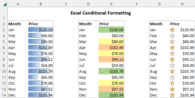
Data Bars: These create mini bar charts inside each cell, making it easy to compare the magnitude of numbers. This is excellent for visualizing the relative size of holdings in a portfolio or daily trading volumes.
-
Color Scales (Heatmaps): These apply a color gradient across a range of cells. This is perfect for visualizing data where the relative value matters, like performance across different market sectors or countries.
-
Icon Sets: These add small icons like arrows, traffic lights, or stars to your cells to indicate status. This is the go-to method for showing trends, like whether a stock's price variance is positive, negative, or neutral.
The following video provides dynamic, finance-focused examples of these three techniques.
Conditional Formatting Hacks That Will Blow Your Mind!
This energetic video from 'Mike’s F9 Finance' showcases practical applications of these visual tools in a financial context, such as budget analysis and performance dashboards.
Watch the segments on Icon Sets (01:07 - 03:21), Data Bars (05:24 - 06:32), and Color Scales (08:41 - 09:56). Focus on how each tool is used to answer a different kind of visual question.
Test your understanding!
For each scenario below, which conditional formatting type (Highlight Cells Rule, Data Bars, Color Scales, or Icon Sets) would be most appropriate?
- You have a list of 50 stocks and want to see the relative market capitalization of each at a glance.
- You have a column of daily returns and want to show whether the return was positive, negative, or zero.
- You want to draw attention to any transaction in your statement that is over $10,000.
Show answer
- Data Bars would be best. They create an in-cell bar chart, making it easy to visually compare the magnitudes (market caps) of the 50 stocks relative to each other.
- Icon Sets (like up/down/sideways arrows) would be ideal. They provide a clear, simple status indicator for direction (positive, negative, neutral).
- A Highlight Cells Rule (
greater than 10000) is the most direct way to do this. It will simply color the cells that meet this specific condition, making them stand out.
3. Practical Application: Enhancing a Portfolio Tracker
Now let's apply these techniques to a real-world financial example. Imagine you have a portfolio tracker with columns for market value and profit/loss. Conditional formatting can make it instantly readable.
The following resource provides a perfect, concise guide on how to do this.
7 Steps to Build Investment Portfolio Tracker in Excel
This article from Analytics Vidhya on building a portfolio tracker has a section dedicated to using conditional formatting for visual alerts. It's a perfect practical exercise.
Please read just Section 6: Creating Visual Alerts with Conditional Formatting. Follow the steps described to format the Gain/Loss columns and add Data Bars to the Market Value column. This directly applies what we've just learned.
By applying these simple rules, your static portfolio table is transformed. You can now instantly see:
- Which positions are profitable (green) and which are at a loss (red).
- The relative size of each holding in your portfolio via the data bars.
4. Managing Your Rules
As you add more rules, it's important to know how to manage them. Excel has a "Rules Manager" that lets you view, edit, delete, and change the priority of all conditional formatting rules on your sheet.
For a quick overview of how to manage your rules and some best practices, refer back to the first article we looked at.
Excel Conditional Formatting: Mastering Dynamic Data Visualization for Financial Analysis
The 'Excel Conditional Formatting' article also contains excellent advice on managing your rules and designing them effectively.
Skim the sections 'Managing and Editing Conditional Formatting' and 'Best Practices for Conditional Formatting'. Pay close attention to the concepts of the Rules Manager, rule priority, and the tip to keep rules simple to maintain workbook performance.
Conclusion
Congratulations! You've just added a powerful data visualization technique to your Excel toolkit. You can now move beyond simply looking at numbers and start creating tables that communicate insights visually and automatically.
Here are the key takeaways from this lesson:
- Conditional Formatting makes data tables dynamic and easier to interpret by applying formatting based on cell values.
- Highlight Cell Rules and Top/Bottom Rules are great for flagging specific data points and outliers.
- Data Bars, Color Scales, and Icon Sets are visual powerhouses for comparing magnitudes, showing relative performance, and indicating status.
- Applying these rules to financial data, like a portfolio tracker, can immediately reveal profits, losses, and position sizes.
- The Rules Manager is your central hub for editing, deleting, and prioritizing your formatting rules.
In our previous lessons, we imported, cleaned, and calculated metrics. Now, you've learned to visually analyze that data within the table itself. We are almost ready to start charting. In the next lesson, we will cover the final foundational step: organizing data for charting using Excel Tables, which will make your charts dynamic and automatically update as you add new data.
Can't find a good explanation? Sign up and we'll make it for you
Sign up