
Hello! Welcome back to your course on financial data visualization.
In our last lesson, you mastered the essential skill of data cleaning. You now have a solid foundation of accurate and well-structured data, which is the mandatory starting point for any meaningful analysis.
Today, we'll build directly on that foundation. We will start transforming your clean data into valuable financial insights. This lesson focuses on using Excel formulas to calculate two fundamental metrics that are cornerstones of financial analysis: simple returns and moving averages. For anyone involved in financial markets, understanding an asset's performance (return) and its price trend (moving average) is non-negotiable.
By the end of this 60-minute lesson, you will be able to calculate and interpret these key metrics, setting the stage for creating insightful financial charts.
1. Measuring Performance: Simple Returns
The most basic question about any investment is: "How did it perform?" The simple rate of return gives us a direct answer. It measures the percentage gain or loss of an investment over a specific period.
The Concept: Holding Period Return
The simple return is often called the Holding Period Return (HPR). Its formula is straightforward:
This can also be written as:
Let's look at a static example of this calculation in Excel.

While useful for a single period, in financial analysis, we often need to calculate a time series of returns (e.g., daily or monthly returns) to understand volatility and performance over time.
Calculating a Series of Returns in Excel
To see how this is done for a historical series of stock prices, watch the following short video. It demonstrates how to calculate the daily return for each day in a dataset.
How to Calculate Return on Stock in Excel
This video by Ryan O'Connell, a CFA and FRM charterholder, provides a concise walkthrough of calculating daily stock returns in Excel. It also reinforces the good practice of using 'Adjusted Close' prices, which account for dividends and stock splits.
Please watch the segment from 01:05 to 01:36. Focus on the formula used and the technique to apply it to the entire column.
As you saw in the video, the process is simple:
- Create a new column, for example, named "Daily Return."
- In the second row of your data (since you need a previous day's price), enter the formula. If your prices are in column D, the formula in cell E3 would be
=(D3/D2)-1. - Click the small square (the "fill handle") at the bottom-right of the cell and drag it down, or simply double-click it, to copy the formula to the rest of the column.
- Format the column as a Percentage to make it easy to read.
Test your understanding!
A stock's adjusted closing price yesterday was $250. Today, it closed at $255. What is the simple daily return?
Show answer
The simple daily return is 2%.
Calculation: ($255 / $250) - 1 = 1.02 - 1 = 0.02, or 2%.
For a more detailed textual reference on different types of returns and another worked example, the following article is a useful resource.
How to Calculate Rate of Return in Excel
This article from 365financialanalyst gives a solid conceptual overview of rates of return. It's a good supplement to the video.
You can skim the sections 'What Is the Rate of Return?' and 'Single-Period Return' for a clear definition. Then, review 'How to Calculate Rate of Return in Excel: Step 4' for another example of the Excel calculation.
2. Identifying Trends: Moving Averages
Stock prices can be volatile, with daily up-and-down movements that make it hard to see the underlying trend. A moving average helps solve this by smoothing out these short-term fluctuations. It is one of the most widely used technical indicators in financial markets.
A moving average is simply the average price over a specific number of periods. For example, a 10-day moving average is the average of the closing prices for the last 10 days.
Calculating a Simple Moving Average (SMA) in Excel
The most common type is the Simple Moving Average (SMA). Calculating this in Excel is straightforward using the AVERAGE function.
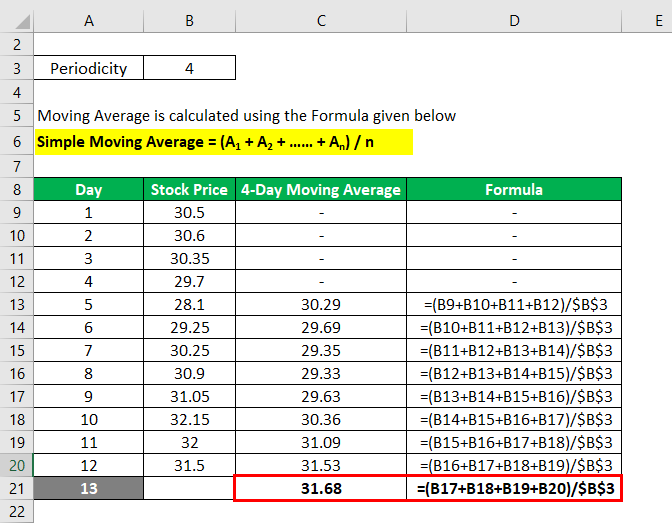
The following video provides an excellent walkthrough of calculating and, importantly, visualizing moving averages.
Moving Averages in Stock, Bitcoin, Cryptocurrency Trading Charts Explained - Excel & Google Sheets
This video clearly explains what a moving average is and shows you how to calculate it in Excel. It also visualizes the 'smoothing' effect, which is key to your goal of creating effective data visualizations.
Please watch from 01:15 to 08:18. The video will cover: How to calculate a 7-day moving average using the AVERAGE function. How to chart the SMA against the actual price to see the smoothing effect. How different time periods (e.g., 14-day vs. 4-day) affect the trendline's smoothness and responsiveness. Pay close attention to this trade-off.
As the video highlighted, the choice of the period (N) for the moving average is a critical decision:
- Short Period (e.g., 10-day, 20-day): More sensitive to recent price changes. It will follow the price more closely.
- Long Period (e.g., 50-day, 200-day): Less sensitive and much smoother. It reveals the long-term trend but reacts slowly to changes.
Test your understanding!
A technical analyst wants to identify the primary, long-term trend of a stock, ignoring short-term market "noise." Should they use a 20-day SMA or a 200-day SMA? Why?
Show answer
They should use the 200-day SMA. A longer period averages out more of the short-term volatility, resulting in a smoother line that better reflects the long-term underlying trend. The 20-day SMA would be too "choppy" and reactive for this purpose.
A Quick Look at Weighted Moving Averages (WMA)
A limitation of the SMA is that it gives equal importance to all data points in the period. A Weighted Moving Average (WMA) gives more weight to more recent data, making it react faster to price changes than an SMA of the same period. This video provides a good conceptual overview.
Moving Averages in Stock, Bitcoin, Cryptocurrency Trading Charts Explained - Excel & Google Sheets
Let's revisit the same video to understand the 'why' and 'what' of Weighted Moving Averages.
Watch the segments from 08:18 to 09:50 and 16:05 to 17:20. The first part explains the concept, and the second part shows a visual comparison between an SMA and a WMA. You don't need to memorize the complex formula shown; focus on understanding why a WMA is used and how it behaves differently on a chart.
Visualization Shortcut: The Trendline Feature
If your main goal is simply to visualize the moving average on a chart, you don't even need to calculate it in a column first! Excel can do it for you automatically.
Calculate moving average in Excel: formulas and charts
This article from Ablebits shows a very practical shortcut for adding a moving average line directly to an Excel chart.
Please read the section 'Creating an Excel moving average chart'. Follow the steps to add a 'Moving Average' trendline to a chart. This is a very efficient technique for visualization.
This trendline feature is a perfect example of using the tool's built-in capabilities to achieve a visual goal quickly, aligning perfectly with your preference for tool-based analysis.
Conclusion
Excellent work! You have now moved from raw data to meaningful metrics. You've learned how to quantify performance with simple returns and identify trends with moving averages—two indispensable skills for financial analysis.
Here are the key takeaways from today's lesson:
- Simple Returns measure the percentage change in price over a period and can be calculated easily in Excel with the formula
(New Price / Old Price) - 1. - Simple Moving Averages (SMA) smooth out price data to reveal underlying trends. You can calculate them with the
AVERAGEfunction. - The period
Nof a moving average determines its sensitivity: shorter periods are more reactive, while longer periods are smoother and show long-term trends. - A Weighted Moving Average (WMA) gives more importance to recent prices, allowing it to react more quickly than an SMA.
- For pure visualization, you can use Excel's built-in Chart Trendline feature to add a moving average without needing to calculate it in a separate column.
Your data is now not only clean but also enriched with analytical calculations. In our next lesson, we will explore conditional formatting, a powerful tool to make your data tables visually communicative by automatically highlighting key patterns, such as positive vs. negative returns, without even needing a chart.
Can't find a good explanation? Sign up and we'll make it for you
Sign up