
Hello! Welcome back to our course on financial data visualization.
In our last lesson, we transformed our raw data tables into visually informative reports using conditional formatting. We can now spot trends and outliers within the data itself. But what happens when new data arrives, like the next day's stock prices or a new month's sales figures? If your charts aren't set up correctly, you'd have to manually update them every single time, a tedious and error-prone process.
Today, we'll solve that problem by learning to organize data for charting using Excel Tables for dynamic updates. This is the final and perhaps most crucial lesson in our "Data Foundations" module. Mastering this will save you countless hours and ensure your visualizations are always up-to-date.
By the end of this lesson, you will be able to structure your data in a way that makes your Excel charts automatically update whenever new data is added.
1. The Problem: Static Charts and Constant Manual Updates
Imagine you've built a beautiful chart showing a stock's performance over the last month. The next day, you add the new closing price to your spreadsheet. You look at your chart... and nothing has changed. The new data point is missing. This is the default behavior when you build charts from a standard range of cells.
To understand this common frustration, let's start with a quick read that frames the problem we're about to solve.
How to Make an Excel Dynamic Chart & Keep Updates Consistent
This article from Excel University clearly explains the difference between a static and a dynamic chart. Understanding this is key to appreciating the power of Excel Tables.
Please read the introduction and the section titled 'The Issue We Are Solving'. This will set the stage for why the technique we're learning today is so important.
2. The Solution: Excel Tables
The solution to this problem is to stop using plain data ranges and start using official Excel Tables. An Excel Table isn't just about formatting; it's a special object that treats your data as a structured, single unit with powerful properties.
The most important property for our purpose is its ability to auto-expand. When you add new data in an adjacent row or column, the table automatically grows to include it. Any formulas, charts, or PivotTables based on that table will "know" about the new data.
Let's see how to create one and watch it in action.
7 Reasons Why you Should use Excel Tables
This video from Teacher's Tech provides a quick and clear demonstration of what Excel Tables are and why they are so useful.
First, watch from 00:22 to 02:00 to learn the simple ways to create an Excel Table (the Ctrl + T shortcut is a favorite of many professionals). Then, watch from 04:48 to 05:46 to see how the table automatically expands when new rows and columns are added.
3. Creating a Dynamic Chart, Step-by-Step
Now we'll put the pieces together. By creating a chart from an Excel Table instead of a regular range, we create a dynamic chart.
The process is simple:
- Organize your data with headers in the first row.
- Select any cell in your data and press
Ctrl + Tto turn it into an Excel Table. - With a cell in your new Table selected, go to
Insert > Chartand choose the chart type you want. - Add a new row of data directly below your table.
- Watch as your chart updates automatically to include the new data point!
This process is the core of today's lesson. The article from Excel University that you looked at earlier provides a perfect text-based walkthrough of this exact process.
How to Make an Excel Dynamic Chart & Keep Updates Consistent
Let's return to the Excel University article. It lays out the steps to create a dynamic chart using the Table method, which it rightly calls the simplest and most common option.
Please read the section 'Creating a Dynamic Chart Using a Table'. It walks you through converting a range to a Table, inserting a chart, and then seeing it update when a new row is added. (You can skip the next section on the formula-based method, as the Table method is the modern standard and aligns with your preference for tool-based solutions).
Here is a visual summary of the dynamic update in action:

Test your understanding!
You have a table of daily stock prices for the last year. You create a line chart from this data to visualize the price trend. If you did not use an Excel Table, what would you have to do every day to include the new day's price in your chart?
Show answer
You would have to manually edit the chart's data source. This usually involves right-clicking the chart, selecting "Select Data," and then re-selecting the entire data range to include the new row. Doing this every day is inefficient and increases the risk of error. Using an Excel Table automates this entire process.
4. Taking It Further: Interactive Charts with Slicers
Excel Tables don't just make your charts update automatically; they also open the door to making them interactive. One of the best ways to do this is with Slicers.
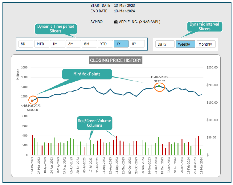
Slicers are essentially stylish, clickable buttons that you can use to filter your table's data. Since your chart is linked to the table, filtering the table with a slicer will also filter the chart in real-time. This is a fantastic way to allow users (including yourself) to explore the data.
This video demonstrates how to connect a slicer to a table and its chart.
How to make a dynamic chart using slicers in excel
This short tutorial by Karina Adcock shows how to link a slicer to a Table-based chart to create an interactive experience. This is a great preview of the kind of interactivity we'll build in Power BI later.
Watch the entire video (it's short!). Pay attention to the sequence: 1. Create the Table (Ctrl+T), 2. Insert the Slicer, 3. Create the Chart. Notice how clicking the slicer buttons instantly changes what's visible in both the table and the chart.
Using Tables, charts, and slicers, you can start building surprisingly powerful and interactive dashboards right within Excel, bringing you closer to your goal of creating great financial visualizations.
Conclusion
You have now completed the final lesson of our foundational module. You've learned to bring data in, clean it, calculate key metrics, format it for clarity, and now, structure it for dynamic charting. This workflow is the bedrock of efficient and reliable analysis in Excel.
Key Takeaways:
- A regular data range is static; an Excel Table is a dynamic, structured object.
- The primary benefit of using Excel Tables for charting is that they auto-expand, and any charts based on them update automatically when new data is added.
- The process is simple: convert your data to a Table with
Ctrl + Tbefore you create your chart. - You can add Slicers to Tables to create interactive charts that can be filtered with the click of a button.
In our next lesson, we will move into Module 2: Core Financial Charting in Excel. With our data perfectly prepared in a dynamic table, we are now ready to dive deep into the art and science of visualization itself. We will begin by learning how to create and customize basic column, bar, and line charts to effectively tell stories with financial trend data.
Can't find a good explanation? Sign up and we'll make it for you
Sign up