
In our last lesson, we established the digital foundation of sound, exploring how continuous analog waves are converted into discrete numerical data through sampling and quantization. You now understand that a digital audio file is fundamentally a sequence of numbers representing the sound wave's amplitude at precise moments in time. This lesson builds directly on that foundation by asking the next logical question: how do we visually interpret this data to understand a sound's character?
Today, we will explore the two most fundamental ways of visualizing audio: the waveform and the spectrogram. Our goal is to learn how to interpret these displays to identify a sound's amplitude and frequency content over time. Mastering this skill is like learning to read the "source code" of audio. It is an indispensable ability for everything from sound design and synthesis to mixing and analyzing the structure of tracks you admire, including those by deadmau5.
The Waveform: Visualizing the Time Domain
The most direct way to visualize the digital audio data we discussed previously is through a waveform. A waveform is a two-dimensional graph that plots amplitude on the vertical (y) axis against time on the horizontal (x) axis. It is a literal, point-by-point representation of the samples in an audio file.
At its simplest, a waveform can represent a pure tone, like a sine wave.
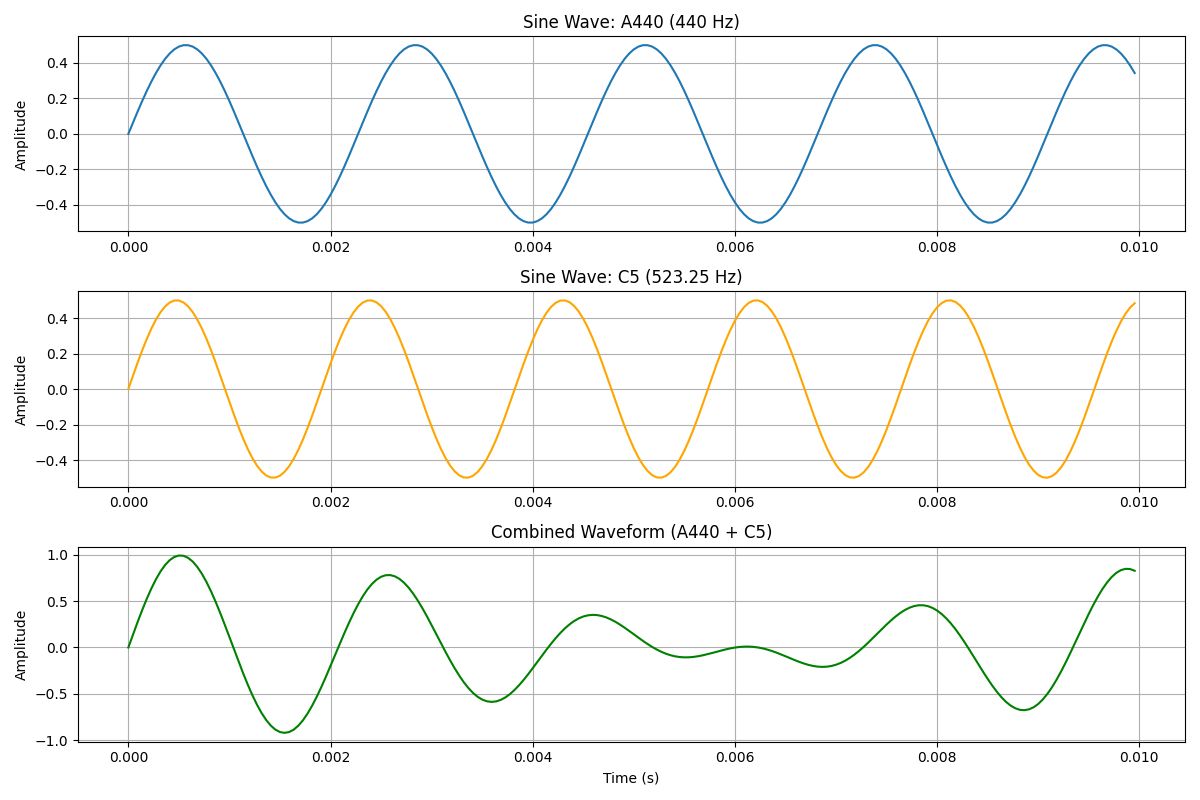
The image above illustrates a key principle. The top two graphs show simple sine waves. The "A440" wave oscillates 440 times per second, and we perceive its amplitude as its volume. The bottom graph shows what happens when we simply add the amplitude of these two waves together at every point in time. The result is a more complex waveform. Real-world sounds are composed of many, many sine waves summed together in this fashion, creating highly intricate waveforms.
Now let's look at a waveform for a piece of music.
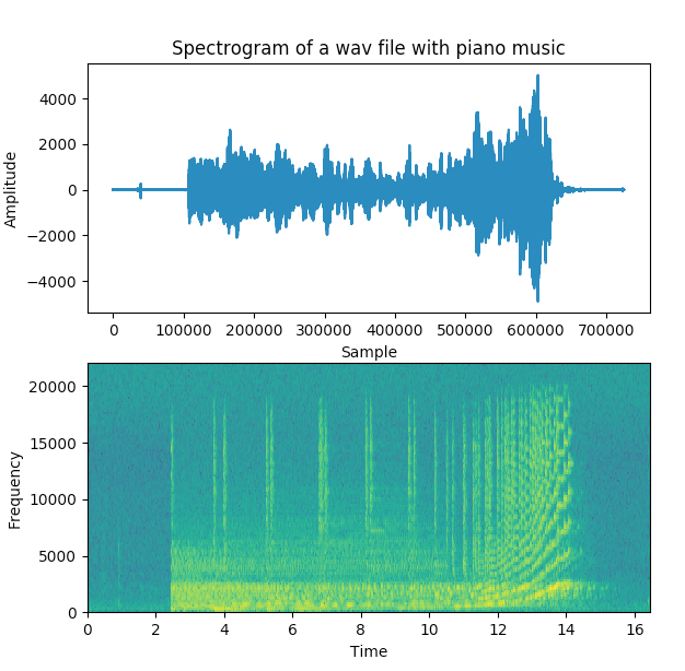
Looking at the top waveform plot, you can immediately see the dynamic contour of the music.
- Amplitude: The vertical extent of the wave from the center line indicates the instantaneous amplitude. Large peaks and troughs correspond to loud moments, while sections near the zero line are quiet or silent.
- Time: The horizontal axis shows the progression of time, allowing you to see exactly when sounds occur.
To formalize this, please read a short section from the Hugging Face Audio Course.
This section will solidify your understanding of the waveform as a time-domain representation of sound.
Please read the section titled Audio as a waveform. Pay attention to the clear definition of the axes and how the plot directly corresponds to the sample values.
The waveform is invaluable for tasks like editing the timing of audio clips or identifying clipping (where the amplitude exceeds the maximum possible value, causing distortion). However, it has a significant limitation: while it tells you that a sound is complex, it doesn't easily reveal what frequencies make up that complexity. For that, we need to switch from the time domain to the frequency domain.
The Spectrogram: Visualizing the Frequency Domain
To understand the frequency content of a sound, we need a different kind of visualization. This is where your quantitative background will be particularly helpful. The mathematical tool that allows us to decompose a complex signal into its constituent simple sine waves is the Fourier Transform.
While a full frequency spectrum shows the frequency content of an entire clip averaged over time, this isn't very useful for music, which changes constantly. Instead, we use a method called the Short-Time Fourier Transform (STFT). The STFT works by:
- Breaking the audio into very short, overlapping time windows (e.g., a few milliseconds long).
- Calculating the Fourier Transform for each short window to get a frequency spectrum for that specific moment.
- Stacking these individual spectra side-by-side to show how the frequency content evolves over time.
The resulting visualization is a spectrogram.
Let's return to the image of the piano music. The bottom plot is the spectrogram. It presents three dimensions of information:
- X-axis (horizontal): Time, just like the waveform.
- Y-axis (vertical): Frequency, typically with the lowest frequencies at the bottom and the highest at the top.
- Color/Brightness: Amplitude. Brighter or "hotter" colors represent higher amplitude (louder) at that specific frequency and time.
Look at the piano spectrogram in the image LINK again. You can see distinct horizontal lines appear and fade. These are the fundamental frequencies and overtones (harmonics) of the piano notes being played. Where the waveform just showed a blob of high amplitude around the 12-second mark, the spectrogram reveals this is a complex arpeggio with frequencies sweeping rapidly upwards.
The following resources provide a comprehensive look at how to interpret these powerful displays.
Understanding spectrograms - iZotope
This article from iZotope, a leader in audio analysis software, provides an excellent conceptual introduction and a practical example.
First, read the initial section What is a spectrogram? to see a clear visual comparison between a waveform and a spectrogram for a simple sweeping sine wave. Next, jump to the section How to read spectrograms. This provides a concrete example of analyzing a spoken word, connecting the visual "blobs" of color to specific phonetic sounds and their corresponding frequency ranges.
Now, let's dive deeper with a video that consolidates these concepts and introduces more advanced details.
RX 8 Introduction & Spectrogram Basics
This video, "RX 8 Introduction & Spectrogram Basics," gives a complete tour of reading spectrograms, including customization options relevant to music production.
Watch the following segments: Waveform basics: A quick recap of reading a waveform. Spectrogram basics: This part clearly explains the three dimensions of a spectrogram (time, frequency, amplitude/color). Frequency scales: This is a key section. It explains the difference between linear and logarithmic frequency scales. Logarithmic scales are standard in audio analysis because they more closely match human perception of pitch. Practical examples: The presenter analyzes a piece of music, pointing out how to identify rhythmic elements like kick drums and sustained elements like basslines, and even how to distinguish a vocal from a synth. This is exactly the kind of interpretation you'll be doing.
One final technical point that stems from the STFT process is the trade-off between time resolution and frequency resolution. This is determined by the size of the time windows used for the analysis (often called the FFT size).
- Large FFT size (long windows): Provides high frequency resolution (you can distinguish between very close frequencies) but poor time resolution (you can't pinpoint the exact start time of an event). Good for analyzing sustained sounds like pads or bass notes.
- Small FFT size (short windows): Provides high time resolution (great for seeing the precise timing of transients like drum hits) but poor frequency resolution.
This is analogous to the uncertainty principle in physics and is a fundamental trade-off in signal processing.
Application in Ableton Live: The 'Spectrum' Analyzer
While complex spectrograms like those in iZotope RX are often used for detailed audio repair and offline analysis, you have a powerful real-time tool directly inside Ableton Live: the Spectrum audio effect.
Spectrum is a real-time spectrum analyzer. Think of it as a single, live-updating vertical slice of a spectrogram. It shows you the frequency content of the audio passing through it at the current moment. This is incredibly useful for mixing, sound design, and analysis. For example, you can use it to:
- Identify the fundamental frequency of a bass sound to ensure it's in key.
- Find resonant frequencies in a room recording that need to be EQ'd out.
- Analyze a deadmau5 track to see how he balances low-end energy from the kick and bass, or what frequencies his signature leads occupy.
The following video walks through Ableton's Spectrum device and its controls.
Ableton Live Tutorials – Spectrum and EQ Eight Analyser
This tutorial from MusicTech provides a focused look at Ableton's Spectrum device, explaining how to tailor it for musical analysis.
Please watch these key parts: Core controls: This section explains Block Size (which is the FFT size, controlling frequency resolution), Refresh Rate, and Average (which smooths the display to be more like human hearing). Display modes: This covers the 'Graph' vs 'Bins' view and the useful 'Max Value' feature, which holds the peak level for each frequency. Frequency scales: This reinforces the concept of linear vs. logarithmic scales and introduces the 'musical scale' view, which maps frequencies directly to notes on a keyboard. Practical uses: This demonstrates how to use Spectrum for analysis on individual tracks and for comparing your mix to a professional reference track. This is a workflow you will use extensively.
Conclusion
In this lesson, we have moved from the abstract concept of digital audio as numbers to the practical skill of visualizing and interpreting that data. You are now equipped to analyze sound in both the time and frequency domains.
Here are the key takeaways:
- Waveforms plot amplitude vs. time. They are ideal for seeing the overall dynamics of a sound and the precise timing of events.
- Spectrograms visualize frequency content over time, using color or brightness to represent amplitude. They are created using the Short-Time Fourier Transform (STFT).
- Reading a spectrogram involves interpreting three axes: time (x), frequency (y), and amplitude (color).
- Logarithmic frequency scaling is standard in audio tools because it aligns with our logarithmic perception of pitch.
- Ableton's Spectrum device is a real-time analyzer that allows you to "see" the frequency content of your sounds as they play, an essential tool for production and mixing.
We've established how to see frequencies in a sound. In our next lesson, we will connect this physical property of frequency (measured in Hz) to the musical concepts of pitch and the harmonic series, exploring why a note from a piano and a note from a synthesizer, despite having the same pitch, sound so different.
Can't find a good explanation? Sign up and we'll make it for you
Sign up