
Hello! Welcome back to our course.
In our last lesson, we built a solid foundation by learning to create and customize the fundamental chart types: column, bar, and line charts. You now know how to take raw data and begin telling a visual story.
Today, we'll level up that skill significantly. We'll address a very common challenge in financial analysis: how do you compare two different types of data, like price and volume, on the same chart when their scales are completely different? The answer is the combo chart. This lesson is dedicated to today's learning outcome: building combo charts to compare multiple data series with different scales. This is a powerful technique you'll use constantly when creating visualizations for financial markets.
1. The Challenge: Comparing Apples and Oranges
Imagine you want to see how a stock's trading volume impacts its price. You have data for both:
- Price: Measured in dollars (e.g., $150.25)
- Volume: Measured in millions of shares (e.g., 50,000,000)
If you try to plot both of these on a standard line or column chart with a single vertical (Y) axis, the price line would be a tiny, unreadable squiggle at the very bottom, completely flattened by the massive volume numbers.
This is where combo charts come in. A combo chart combines two or more chart types (like a column chart for volume and a line chart for price) into a single visual. Crucially, it allows us to use a secondary vertical axis to handle the different scales.
To start, let's explore why this is so valuable in a financial context.
How to Create a Combo Chart in Excel
This article from Macabacus, a platform for finance professionals, introduces combo charts and their applications. It will give you a good understanding of their role in financial analysis.
Please read the sections 'What is a Combo Chart?' and 'Financial Use Cases'. This will set the stage by explaining what these charts are and why they are so relevant to your goals.
2. The Solution: The Secondary Axis
The key that unlocks the power of combo charts is the secondary axis. This is a second vertical (Y) axis that appears on the right side of the chart.
- The primary axis (left) is used for one data series (e.g., Volume).
- The secondary axis (right) is used for the other data series (e.g., Price).
Excel plots each series against its own corresponding axis, allowing both to be displayed clearly and in a way that makes their relationship easy to see.
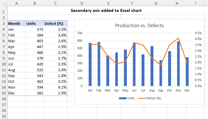
The Macabacus article you just reviewed explains exactly how to add this secondary axis to a chart.
How to Create a Combo Chart in Excel
Let's revisit the Macabacus article to see the specific steps for incorporating a secondary axis.
Now, please read the section 'Enhancing Financial Analysis with Advanced Combo Chart Techniques', focusing specifically on the sub-section 'Incorporating Secondary Axes'. This provides the exact steps to assign a data series to a secondary axis.
Test your understanding!
You have a dataset with a company's quarterly Revenue (in millions of dollars) and its Customer Growth Rate (as a percentage). You want to see if there's a relationship between them on a single chart. Why would a standard line chart with one Y-axis be a poor choice for this task?
Show answer
A standard line chart would be a poor choice because the scales are incompatible. The revenue numbers would be in the millions (e.g., 50,000,000), while the growth rate would be a small decimal (e.g., 0.05 for 5%). When plotted on the same axis, the revenue line would dominate the chart, and the growth rate line would appear as a flat line at zero, making it impossible to see any trend or correlation. A combo chart with a secondary axis is the correct tool.
3. Building a Stock Price and Volume Chart
Now for the practical part. Let's build the most classic financial combo chart: Price and Volume. We will use a line for the price and columns for the volume.
The following video provides a clear, step-by-step demonstration of this exact task. It shows how to start with a basic chart, modify it into a combo chart, and add the crucial secondary axis.
Create a Stock Price and Volume Chart
This video by Doug H is a perfect walkthrough for our goal. It covers creating the chart, changing a series's type, adding a secondary axis, and tidying up the formatting.
Please watch the following segments carefully: 00:32 - 01:08: Inserting the initial line chart. 01:08 - 01:38: Changing the 'Volume' series from a line to a column chart. 01:38 - 02:31: The most important step! This shows how to right-click the volume columns and plot them on a secondary axis. 03:07 - 04:24: Adding essential formatting like a chart title and axis titles to make the chart clear and professional.
This method—starting with a basic chart and modifying it—is a flexible approach that always works. To reinforce this process, you can also refer to the steps outlined in the text-based guide below.
how to make stock graph in excel: step-by-step
This article from Bitget provides a concise textual summary of the same process, which is great for quick reference.
Read the section 'Adding Volume (Volume + Price combo charts)'. Notice how the steps described—create the price chart, add volume, convert to column, assign to secondary axis—are exactly what you just saw in the video.
4. A More Direct Method
The method you just learned is powerful, but Excel also provides a more direct way to create combo charts from the start, which can save you time. You can use the dedicated "Combo Chart" option in the 'Insert' menu.

The following video demonstrates this more streamlined workflow.
How to Create a Combination Chart (Combo Chart) in Excel
This tutorial from Data Design Style shows how to use Excel's built-in Combo Chart dialog, which lets you configure everything in one go.
Watch from 00:24 to 02:14. Pay close attention to how the 'Change Chart Type' window for a combo chart allows you to: Choose the chart type for each data series (e.g., Clustered Column, Line). Check a box to assign a series to the Secondary Axis right away. This dialog is your all-in-one control panel for creating combo charts.
Both methods achieve the same result. The second method is often faster if you know from the outset that you need a combo chart. The first method (modifying an existing chart) is useful when you decide to add a new data series with a different scale to a chart you've already built.
Conclusion
Excellent work! You've now added one of the most versatile and important chart types for financial analysis to your toolkit. You understand not just how to build a combo chart, but why it's so essential for comparing data with different units and scales.
Key Takeaways:
- Combo charts combine multiple chart types (e.g., column and line) to visualize data series with different scales.
- The secondary axis is the critical feature that enables this, providing a separate scale on the right side of the chart.
- A classic financial use case is plotting stock price (line) and trading volume (columns) together.
- You can create a combo chart either by modifying an existing chart or by using Excel's dedicated "Combo Chart" dialog from the start.
In our next lesson, we will explore another powerful visualization, the area chart. We'll see how it can be used to show not just a trend over time, but also the changing composition of a whole, making it ideal for visualizing things like asset allocation in a portfolio.
Can't find a good explanation? Sign up and we'll make it for you
Sign up