
Hello and welcome back!
In our last lesson, we mastered combo charts, a fantastic tool for comparing data with different scales, like stock price and volume. You learned how to use a secondary axis to make these comparisons clear and insightful.
Today, we'll explore another powerful visualization for financial analysis: the area chart. This lesson directly addresses the learning outcome: constructing area charts to visualize asset allocation and portfolio composition over time. While a line chart shows a trend, an area chart does that and emphasizes the magnitude or volume of that trend. This makes it perfect for showing not just the total value of a portfolio, but how its constituent parts contribute to that total and change over time.
1. Understanding Area Charts
At its core, an area chart is a line chart with the area below the line filled in. This simple addition has a significant impact: it helps the viewer perceive the quantitative value, or magnitude, of a trend. For financial data, this means you can visualize not just the direction of revenue or portfolio value, but the sheer volume of it.
How to Create an Area Chart in Excel
To start, let's get a formal understanding of what area charts are and why they are so valuable in a financial context. This article from Macabacus provides a great overview.
Please read the first section, 'Why Do Area Charts Matter?'. It explains how these charts help in spotting trends and comparing the performance of different products or portfolios over time.
2. Types of Area Charts for Portfolio Analysis
Area charts come in a few variations, and choosing the right one is key. For visualizing asset allocation, two types are particularly important: the Stacked Area Chart and the 100% Stacked Area Chart.
-
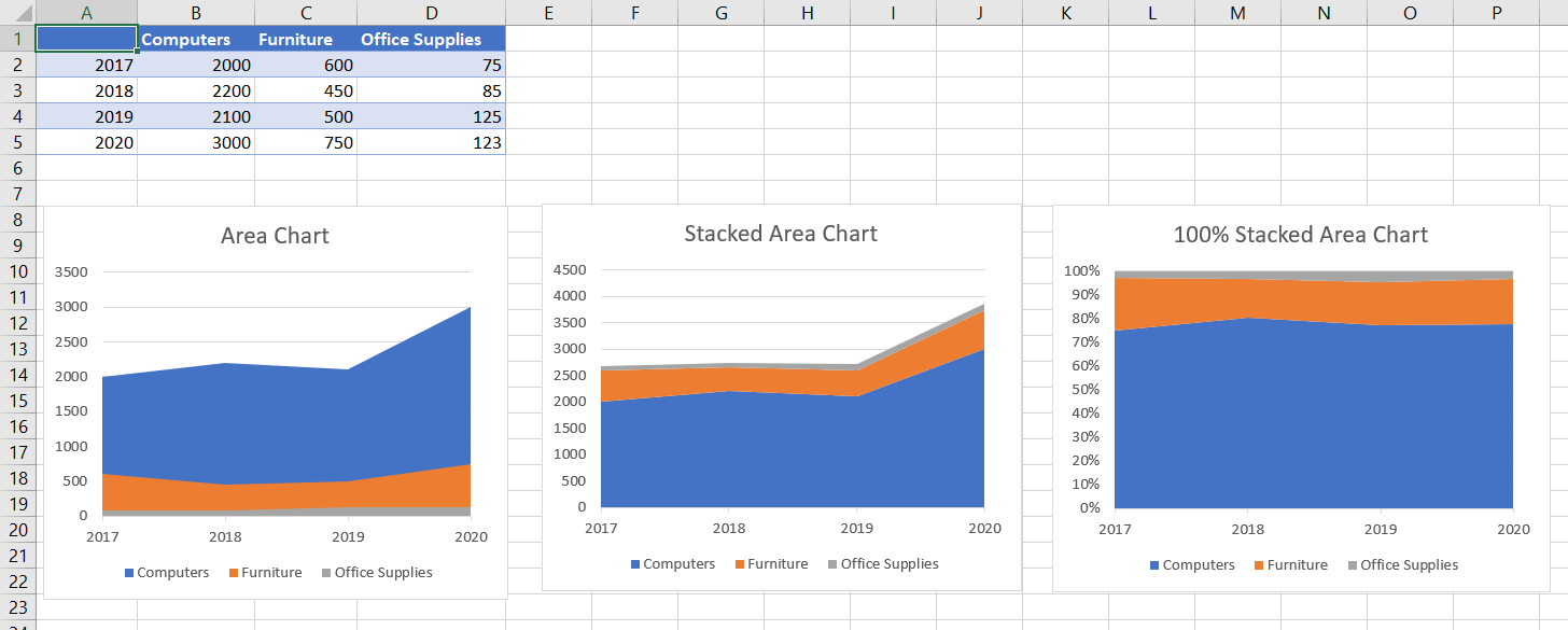
Stacked Area Chart: This chart shows the trend of individual components that add up to a total. For a portfolio, it would show the value of each asset class (e.g., stocks, bonds, cash) stacked on top of each other. The top of the chart represents the total portfolio value. This is excellent for seeing how both the individual assets and the total portfolio have grown.
-
100% Stacked Area Chart: This chart is specifically designed to show the proportion of each component to the total. The vertical axis always goes from 0% to 100%. This is the perfect tool for visualizing asset allocation as a percentage, showing how the mix of your portfolio changes over time, regardless of its total dollar value.
The article below gives a clear breakdown of these types.
Area Chart In Excel: Know Types, How To Creat, ...
This article from Unstop clearly defines the different types of area charts and their specific use cases.
Read the section 'Types of Area Charts in Excel'. Focus on understanding the difference between a 'Stacked Area Chart' and a '100% Stacked Area Chart' and their recommended use cases.
To see the difference visually, look at the image below. It shows the same data visualized with a standard, stacked, and 100% stacked area chart.
Test your understanding!
You are managing a portfolio and want to create a chart that strictly shows whether you are sticking to your target allocation of 60% stocks, 30% bonds, and 10% cash over the last five years. The total value of the portfolio has fluctuated. Which type of area chart should you use, and why?
Show answer
You should use a 100% Stacked Area Chart. Because your goal is to track the percentage allocation, this chart type is ideal. It normalizes the data to show the relative contribution of each asset class to the whole, making it easy to see if the proportions are changing over time, independent of the portfolio's total dollar value.
3. Building a Portfolio Composition Chart in Excel
Now let's put this into practice. We'll build a stacked area chart to visualize a portfolio's composition over time. Imagine you have a dataset showing the value of different asset classes (like Stocks, Bonds, and Real Estate) at the end of each year.
The process is very similar to creating other charts in Excel:
- Prepare your data: Make sure it's in a clean table with time periods (e.g., years) in the first column and the value of each asset class in the subsequent columns.
- Insert the chart: Select your data and insert a Stacked Area chart.
- Format for clarity: Adjust colors, titles, and the legend to make the chart easy to read and professional-looking.
The following video provides an excellent walkthrough of this process. The example uses company revenue by product, which is conceptually identical to portfolio value by asset class.
AWESOME Excel Charts & Visuals | For Business & Finance Professionals
This video from Kenji Explains demonstrates how to create and format a beautiful stacked area chart in Excel.
Watch from the beginning until 02:28. Pay close attention to how the data is selected and how the chart is inserted. Also, note the formatting techniques used, such as changing colors, removing gridlines, and creating a clean title. These are key steps to making your visualizations look professional.
4. Best Practices for Clear and Effective Area Charts
Your goal is to create 'nice' data visualizations, and that means going beyond the default Excel settings. A well-designed chart tells a clearer story.
Here are some key design principles for area charts:
- Color Choice: Use distinct colors for each area. A common practice is to order them from darkest (at the bottom) to lightest (at the top) to create a sense of visual weight.
- Clutter Reduction: Remove unnecessary elements like gridlines or borders that don't add information. This helps the data stand out.
- Clear Labeling: Always include a clear title, axis labels, and a legend so your audience knows exactly what they are looking at.
- Ordering: Place the least volatile or largest component at the bottom of a stacked area chart to create a more stable baseline.
This article provides an excellent summary of these design best practices.
How to Create an Area Chart in Excel
Let's revisit the Macabacus article for some essential design tips that will elevate your charts.
Please read the section 'Best Practices in Financial Chart Design'. These tips on color, labeling, and providing context are universally applicable and will help you create more effective financial visualizations.
Here is an example of a 100% stacked area chart used to show the proportional sales contribution by quarter across different regions. You could use this exact same format to show portfolio asset allocation across different years.

Conclusion
Great job! You have now learned how to use area charts to effectively visualize trends and composition over time. This is a fundamental skill for representing financial data, especially for tasks like analyzing portfolio performance and asset allocation.
Key Takeaways:
- Area charts emphasize the magnitude of a trend over time, making them different from line charts.
- Stacked Area Charts are used to show how individual components contribute to a changing total, like the value of asset classes within a growing portfolio.
- 100% Stacked Area Charts are used to show the proportion of each component to the whole, which is perfect for visualizing percentage-based asset allocation.
- Effective design—through smart color choices, clear labeling, and reduced clutter—is crucial for making your charts professional and easy to understand.
In our next lesson, we will shift gears to explore relationships between variables. We will learn how to design scatter plots to analyze correlations between financial variables, such as the returns of two different stocks.
Can't find a good explanation? Sign up and we'll make it for you
Sign up