
Hello! Welcome to the second module of our course.
In our last lesson, we mastered a crucial step in efficient data visualization: using Excel Tables to create dynamic charts that update automatically. We now have our data perfectly structured and ready for analysis. The foundation is set.
Today, we'll begin building the structure itself. This lesson kicks off our module on "Core Financial Charting in Excel" by focusing on the absolute fundamentals. We will learn how to create and customize the three most essential chart types: column, bar, and line charts. These charts are the primary tools you'll use to identify and communicate financial trends, making this a cornerstone of your visualization skillset.
1. Choosing the Right Tool for the Job
Before we dive into creating charts, it's vital to know when to use each type. A well-chosen chart tells a story clearly, while a poor choice can confuse or mislead.
-
Line Charts are your go-to for showing trends over a continuous scale, most commonly time. Think of tracking a stock's price over a year, a company's revenue over several quarters, or changes in an economic indicator like inflation.
-
Column Charts (vertical bars) are best for comparing values across a limited number of distinct categories. For example, comparing the quarterly earnings of three different companies or the revenue from different product lines in a single year.
-
Bar Charts (horizontal bars) are functionally the same as column charts but are oriented horizontally. They are preferable when you have many categories to compare or when your category labels are long, as they are easier to read horizontally.
To solidify your understanding of when to use a line chart for financial data and the key difference between bar and column charts, please review these two brief resources.
How to Create a Line Chart in Excel
This first article from Macabacus, a resource for finance professionals, explains what kind of data is a perfect fit for line charts. This directly connects to your goal of visualizing market data.
Please read the sections titled 'Types of Data Suitable for Line Charts in Excel' and 'Examples of Effective Line Chart Usage in Business and Finance'. Focus on how these charts are used to track time-series data like stock prices.
How to Make a Bar Graph in Excel: A Beginner's Guide
Next, this guide from DataCamp clearly explains the practical difference between vertical column charts and horizontal bar charts.
Read the short section 'Step 4: Switch between horizontal and vertical formats' to understand the simple rule for choosing between these two chart types.
2. Creating and Customizing a Line Chart
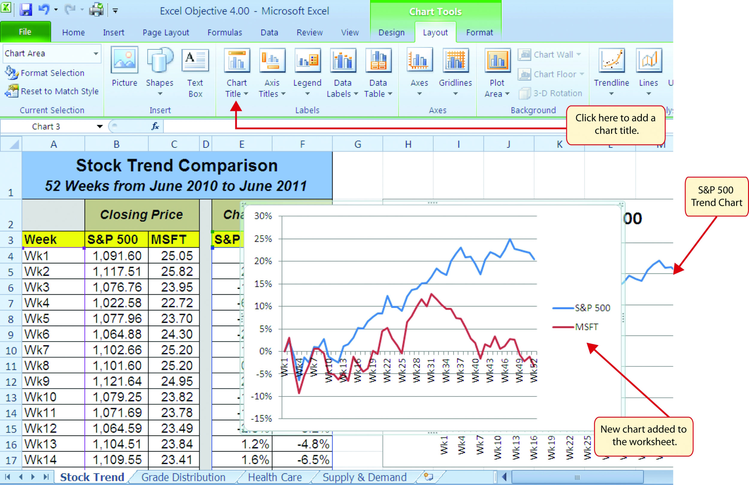
Since so much of financial analysis involves tracking performance over time, the line chart will be one of your most-used tools. Let's build one from scratch. The general process involves selecting your data, inserting a chart, and then formatting it for clarity and impact.
The following video provides an excellent, beginner-friendly walkthrough of this entire process.
Excel Charts and Graphs Tutorial
This tutorial by Kevin Stratvert covers everything from inserting your first chart to customizing it like a pro. We'll use it as our main guide for the general mechanics of Excel charting.
Please watch two key segments: 03:23 - 06:04: This part shows how to insert a line chart and explains its suitability for time-based data. 07:50 - 13:01: This is the most important part. It details how to customize your chart by editing titles, adding axis labels, changing colors, and applying different styles. Pay close attention to the 'Chart Design' and 'Format' tabs.
As you saw in the video, creating the chart is easy. Making it effective requires thoughtful customization. Always ask yourself:
- Is the title descriptive? "Cookie Sales" is okay; "Kevin Cookie Company Sales 2026" is better.
- Are the axes labeled? What do the numbers represent? Dollars? Units sold? Percentage change?
- Are the colors clear? Use color to distinguish data series or to align with brand guidelines.
- Is the chart free of clutter? Remove any elements that don't add to the understanding.
Test your understanding!
You've created a line chart of a stock's price over the last five years. The price fluctuated between $150 and $180, but your chart's vertical (Y) axis runs from $0 to $200, making the price movements look almost flat. What specific customization could you apply to make the trend more visible?
Show answer
You can format the vertical axis to change its minimum and maximum bounds. By setting the minimum to around $140 and the maximum to $190, you "zoom in" on the relevant price range, which will make the fluctuations and the overall trend much more pronounced and easier to analyze.
3. Creating and Customizing Column & Bar Charts
The process for creating column and bar charts is nearly identical to what we just learned for line charts. You select your data, go to the Insert tab, and choose your chart type. The customization options under the Chart Design and Format tabs are also the same.
Let's walk through the specific steps for a bar/column chart.
How to Make a Bar Graph in Excel: A Beginner's Guide
This DataCamp article provides a clear, step-by-step guide to creating and formatting a bar chart. Since you've already seen the general customization options in the video, you can focus on the initial setup.
Review 'Data preparation' to see how organizing data in columns is key. Notice the tip about using an Excel Table (Ctrl + T), which connects back to our last lesson. Read 'Inserting a basic bar graph' for the core creation steps. Skim 'Axis and label formatting' to reinforce how to customize labels for readability.
A Quick Financial Example
Let's see this in a direct financial context. Imagine we have a company's annual Revenue and Gross Profit, and we want to compare them side-by-side for the last few years. A column chart is perfect for this.
The following video quickly demonstrates exactly this scenario.
Excel Charts & Graphs for Advanced Financial analysis📈
This clip from Learn Accounting Finance shows the creation of a clustered column chart for a typical financial analysis task.
Watch just the beginning, from 02:47 to 03:07. The video shows the user selecting financial data (revenue and gross profit) and inserting a clustered column chart. This is a perfect real-world use case.
The chart created in that clip allows for an immediate visual comparison: we can see how both revenue and profit have grown year-over-year and what the gap between them looks like.
Conclusion
Congratulations on completing your first lesson in core charting! You now have the foundational skills to turn raw numbers into clear, insightful visuals using the three most common chart types.
Key Takeaways:
- Use line charts for trends over time.
- Use column charts for comparing a few categories and bar charts for many categories or long labels.
- The creation process is always: Select Data → Insert Chart → Customize.
- Effective customization is key: always provide clear titles, axis labels, and legends to ensure your chart tells an unambiguous story.
In our next lesson, we will build directly on this foundation by learning how to create combo charts. These powerful charts allow you to combine different chart types—like a column chart and a line chart—to compare data with very different scales on a single graph. This is essential for visualizing common financial pairs like stock price and trading volume.
Can't find a good explanation? Sign up and we'll make it for you
Sign up