
Hello! Welcome to the final lesson in our module on Data Storytelling and Stakeholder Influence.
In our last lesson, we focused on designing dashboard structures that guide users from a high-level summary to actionable insights. We established that a well-designed dashboard helps a user find a problem or opportunity. However, it often stops short of explicitly stating what to do about it. This leaves a critical gap between data and decision.
Today, we will close that gap. Your learning outcome is to incorporate clear commentary and explicit recommendations into reports to guide decision-making. We'll move beyond just presenting data to interpreting it, building a narrative, and providing the clear, confident direction that stakeholders expect from a leader. For someone in a strategic role, this skill is what separates a data reporter from a decision driver.
1. Beyond "What" to "So What?" and "What Next?"
You have likely seen countless reports that are little more than data dumps—a collection of metrics, charts, and tables. As a leader, you know these reports often create more questions than answers. The most common question is usually, "Okay, but what does this mean for the business?"
An effective report answers this question proactively. It translates the "what" (the metric) into the "why" (the root cause) and, most importantly, the "what should we do about it?" (the recommendation).
Let's watch a short video that frames this transition from metrics to insights and recommendations.
Data Analyst on How to Turn Business Metrics to Insights
In this clip from 'Data Analyst on How to Turn Business Metrics to Insights', Christine Jiang introduces the core challenge: stakeholders want to know what to do about the numbers they see. This sets the stage for our entire lesson.
Watch from 01:05 to 02:14. Pay attention to how she distinguishes between the 'what' (metrics), the 'why' (root causes), and the ultimate question of 'what should we actually do about it?'
This journey from observation to action is the essence of strategic reporting. Let's break down a framework to do this consistently.
2. The Observation → Insight → Recommendation Framework
The most effective way to structure your commentary is by using a simple but powerful narrative framework. While several exist, the Observation → Insight → Recommendation model is a robust foundation for almost any analytical summary.
Here's how it works:
- Observation: State the objective fact. What does the data show? This is the "what."
- Insight: Explain the meaning or cause. Why did this happen? This is the "so what."
- Recommendation: Propose a specific next step. What should we do now? This is the "what next."
The article "Report On Digital Marketing" provides a perfect example of this framework in action, contrasting a weak observation with a powerful, actionable insight.
Report On Digital Marketing: Actionable Stakeholder Insights
This article highlights the shift from 'data dump to strategic narrative'. We'll focus on the section that provides a clear, practical example of turning a simple metric into a full recommendation.
Read the section titled 'Transforming Data into Actionable Insights', starting from 'From Observation to Recommendation'. Notice the stark difference between the weak observation about Facebook CPA and the actionable insight that follows. This is the core skill we are developing today.
Let's break down the example from the article:
- Weak Observation: "Our Facebook CPA increased to $50 this month." (This is a data point, not an analysis.)
- Actionable Narrative:
- Observation: "Our Facebook CPA rose to $50 this month..."
- Insight: "...likely due to ad fatigue in our primary audience as frequency hit 5.8." (Connects the "what" to a plausible "why," supported by another metric.)
- Recommendation: "I recommend we test three new creative concepts and allocate 15% of the budget to a new lookalike audience to reduce costs and re-engage users." (Proposes a specific, measurable, and actionable plan.)
This structure transforms you from a bearer of news into a strategic partner who provides solutions.
3. Practical Techniques for Writing a Narrative
Knowing the framework is the first step. The next is applying it with language that is clear, persuasive, and easy to understand.
From Generic Updates to Specific Stories
How you phrase your commentary matters. Small shifts in language can turn a dry fact into a compelling point. The article "Using a narrative report to tell the story behind the numbers" offers excellent before-and-after examples.
Using a narrative report to tell the story behind the numbers
This article provides practical, sample language to help you move from generic reporting to client-facing insight. It's a great resource for improving the quality of your written analysis.
Please read the section 'From data to direction: Sample language and narrative prompts'. Pay close attention to the 'Don’t say' vs. 'Try instead' examples for different performance scenarios. Also, note the prompts for guiding your team's thinking.
Making Your Charts Do the Talking
Your commentary doesn't have to live in a separate text box. One of the most powerful and efficient ways to add narrative is by using descriptive chart titles. Instead of a generic title like "Revenue by Month," use a full sentence that states the key takeaway.
This short video segment demonstrates this technique beautifully.
Telling a Story with Data | Dashboard Build Demo
In this final clip from the 'Telling a Story with Data' demo, the presenter shows how to replace default chart titles with descriptive sentences, instantly adding a narrative layer to the dashboard.
Watch from 11:26 to 13:15. Notice how changing the titles transforms the dashboard from a collection of charts into a story that reads logically from one point to the next. The segment ends by mentioning the final step: adding explicit insights and recommendations.
This simple change guides the user's interpretation and reinforces the main point you want to make, making your report clearer and more persuasive.
Test your understanding!
You are reporting on a recent Google Ads campaign. The data shows that the campaign's click-through rate (CTR) was 5%, which is above the 3% target, but the conversion rate was only 1%, below the 4% target.
Which of the following represents the most effective Observation → Insight → Recommendation narrative?
A. "The campaign had a 5% CTR and a 1% conversion rate."
B. "The campaign performed well on CTR (5%) but poorly on conversions (1%). We should pause the campaign to investigate."
C. "The campaign achieved a strong CTR of 5%, exceeding our 3% target. However, the conversion rate was low at 1% against a 4% goal. This suggests our ad creative is compelling, but the landing page is not effectively converting the traffic. I recommend we A/B test a new landing page with a clearer call-to-action and revised headline."
D. "The campaign failed to meet its conversion goal. The CTR was high, but the landing page seems to be the problem. We need to fix the landing page."
Show answer
C. "The campaign achieved a strong CTR of 5%, exceeding our 3% target. However, the conversion rate was low at 1% against a 4% goal. This suggests our ad creative is compelling, but the landing page is not effectively converting the traffic. I recommend we A/B test a new landing page with a clearer call-to-action and revised headline."
This is the best answer because it follows the full framework:
- Observation: Clearly states the key metrics (CTR 5%, Conversion Rate 1%) and compares them to goals.
- Insight: Interprets the data to form a plausible hypothesis ("ad creative is compelling, but the landing page is not").
- Recommendation: Proposes a specific, actionable, and testable next step ("A/B test a new landing page...").
Option A is just an observation. Option B has a weak insight and a reactive, non-specific recommendation. Option D has the right idea but lacks the specific data points and a concrete, well-defined recommendation.
4. Tailoring the Narrative to Your Audience
As a leader, you communicate with a variety of stakeholders, from your own team of specialists to the C-suite. A tactical recommendation for your social media manager is not the same as a strategic update for your CEO. The depth, focus, and language of your commentary must be tailored to the audience.
Report On Digital Marketing: Actionable Stakeholder Insights
Let's return to the 'Report On Digital Marketing' article to explore how to adapt your narrative for different stakeholders.
Read the subsection titled 'Tailoring the Narrative for Your Audience'. This provides a clear distinction between reporting to executives (strategic, bottom-line focus) and marketing teams (tactical, granular focus).
- For the C-Suite: Connect everything to high-level business goals like revenue, profit, market share, and LTV/CAC. Keep it concise and strategic. Emphasize the financial impact.
- For Your Team (e.g., Campaign Managers): Dive into tactical details. Discuss campaign-level performance, A/B test results, and specific optimization opportunities. Your recommendations should be concrete actions they can implement immediately.
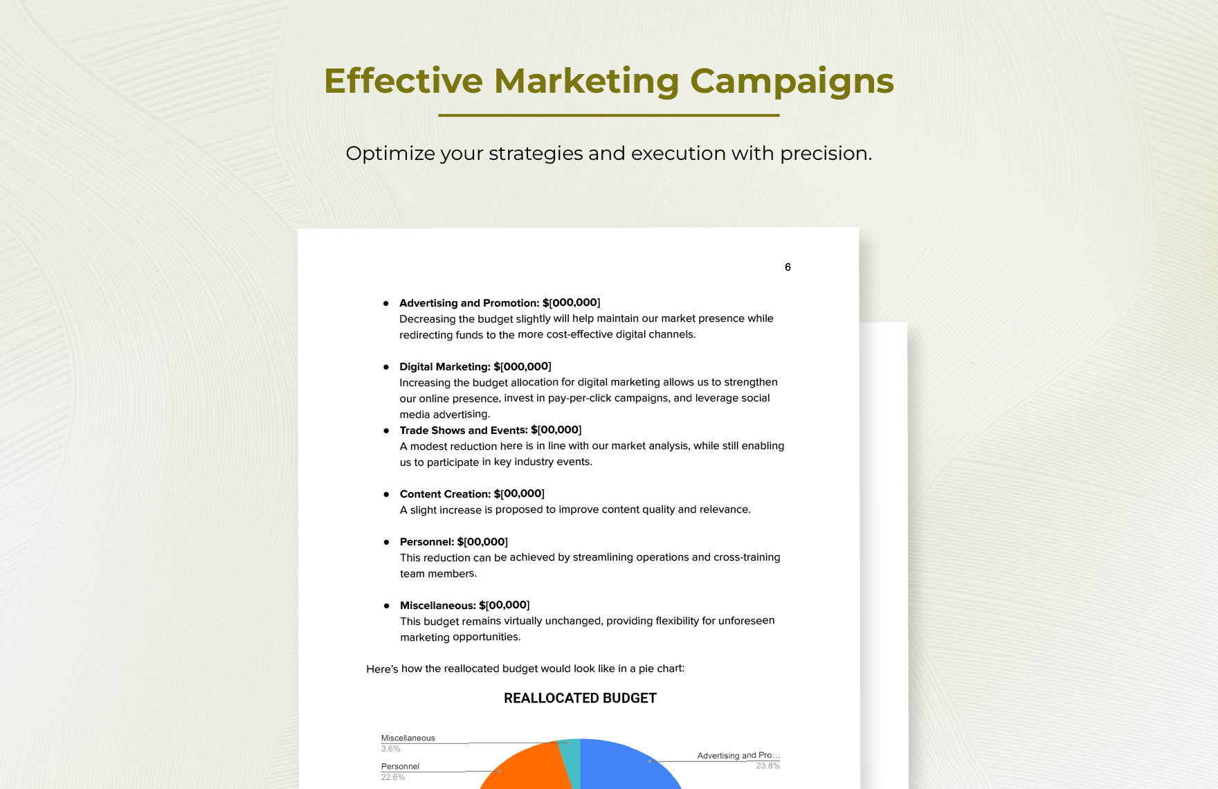
This image of a budget reallocation proposal is a good example of how recommendations are presented in a formal, strategic document intended to persuade leadership.
Conclusion
In this lesson, you've learned how to bridge the gap between data and decision-making by adding a crucial narrative layer to your reports. By moving beyond simple observations to provide insights and recommendations, you elevate your role from a data manager to a strategic leader who drives the business forward.
Key Takeaways:
- Answer the "So What?": The goal of a report is not just to present data, but to explain what it means and what to do about it.
- Use a Narrative Framework: Structure your analysis using the
Observation → Insight → Recommendationmodel to ensure clarity and actionability. - Craft Your Language: Use practical techniques like descriptive chart titles and strategic phrasing to tell a compelling story.
- Know Your Audience: Tailor the depth and focus of your commentary and recommendations to the specific needs of your stakeholders, from tactical teams to the C-suite.
Preview of the Next Module:
This lesson concludes our module on Data Storytelling. You now have the tools to select the right visualizations, structure a dashboard, and add a persuasive narrative.
In our next module, Designing and Interpreting Experiments, we will shift our focus to generating reliable data in the first place. Our first lesson will be on how to evaluate A/B test designs for validity and potential biases, a critical skill for ensuring the data you're analyzing and reporting on is trustworthy.