
Hello! Welcome to the next lesson in our module on Data Storytelling and Stakeholder Influence.
In our last lesson, we focused on selecting and designing individual visualizations to communicate a specific insight with clarity. You learned how a well-chosen bar chart or a decluttered line chart can make a powerful argument on its own.
Today, we're zooming out. We'll move from crafting a single, perfect chart to arranging multiple charts into a cohesive and strategic tool: the dashboard. Your learning outcome is to design a dashboard structure that guides users from a high-level summary to actionable insights.
As a marketing leader, your success depends on your team's ability to monitor performance and react quickly. A poorly structured dashboard is a digital filing cabinet—full of data but offering no clear direction. A well-structured dashboard, however, is a strategic command center. It doesn't just display data; it tells a story, surfaces problems, and guides your team toward the right questions and, ultimately, the right actions.
1. The Foundation: Purpose, Audience, and Questions
Before a single chart is placed, the most critical work is done. A dashboard that tries to be everything to everyone ends up being useful to no one. As a leader, your primary role is to set a clear, focused purpose for any dashboard your team builds. This means defining the audience and the specific business questions they need answered.
The following video from Maven Analytics provides an excellent overview of a six-step framework for dashboard design. The first two steps are the most strategic and where you, as a leader, will have the most input.
Telling a Story with Data | Dashboard Build Demo
Watch this segment from 'Telling a Story with Data' to understand the foundational steps of defining a dashboard's purpose and choosing the right metrics.
Please watch from 04:02 to 06:18. Pay close attention to how the presenter breaks down the dashboard's purpose by asking: Who is the audience? What are their goals? What specific questions do they need answers to?
This planning phase is non-negotiable. An article from Dataslayer, aimed at marketing leaders, reinforces this by reframing the process: don't start with metrics, start with business questions.
Marketing Dashboard Best Practices: The Ultimate Guide ...
This article, 'Marketing Dashboard Best Practices', offers several rules that are highly relevant to a strategic leader. We'll focus on the first two.
Please read Best Practices #1 ('Define One Clear Purpose Per Dashboard') and #2 ('Start With Business Questions, Not Metrics'). Notice the concrete examples of role-specific dashboards and how questions drive the design.
This leads to a simple but powerful test for any dashboard: the 5-Second Rule. If a user can't understand the main takeaway within five seconds, the design has failed. This forces a focus on clarity and hierarchy, which we will explore next.
2. The Blueprint: Top-Down Layout and Progressive Disclosure
Once the purpose is clear, the next step is structuring the layout to guide the user's attention. The most effective structure follows how we naturally read and process information.
The F-Pattern and Top-Down Layout
In Western cultures, people tend to scan a page in an "F" or "Z" pattern: they look across the top left, scan to the right, and then move down the left side. This makes the top-left corner of your dashboard the most valuable real estate. It's where you must place the most critical, high-level summary metrics.
This video segment beautifully illustrates how to apply this principle.
Telling a Story with Data | Dashboard Build Demo
Continuing with the Maven Analytics demo, this part shows how to use layout to focus attention, transforming a jumble of charts into an intuitive story.
Watch from 08:59 to 12:00. Observe how the presenter intentionally arranges the visuals: Placing the most important KPIs in the top-left. Using font size and color to create a visual hierarchy. Grouping related metrics to tell a coherent story (e.g., all revenue metrics together). Progressing from a high-level summary to more granular details.
This approach, starting high-level and getting more granular, is the key to guiding users from a summary to an insight.
Layers and Progressive Disclosure
An effective dashboard doesn't throw all the data at the user at once. Instead, it presents information in layers. This concept is called progressive disclosure: showing the essential information first and revealing more detailed data only when the user requests it.
This article from Metrics Watch explains the layered approach perfectly.
10 Data Presentation Tips for Marketing Dashboards
The article '10 Data Presentation Tips' provides a great explanation of how to structure data in layers to avoid overwhelming users.
Please read section #3, 'Show Data in Layers'. Focus on the three-layer structure: Overview, Analysis, and Detail. Think about how this structure naturally guides a user's investigation.
The layers work like this:
- Overview Layer: The first thing the user sees. It contains the most critical KPIs (e.g., overall ROAS, total conversions, LTV/CAC ratio). It answers the question, "Is everything okay?"
- Analysis Layer: If a KPI in the overview looks off, the user navigates here. This layer breaks down the KPIs by category (e.g., ROAS by channel, conversions by campaign). It answers, "Why is it not okay?"
- Detail Layer: The most granular view, containing raw data or specific ad-level performance. It's for deep-dive investigations.
This navigation between layers is often enabled by interactive features like drill-downs or drill-throughs.
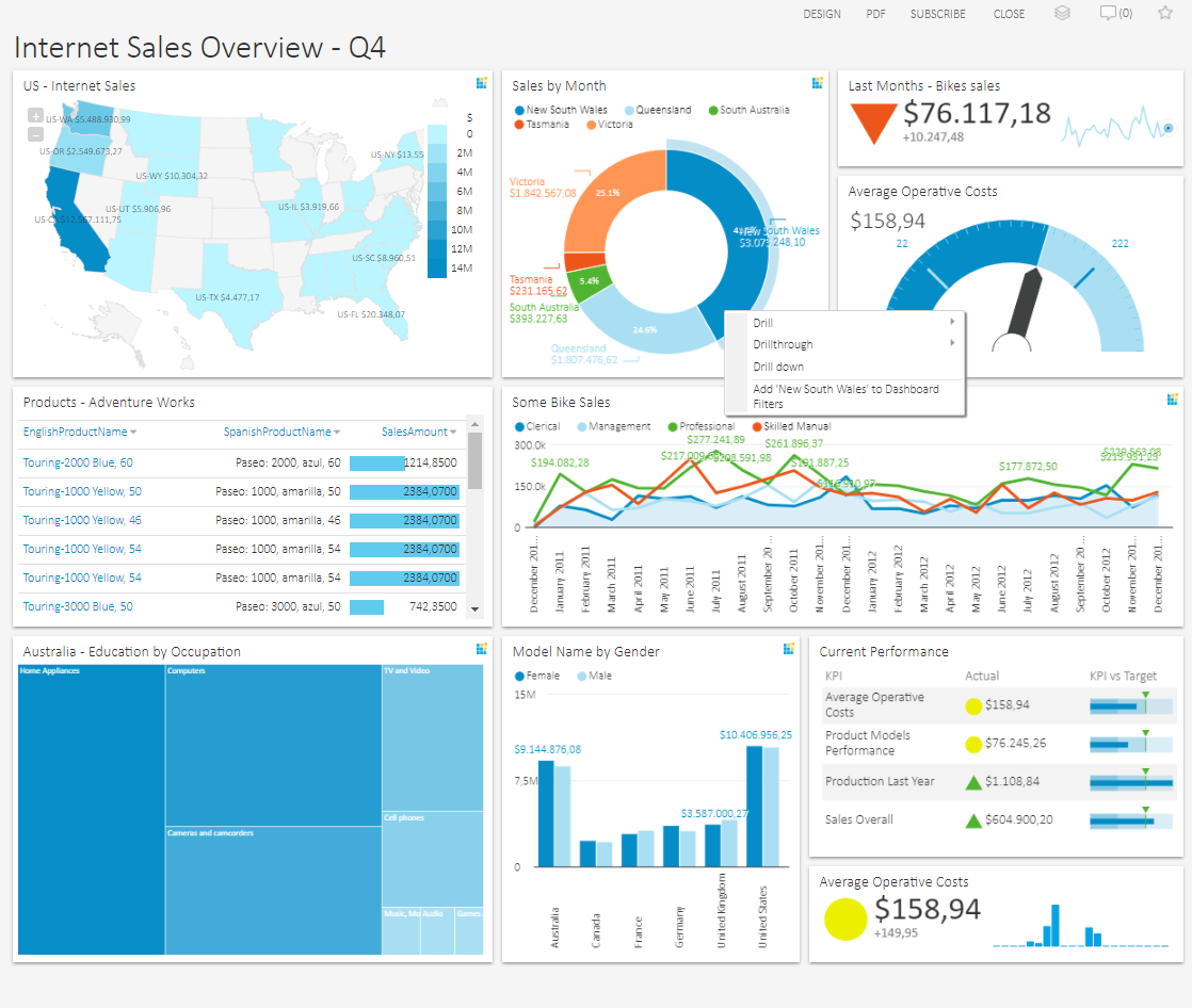

Test your understanding!
You are briefing your analytics team on a new dashboard for your social media marketing team. The main goal is to monitor and optimize ad spend efficiency. Following the top-down, layered approach, which of these metrics belongs in the Overview Layer?
A. A table showing the click-through rate of every individual ad.
B. A line chart showing the trend of Cost Per Lead (CPL) for the entire social media department over the last 90 days.
C. A bar chart comparing the CPL of Instagram campaigns vs. Facebook campaigns for the current month.
D. A large KPI card showing the blended Cost Per Lead (CPL) for all social channels for the current month, with a comparison to the previous month.
Show answer
D. A large KPI card showing the blended Cost Per Lead (CPL) for all social channels for the current month, with a comparison to the previous month.
This is the highest-level summary. It answers the most critical question ("How is our overall CPL doing right now?") in seconds.
- B and C are excellent candidates for the Analysis Layer, as they break down the 'why' behind the overall CPL.
- A belongs in the Detail Layer, for granular, ad-level investigation.
3. A Practical Framework for Your Organization
As a leader, you need a scalable way to apply these principles. One of the most effective methods is to stop thinking about a single "marketing dashboard" and instead create a small suite of role-based dashboards.
The Dataslayer article you read earlier provides a fantastic, actionable framework for this.
Marketing Dashboard Best Practices: The Ultimate Guide ...
Let's revisit the 'Marketing Dashboard Best Practices' article, this time focusing on a highly practical framework for structuring your company's entire reporting suite.
Find the FAQ section at the end and read the answer to the question, 'How many marketing dashboards should our team have?'. This provides a concrete, multi-dashboard structure.
This multi-dashboard framework naturally creates the "summary to insight" pathway across your organization:
- Executive Dashboard: The highest-level summary for the C-suite. Focuses on business impact (e.g., Marketing's contribution to revenue, LTV/CAC). This is your organization's "Overview Layer."
- Performance Dashboard: The command center for you and your campaign managers. Breaks down performance by channel, campaign, etc. This is the "Analysis Layer."
- Content/Technical Dashboards: More specialized views for specific teams, acting as part of the "Detail Layer."
Imagine this in action:
- Your CMO looks at the Executive Dashboard and sees that the overall LTV/CAC ratio has dipped this quarter.
- They ask you to investigate. You open the Performance Dashboard and immediately see that while Google Ads' CAC is stable, Meta Ads' CAC has increased by 30%.
- You then drill down within the Performance Dashboard to see which specific Meta campaigns are responsible, identifying an ad set that is suffering from creative fatigue.
This seamless flow from a high-level business problem to a specific, actionable insight is the hallmark of a well-designed dashboard structure.
Conclusion
In this lesson, we've established the strategic principles for designing dashboards that serve as decision-making tools, not just data repositories. You now have a framework for guiding your team to build clear, intuitive, and actionable dashboards.
Key Takeaways:
- Start with Why: The most important step is defining the dashboard's purpose, audience, and the specific business questions it must answer.
- Structure for Scanning: Use a top-down layout that respects natural reading patterns (F-pattern), placing the most critical, high-level KPIs in the top-left.
- Embrace Layers: Organize information using progressive disclosure. Start with a high-level Overview, allow users to navigate to an Analysis layer, and provide a Detail layer for deep dives.
- Use Role-Based Dashboards: Structure your organization's reporting into a suite of dashboards (e.g., Executive, Performance) to naturally guide users from high-level business metrics to tactical campaign data.
Preview of the Next Lesson:
A well-structured dashboard guides a user to an insight, but it often doesn't explicitly state what to do about it. The final step in data storytelling is to close that loop. In our next lesson, we will focus on how to incorporate clear commentary and explicit recommendations into reports to guide decision-making, ensuring your team's analytical work translates directly into business action.