
Hello! Welcome back to our module on Data Storytelling and Stakeholder Influence.
In our last lesson, we focused on structuring a compelling narrative using frameworks like SCR and "What? -> So What? -> Now What?". You learned to build a logical argument that connects an analytical finding to a business outcome. That was about crafting the core message. Today, we'll focus on delivering that message effectively.
Your learning outcome for this lesson is to tailor data presentations to different audiences (e.g., C-suite, finance, product teams). A story that captivates your Head of Product might be the one that loses your CFO's attention in the first 30 seconds. As a leader, your ability to translate a single core insight into multiple, audience-specific narratives is what separates merely reporting data from driving real business decisions.
1. The Foundation: Know Your Stakeholders
Before you even think about what charts to use or what points to make, the most critical step is to understand who you are speaking to. A successful presentation isn't about showing how much you know; it's about giving your audience what they need in a way they can understand and act upon.
This article from Statsig provides an excellent framework for thinking about this.
How do I effectively share analytics insights with ...
The article 'How do I effectively share analytics insights with stakeholders?' explains the importance of segmenting your audience and aligning your message with their specific objectives and data literacy.
Please read the first section, 'Understand your stakeholders: tailoring your analytics insights.' Focus on the key differences it outlines for communicating with executives versus marketing or technical teams.
As the article suggests, your audience isn't a monolith. For any presentation, you should be able to answer these four questions:
- What are their primary goals? (e.g., Profit growth, operational efficiency, user engagement)
- What decisions do they need to make? (e.g., Approve a budget, prioritize a feature, stop a campaign)
- What is their level of data literacy? (e.g., Are they comfortable with statistical terms like 'p-value' or do they need the bottom-line business impact?)
- What is their relationship to the data? (e.g., Are they accountable for the results, or are they a collaborator in the execution?)
Answering these questions first will guide every choice you make in your presentation. Let's now break down how to apply this to three critical audiences you'll frequently encounter.
2. Presenting to the C-Suite: The Strategic View
Communicating with executives (CEO, CMO, C-suite) requires a unique approach. They are guardians of the company's overall strategy, incredibly time-poor, and focused on outcomes, not process.
To understand their mindset, let's watch a few key segments from this video on executive communication.
5 Rules for Communicating Effectively with Executives
The video '5 Rules for Communicating Effectively with Executives' by Dr. Grace Lee provides direct insight into the executive mindset. It will help you frame your data presentations in a way that resonates at the highest level.
Please watch the following clips: Rule 1: Escape the minutiae (00:54 - 02:20): Note the distinction between 'implementers' and strategic leaders. Rule 3: Execute rainmaking conversations (03:46 - 05:19): Focus on what executives care about (profit, market relevance). Rule 4 & 5: Elongate your timeframes & Exercise business acumen (05:57 - 10:20): Understand their focus on long-term vision and the big picture.
With this context, here’s how to tailor your presentation for a C-suite audience:
| Element | How to Tailor for the C-Suite |
|---|---|
| Opening | Start with the conclusion (BLUF: Bottom Line Up Front). Use the SCR framework to state the situation, complication, and your recommendation within the first minute. |
| Language | Speak in terms of business and finance: "profit," "market share," "growth," "risk," and "opportunity." Avoid marketing jargon and technical acronyms. |
| Metrics | Focus on high-level business outcomes: Revenue, Profit Contribution, LTV/CAC ratio, Incremental ROAS, and P&L impact. |
| Timeframe | Connect your findings to quarterly and annual goals, or even longer-term strategic initiatives. Show you are thinking beyond the current campaign. |
| Visuals | Use simple, clean charts that tell one story clearly. A single, bold number is often more powerful than a complex graph. The IAB's MMM guide mentions delivering a "one-page executive summary"—this is the level of synthesis you should aim for. |
| Ask | Be explicit about the decision you need them to make. Frame it as a clear choice with defined outcomes (e.g., "I am asking for approval to reallocate $200k from Channel A to Channel B to generate an estimated $500k in additional profit this half.") |
3. Presenting to Finance: The Scrutinizer's View
Your Finance team's primary role is to ensure the company's financial health and rigor. When you present to them, you are not just sharing insights; you are defending an investment. Their main question is: "Can I trust these numbers?"
| Element | How to Tailor for Finance |
|---|---|
| Opening | State the financial implication upfront. "I'm here to propose a budget reallocation that will improve marketing efficiency by 15% and increase net profit by $500k." |
| Language | Use precise financial terms. They are comfortable with concepts like marginal cost, contribution margin, and payback period. Be prepared to define your assumptions clearly. |
| Metrics | Focus on efficiency and return: Marginal ROI (mROI), Incremental ROI (iROAS), payback periods, cost per incremental action, and budget scenarios. Show the math. |
| Timeframe | Connect marketing spend to financial reporting periods (quarterly, annually). Show how your proposed changes will appear in their financial models. |
| Visuals | While simplicity is good, Finance is comfortable with more detailed tables and charts that show the underlying data. As the IAB MMM guide (LINK) wisely suggests, providing a "finance-ready reconciliation (numbers + provenance)" builds immense credibility. This means showing where the data came from. |
| Ask | Frame your request around budget approval, forecasting, and financial impact. Be prepared to discuss risks and show confidence intervals around your projections. |
4. Presenting to Product and Technical Teams: The Collaborator's View
This group includes your peers and direct reports: channel managers, product managers, engineers, and analysts. They are your partners in execution. They care less about the high-level P&L impact and more about the "what, why, and how" of the data. Their main question is: "What does this mean for our work?"
| Element | How to Tailor for Product/Technical Teams |
|---|---|
| Opening | Start with the observation or problem. "Our conversion rate for the new user onboarding flow dropped by 10% last week. Let's dig into why and what we can do about it." |
| Language | Use operational and technical language they understand. Discuss user segments, conversion funnels, feature usage, campaign tactics, and specific A/B test variants. |
| Metrics | Focus on performance and behavioral drivers: Conversion rates, click-through rates (CTR), feature adoption funnels, bounce rates, and channel-specific metrics (e.g., CPC, CPA). |
| Timeframe | Focus is typically more immediate: week-over-week trends, sprint cycles, and campaign flights. The goal is tactical optimization. |
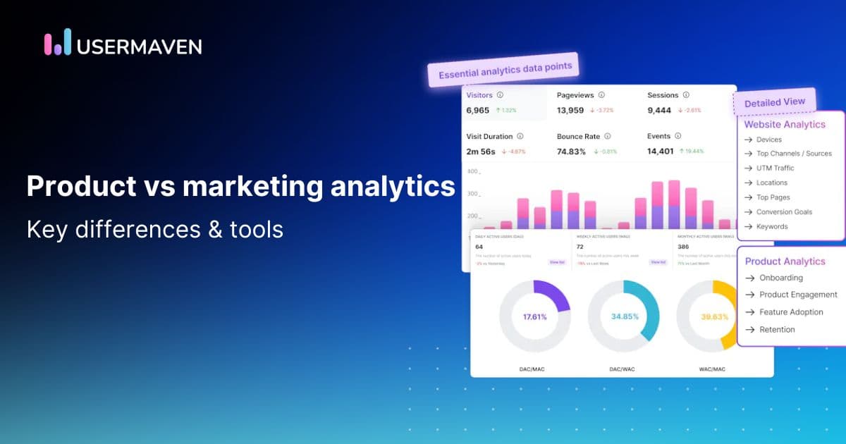
| Visuals | Interactive dashboards, detailed funnel visualizations, and cohort charts are very effective. You can go deeper. The IAB guide (LINK) calls this the "tactical drilldown for channel teams." |
| Ask | Frame your ask as a collaboration. "Based on this data, I think we should test X. What are your thoughts on feasibility?" or "Let's brainstorm how to fix this drop-off point in the user journey." |
Test your understanding!
You've just completed an A/B test. The result: Changing the checkout page headline from "Complete Your Purchase" to "Secure Your Order & Get Free Shipping" increased the final purchase conversion rate by 8%, with 98% statistical significance.
How would you frame the opening sentence of your presentation for each of these three audiences?
- CEO
- CFO
- Head of E-commerce (Product)
Show answer
- CEO: "I've found a simple, zero-cost way to increase our online store revenue by an estimated $1.2 million annually." (Focus: High-level revenue impact)
- CFO: "Our latest experiment has validated a change that increases the ROI of our acquisition spend by 8% by improving our final checkout conversion rate." (Focus: Efficiency and ROI of existing spend)
- Head of E-commerce (Product): "The A/B test on the checkout page headline just finished, and we found a clear winner that lifts our purchase conversion rate by 8% with high confidence. Let's roll it out." (Focus: The direct finding and the immediate action)
5. Using Visuals to Enhance Your Tailored Message
How you visualize data is a powerful tool for tailoring your message. A chart is not just a container for numbers; it's an argument.
Let's watch a segment from a foundational talk on data storytelling to understand how to direct your audience's attention purposefully.
Storytelling with Data | Cole Nussbaumer Knaflic | Talks at Google
In this famous talk from Google, 'Storytelling with Data', Cole Nussbaumer Knaflic explains the difference between exploratory and explanatory analysis and how to use 'pre-attentive attributes' like color to focus your audience's attention.
Please watch from 07:18 to 17:06. Pay close attention to: The difference between exploratory analysis (finding insights) and explanatory analysis (communicating insights). How pre-attentive attributes (like color) can make your key message pop instantly. The 'Where are your eyes drawn?' test for checking if your visual is working.
The key takeaway is that for explanatory presentations, you must guide your audience.
- For the C-Suite: Use color sparingly to highlight one number—the final business outcome. Grey out everything else. Make the conclusion impossible to miss.
- For Finance: Your visuals can be more dense, but use color and annotations to highlight the specific lines in a financial model that are changing, or to compare actuals vs. forecast.
- For Technical Teams: You might present a full dashboard, which is more exploratory. But even here, you can use a red box or an arrow in a static screenshot to say, "This is the metric that dropped. Let's focus our attention here first."
Conclusion
You now have a framework for adapting your core data story to the specific needs of the most common and critical stakeholders you'll face as a marketing leader. This skill is less about analytics and more about empathy and strategic communication.
Key Takeaways:
- One Size Fits None: The success of your data presentation depends on tailoring it to the specific goals, language, and needs of your audience.
- Speak Their Language: Communicate strategic impact to the C-suite, financial rigor to Finance, and operational details to your technical and product teams.
- Layer Your Deliverables: A single analysis should produce multiple outputs: a one-page exec summary, a detailed financial reconciliation, and tactical drill-downs for the teams on the ground.
- Guide Their Eyes: Use visual design principles, like the strategic use of color, to ensure your audience's attention is drawn to the most important part of your story.
Preview of the Next Lesson:
In this lesson, we discussed why tailoring visuals is important for different audiences. In our next lesson, we will dive deeper into the craft of creating those visuals. The learning outcome will be to select visualizations that communicate a key insight with clarity and impact. We'll move from theory to practice, exploring which chart types work best for different kinds of data and stories.