
Hello! Welcome back to our module on Data Storytelling and Stakeholder Influence.
In our last lesson, we focused on the crucial skill of tailoring your data presentations to different audiences. You learned how to frame the same insight differently for a CEO, a CFO, or a product team by speaking their language and focusing on the metrics they care about. We established that the goal isn't just to share data, but to drive specific decisions.
Today, we build directly on that foundation. Knowing who you're talking to and what you want to say is half the battle; the other half is showing it effectively. Your learning outcome for this lesson is to select visualizations that communicate a key insight with clarity and impact. As a leader, you won't always build the charts yourself, but your ability to critique your team's visuals and direct them toward clarity is paramount. A well-chosen, well-designed chart makes your argument for you. A poor one undermines it.
1. The Goal: From Data Container to Decision Catalyst
Before we dive into chart types, let's establish a core principle. An effective visualization is not just a container for numbers; it's an engineered tool designed to support a decision. Its purpose is to reduce the cognitive load on your audience, allowing them to see the pattern or insight instantly.
An excellent article from Improvado frames this perfectly by breaking down effective visualization into three key elements.
Data Visualization: A Complete Guide for Marketers and ...
The article 'Data Visualization: A Complete Guide for Marketers and ...' introduces the core components of effective visualization and its strategic importance.
Please read the first two sections, 'What Is Data Visualization?' and 'Why Is Data Visualization Important?'. Focus on the three elements of effective visualization (right encoding, right context, right interactions) and the strategic benefits it provides.
The key takeaway is that visualization isn't about making things pretty; it's about accelerating decision-making and aligning stakeholders. Every visual you present should be a deliberate choice aimed at achieving this.
2. Choosing the Right Chart for the Right Question
The most common mistake in data visualization is choosing a chart type that doesn't match the question you're trying to answer. As a leader, your role is to ensure the visual aligns with the business question.
The Improvado article provides a brilliant, practical table that maps analytical questions to chart types. This is your strategic cheat sheet.
Data Visualization: A Complete Guide for Marketers and ...
This section of the Improvado guide provides a clear, actionable table that you can use to guide your team in selecting the appropriate visualization.
Now, read the section 'Types of Data Visualization'. Pay close attention to the table mapping visualization types to their best use case. Think about how these apply to your daily work with Meta and Google Ads data.
Let's break down the most common questions in a marketing context:
- To Compare Categories: "Which channel has the highest ROAS?" or "How does ad creative A compare to B?"
- Your go-to chart: A bar chart. Our brains are excellent at comparing lengths along a common baseline.
- To Show Change Over Time: "How has our Customer Acquisition Cost (CAC) trended over the last year?"
- Your go-to chart: A line chart. It's the most intuitive way to show trends, seasonality, and patterns over time.
- To Show Part-to-Whole Composition: "What percentage of our marketing budget is allocated to each channel?"
- Your go-to charts: A stacked bar chart or a treemap. While pie charts are common, they can be hard to interpret accurately if there are more than a few slices.
- To Show Correlation: "Is there a relationship between our ad spend and the number of conversions we get?"
- Your go-to chart: A scatterplot. This helps you see the relationship between two different numerical variables and spot potential diminishing returns.
To help with these decisions, many analysts use a flowchart. Here is a popular and effective one.

3. Designing for Clarity: Declutter and Focus
Once you've selected the right chart type, the next step is to design it for maximum impact. This means removing anything that doesn't add informational value (clutter) and using visual cues to draw your audience's eye to the key message.
This is where the principles you were introduced to in the previous lesson, like using pre-attentive attributes, come into play. Let's see a practical demonstration.
Telling a Story with Data | Dashboard Build Demo
The 'Telling a Story with Data' video by Maven Analytics provides a fantastic step-by-step demonstration of transforming a cluttered, confusing set of charts into a clean, impactful dashboard. It perfectly illustrates the principles of decluttering and focusing attention.
Please watch from 07:50 to 12:26. Observe how the presenter systematically improves the charts by: Eliminating clutter (removing gridlines, simplifying labels). Using layout to guide the eye (placing important info top-left). Using text and color to tell a story (using descriptive titles and highlighting key trends).
This process of refining a visual can be summarized into a few key best practices. The Improvado article you read earlier has a great section on this, and the article "from dashboard to story" by the experts at storytelling with data reinforces these points.
The article 'from dashboard to story' provides concrete examples of using words and color to make the 'so-what' of your data immediately obvious.
Read the section 'Use words and color strategically'. Notice how they transform a simple chart into a powerful recommendation by adding a clear title and highlighting the key data point in color.
Here are the rules of thumb you should instill in your team:
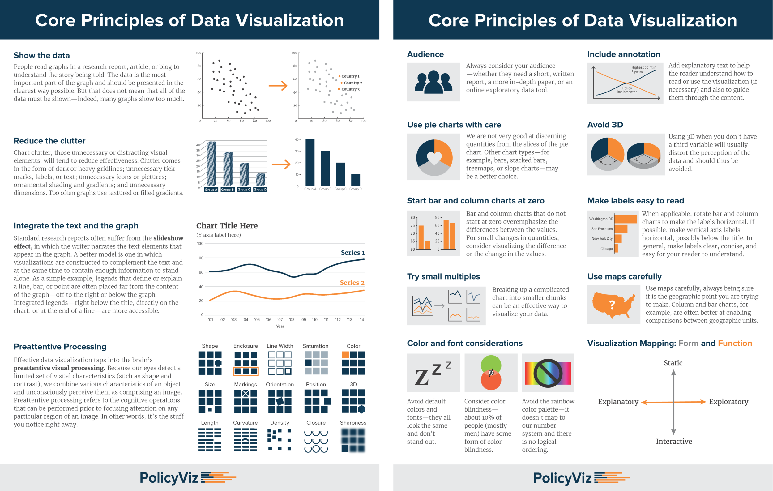
- Start Bar Charts at Zero: Violating this rule is a common way to exaggerate differences and mislead your audience.
- Declutter Ruthlessly: Remove gridlines, borders, background colors, and 3D effects. Every pixel should serve a purpose. This is often referred to as maximizing the "data-ink ratio."
- Use Color Strategically, Not Decoratively: Don't use different colors for each category just because you can. Use grey for context and a single, bold color to highlight your key data point.
- Write a Title That States the Insight: Instead of "Revenue by Month," use "Revenue Declined 15% in Q3 After We Paused Brand Campaigns." Your title is your story's headline.
Here's a great cheatsheet that summarizes many of these core principles.
Test your understanding!
You have a bar chart showing the conversion rate for five different ad campaigns. Campaign C has the highest conversion rate at 5.2%, while the others are all between 2-3%. You want to present this to your CMO to argue for shifting more budget to Campaign C's strategy.
Which of the following is the least effective design choice?
A. Making the bar for Campaign C a bright blue and all other bars a light grey.
B. Changing the chart title to "Campaign C is 2x More Effective at Driving Conversions".
C. Using a different color for each of the five bars to make them distinct.
D. Removing the y-axis gridlines to make the chart cleaner.
Show answer
C. Using a different color for each of the five bars to make them distinct.
This is the least effective choice because it creates visual clutter without adding insight. It forces the audience to work harder, matching the legend colors to the bars, rather than guiding their attention. Choices A, B, and D all actively improve the chart's clarity and impact by focusing attention, stating the key message, and reducing clutter.
4. From Chart to Story: Finding the Narrative
The most powerful visualizations are those embedded in a story. A simple but effective narrative structure is Setup -> Conflict -> Resolution. You can apply this directly to your data.
Let's watch a masterclass on how to do this.
Telling Stories with Data in 3 Steps (Quick Study)
In this short video, Harvard Business Review breaks down how to find a narrative in a complex chart and then redesign the visualization to tell that story.
Watch from the beginning to 04:16. Pay attention to how the presenter: Analyzes a confusing chart to find the 'setup,' 'conflict,' and 'resolution.' Sketches out new visuals that isolate each part of the story. Uses titles and highlights to walk the audience through the narrative, step by step.
This process—transforming a single, complex, exploratory chart into a sequence of simple, explanatory charts—is a hallmark of effective data storytelling. You are not just presenting a finding; you are guiding your audience's thought process from a starting reality (the setup), through a change or problem (the conflict), to the new reality or your recommendation (the resolution).
Conclusion
In this lesson, you've moved from the why of tailoring your message to the how of selecting and designing visuals that do the heavy lifting for you. You now have a strategic framework for ensuring that the charts you and your team produce are not just accurate, but also persuasive and impactful.
Key Takeaways:
- Match the Chart to the Question: Use a systematic approach (like the flowchart and table) to select the right visualization for your analytical goal—be it comparison, trend analysis, or showing correlation.
- Design for Impact: A great visual is decluttered and uses design elements like color and titles to focus the audience's attention on the single most important insight.
- A Chart is an Argument: The best visualizations don't just show data; they present a clear point of view and make the conclusion feel obvious.
- Find the Story: Use narrative structures like Setup -> Conflict -> Resolution to break down a complex finding into a clear, digestible story told through a sequence of visuals.
Preview of the Next Lesson:
Today, we focused on selecting individual charts to tell a specific, explanatory story in a presentation or report. However, as a leader, you also oversee the creation of exploratory tools—namely, dashboards. In our next lesson, we will address the learning outcome: Design a dashboard structure that guides users from a high-level summary to actionable insights. We'll explore how to arrange these individual visual components into a coherent and useful tool for your team and stakeholders.