
Hello again. In the last lesson, you judged whether a landscape motif has enough shape strength, value clarity, and light character to survive enlargement. Once a motif passes that test, the next decision is consequential: what physical frame will give that visual idea its best chance?
A canvas is not a neutral surface waiting to be filled. Its proportion determines what can be included, excluded, compressed, or allowed to breathe. Its physical size determines how the painting reads across a room, how much selective development it can carry, and how practical it will be to paint, frame, transport, and submit. This lesson gives you a method for choosing both a format and a canvas size before your field studies begin.
Treat the frame as part of the composition
There is no universally “correct” landscape format. A horizontal rectangle is common because land often unfolds laterally, but convention is not a reason to choose it. The question is: what direction, containment, and visual tempo does this particular motif need?
Aspect ratio describes the relationship of width to height. A canvas measuring 36 by 24 inches has a horizontal ratio; one measuring 48 by 24 inches has a much wider ratio. Those proportions change the painting even when the central subject remains identical.
A useful starting vocabulary:
| Format | Often supports | Common risk |
|---|---|---|
| Horizontal | A balanced lateral view; a horizon with enough height for sky, land, and foreground; varied but stable movement | Choosing it automatically, even when the motif is fundamentally vertical or compact |
| Wide horizontal | Long shorelines, mountain chains, a sequence of tree groups, a road or river moving laterally, spacious atmosphere | A thin “strip” of unrelated incidents; too much empty width without a unifying rhythm |
| Vertical | Tall trees, cliffs, buildings, waterfalls, a near-to-far ascent, or a small motif held by generous sky | Adding a vertical foreground merely to justify the format |
| Square | A self-contained mass, centered mountain, reflective symmetry, strong diagonals, and graphic simplification | Unintentional stiffness or a composition that feels evenly divided into quarters |
These are tendencies, not rules. A square can contain a sweeping river, and a vertical can describe a broad valley. But the format should make the painting’s central relationship easier to feel rather than forcing the motif to fit a habitual shape.
Acrylic painting tutorial and thoughts on canvas size for a painting
Watch “Acrylic painting tutorial and thoughts on canvas size for a painting” by Painting with the old guy. Although the demonstration uses acrylic, Henrik Skora’s central point applies directly to oil landscape work: choose the support in response to the painting’s idea, not merely what happens to be available.
Watch the premise for the distinction between a format that is possible and one that actively serves an idea. Then watch the constraints, noting the real logistical pressures that can distort a format decision. Finish with the long format, where he connects a wide canvas to a subject intended to unfold through time.
Think back to the artistic intention you wrote in the first lesson. It should influence format directly. For example:
- An intention centered on the slow lateral movement of evening light across a marsh may call for a horizontal rectangle, perhaps wider than .
- An intention centered on a single dark pine rising through fog into a pale sky is likely strengthened by a vertical.
- An intention centered on a mountain reflected in still water as one enclosed, nearly abstract shape may invite a square.
- An intention centered on a bright opening between dark wooded banks may need a more standard horizontal format so that the opening has supporting space without becoming a narrow slot.
The key is to identify the motif’s dominant directional force: lateral spread, vertical ascent, central containment, or a diagonal crossing. The boundary of the canvas should reinforce that force.
Choose format by testing crops, not by guessing
Your previous value thumbnail is the right material for this decision. Copy it three or four times, changing only the outer rectangle at first. Keep the major value relationships simple. You are not looking for a more detailed drawing; you are looking for the frame in which the same visual event becomes most inevitable.
15 landscape composition tips to improve your paintings
Read “15 landscape composition tips to improve your paintings” from Artists & Illustrators for a concise account of using thumbnails, format choice, and a small painted sketch as linked stages of composition.
In Sections 3–5, begin with the thumbnail method. Then continue through “Select a format for your landscape” and “Start with a small sketch,” ending at the sketch qualities. Notice that changing format affects both the balance of the large shapes and the number of elements the picture can credibly contain.
As you compare thumbnails, look for specific evidence rather than relying on a vague sense that one “looks better.”
Horizontal formats
A horizontal frame is useful when the eye needs to travel across the scene: from a foreground bank toward distant hills, along a sequence of buildings, or through a band of sunlit water. It can also create a calm, expansive mood.
However, a broad format does not mean that every visible feature deserves inclusion. If a wide crop requires you to add a second unrelated tree group, a blank field, and another distant hill merely to fill the sides, the motif may not actually support width. Crop tighter or choose a less elongated rectangle.
A standard horizontal canvas is often a good first test because it provides room for lateral movement while retaining enough height to make the foreground, middle ground, and sky interact. A canvas should be selected when the additional width performs a clear job: extending a procession, emphasizing a long contour, or creating a deliberately panoramic sweep.
Vertical formats
A vertical frame creates upward or downward pressure. It suits motifs in which height is not simply present but expressive: a tall tree interrupting sky, a cliff face above water, a narrow lane receding between high banks, or a building catching light on one face.
The vertical’s extra height can also give a small subject dramatic isolation. But do not confuse a vertical subject with a vertical composition. A tall tree surrounded by an otherwise broad, horizontal landscape may still work better in a horizontal frame if the important event is the tree’s relationship to the wider land.
Square formats
A square has equal visual pressure in both directions. That makes it particularly useful when the motif is compact, symmetrical, or built around a strong diagonal tension. It can make a mountain, tree mass, pond, or bright opening feel deliberately contained.
Because a square does not naturally encourage travel from side to side or bottom to top, it asks more of the internal design. A central subject needs a counterforce: reflection, diagonal shoreline, cloud movement, shadow, or an unequal distribution of light and dark.
Mastering Aspect Ratios in Photography - Crucial for Your Expression!
Watch selected examples from “Mastering Aspect Ratios in Photography – Crucial for Your Expression!” by Jonas Paurell – Unscripted. The medium is photography, but the comparisons are useful because they isolate how the frame itself changes the expression of mountains, negative space, and extended subjects.
Watch square formats to see why a square can support centered, self-contained subjects and strong diagonal tension. Then skip to wide panoramas, focusing on the comparison between 2:1, 3:1, and more conventional rectangles. Treat the presenter’s preferences as examples to test, not rules to adopt.
A practical rule follows from these comparisons: choose the narrowest format that still contains the visual movement you need. Excess width or height is never neutral; it becomes an area that must participate in the design.
Size determines the encounter with the painting
After choosing a proportion, choose the physical dimensions. “Large” is relative. A 30 by 40 inch canvas has substantially more physical presence than an 18 by 24 inch canvas, but its proportion may be exactly the same. The design question is therefore separate from the scale question.
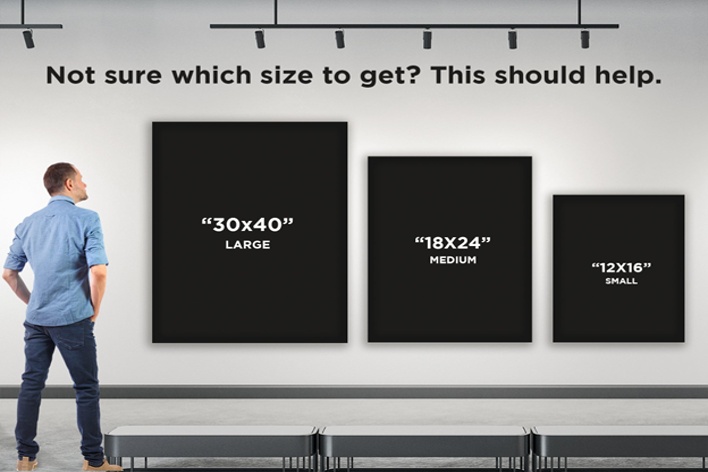
A small painting invites a close, intimate encounter. The viewer can approach it to see a broken edge, a loaded stroke, or a color transition. A larger painting is encountered first from farther away. Its big value pattern, silhouette, and focal structure must cohere across a room before the viewer is close enough to appreciate brushwork.
For a studio landscape, plan for two viewing distances:
-
The approach distance is where a juror or gallery visitor first sees the painting as a whole. At this distance, the major value masses, focal area, and overall light effect must read immediately.
-
The close distance is where a viewer discovers paint handling, nuanced temperature shifts, selective detail, and surface variety.
A strong oil landscape works at both distances, but it does not show the same information at both. This is why enlarging a field study is not a matter of making every brushmark bigger. At a larger scale, you must preserve the large read while giving a few important passages enough room to reward closer attention.
The relationship between scale and viewing is particularly relevant for oil paint. A broken, impressionistic mark that appears fragmented at arm’s length may merge into luminous atmosphere when viewed from several steps back. Conversely, a painting designed entirely for distant viewing can feel empty when the viewer approaches. Choose a size that allows the degree of surface activity your intention needs.
A sensible size range
Without a specific competition prospectus, do not select size by prestige. Select it by what the motif needs and what you can execute well.
For many field-to-studio projects, a useful working distinction is:
| Scale | Typical studio use | What it demands |
|---|---|---|
| Small, such as 9 by 12 or 11 by 14 inches | Studies, color trials, and exploratory versions | Economy; little room for extensive structural revision or selective development |
| Moderate, such as 16 by 20, 18 by 24, or 20 by 30 inches | A resolved studio painting with controlled detail and manageable logistics | Clear composition, but still practical for most home studios and framing |
| Large, such as 24 by 36, 30 by 40, or comparable dimensions | An immersive competition or exhibition statement with room for varied surface and hierarchy | Durable drawing, value organization, deliberate brushwork, transport planning, and enough time for drying |
These are not quality rankings. A 12 by 16 inch painting can be complete and powerful; a 30 by 40 inch painting can be weak. The larger surface simply magnifies every decision. It is appropriate when the motif offers a broad atmospheric experience, significant spatial depth, or a focal passage that genuinely benefits from expansion.
Let competition constraints set the outer boundary
Competition requirements are not an administrative afterthought. They are part of the problem you are designing.
Before committing to a target canvas, obtain the current prospectus for the competition you have in mind and make a brief constraint sheet. Requirements vary, so verify rather than relying on habits from other shows.
Record:
- Eligible media: Confirm that oil painting is accepted and whether works made from photographic reference, studio work, or plein-air work have special rules.
- Maximum and minimum dimensions: Check whether limits apply to the painted surface, the framed outside dimensions, or both.
- Frame requirements: Note whether a frame is mandatory, whether it needs a particular finish, and whether it is included in the measurement limit.
- Weight, depth, and hanging requirements: A heavy, deep canvas may be impractical or ineligible even if its face dimensions fit.
- Completion dates and originality rules: Confirm when the work must have been completed and whether it may have been previously exhibited.
- Delivery method, cost, and schedule: Account for crating, shipping, hand delivery, return shipping, and the time needed for oil paint to cure sufficiently for framing and handling.
The competition’s maximum permitted size is a ceiling, not a recommendation. A painting should be as large as its purpose requires, not as large as regulations allow. If a modest 18 by 24 inch canvas gives the motif concentration and clarity, enlarging it to 30 by 40 inches may only create more inactive area and more opportunities to overwork.
On the other hand, a small canvas can be strategically wrong if your intention depends on the viewer feeling enveloped by a large sky, a long river, or a broad field of light. In that case, choose a scale at which the main shape pattern can be grasped at a few paces while the paint retains a compelling close-range life.
Make the decision physically before committing
A screen image cannot tell you how a canvas will occupy a wall. Before buying or stretching the final support, make a full-scale mock-up.
Use inexpensive paper, kraft paper, newspaper sheets, or painter’s tape to mark the outer dimensions on a wall. Stand at your intended first-view distance, then approach to arm’s length. If possible, place a printout or a rough enlarged value design inside the rectangle.
Notice:
- whether the canvas feels commanding, modest, or merely oversized;
- whether the format gives the main masses enough breathing room;
- whether the focal event is visible from across the room;
- whether the outer edges feel purposeful rather than arbitrary;
- whether you can physically step back far enough in your studio to judge the whole painting;
- whether the size is feasible to transport, frame, and store.
This test also reveals a practical studio truth: you need enough room to see the whole painting from a distance. If your available working space allows only two or three feet of retreat, a very large canvas may be difficult to judge accurately while painting.
Write a provisional specification in your project notebook. It might read:
Target: 24 by 36 inches, horizontal , oil on linen panel.
Reason: The lateral curve of the river and alternating light-dark tree groups need breadth, while the format retains sufficient height for the illuminated sky opening and foreground shadow. The painting should read from several paces away, with the water and near-bank passages offering closer viewing interest.
Constraint check: Final framed outside dimensions must remain within the competition limit; panel depth and frame weight are to be confirmed before purchase.
That statement is not a contract. If later thumbnail and color studies reveal that the design is slack, you can revise it. But it prevents a vague, default choice from silently directing the entire project.
Key takeaways
Format and size are compositional decisions with physical consequences.
- Choose a canvas proportion that supports the motif’s dominant movement: lateral, vertical, contained, or diagonal.
- Test several crops as simple value thumbnails before choosing a rectangle.
- Use a standard horizontal format when it truly supports the scene; use panoramic, vertical, or square formats only when they make the visual idea more forceful.
- Plan for both distant and close viewing: large value structure must read at first sight, while selective paint handling can reward approach.
- Let competition rules establish practical boundaries, especially framed dimensions, medium eligibility, weight, deadlines, and transport requirements.
- Make a full-scale wall mock-up before committing to the final support.
Next, you will plan a coordinated set of plein-air studies so that composition, color, and important subject details are investigated deliberately rather than left to chance.
Can't find a good explanation? Sign up and we'll make it for you
Sign up