
Good to continue from the decision you made last lesson. You now have a provisional target format and scale for the studio painting. The purpose of fieldwork is not to produce one precious little painting that must carry every future decision. It is to gather several purpose-built studies, each answering a different question that the large painting will ask.
In this lesson, you will design a compact plein-air study campaign: one set of studies for composition and values, one for the overall color-and-light effect, and a few tightly focused studies for the details that give the motif its character. By the end, you should be able to leave for a location knowing what each panel or page is meant to teach you.
Treat field studies as a coordinated investigation
A field study has more value when it has a sharply defined job. A 20-minute panel cannot simultaneously test three alternative crops, establish every color relationship, record a complicated tree, and resolve the drawing of a cottage. Trying to do all of those things at once usually produces a partial painting rather than useful evidence for a studio work.
Instead, organize the work as a reference set. Each item can be modest, but together they provide reliable answers:
| Study type | Primary question | Suggested format | Typical duration |
|---|---|---|---|
| Composition thumbnails | Which crop and arrangement makes the intended visual idea clearest? | Sketchbook, 2 to 4 inches | 2 to 5 minutes each |
| Value study | Do the major light and dark masses hold together? | Sketchbook or small panel | 10 to 20 minutes |
| Color-and-light study | What is the overall temperature, value, and atmospheric effect? | Small oil panel, such as 5 by 7 or 6 by 8 inches | 20 to 45 minutes |
| Detail study | How does one important feature actually turn, overlap, or catch light? | Small sketch, panel, or note page | 5 to 20 minutes |
| Observation notes | What changes too fast to trust to memory? | Notebook | Brief, repeated entries |
The final studio painting need not reproduce any one of these studies exactly. The strength lies in comparison: a thumbnail might provide the best crop; an oil sketch may preserve the truest sky color; a close study may explain the structure of a tree or road edge that was too small to resolve in the broader scene.
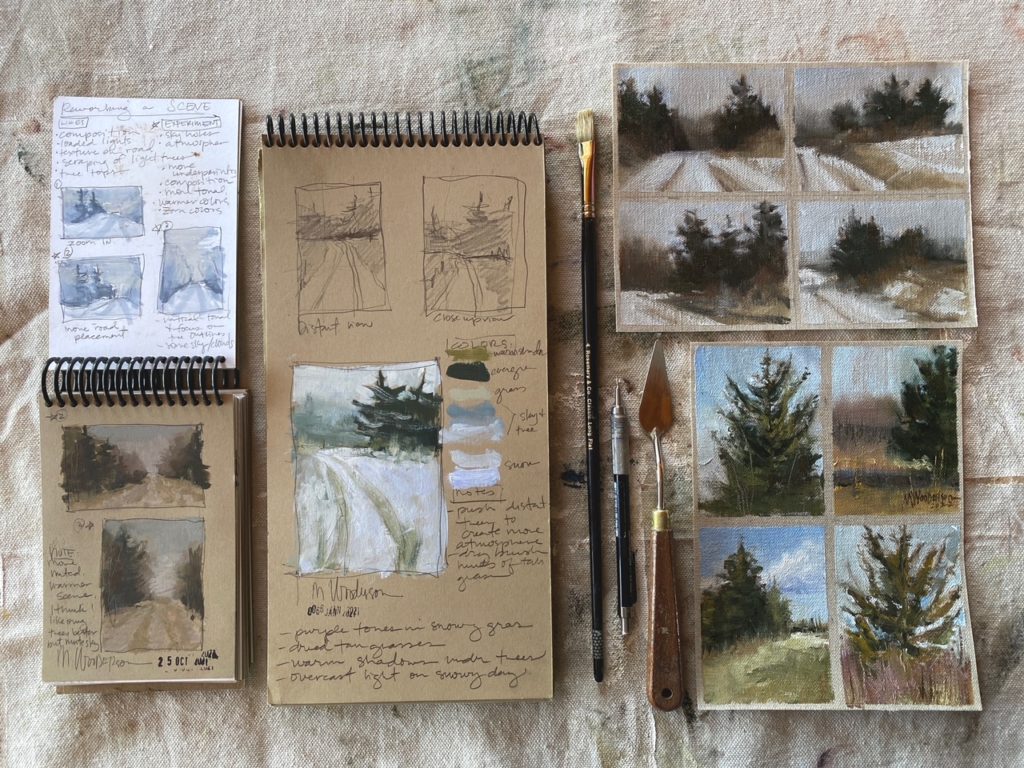
The image shows a useful standard of organization. Notice the difference between a collection and a system. A collection is a pile of pleasant sketches. A system makes it possible to say, “This small panel records the cool sky against the warmer snow; this drawing clarifies the road’s bend; this thumbnail proves that the tighter crop is stronger.”
Your study set should be built around the artistic intention from Lesson 1. Suppose your intention is:
To convey late-afternoon light breaking across a quiet river bend, with the dark bank acting as a threshold to distant open water.
That statement suggests what to investigate:
- Composition: Does the river bend carry the eye convincingly, and how much dark bank is necessary?
- Color: Is the effect governed by warm light against cool shadow, or by a pale, cool atmosphere with small warm accents?
- Details: How does the near bank break into water, and which distant tree or building silhouettes make the bend recognizable?
This is more useful than a general instruction such as “paint the river scene.”
Begin with small compositional questions
Before setting up an oil panel, make multiple thumbnail sketches. They are fast enough to let you test decisions while the scene is still available, and they prevent you from committing hours to an accidental crop.
Ian Roberts describes the plein-air thumbnail as a map that establishes major blocks, cropping, and the route through the composition before changing light makes those decisions harder. Watch his demonstration before planning your own thumbnail sequence.
Roadmaps, Thumbnails and Final Destinations - Planning Increases Creativity
In “Roadmaps, Thumbnails and Final Destinations” from Ian Roberts, watch how a rapid outdoor sketch establishes cropping, large masses, and visual movement before painting begins.
Watch the thumbnail example. Focus on the deliberate removal of material at the right edge, the placement of shadow shapes, and the way a simple value plan can direct the eye through the landscape. Then watch the two value plan to see how overlapping lights and darks can clarify depth without descriptive detail.
A three-pass thumbnail sequence
Make three to six thumbnails in the target aspect ratio you selected last lesson. If you chose a horizontal studio canvas, draw several tiny rectangles. Do not begin with an arbitrary square page and crop it later; the frame itself is one of the variables under test.
Use the sequence below.
-
First thumbnail: the observed frame. Record the scene as it initially presents itself. Reduce it to the largest visible sky, land, water, foliage, or built-form masses.
-
Second thumbnail: a tighter crop. Remove information from one or more edges. Ask whether the main event gains tension and whether an unnecessary object has stopped competing for attention.
-
Third thumbnail: a redesigned option. Shift a mass, simplify a silhouette, lower or raise the horizon, or omit an element that contributes nothing to the intended experience.
-
Optional fourth through sixth thumbnails: targeted variations. Test one question at a time: a wider sky, a lower foreground, a shifted focal light, a vertical crop, or a more panoramic rectangle.
At this stage, draw masses, not objects. A group of trees is one irregular dark shape until proving otherwise. A sunlit field is one light plane. A road is not two carefully ruled edges but a directional interval between neighboring masses.
Use value limitation to reveal design
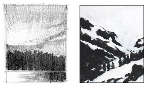
A thumbnail becomes more informative when it has a limited value vocabulary. A two-value notan asks the hardest and most basic question: are the light and dark shapes compelling when all intermediate nuance is removed? A three- or four-value sketch gives more information about planes and depth while remaining design-led.
The black-and-white studies below demonstrate the difference. The left drawing retains a middle value and a modest degree of description. The right study organizes a snowy mountain motif into a decisive pattern of light and dark. Neither is meant to imitate every visual fact. Each makes the underlying structure visible.
Composition Before Color — Considerations in the First Phases of Plein Air Painting
Read Mitch Albala’s article to distinguish a two-value notan from three- and four-value studies, and to see why these small plans belong at the beginning of a plein-air session.
Start with the subsection “The 4-value study.” Read the explanation of value divisions, noting how sky, ground, hills, and vertical tree masses often fall into broadly different value families because their planes receive light differently. Then, in “The 2-value study (notan)” and “The 3-value study,” read the account of notan and continue through the three-value example. Finish with “In praise of the humble thumbnail,” reading the thumbnail discussion. Focus on the distinction between a viewfinder, which selects a view, and a value sketch, which tests whether that view can become a designed painting.
A practical choice for your campaign is:
- Make three two-value thumbnails to test the strongest light-dark pattern.
- Select the best one and make one four-value version. Assign only the major sky, horizontal ground or water, sloping planes, and upright or shadowed masses.
- Keep the thumbnail small enough that detail is physically inconvenient. If you can draw individual leaves or stones, the study is too large or too slow for its job.
Do not interpret the four-value approach as a rigid formula. A stormy scene may place the sky in a darker family than the ground; reflected water may disturb the usual hierarchy. The purpose is to identify the large value families as they actually appear under that day’s light, not to force nature into a preset diagram.
Plan a color study that records the whole effect
After choosing a promising composition, paint a small, fast color study. This is a separate task from making an attractive miniature landscape. Its central question is: what is the dominant color impression under this specific light?
Patrick Okrasinski’s video offers a helpful definition: a color study is a compact painting whose attention remains on the overall effect rather than intricate description. Working small is especially useful outdoors because it limits the time available for a changing light condition.
The BEST Exercise to Become a Better Painter
In Patrick Okrasinski’s “The BEST Exercise to Become a Better Painter,” watch the sections that define a color study and connect fast studies to plein-air work under changing light.
Watch the definition for the distinction between a preparatory color study and a detailed small painting. Then watch working small and fast, concentrating on why limited scale forces attention onto major shapes, color relationships, and light. If time permits, watch plein air examples for examples of brief studies used to capture transient clouds and variations of illumination.
What the color study must include
Use a small panel close to your intended studio aspect ratio. A 5 by 7 inch panel is sufficient for many motifs; a 6 by 8 or 8 by 10 inch panel may be better if the study must include a clear spatial progression. Set a time limit, ideally no longer than 30 to 45 minutes.
A productive order of attention is:
-
State the atmospheric ground. Establish the sky or overall air color first, especially if it controls the mood of the entire scene.
-
Place the largest masses. Mix and paint the principal sky, land, water, foliage, architecture, or shadow groups. Avoid breaking a tree line into individual trees.
-
Match value before pursuing hue. A beautifully mixed blue-green that is too light or too dark will falsify the effect. Squint repeatedly and compare the value of the painted mass to the observed mass.
-
Identify temperature relationships. Ask relational questions: Is the shadowed snow cooler than the sky? Is the sunlight on grass warmer than its local color? Does a distant blue-gray hill appear cooler and lighter than the near foliage?
-
Reserve accents. A bright highlight, saturated warm roof, or dark punctuation can be added only after the large relationship works.
The phrase “local color” can be misleading outdoors. A green tree may appear blue-green under cool overcast light, yellow-green in morning sun, or nearly black against a pale sunset. Your study should record the observed appearance in context, not the paint-tube label associated with the object.
The Artists Network demonstration provides a method for mixing the major color masses and then exploring their warmer and cooler variations rather than treating each green or violet as a single fixed mixture.
Landscape Color Palette Secrets for Plein Air Painters | Artists Network
Read the middle stages of John Hulsey and Ann Trusty’s color-palette demonstration for a practical way to identify major masses, check their values, and build related warm-to-cool mixtures.
In “Step 3,” read the major-mass method. Pay particular attention to squinting and comparing the values of the biggest color areas before mixing smaller notes. Then read “Step 4” and “Step 6,” from color strings and harmonized grays. For this lesson, use the idea to investigate a limited set of related mixtures, not to pre-mix every conceivable color in the scene.
A field color chart, not a paint catalogue
Next to the oil study, make a small chart of four to eight swatches. Label them by relationship and location, rather than generic names:
- sky at zenith;
- sky near horizon;
- sunlit grass;
- grass in shadow;
- near tree dark;
- distant tree line;
- water reflection;
- brightest accent.
Beside each swatch, add a note such as “cooler than lit grass,” “same value as distant hill,” or “warmer and duller after 4:30.” These comparative notes are often more valuable in the studio than a color name.
A color string is especially useful when one mass changes temperature across the scene. For example, the foliage might move from a yellow-green plane in direct light, through a neutral olive, to a blue-green shadow. Mix a small progression rather than isolated piles. This helps you see a single mass as a connected family rather than a patchwork of unrelated greens.
The goal is not to use a complicated palette. It is to establish a coherent set of mixtures with clear value and temperature differences.
Isolate the details that carry identity
A large studio landscape must often enlarge a small number of features beyond the degree of description possible in a general plein-air sketch. That does not mean you need a study for every rock, leaf, fence post, or cloud. Identify the few subject details that fulfill one of three roles:
| Detail role | Examples | What to investigate |
|---|---|---|
| Structural | Road bend, bridge, barn roof, waterline, retaining wall | Proportion, perspective, overlaps, direction |
| Expressive | Wind-bent pine, breaking wave, luminous cloud edge, autumn tree | Gesture, silhouette, light pattern, characteristic color |
| Focal | Boat, gate, figure, bright cottage face, opening in trees | Contrast, edge quality, scale, placement against surrounding values |
Choose one to three details for dedicated study. A detail study should answer a question that a broad color study cannot answer.
For instance, a general study may show a dark pine against blue sky. But if the pine will become the focal vertical in a 30 by 40 inch painting, make a separate five-minute silhouette sketch and perhaps a 15-minute color note. Look for:
- the trunk’s directional lean;
- the division between the main crown and secondary branches;
- where the silhouette is lost into a neighboring dark;
- which edge catches light and which is softened by atmosphere;
- the few branch intervals that make it read as this tree rather than a generic symbol.
Similarly, if a road or river creates the main movement, study its intervals and overlaps: where it narrows, where it disappears, where its value changes, and which bank interrupts it. Record the large directional structure, not just its contour.
This is the beginning of selectivity. Fieldwork is successful when it gives the studio painting enough specific evidence to feel observed, while leaving you free to simplify and redesign later.
Build a realistic field session plan
For one focused session of roughly two hours, the following schedule is sufficient. It is a plan, not a rule; shorten it if the light is fleeting and extend a color study only when the condition is stable.
| Time | Activity | Result |
|---|---|---|
| First 10 minutes | Observe without painting; restate the artistic intention; identify the light direction and most transient effect | A clear question for the session |
| Next 15 minutes | Make three to six two-value thumbnails | Several crop and value options |
| Next 10 minutes | Make one selected three- or four-value plan | A compositional map for the best option |
| Next 30 to 45 minutes | Paint one small color-and-light study | A record of the overall effect |
| Next 15 to 25 minutes | Make one or two isolated detail studies | Structural or focal evidence |
| Final 10 minutes | Add color swatches and written observations | Notes that preserve comparisons and time-based change |
Work in this order because some information disappears quickly. The light effect and large color relationship may change within an hour; the anatomy of a tree, shape of a roof, or curve of a bank can usually be observed later.
A notebook page for each session can include:
Location and viewpoint: Standing on north side of footbridge, looking west.
Time window: 4:15 to 5:10 p.m.
Weather: Broken cloud, wind from left; sun appearing in short intervals.
Light direction: From upper left, striking near bank and roof planes.
Dominant effect: Cool blue-gray air interrupted by warm low sunlight.
Composition decision: Tighter horizontal crop; omit far-right shed; preserve dark bank as one connected shape.
Color note: Lit grass is warmer and lighter than expected, but not as light as the near water reflection.
Detail to resolve later: Pine silhouette at river bend; road edge disappears behind shadowed wall.
The precision of this language matters. “Beautiful sunset” may remind you of your feeling, but it does not tell you which plane was warmest, where the shadow edge fell, or which dark mass connected the foreground to the middle distance.
Protect the study from becoming a miniature finished painting
The temptation during plein-air work is to keep refining the first study because it begins to look promising. Sometimes that is appropriate. But for a field-to-studio project, a study is most valuable when it preserves a distinct kind of information.
Stop or shift studies when you have answered their question:
- Stop the thumbnail when the crop and masses are legible.
- Stop the value study when the major light and dark families are established.
- Stop the color study when the overall light, temperature, and major color relationships are convincing.
- Stop the detail study when the feature’s structure or character is understood.
You are allowed to make a more finished plein-air painting later, but do not let it replace the investigative set. Repetition has value when it varies a decision. Paint the same view under a changed sky; test a different crop; isolate a different detail; compare morning coolness to evening warmth. Repeating the same approach without a new question produces less useful information.
A field-study brief for your next motif
Before your next outdoor session, write a brief that fits on one notebook page:
Studio intention: [One concise sentence.]
Target studio format: [For example, horizontal , 24 by 36 inches.]
Composition question: [What crop, horizon placement, or dominant movement must be tested?]
Color question: [What light effect or warm-cool relationship must be captured?]
Detail questions: [Name one to three structures, silhouettes, or focal features.]
Minimum study set: [For example, four thumbnails, one four-value sketch, one 6 by 8 inch color study, two detail sketches, and field notes.]
This brief turns plein-air work into preparation for a specific painting without making it mechanical. Planning resolves the questions that should not consume your attention later, leaving more freedom in the studio for paint handling, edge variation, surface, and imaginative adjustment.
Key takeaways
A coordinated field set is more valuable than a single ambitious plein-air painting because each study has a clear role.
- Use several small value thumbnails to test crops, major masses, and the overall light-dark design.
- Make a selected three- or four-value study to understand planes and depth without losing the strength of the larger pattern.
- Paint one fast color-and-light study to capture the day’s dominant atmospheric effect, values, and warm-cool relationships.
- Make isolated studies only for details that are structural, expressive, or focal in the eventual studio painting.
- Add comparative written notes: light direction, timing, weather, observed color relationships, and decisions to keep or revise.
- Stop each study when it has answered its intended question.
Next, you will focus on recording field observations of light direction, weather, transient effects, and color relationships in a form that remains usable once you are back in the studio.
Can't find a good explanation? Sign up and we'll make it for you
Sign up