
Hello! Welcome back to your course on Medical Instrumentation.
In our last lesson, we connected the abstract EEG frequency bands to tangible cognitive and emotional states, particularly through the arousal-valence model. You learned that alpha power might signal relaxation, while beta and gamma indicate active processing.
Today, we take that understanding one step further by answering the question: where in the brain is this activity happening? This lesson directly addresses the learning outcome: Perform quantitative EEG (qEEG) analysis to create topographical brain maps. We will transform the columns of numbers and squiggly lines from your EEG system into intuitive, color-coded maps of brain activity. This is a cornerstone technique for the kind of neuro-monitoring you're developing at Neuraease.
1. From Time-Series to Brain Map: What is qEEG?
At its core, Quantitative Electroencephalography (qEEG) is a set of techniques for processing and analyzing multi-channel EEG data to produce quantitative metrics. The most common output of this process is a topographical brain map, which visually represents the spatial distribution of brainwave activity across the scalp.
Think of it as the difference between looking at a stock ticker (the raw EEG trace for one channel) and looking at a thermal map of the trading floor (a qEEG map showing where the most "activity" is).
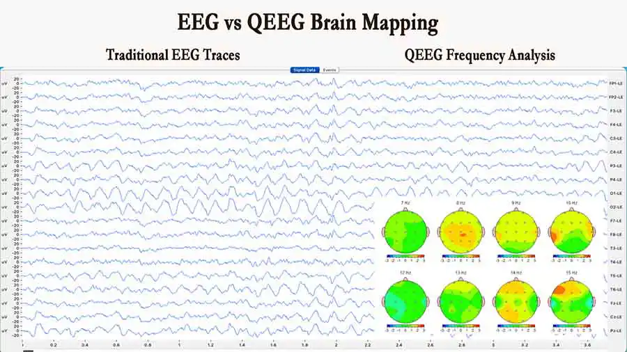
The process to generate these maps generally follows these steps:
- Record EEG from multiple channels (e.g., a 19-channel cap following the 10-20 system).
- Clean the data by removing artifacts (blinks, muscle tension, etc.).
- Perform Spectral Analysis (usually with an FFT) on short, clean segments of data for each electrode.
- Calculate Power Metrics for each frequency band (e.g., absolute alpha power, relative beta power) at each electrode site.
- Interpolate the values between the electrodes to create a smooth, continuous color map.
To get a formal introduction to these concepts, please read the first two sections of the following article from Bitbrain.
What is QEEG Brain Mapping & how to interpret it
This article provides a clear, technical introduction to qEEG, explaining how raw EEG signals are converted into quantitative metrics and visualized as maps.
Please read the introduction and the first main section, titled '1. From EEG to QEEG'. Focus on understanding the definitions of absolute and relative power and the introduction of LORETA for 3D source estimation.
As the article mentions, while 2D topographical maps show activity on the scalp, more advanced techniques like LORETA (Low-Resolution Electromagnetic Tomography) attempt to estimate the location of the activity within the 3D volume of the brain. This is computationally much more complex but can provide deeper insights.
2. The Power of Comparison: Normative Databases and Z-Scores
A brain map is interesting, but its diagnostic and analytical power is truly unlocked when you can compare it to a reference. Is the amount of theta activity in the frontal lobe "normal"? Is it high? Is it low? This is where normative databases come in.
These are large databases containing the EEG recordings of hundreds or thousands of healthy, carefully screened individuals across different age groups. By comparing an individual's qEEG data to this database, we can calculate a Z-score.
A Z-score tells you how many standard deviations an individual's brain activity is away from the population average for their age.
- A Z-score of 0 means the activity is perfectly average.
- A Z-score of +1.0 means it is one standard deviation above the average.
- A Z-score of -2.0 means it is two standard deviations below the average.
Typically, Z-scores between -2.0 and +2.0 are considered within the normal range. Values outside this range may indicate atypical brain function. The map is then colored based on these Z-scores, immediately highlighting areas of abnormally high or low activity.
This video gives a great intuitive explanation of this process.
QEEG & s-LORETA Brain Mapping Basics Explained
This video provides a high-level overview of qEEG, with a particularly good explanation of reference databases and Z-scores.
Watch the segment from 06:55 to 08:18. Focus on how the narrator explains the use of reference databases, the bell curve analogy, and the concept of a Z-score to determine what is 'normal' versus 'imbalanced'.
3. Reading the Maps: A Practical Guide
Now that we have the building blocks, let's learn to interpret a typical qEEG report. These reports often show several different types of maps to provide a complete picture.
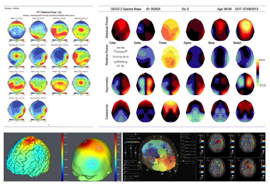
Let's break down the most common map types:
- Absolute Power: The raw electrical power (in microvolts squared, ) in a specific frequency band. It shows the sheer amount of energy.
- Relative Power: The percentage of total power that a specific band occupies. For example, a map might show that alpha accounts for 60% of the total brainwave energy at a specific site. This is useful for seeing which rhythm is dominant.
- Asymmetry: The difference in power between corresponding electrodes on the left and right hemispheres. This is exactly what you'd use to visualize the frontal alpha asymmetry we discussed in the last lesson for measuring emotional valence.
- Coherence: A measure of the degree of synchrony or phase consistency between two brain regions. High coherence suggests two areas are functionally connected and communicating, while low coherence suggests they are operating more independently.
This next video provides a practical walkthrough of how to interpret these maps, linking colors to deviations from the norm.
How to Interpret Your qEEG Brain Map.
Dr. Trish Leigh gives a very clear and practical guide on how to read a qEEG map, explaining the color-coding and the meaning of the different power and communication metrics.
Watch from the beginning to 02:33. Pay close attention to: The color legend (green for optimal, warm colors for excess, cool colors for deficit). The distinction between Absolute Power and Relative Power. The introduction of communication parameters like coherence.
Test your understanding!
Imagine you are reviewing a qEEG Z-score map for a user of your Neuraease device just before they reported feeling overwhelmed. The map shows the following for the alpha band:
- A large area of dark blue (e.g., Z-score of -2.5) over the posterior (occipital) region.
- A splotch of orange/red (e.g., Z-score of +2.0) over the left frontal region compared to the right frontal region.
How would you interpret these two findings in the context of the user's report of feeling overwhelmed? Connect your answer to the concepts from this lesson and the previous one.
Show answer
This map points towards a state of high arousal and negative valence, consistent with feeling overwhelmed or stressed.
-
Low Posterior Alpha (High Arousal): The dark blue in the posterior region indicates significantly less alpha power than is typical. As we learned previously, posterior alpha is associated with a relaxed, idling state. Abnormally low alpha power suggests the user is in a state of high mental engagement or arousal, the opposite of relaxed.
-
Left Frontal Alpha Asymmetry (Negative Valence): The orange/red splotch over the left frontal lobe indicates more alpha activity there compared to the right side (or more right-side activation). This pattern of frontal alpha asymmetry is the classic marker for negative valence (unpleasant emotions like stress, sadness, or frustration).
Conclusion: The map visually confirms the user is in a brain state characterized by high arousal and negative emotion, which aligns perfectly with their subjective report of feeling overwhelmed. This is a prime example of how qEEG can provide objective biomarkers for subjective experiences.
4. A Word of Caution: Pitfalls and Limitations
While qEEG is powerful, it is not infallible. As someone building a product based on this technology, it is critical to understand its limitations to avoid misinterpretations and false claims.
- Artifacts are the Enemy: An eye blink creates a massive electrical signal in the frontal electrodes. Muscle tension in the jaw or neck creates high-frequency noise that looks like gamma activity. If not properly removed, artifacts will completely distort the map and lead to incorrect conclusions.
- The Map is an Estimation: A 19-channel EEG only measures data at 19 points. The smooth map you see is created by mathematical interpolation. The values between the electrodes are just educated guesses.
- Confounding Factors: Drowsiness, medication, caffeine, a thick skull, or even a recent haircut that affects electrode contact can all change the EEG and produce an "abnormal" map that has nothing to do with the user's cognitive or emotional state.
This final reading provides a healthy, critical perspective on these challenges.
Topographic Mapping, Frequency Analysis, and Other Quantitative Techniques
To ensure we maintain a scientifically rigorous approach, it's important to understand the potential pitfalls of qEEG. This article highlights some of the most common problems.
Please read the section titled 'Problems', which includes the sub-sections on 'Artifacts' and 'Confounding Clinical Factors'. Focus on why automated artifact rejection is not a perfect solution and how non-neurological factors can alter a qEEG map.
Conclusion
In this lesson, you've learned how to transform raw, multi-channel EEG data into visually intuitive topographical brain maps. This is a fundamental skill for moving from basic signal analysis to a holistic understanding of brain function.
Key Takeaways:
- qEEG quantifies and visualizes EEG data, most commonly through topographical brain maps.
- These maps are created by calculating power in each frequency band at each electrode and interpolating the results.
- Normative databases and Z-scores allow you to compare an individual's brain activity to a healthy population, highlighting significant deviations.
- Common map types include absolute/relative power, asymmetry, and coherence, each providing a different lens on brain function.
- Rigorous artifact cleaning and awareness of confounding factors are essential for accurate interpretation.
Preview of the Next Lesson:
So far, we have analyzed spontaneous EEG—the brain's ongoing activity at rest. However, much of what we want to measure involves the brain's response to something specific. In the next lesson, we will explore this by learning to differentiate between spontaneous EEG, event-related potentials (ERPs), and steady-state evoked potentials (SSEPs). This will open the door to analyzing brain activity locked to specific sensory, motor, or cognitive events.
Can't find a good explanation? Sign up and we'll make it for you
Sign up