Hello! Welcome back to our final lesson on crafting high-conversion B2B web pages.
In our last session, we focused on building trust by strategically integrating social proof. You learned how to use testimonials, logos, and data to make your claims believable and reduce a buyer's perceived risk. That was about building the confidence to act.
Today, we'll focus on the action itself. A visitor can be fully convinced by your copy and proof, but if they don't know what to do next—or if the next step feels too demanding—you'll lose them. This lesson is about the final, crucial instruction: the Call-to-Action (CTA). Our goal is to write a clear, low-friction call-to-action tailored to the buyer's stage of readiness.
1. The "Low-Friction" Principle: Making "Yes" Easy
In B2B, a "yes" to a CTA for a demo or trial is a bigger commitment than a B2C purchase of a pair of shoes. It involves time, company resources, and professional reputation. "Friction" is anything that makes that "yes" feel harder or riskier. It could be a long form, unclear benefits, or a commitment that feels too big, too soon.
A low-friction CTA minimizes this psychological resistance. It makes the next step feel safe, easy, and valuable.
To see this in action, let's start with a short video clip that explains the concept of making a CTA section less intimidating.
How To Create High Converting B2B Landing Pages in 2025
The video 'How To Create High Converting B2B Landing Pages in 2025' by Exposure Ninja has a great segment on 'ease of use' that directly illustrates the low-friction principle.
Please watch from 02:28 to 03:03. Notice how the landing page example succeeds by not overwhelming the user with a huge form upfront. This is a core tactic for reducing friction.
The opposite of this is a high-friction CTA that asks for too much, too early. Let's look at some examples of what to avoid.
How To Create High Converting B2B Landing Pages in 2025
In the same video, the presenter analyzes several ineffective B2B landing pages. The critiques are highly instructive.
Please watch from 06:03 to 08:11. Pay close attention to why CTAs like 'Meet our leadership' or 'Apply now' fail. The presenter notes that a premature 'Apply now' CTA is like a restaurant handing you the bill before you've seen the menu. This is a perfect metaphor for a high-friction, poorly-timed CTA.
As the video demonstrates, asking a cold prospect to "Apply Now" or "Log In" creates immediate friction because it's a mismatch with their current intent. They aren't ready for that level of commitment. This brings us to the most important part of writing effective CTAs: timing.
2. Matching Your CTA to the Buyer's Readiness
A CTA that works wonders on a pricing page will completely fail in a blog post. The key is to match the CTA to where the buyer is in their journey. We can think of this journey in three simple stages: Awareness, Consideration, and Decision.
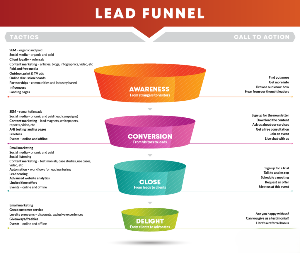
Let's break down what kind of CTA works at each stage.
Stage 1: Awareness
- Buyer's Mindset: "I have a problem, but I'm not sure what the solution is. I'm researching."
- Your Goal: Educate and build trust.
- CTA Type: Low-commitment, high-value content offers.
- Examples: "Download the Free Guide," "Watch the Explainer Video," "Read the Report."
Stage 2: Consideration
- Buyer's Mindset: "I know about potential solutions, including yours. I'm now comparing features, pricing, and fit."
- Your Goal: Demonstrate your product's specific value for them.
- CTA Type: Higher-commitment actions that facilitate evaluation.
- Examples: "Request a Personalized Demo," "See Our Plans and Pricing," "Get a Free ROI Assessment."
Stage 3: Decision
- Buyer's Mindset: "I think your solution is the right choice. I'm ready to take the next step towards purchase or implementation."
- Your Goal: Make it easy to get started.
- CTA Type: High-commitment, action-oriented.
- Examples: "Start Your 30-Day Free Trial," "Talk to Sales," "Get Started Today."
A great landing page often provides CTAs for visitors at different stages. The primary CTA might be for those in the Consideration stage (e.g., "Request a Demo"), but a secondary, lower-friction CTA can capture those still in the Awareness stage.
This next resource provides a fantastic list of CTA examples categorized by these very goals.
60 powerful calls to action (CTAs) to drive B2B marketing results
The article '60 powerful calls to action (CTAs) to drive B2B marketing results' by ProductiveShop is an excellent resource for practical CTA ideas.
Please skim through the section titled '60 best call to action phrases.' You don't need to memorize them all. Instead, notice how the phrases are grouped by intent, such as 'To increase brand awareness' (Awareness stage) and 'To enhance consideration' (Consideration stage). This structure reinforces the idea of matching the CTA to the buyer's mindset.
3. The Anatomy of a Powerful B2B CTA
Now that we know when to use different CTAs, let's look at how to write them. A strong CTA is more than just a button; it's a concise promise. It generally consists of three parts:
- A Clear Action Verb: Start with a command. Words like Get, Download, Start, Request, See, Find are direct and effective.
- A Specific Outcome: Tell the user exactly what they will get. Don't say "Submit"; say "Get Your Free Ebook."
- Value or Friction-Reducer (Optional but powerful): Add a phrase that reinforces the value or lowers the perceived effort. Examples: "No credit card required," "Takes 3 minutes," "Instant access."
This video provides a perfect deconstruction of a powerful, low-friction CTA.
The $1 Million Landing Page (Works For Normal People)
In 'The $1 Million Landing Page,' Daniel Priestley breaks down the components of a highly effective CTA for an online assessment.
Watch from 03:44 to 04:23. Notice how he combines the action ('Start the quiz') with friction-reducers ('takes 3 minutes,' 'completely free') and a value promise ('get immediate recommendations').
4. Your Turn: Writing CTAs for Different Stages
Let's put this into practice.
Scenario: You are writing copy for "ForecastAI," a B2B SaaS tool that uses artificial intelligence to create highly accurate sales forecasts for enterprise teams.
Task: Write a clear, low-friction CTA for each of the following scenarios. Think about the buyer's mindset and the anatomy of a good CTA we just discussed.
- Awareness Stage: A CTA at the end of a blog post titled "Top 5 Blind Spots in Your Sales Forecasting." The goal is to capture the reader's email.
- Consideration Stage: A primary CTA on a product page that details how ForecastAI's technology works. The goal is to get the prospect to see the product in action.
- Decision Stage: A CTA on the pricing page for a qualified prospect who is ready to try the software.
Take 5-7 minutes to write your three CTAs.
My Examples
Here’s how I might approach this task:
-
Awareness CTA:
Download Your Free Guide: The 10-Point Sales Forecast Accuracy Checklist
- Why it works: It offers a tangible, valuable tool (
The Checklist) that directly addresses the problem discussed in the blog post. "Download" is a clear action, and "Free Guide" reduces friction.
- Why it works: It offers a tangible, valuable tool (
-
Consideration CTA:
Request a Personalized Demo
- Why it works: At this stage, the buyer isn't interested in a generic video; they want to know how it solves their problem. "Personalized Demo" promises a tailored experience, justifying the higher commitment of scheduling a call. "Request" is a standard, understood verb for this action.
-
Decision CTA:
Start Your 14-Day Free Trial
No credit card required- Why it works: "Start" is an immediate, empowering verb. "14-Day Free Trial" sets a clear expectation of what they're getting and for how long. The sub-text "No credit card required" is a classic and powerful friction-reducer, removing the fear of being automatically charged.
Conclusion
Great job! You've now learned how to craft the final, critical instruction that turns a convinced prospect into a lead. The CTA is where all your persuasive copywriting pays off.
Key Takeaways:
- Reduce Friction: Make your CTA feel easy and safe to click by asking for an appropriate level of commitment and removing barriers (e.g., long forms, credit card requirements).
- Match the Message to the Moment: Align your CTA with the buyer's stage of readiness. Offer content to the unaware, demos to the considering, and trials to the decided.
- Be Clear and Specific: Use a strong action verb and state exactly what the user will get. A CTA should be an instruction, not a mystery.
Preview of the Next Lesson:
Over the past few lessons, we've dissected the most important parts of a high-conversion B2B landing page: its structure, layered messaging, social proof, and now, the call-to-action. In our next session, we'll put all this knowledge together. You'll learn how to critique and rewrite a section of a B2B landing page to better address a target buyer's needs, applying everything you've learned in a holistic way.