
Hello! Welcome to the final lesson in our module on building advanced financial dashboards in Power BI.
In our previous lesson, we learned how to use bookmarks and buttons to create curated narrative paths, transforming a static report into an interactive experience. You now have the skills to guide a user from a high-level summary to detailed data with just a click.
Now that we can build the individual charts and connect them interactively, it's time to focus on the art and science of putting them all together. A dashboard can have all the right data, but if it's poorly designed, it can be confusing, misleading, or simply ignored.
Today's lesson addresses this crucial final step in the creation process. Our learning outcome is to apply principles of effective dashboard design (layout, color, and data-ink ratio) to a financial report. We will move from simply making charts to designing professional, clear, and compelling reports that effectively communicate financial insights.
1. The Philosophy of Good Design: Substance Over Style
Your goal is to create "nice" data visualizations for financial markets. A common misconception is that "nice" means flashy, colorful, or complex. In professional data visualization, "nice" actually means clear, understandable, and actionable. The best designs prioritize the data itself, not the decoration around it.
This philosophy was famously championed by Edward Tufte, a pioneer in the field of data visualization. To understand these foundational ideas, let's start with a video that breaks down his core principles.
🚨 YOU'RE VISUALIZING YOUR DATA WRONG. And Here's Why...
This video from 'Learn BI Online' introduces the core idea that effective data visualization is more science than art. It then outlines Edward Tufte's eight fundamental principles, which provide a solid framework for our entire lesson.
Please watch from the beginning to 05:34. Pay close attention to Tufte's principles, especially: Inducing the viewer to think about the substance (the data), not the design. Encouraging the eye to compare different pieces of data (crucial for financial analysis like Year-over-Year growth). Serving a clear purpose.
As you can see, the emphasis is always on the data. For a financial analyst, principles like "avoid distorting what the data have to say" and "encourage comparison" are not just design tips—they are matters of professional integrity and analytical rigor.
2. Maximizing Clarity with the Data-Ink Ratio
One of Tufte's most influential concepts is the data-ink ratio. It's a simple but powerful idea: a large share of the "ink" (or pixels on a screen) used to create a graphic should be dedicated to presenting the actual data. Anything else is potentially "non-data ink" or "chart junk" that clutters the visual and distracts the viewer.

Now, let's see how to apply this in practice by deconstructing a typical chart and removing the "junk."
🚨 YOU'RE VISUALIZING YOUR DATA WRONG. And Here's Why...
The same video provides an excellent practical demonstration of improving the data-ink ratio. It takes a standard chart and systematically removes unnecessary elements, showing the dramatic improvement in clarity.
Watch from 05:34 to 10:54. Observe each element that is removed or muted: chart title styling, borders, redundant legends, axis titles, and heavy gridlines. Notice how each change makes the data itself stand out more.
The key takeaway is to critically evaluate every element on your chart. Does it convey essential information? If not, consider removing it or making it less prominent (e.g., by using a lighter gray for gridlines). In Power BI, you can control all of these elements in the "Format your visual" pane.
3. Layout and Visual Hierarchy: Guiding the User's Eye
A dashboard's layout is not arbitrary. The placement of visuals guides the user's attention and tells them what is most important. In Western cultures, people tend to read screens in an "F" or "Z" pattern, starting from the top-left. Therefore, you should place your most important information there.
Here is a common and effective structure for a financial dashboard:
- Top-Left: High-level Key Performance Indicators (KPIs) and summary numbers (e.g., Total Revenue, Net Profit Margin, YTD Growth). These are often displayed using Card visuals.
- Top/Left: Interactive elements like slicers and filters for date ranges, regions, or business units.
- Main Body: Key charts and graphs that show trends and comparisons (e.g., line charts for revenue over time, bar charts for performance vs. budget).
- Bottom/Right: Detailed, granular data, often in a Matrix or Table visual, that users can refer to after seeing the high-level trends.
This structure follows a principle called "progressive disclosure"—it presents a summary first and allows the user to explore details as needed.
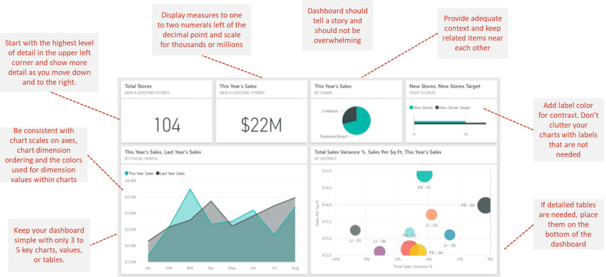
The following article offers specific, actionable advice on common layout mistakes and how to fix them.
10 Common Mistakes in Data Visualization in Power BI
This article from Zebra BI discusses common mistakes in Power BI design. The section on page layouts provides clear rules for organizing your dashboard.
Read the section 'Mistake 6: Confusing page layouts'. Focus on the 'Design for how people read' principle and the 'Power BI specific guidance' about using whitespace and grouping related charts.
Test your understanding!
You are designing a financial dashboard for a company's executive team. You have the following visuals to place:
- A card showing "Total YTD Revenue".
- A date slicer for the user to select the quarter.
- A line chart showing "Revenue Trend by Month".
- A detailed table of all transactions.
Based on standard dashboard layout principles, in what order (from 1 to 4) would you typically place these items, starting from the top-left of the page?
Show answer
A standard and effective layout would be:
- Total YTD Revenue (Card): The most important KPI, placed at the top-left.
- Date Slicer: An interactive control, placed near the top.
- Revenue Trend by Month (Line Chart): The main visualization showing a key trend.
- Detailed Transactions (Table): The most granular data, placed at the bottom for reference.
4. The Strategic Use of Color
Color is not just for decoration; it is a powerful tool for encoding information. When used improperly, it can create confusion and clutter. When used strategically, it can highlight key insights and guide your audience's attention.
For financial dashboards, here are some of the most important color principles:
- Use Color Consistently: If you use blue to represent "Actual Revenue" in one chart, use blue to represent it in all charts. Don't make the user re-learn what colors mean on different parts of the dashboard.
- Use Neutral Colors for Baselines: Use muted colors like gray for your primary data (e.g., actual sales, previous year's figures).
- Use Saturated Colors for Emphasis: Reserve bright, saturated colors to draw attention to the most important information, such as the variance between your plan and actual results.
- Use Red/Green Intuitively: In finance, the red/green convention for negative/positive variance is universally understood and very effective. Use it to immediately signal performance against a target.
- Design for Accessibility: A significant portion of the population has some form of color vision deficiency. Avoid relying solely on red/green combinations to convey meaning. Use icons (▲/▼), labels, or other indicators as well.
This next resource provides an excellent, detailed guide on using color effectively in a business context.
10 Common Mistakes in Data Visualization in Power BI
This section of the Zebra BI article provides a masterclass in using color purposefully. It moves beyond aesthetics to discuss consistency, contrast, and using color to tell a story.
Please read 'Mistake 4: Inconsistent use of colors'. Pay close attention to the concepts of 'Too many colors', 'Inconsistent color meaning', and especially the 'Use simple and effective colors' section, which demonstrates the powerful gray/black/red/green approach.
5. Your Dashboard Design Checklist
You've now learned about the core principles of effective design. Before finalizing a report, it's helpful to run through a mental checklist.
Here is a summary of best practices for you to apply to your financial dashboards:
Visual Design Principles
- Hierarchy: Are your most critical KPIs at the top-left?
- Consistency: Are your colors and chart choices consistent for related metrics?
- White Space: Does your dashboard feel balanced and uncluttered, or is it cramped? Let your metrics breathe.
- Data-Ink Ratio: Have you removed all non-essential "ink" like unnecessary borders, backgrounds, and heavy gridlines?
- Color: Is color used purposefully to highlight variances and guide attention, rather than just for decoration? Is the meaning of each color consistent?
User Experience
- Clarity: Is the purpose of the dashboard immediately obvious? Does it answer key business questions (e.g., "Is performance good or bad?") at a glance?
- Context: Are your numbers in context? A number like "$5M Revenue" is meaningless without comparison to a target, a previous period, or a forecast.
- Clear Labeling: Are all charts, axes, and metrics clearly and concisely labeled? Avoid jargon and overly long labels.
- Progressive Disclosure: Does the dashboard start simple and allow users to drill down or navigate to more detailed views?
You can find these principles summarized and applied in the following resource.
Financial Dashboard Power BI Example: The Complete ...
This article from datasights.co provides a great summary of best practices specifically for financial dashboards in Power BI.
Read the section 'Best Practices for Financial Dashboard Design'. It provides a concise checklist covering visual design, performance, and user experience that you can use for your own projects.
Conclusion
Congratulations on completing this lesson! You've now moved beyond the technical "how-to" of building charts and have explored the design principles that separate amateur work from professional, high-impact financial reports.
Key Takeaways:
- Design for Clarity, Not Decoration: The primary goal of a financial dashboard is to communicate information clearly and accurately.
- Maximize the Data-Ink Ratio: Reduce clutter by removing any visual element that doesn't represent data or serve an essential purpose.
- Layout Guides the Eye: Place your most important, high-level information at the top-left and create a logical flow from summary to detail.
- Use Color Strategically: Employ a limited, consistent color palette. Use neutral colors for baselines and saturated colors (like red and green) to highlight important variances.
In our final lesson, we'll cover the last step in the process: Publishing a Power BI report to the web and sharing it with stakeholders. With a well-designed, interactive, and insightful dashboard in hand, you'll be ready to deliver your findings to your audience.
Can't find a good explanation? Sign up and we'll make it for you
Sign up