
Hello! Welcome to the next lesson in our journey to master financial data visualization.
In our last lesson, we learned how to integrate specialized custom visuals from AppSource, like candlestick charts and waterfall charts for P&L statements. This gave us the power to create highly specific, professional financial charts.
Now that we can build these powerful individual components, the next step is to connect them into a fluid, guided experience for our users. We want to move beyond a static page of charts and create an interactive report that tells a story.
This brings us to today's learning outcome: Use bookmarks and buttons to create curated narrative paths and user experiences within a report.
You'll learn how to capture different states of your report—like a "Summary View" versus a "Detailed View"—and allow users to switch between them with a simple button click. This skill is vital for building executive dashboards where you want to guide the audience from high-level KPIs to the underlying details, all within a single, clean interface.
1. What Are Bookmarks and Why Do They Matter?
Think of a bookmark in Power BI as a saved "snapshot" of a report page. It doesn't just save the page itself; it captures the complete state of that page at a specific moment, including:
- Current filters and slicers
- The visibility of visuals (which are shown or hidden)
- Sort order in tables and charts
- Drill-down locations within a visual
By creating a series of bookmarks, you can define a narrative path. For a financial report, this could mean creating a "story" that moves from a company's overall revenue, to a breakdown by product line, and finally to a regional sales analysis, all controlled by the user with simple navigation buttons.
To get a solid foundation, please start by reading the official Microsoft documentation on what bookmarks are and what they save.
Create report bookmarks in Power BI
Let's start with the official definition from Microsoft. This document clearly explains what a bookmark is and what elements of your report it captures.
Please read the introduction and the section 'Create report bookmarks'. Focus on the list of elements that are saved with a bookmark (filters, slicers, visibility, etc.).
Now, to see how these concepts come together to create a dynamic, app-like feel in a report, watch this short introductory clip.
The 'Guy in a Cube' channel provides an excellent conceptual overview of why bookmarks are so powerful when combined with selections and buttons.
Watch the first part of this video (00:25 - 01:22) to see examples of what's possible and understand how bookmarks, selections, and buttons work together to create an app-like experience.
2. The Foundation: The Selection Pane and Grouping
To effectively use bookmarks, you first need to master the Selection Pane. This pane is the control center for all the objects on your report page. The key to creating clean, interactive views is to think of your visuals as layers that you can show, hide, and group.
This is very similar to managing layers in presentation software like PowerPoint. Before creating a bookmark, you first set the stage by deciding which "layers" (visuals) you want to be visible.
Key best practices are:
- Rename Everything: Give your visuals, buttons, and shapes descriptive names in the Selection pane (e.g., "Chart - Revenue by Quarter," "Button - Show Details"). This will be invaluable as your reports get more complex.
- Order Your Layers: The order in the Selection pane determines which visuals appear in front of others. Background shapes should be at the bottom, while pop-up windows should be at the top.
- Group Objects: Grouping related visuals together allows you to show or hide an entire section of your report with a single click. For example, you could group a candlestick chart, a volume chart, and a moving average card into a single "Stock Detail View" group.
The following video gives a fantastic, practical demonstration of these foundational skills.
Master Power BI Bookmarks & Layer Grouping to Create Next-Level UIs!
Before creating bookmarks, we must master the Selection pane. This video from 'Next Level Power BI Reports' provides an excellent walkthrough of how to think of visuals as layers, the importance of naming and ordering them, and how to use groups to stay organized.
Please watch from 02:00 to 06:23. Pay close attention to: The Layer Analogy (02:00 - 03:45): Understand how visuals are stacked and why order matters. Renaming Layers (03:45 - 05:08): See why giving clear names to your visuals and buttons is critical. Grouping (05:08 - 06:23): Observe how grouping visuals allows you to control the visibility of entire sections of your report at once.
3. Practical Walkthrough: Creating Interactive Views
Now let's combine these concepts to build an interactive experience. The basic workflow is:
- Arrange View 1: Use the Selection pane to show the visuals for your first view and hide everything else.
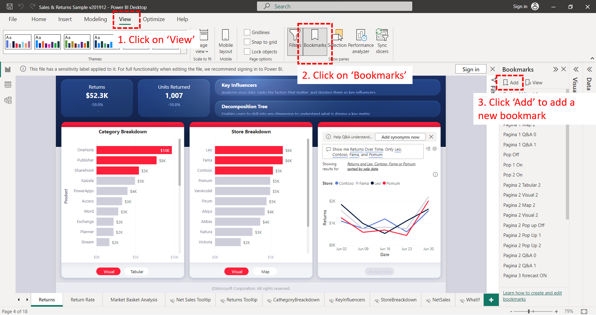
- Create Bookmark 1: Go to the Bookmarks pane, click "Add," and give it a descriptive name (e.g., "Summary View").
- Arrange View 2: Now, hide the visuals from View 1 and show the visuals for your second view.
- Create Bookmark 2: Add another bookmark and name it (e.g., "Detail View").
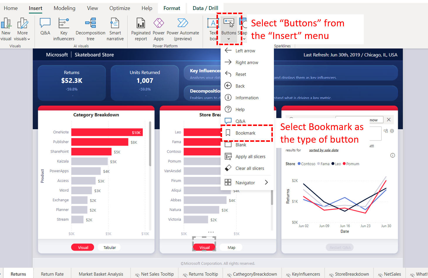
- Insert Buttons: Add buttons to your report canvas.
- Assign Actions: Select a button, go to the "Format" pane, turn on the "Action" property, and assign it to one of your bookmarks.
The following video demonstrates this entire process from start to finish. It uses a sales example, but the principle is identical for any financial report, such as toggling between a portfolio summary and a detailed stock analysis.
Master Power BI Bookmarks & Layer Grouping to Create Next-Level UIs!
Now let's put it all together. This part of the 'Next Level Power BI' video walks through the entire workflow: duplicating visual groups to create different views, creating bookmarks for each view, and assigning those bookmarks to buttons.
Watch from 06:23 to 10:38. Follow the process for: Creating Views (06:23 - 08:24): See how they duplicate and modify groups to create two distinct report views. Adding Bookmarks (08:24 - 09:06): Watch how a bookmark is created for each view. Assigning Bookmarks to Buttons (09:06 - 10:38): Observe how the Action property of a button is used to link it to a specific bookmark.
Here are some static images to serve as a quick reference for the key steps:
1. Adding a Bookmark:
2. Inserting and Linking a Button:
4. Fine-Tuning Your Bookmarks: Advanced Options
Creating a bookmark captures more than just which visuals are visible. By clicking the ellipsis (...) next to a bookmark, you can access several powerful options that control its behavior.
A bookmark's options allow you to control its behavior regarding data, display, page navigation, and which visuals it affects.
-
Data: This is one of the most important settings.
- Checked (Default): The bookmark will reset all filters and slicers to how they were when you created the bookmark.
- Unchecked: The bookmark will preserve the user's current filter selections. This is usually what you want for navigation. For example, if a user filters the report to "2023", they expect that filter to remain active when they toggle from a summary view to a detailed view.
-
Display: This controls the visibility and spotlight state of your visuals. You will almost always want to leave this checked.
-
Current Page: If checked, the bookmark will always take the user to the page where the bookmark was created. If unchecked, the bookmark's actions (like showing/hiding visuals) can be applied to other pages, which is a more advanced use case.
-
All Visuals vs. Selected Visuals: This is a crucial distinction for building complex reports.
- All Visuals (Default): The bookmark affects every single visual on the page. This is fine for simple view-swapping.
- Selected Visuals: The bookmark only affects the visuals you had selected in the Selection pane when you created or updated it. This is essential for creating independent components. A perfect example is a help icon that shows a pop-up text box. You want that pop-up to appear and disappear without resetting your main charts. Using "Selected Visuals" for the pop-up's bookmarks makes this possible.
The following video provides an excellent, in-depth explanation of these options.
To truly master bookmarks, you need to understand their settings. This video from 'Guy in a Cube' does an excellent job of breaking down the key options that control a bookmark's behavior.
Watch from 02:27 to 11:02. This is a critical section, so pay close attention: Data, Display, and Current Page (02:27 - 06:47): Understand the difference between these three settings and when you would want to uncheck 'Data' to preserve user filters. All Visuals vs. Selected Visuals (06:47 - 11:02): Focus on the example of how using 'Selected Visuals' allows for an information pop-up to work independently without resetting the rest of the report.
Test your understanding!
You are building a stock analysis page. You have two main views toggled by buttons: a "Price View" (candlestick chart) and a "Fundamentals View" (table of financial ratios). You also have a date slicer on the page. A user selects a specific date range in the slicer and then clicks the button to switch from the "Price View" to the "Fundamentals View." You want the date range they selected to remain active in the new view.
Which setting must you configure on your bookmarks to achieve this?
Show answer
You must uncheck the Data option for both the "Price View" and "Fundamentals View" bookmarks. This tells Power BI not to reset the slicer's state when the bookmark is activated, thus preserving the user's date range selection as they navigate between views.
Conclusion
You now have the tools to transform a collection of charts into a guided, interactive data story. By thoughtfully combining visuals, the Selection pane, bookmarks, and buttons, you can create intuitive, app-like experiences that empower your audience to explore financial data on their own terms.
Key Takeaways:
- Bookmarks are Snapshots: They capture the state of a report page, including filters, slicer settings, and visual visibility.
- The Selection Pane is Your Control Center: Use it to name, order, and group visuals to manage complex views efficiently.
- Buttons Trigger Bookmarks: The
Actionproperty of a button allows you to link it to a bookmark, creating user-driven navigation. - Uncheck 'Data' for Navigation: To allow user filters to persist while they switch between bookmarked views, remember to uncheck the 'Data' property in the bookmark's options.
- Use 'Selected Visuals' for Independence: For components like pop-up windows that shouldn't affect the rest of the report, use the 'Selected Visuals' bookmark option.
In our next lesson, we will tie everything together by focusing on applying principles of effective dashboard design. You've learned how to create individual visuals and how to connect them; now we'll focus on the layout, color, and other design principles that make a financial dashboard not just functional, but clear, compelling, and professional.
Can't find a good explanation? Sign up and we'll make it for you
Sign up