Introduction
In our last lesson, you successfully implemented the forward pass for a two-stage pipeline-parallel model. We discussed the core mechanics of partitioning a model and using send/recv primitives to shuttle micro-batches between GPUs. We also introduced a critical concept from a systems perspective: the pipeline bubble, the idle time on GPUs that limits overall efficiency.
Today, we will bring this concept into sharp focus. Your objective is to visualize the GPU utilization timeline for a pipeline-parallel implementation to identify and measure the pipeline bubble. We will move from the print statements in our code to the kind of timeline visualizations produced by professional profiling tools. You will learn to interpret these diagrams, understand the fundamental data dependencies that cause the bubble, and, most importantly, calculate its impact on performance.
1. From Code to Timeline: Visualizing Execution
In the previous lesson, our code's print statements gave us a sequential log of events. A profiler, however, provides a much richer view: a timeline. This is a graph where the y-axis lists the GPUs and the x-axis represents time. Colored blocks show when a GPU is actively computing, and empty spaces represent idle time.
Let's first consider the most inefficient case: naive pipeline parallelism without micro-batching.
Pipeline-Parallelism: Distributed Training via Model Partitioning
The article 'Pipeline-Parallelism' from siboehm.com provides an excellent step-by-step breakdown of pipelining. We'll start with its description of the naive approach.
Read the initial section titled 'Naive Model Parallelism'. Pay close attention to the text describing the inefficiency: 'At any given time, only one GPU is busy, while the other GPU is idle.' The 'pebble graph' visualization illustrates this sequential, one-at-a-time execution.
A timeline for this naive approach would look stark: a single block of work moving from GPU 0, to GPU 1, to GPU 2, and so on, with all other GPUs sitting idle. The utilization would be a dismal .
Now, let's re-introduce micro-batching, as we did in our code. This allows the GPUs to work in an assembly-line fashion.
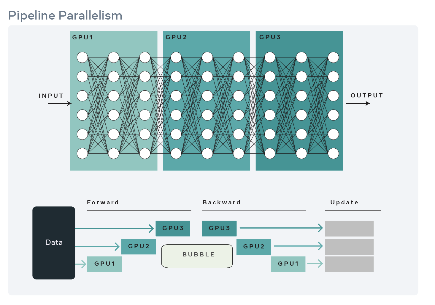
This timeline view is precisely what we want to analyze. The "staircase" pattern at the beginning is the pipeline warm-up, where GPUs sequentially come online as the first few micro-batches propagate through. The inverse staircase at the end is the pipeline cool-down or drain. Together, these idle periods form the pipeline bubble.
2. The Anatomy and Cause of the Bubble
The bubble isn't a bug; it's a fundamental consequence of data dependency. In our code from the last lesson, the dist.recv() call on rank=1 is a blocking operation. The GPU physically waits, consuming no compute, until the dist.send() call from rank=0 completes. This waiting period is the bubble.
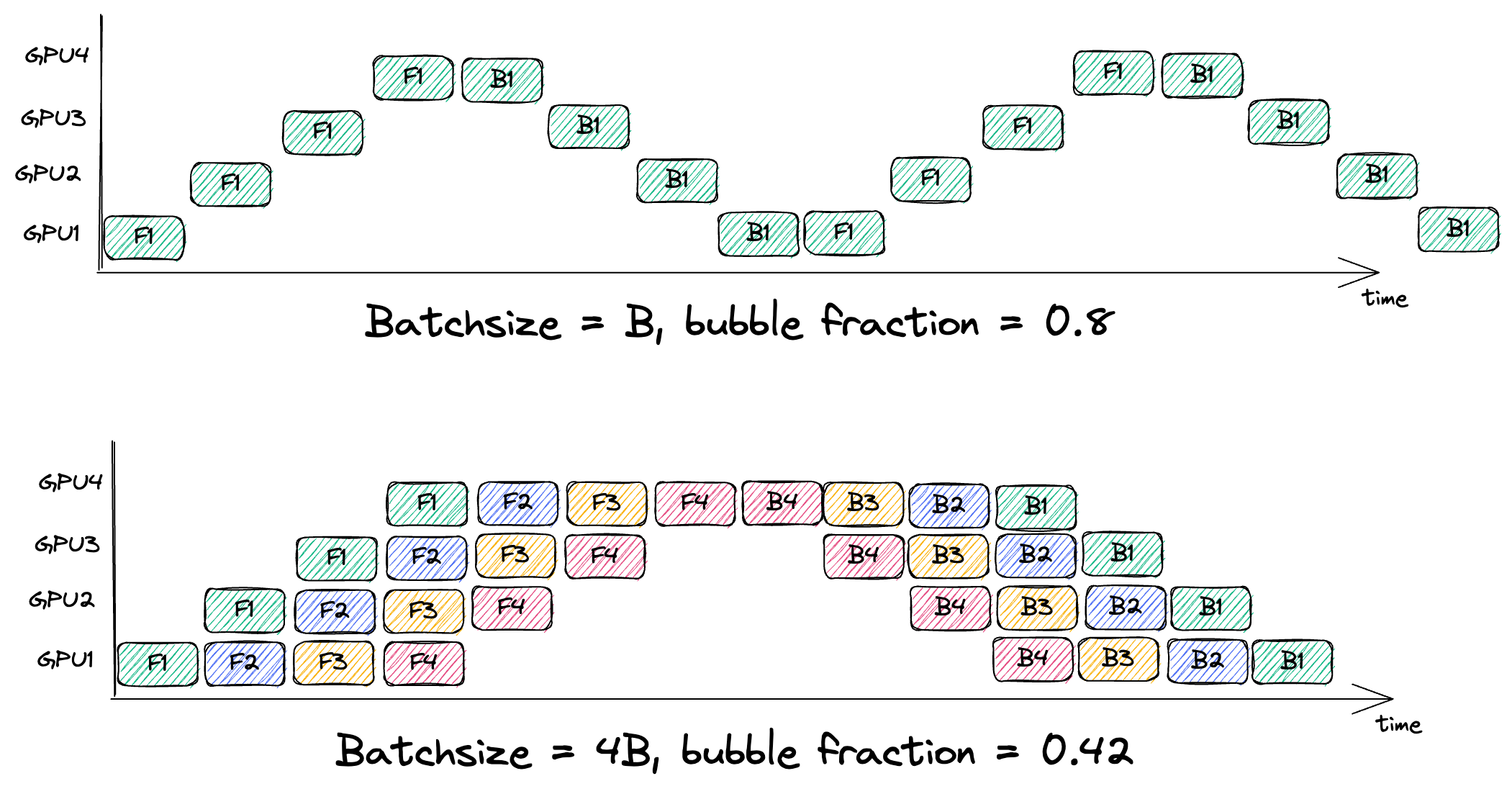
By splitting a large batch into many small micro-batches, we can keep the pipeline "full" for a longer period, maximizing the time when all GPUs are active.
Efficient Large-Scale Language Model Training on GPU Clusters Using Megatron-LM | Jared Casper
This video provides a concise animation of how micro-batches work to 'fill in' the idle time and improve GPU utilization.
Watch the segment from 11:26 to 12:55. The speaker presents a clear before-and-after visualization. First, you see the highly inefficient naive pipeline with large idle gaps. Then, the animation shows how splitting the batch into micro-batches fills those gaps, leading to a much smaller 'pipeline bubble' relative to the total work.
The key insight is that while the bubble's absolute size (in terms of micro-batch steps) is fixed by the number of pipeline stages, its relative impact decreases as we add more micro-batches and do more useful work.
3. Measuring the Pipeline Bubble
Now, let's quantify this inefficiency. As an AI Systems Engineer, you need to be able to model performance, not just observe it.
The fraction of time wasted in the bubble can be calculated with a simple formula. Let:
- = the number of pipeline stages (i.e., the number of GPUs in the pipeline).
- = the number of micro-batches.
The total time to process the batch is proportional to the time it takes to warm up the pipeline ( steps), process all micro-batches through the last stage ( steps), and drain the pipeline. However, a simpler way to think about it is that the total wall-clock time is dominated by the first GPU, which processes all micro-batches, plus the time for the last micro-batch to travel through the remaining stages. This gives a total time proportional to .
The total idle time across all GPUs is equivalent to the warm-up and cool-down phases, which sum to a "hole" of size in a grid of GPUs. But a more direct way to get the bubble fraction is to consider the ratio of wasted time to total time. The wasted time is proportional to .
The bubble fraction (the proportion of total runtime spent idle) is:
Let's examine this with an example. Suppose we have a 4-stage pipeline ().
- If we use only 4 micro-batches ():
Bubble Fraction = . A huge amount of time is wasted. - If we increase to 32 micro-batches ():
Bubble Fraction = . A significant improvement.
This formula is a powerful tool for system design. It tells you that for a deep pipeline (large ), you need a very large number of micro-batches (large ) to maintain high efficiency.
4. Visualizing Bubbles in the Wild
The block diagrams we've used are idealizations. In a real LLM, the time to process a chunk of tokens isn't constant. Specifically, in a transformer's self-attention mechanism, the computation for each new token depends on all previous tokens in the sequence. This means processing tokens 1000-2000 takes longer than processing tokens 0-1000.
This non-uniform compute cost complicates our perfect, regular pipeline schedule and can create new, unexpected bubbles.
Pipeline Parallelism in SGLang: Scaling to Million-Token Contexts
Let's look at what a real pipeline profile looks like. This blog post from the SGLang team dives deep into optimizing pipeline parallelism for very long sequences and provides actual profiling screenshots.
First, read the section '3. Advanced Option: Dynamic chunking'. The text explains why fixed-size chunks lead to bubbles: 'the per-chunk processing time increases non-linearly'. Then, carefully examine 'Fig. 2: Profile result of the PP rank 7 with fixed chunked prefill size'. This is a real profiler trace. You can see the compute blocks (colored) and the idle time (white space) forming bubbles due to this non-uniformity. Finally, look at 'Fig. 6: Profile result of the PP rank 3 with dynamic chunking' at the end of the article to see how an advanced scheduling technique (dynamic chunking) can nearly eliminate these bubbles, resulting in a much more 'saturated' execution.
The SGLang article gives you a view into the real-world complexity of system optimization. The idealized bubble from our formula is just the beginning. The second-order effects, like the non-linear cost of attention, create additional inefficiencies that engineers must identify and solve. The difference between Fig. 2 (the problem) and Fig. 6 (the solution) is a perfect example of what an AI Systems Engineer does: analyze a performance visualization, diagnose the root cause, and implement a sophisticated fix.
Conclusion
In this lesson, we transitioned from a theoretical understanding of the pipeline bubble to a concrete, visual, and quantitative one. You now have the mental model to look at a pipeline execution timeline and immediately identify and measure its primary source of inefficiency.
Key Takeaways:
- Timeline visualization is a critical tool for understanding distributed system performance, showing GPU activity versus idle time.
- The pipeline bubble is the idle time caused by data dependencies during the pipeline's warm-up and cool-down phases. It appears as empty space at the beginning and end of a batch's execution on a timeline.
- The bubble's impact can be measured with the formula , highlighting the need for many micro-batches () relative to the number of stages ().
- In real-world transformers, non-uniform compute costs (e.g., in attention) can create additional bubbles not predicted by the simple model, requiring advanced scheduling techniques like dynamic chunking to mitigate.
Preview of the Next Lesson:
We have established that pipeline parallelism is a powerful technique for distributing a model across GPUs, but it comes with a utilization cost—the bubble. We also know from previous lessons that tensor parallelism is another option. In our next lesson, we will analyze the communication overhead of these two strategies. You will learn to compare the costly all-reduce operations of tensor parallelism with the point-to-point sends of pipeline parallelism to understand the trade-offs between compute utilization and network communication bandwidth.