
Hello again. You now have two visuals on your healthcare report page: a bar chart for comparing categories and a line chart for tracking a measure over time. At the moment, they show the whole dataset. This lesson makes the page useful for investigation: the report viewer will be able to choose a category, such as a facility, admission type, or department, and immediately see the relevant subset of the data.
You will create a slicer, test its filtering behavior, and use Edit interactions to decide exactly which visuals respond to it. By the end, you will have an interactive report page rather than two disconnected charts.
A slicer is a visible, user-controlled filter
A slicer is a visual placed on the report canvas that lets the report user choose values to filter other visuals. Unlike the Filters pane, a slicer is deliberately part of the report design: it makes an important filtering choice visible and easy to use.
For this page, choose a field that gives a meaningful way to investigate the data. Good candidates include:
Facility,Hospital, orClinicAdmission TypeDepartmentRegionDiagnosis Group, if your data has a manageable number of groups
Avoid using a field with hundreds or thousands of values, such as patient name, patient ID, or encounter ID. A slicer should support a real analytical decision, not become a long list to search through.
Suppose the page contains:
- Average Wait Time by Department as a bar chart
- Average Wait Time by Admission Date as a line chart
- Facility as a slicer
When a viewer selects North Clinic in the slicer, both charts can recalculate using only North Clinic’s records. The bar chart now compares departments within that facility, while the line chart shows that facility’s trend over time.
Read Microsoft Learn’s “Slicer visual in Power BI.” Focus first on the basic creation process, then on the choice between a list and a dropdown.
Slicer visual in Power BI - Power BI | Microsoft Learn
Microsoft Learn’s guide explains how a slicer is added, populated with a field, and used to filter report visuals. It also gives practical guidance on display styles.
In the “Create a slicer” section, read the creation steps. Notice that the slicer displays the distinct values of the field you add, and that selecting a value filters the other visuals on the page. Then move to “Slicer settings” and the “Dropdown” subsection. Read the dropdown explanation. Compare its space-saving purpose with a vertical list, which is useful when readers should see all available choices immediately.
A brief demonstration of the workflow may help before you build your own slicer.
Power BI Slicers - A Step-by-Step Tutorial for All Types to Improve Data Analysis
In “Power BI Slicers,” Leila Gharani demonstrates the basic slicer workflow and shows where to configure selection behavior and appearance.
Watch creating a slicer. Focus on the sequence: insert the slicer, add a category field, choose its layout, and find the Selection settings. The button-style formatting shown is optional; for your first healthcare report, a vertical list or dropdown is usually clearer.
Build a category slicer for your report
Return to Report view in the .pbix file containing your bar and line charts.
1. Choose the filtering field
Use a categorical field that is meaningful but does not simply duplicate the purpose of a chart already on the page. For example, if your bar chart already compares departments, a Facility or Admission Type slicer will usually be more informative.
If Department is your only suitable field, it is still fine to use it for practice. Just recognize the consequence: after choosing one department, a bar chart of wait time by department will show only that department. That is correct filtering behavior, but it reduces the comparison value of that particular chart.
2. Insert the slicer
- Click an empty area of the report canvas so that no existing visual is selected.
- In the Visualizations pane, select the Slicer icon.
- A blank slicer appears on the canvas.
- In the Data pane, drag your chosen field, such as
Facility, into the slicer’s field well. - Resize the slicer so its values are readable.
Power BI displays the distinct values of the field. If you use a field such as Facility, you might see choices such as Central Hospital, North Clinic, and West Clinic.
Place the slicer near the top or left side of the page. Readers generally look there first for controls that affect the report.
3. Test the default filtering behavior
Select one value in the slicer.
Watch both existing charts:
- The bar chart should recalculate for the selected category.
- The line chart should recalculate for the selected category.
- Hover over a bar or line point and verify that the tooltip reflects the filtered subset.
To select multiple values in a standard list slicer, hold Ctrl while selecting additional items. Select a selected item again to remove it from the selection.
Before continuing, return to the unfiltered view. Depending on your slicer’s appearance, you can use its clear-selection icon if available, or deselect the selected item.
4. Choose a useful slicer style
The default slicer can be changed in Format visual:
- Select the slicer.
- Open Format visual.
- Expand Visual and then Slicer settings.
- Under Options, choose the most suitable Style.
Use this simple rule:
| Situation | Recommended style | Why |
|---|---|---|
| A few values, such as 3–8 facilities | Vertical list | Readers can see every option without opening a menu. |
| Many values, such as dozens of departments | Dropdown | Saves report space and can support search. |
| Short, clear categories | Tile | Can make a compact row of filter buttons. |
| Numeric or date range | Between | Lets users choose a range rather than individual categories. |
For the current report, use a vertical list if you have a small number of facilities or admission types. Use a dropdown if the list is long.
You can also control whether the user may choose more than one value:
- Leave Single select off when comparing several facilities or admission types could be useful.
- Turn Single select on when the report is intended to focus on exactly one unit at a time.
Do not enable single selection merely because it is available. It is a reporting decision: use it only when multiple selections would make the visual interpretation unclear.
Understand visual interactions
A slicer is one type of visual interaction. Power BI visuals can affect one another when a user selects data in them.
There are three main interaction behaviors:
| Behavior | What the target visual does | Typical use |
|---|---|---|
| Filter | Recalculates using only the selected subset of data | A slicer limits a line chart to one facility. |
| Highlight | Keeps the broader visual visible but emphasizes the selected portion | Selecting a department bar highlights its contribution in another compatible chart. |
| None | Does not respond to the selection | A benchmark chart remains fixed while other visuals filter. |
A key idea is that interactions are directional. You first select the source visual, then choose how each other visual should react.
For example:
- Select the Facility slicer first to control what the slicer does to the bar chart and line chart.
- Select the bar chart first to control what a clicked bar does to the line chart and slicer.
Changing the interaction while the wrong visual is selected is one of the most common beginner mistakes.
Power BI does not offer every interaction type for every visual. In particular, line charts can be cross-filtered but cannot be cross-highlighted. For the slicer you are creating, Filter and None are the decisions that matter most.
Configure the slicer’s visual interactions
By default, Power BI generally sets visuals on a page to filter or highlight one another in sensible ways. However, “default” is not the same as “intended.” Check the behavior deliberately.
Read Microsoft Learn’s “Change how visuals interact in a Power BI report.” This is the reference for the interaction controls you are about to use.
Change how visuals interact in a Power BI report
Microsoft Learn explains the difference between cross-filtering and cross-highlighting, then shows how to open and configure the interaction controls in Power BI Desktop.
Begin with the article’s explanation of visual interactions. In “Visual interactions in Power BI reports,” read the defaults and scope; note that these settings apply on a report-page basis. Next, in “Enable the visual interaction controls,” locate the Power BI Desktop instruction to use Format > Edit interactions. Read the on-canvas controls explanation. Finally, read the “Change the interaction behavior” section, especially directional setup. Keep the source-visual-first rule in mind.
Now configure your report.
1. Enter Edit interactions mode
- Select your slicer. Ensure it has a border around it.
- On the Power BI Desktop ribbon, select Format.
- Select Edit interactions.
Interaction icons appear near the upper-right area of the other visuals on the page.
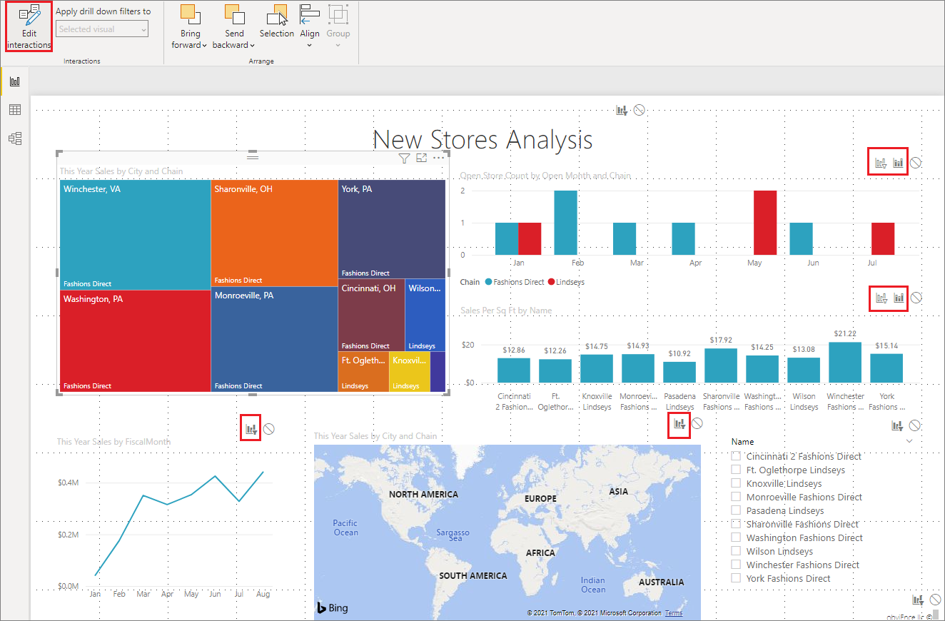
The selected slicer is the source. The icons shown beside the bar chart and line chart describe their response to that slicer.
2. Make the slicer filter both charts
For your initial design:
- Find the interaction icons beside the bar chart.
- Select the Filter icon.
- Find the icons beside the line chart.
- Select the Filter icon.
- Click Edit interactions again, or click a blank part of the canvas, to leave interaction-editing mode.
Your page now has a clear and consistent behavior: selecting a slicer value filters both the category comparison and the time trend.
3. Test it as a report reader would
Select one slicer value, such as a facility or admission type, and confirm all of the following:
- The bar chart changes.
- The line chart changes.
- Tooltips show values that fit the selected category.
- The selected slicer value is obvious.
- Clearing the slicer restores the full-report view.
This test matters because a visual can appear to respond while actually showing nearly identical values. Compare at least one tooltip before and after applying the slicer.
When a visual should not be filtered
Not every visual should necessarily respond to every slicer. A useful design pattern is a context visual: one chart remains unchanged so the reader can compare the filtered subgroup with the overall organization.
For example, imagine these two visuals:
- A line chart of average wait time that filters to the selected facility.
- A bar chart showing average wait time by department for all facilities.
The fixed bar chart provides a stable organization-wide reference. A reader can ask whether the selected facility’s trend is occurring in a department that is generally high-wait or whether it differs from the broader baseline.
To create this design:
- Select the slicer.
- Choose Format > Edit interactions.
- On the chart you want to preserve as context, select None.
- Leave Filter selected for the chart that should respond.
- Exit Edit interactions mode and test a slicer selection.
If you choose this approach, make the title honest. A title such as Average Wait Time by Department — All Facilities tells the reader that the chart deliberately remains unfiltered.
Use this exception sparingly. If a page contains many visuals that ignore a slicer, readers may assume the report is broken. A good report makes its filtering logic predictable.
A short troubleshooting routine
If selecting a slicer value does not change a chart, work through these checks in order:
- Check the selection. Confirm that an actual slicer item is selected, rather than merely clicking the slicer visual.
- Check the source. Select the slicer before entering Edit interactions.
- Check the target icon. The chart should show Filter, not None.
- Check the field choice. A slicer based on a field unrelated to the chart’s data may produce no meaningful change.
- Check the values. Select a noticeably different category and compare a tooltip. A small or identical change may be a real characteristic of the data, not a technical failure.
- Look for blanks. A
(Blank)slicer value often indicates missing source data. Do not silently treat it as a real facility or department; you will address missing-value rules during the Power Query module.
For now, keep the page simple: one well-chosen category slicer, a bar chart, and a line chart. A small number of purposeful controls is easier to understand than a canvas crowded with filters.
Key takeaways
A slicer makes an important filter choice visible on the report page. To use one effectively:
- Add a Slicer visual and populate it with a meaningful category such as facility, admission type, or department.
- Use a vertical list for a small set of visible choices and a dropdown when space is limited or there are many values.
- Test the report by selecting values and checking how each visual changes.
- Use Format > Edit interactions to control how the selected source visual affects each target visual.
- Choose Filter for visuals that should recalculate, and None only when a stable context visual is intentionally needed.
- Give any intentionally unfiltered visual a title that makes its scope clear.
Next, you will format this one-page healthcare report so that titles, labels, colors, and number formats are consistent and easy to interpret.
Can't find a good explanation? Sign up and we'll make it for you
Sign up