
Hello. In the previous lesson, you built a clustered bar chart to compare a healthcare measure across categories, such as average wait time by department. A bar chart is a snapshot: it shows differences among groups. A line chart answers the complementary question: how is a measure changing over time?
In this lesson, you will create a line chart using a date field and a healthcare measure. You will also learn why the date column, aggregation, and X-axis setting determine whether the trend is trustworthy. By the end, you should be able to build and check a chart such as Average Wait Time by Admission Date or Patient Encounters by Date.
From a comparison question to a trend question
Use a line chart when the order of observations matters and that order represents time. It is well suited to questions such as:
- How did average patient wait time change each day?
- Are encounter volumes rising or falling by week?
- When did average length of stay peak during the month?
- Is there a recurring pattern in admissions over time?
A line is meaningful because it connects values in chronological order. The X-axis holds time; the Y-axis holds the measure calculated for each time period.
For this first chart, keep the question focused:
How did average wait time change by admission date?
The field roles are:
| Line-chart role | Example healthcare field | Meaning |
|---|---|---|
| X-axis | Admission Date or Visit Date | Places each calculation in time order |
| Y-axis | Wait Time | Supplies the numeric value to summarize |
| Aggregation | Average | Shows typical wait time for records on each date |
If your dataset has a field such as Patient Count, you might instead build Total Patient Count by Date. The correct summary always depends on what one row represents and what you are trying to communicate.
Before building, make sure your time column is genuinely a Date or Date/Time field, not text that merely looks like a date. In the Data pane, date fields usually have a calendar icon. A text value such as Jan, Feb, or March may sort alphabetically instead of chronologically. You will handle data types systematically in the Power Query module; for now, choose the most clearly date-like field in your imported workbook.
See the essential Power BI pattern
Read Microsoft Learn’s “Line Charts in Power BI” for the basic build process and the distinction between categorical and continuous time axes. These are the two decisions that most affect a beginner line chart.
Line Charts in Power BI - Power BI | Microsoft Learn
In Microsoft Learn's guide, focus on the minimal field placement first, then on how Power BI spaces dates along the X-axis.
In the “Create a line chart” section, read the construction steps. Translate their sales example into your healthcare date and measure. Then, in “Configure axis options”, read the axis explanation. Focus on why dates can be shown as equally spaced categories or proportionally spaced points in time.
A short visual demonstration can make the drag-and-drop workflow feel more concrete.
Power BI Tutorial for Beginners (2025)
Watch Kevin Stratvert’s “Power BI Tutorial for Beginners (2025)” for a quick demonstration of placing a date on the X-axis and a numeric field on the Y-axis.
Watch the line-chart build. Notice the blank visual placeholder, the field wells, and the date hierarchy controls that appear after the visual is populated.
Build a single-series healthcare trend chart
Return to Report view in the Power BI Desktop file that contains your de-identified healthcare workbook.
1. Insert a line chart
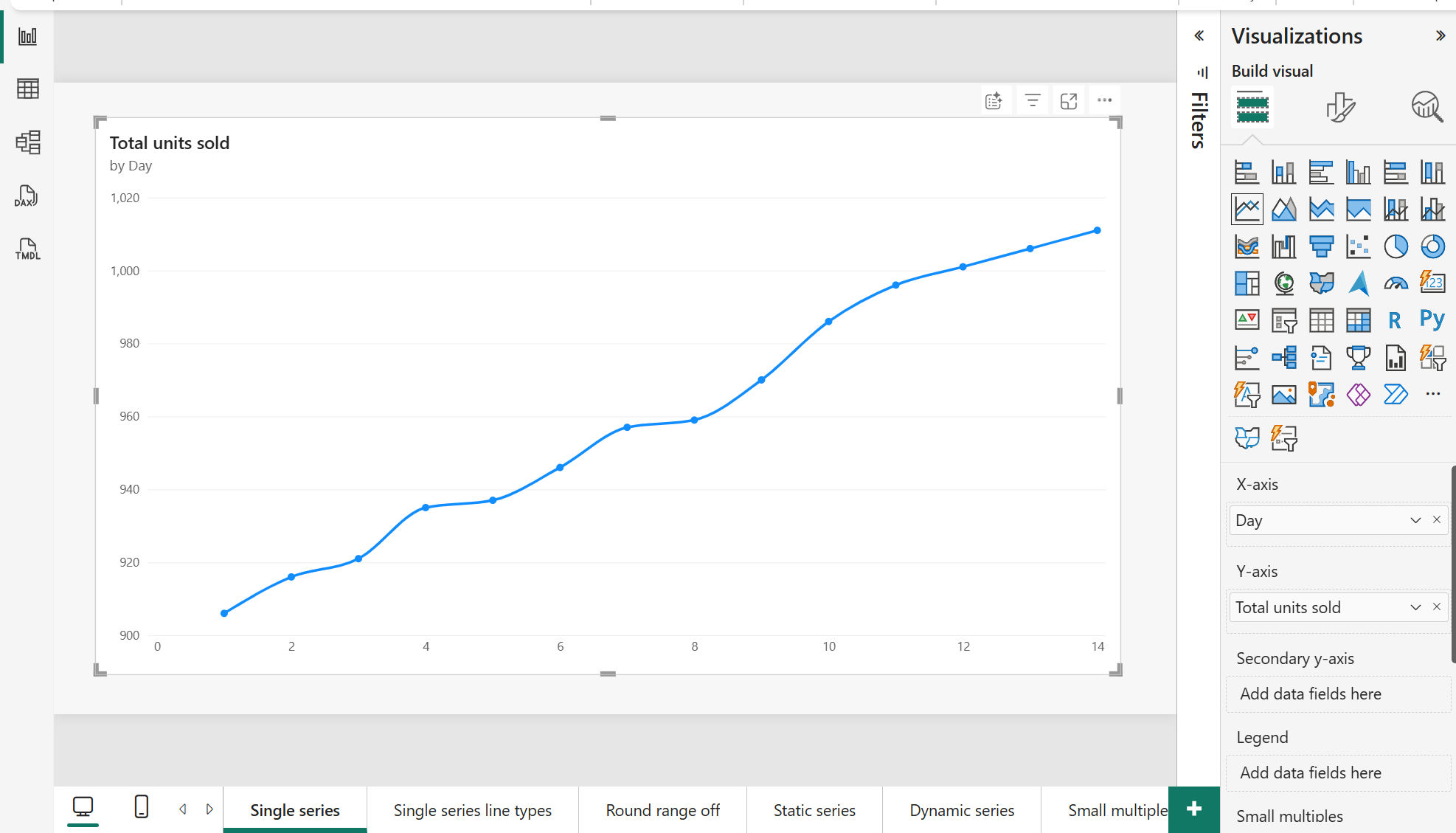
In the Visualizations pane, select the Line chart icon. A blank placeholder appears on the canvas.
Click the placeholder so it is selected. The Build visual pane should display field wells such as:
- X-axis
- Y-axis
- Secondary y-axis
- Legend
For this first trend, use only the X-axis and Y-axis. A single line is easier to interpret while you establish that the time field and calculation are correct.
2. Put your date on the X-axis
In the Data pane, find a date field. It may be named Admission Date, Visit Date, Encounter Date, Discharge Date, or something similar.
Drag it to the X-axis field well.
Power BI may place the field as a Date hierarchy, with levels such as Year, Quarter, Month, and Day. This can be useful for exploring data at several time levels. However, it can also cause confusion if the chart begins at the Year level while you expected daily values.
For a daily trend, aim to show either:
- the individual Date field, or
- the Day level of the date hierarchy.
Use the dropdown beside the date field in the X-axis well to switch between Date Hierarchy and the plain Date field if needed. If you keep the hierarchy, the drill controls in the visual header let you move from Year to Quarter, Month, and Day.
Do not use a patient ID, department name, or month-name text field as the X-axis for this task. The visual may still draw a line, but it would not represent a valid time trend.
3. Add the healthcare measure to the Y-axis
Drag your numeric field to the Y-axis field well.
For the main example, drag Wait Time to the Y-axis. Power BI will create a point for every date and connect those points with a line.
Now inspect the aggregation shown beside the field name in the Y-axis well. Power BI often defaults to Sum, which is not automatically wrong, but it changes the question.
For Wait Time, choose Average:
- Select the dropdown beside
Wait Timein the Y-axis field well. - Choose Average.
- Confirm that the chart or tooltip refers to Average of Wait Time.
The resulting visual means:
For each date, Power BI calculates the average wait time across the healthcare records dated that day.
This is distinct from total wait time. A high total could result from many visits rather than unusually long waits, whereas the average more directly reflects the typical recorded wait for that date.
Use this guide when selecting an aggregation:
| Numeric field | Common aggregation | Example chart meaning |
|---|---|---|
Wait Time | Average | Typical wait time by date |
Length of Stay | Average | Typical length of stay by date |
Patient Count | Sum | Total reported patients by date |
| One row per encounter | Count of an encounter field | Number of encounter records by date |
If the same patient appears in several encounters, a count of rows is a count of encounters, not necessarily a count of unique patients. You will later create explicit DAX measures to make such definitions more reliable and reusable. For now, read the aggregation name carefully and make sure it matches your intended question.
4. Give the visual a precise title
Select the chart and open Format visual in the Visualizations pane. Find the Title card, turn it on if necessary, and write a title that says both what is measured and over what time field.
Examples:
- Average Wait Time by Admission Date
- Patient Encounters by Visit Date
- Average Length of Stay by Discharge Date
Avoid vague titles such as “Trend” or “Healthcare Data.” A reader should understand the chart without examining its field wells.
Make the time axis tell the truth
A line chart is persuasive because people quickly perceive upward and downward movement. That makes the X-axis especially important.
Continuous versus categorical dates
Power BI can display a date axis in two main ways:
| X-axis type | How dates are spaced | Best use |
|---|---|---|
| Continuous | Spaced according to actual elapsed time | A real timeline, especially when dates may be missing or irregular |
| Categorical | Each displayed date gets equal spacing | A small set of reporting periods or discrete labels |
For daily healthcare data, Continuous is usually the clearest starting point because it represents the calendar accurately. For example, a gap between Friday and Monday occupies more horizontal space than a gap between Monday and Tuesday.
To check this setting:
- Select the line chart.
- Open Format visual.
- Expand X-axis.
- Find Type and choose Continuous when that option is available.
Power BI only offers this choice when the X-axis contains a numeric or date field. If you cannot see it, check whether you selected a date hierarchy rather than the plain date field, or whether the source column is still typed as text.
Dates, gaps, and zero values
Consider a chart with dates on 1 June, 2 June, and 5 June. If no records exist for 3 and 4 June, the absence of points does not automatically mean zero patients or zero wait time. It might mean:
- the clinic was closed,
- no data was loaded,
- the source system missed records, or
- there truly were no encounters.
For now, treat gaps as a prompt to investigate rather than as proof of zero activity. Later, you will create a proper date table so your model can represent every calendar date consistently.
Interpret the slope cautiously
A rising line tells you the displayed value increased between periods. It does not, by itself, explain why.
For example, an increase in average wait time could reflect higher demand, staffing changes, a changed triage process, or a small number of unusually long visits. Your line chart identifies when a change appears; further analysis is needed to understand its cause.
Also look at the Y-axis scale before interpreting the severity of a movement. A chart ranging from 29 to 32 minutes can make a three-minute change look visually dramatic. This may be useful for monitoring, but the axis must be visible so the reader can judge the actual size of the change.
Validate the chart before relying on it
Use this quick check after building the visual:
- Correct time field: The X-axis uses an actual healthcare date, such as Admission Date, rather than a text month label or an ID.
- Chronological order: Dates move from earlier to later as you read left to right.
- Correct calculation: The Y-axis says Average of Wait Time, Sum of Patient Count, or another aggregation that matches your question.
- Plausible values: Average wait time should normally be in a realistic range for the units used in your source, such as minutes. Very large values often indicate an unintended sum.
- One point per period: Hover over several points. Confirm the date and value shown in the tooltip.
- Understandable title: The title states the measure and time field clearly.
- No over-formatting: Leave data labels off if the chart has many dates. Labels on every point usually create clutter; tooltips are enough at this stage.
Markers can be useful when the chart has a modest number of daily, weekly, or monthly points. In Format visual, open Markers and turn them on if they help readers see the individual observations. If your chart has many hundreds of points, a clean line without markers will usually be more readable.
For this report page, place the new line chart near your bar chart. You now have two complementary views:
- the bar chart compares departments or other categories;
- the line chart shows change over time.
Save the .pbix file once both visuals are visible.
Key takeaways
A Power BI line chart converts a time-based question into a visual trend:
- Use a real date field on the X-axis.
- Put the healthcare numeric field on the Y-axis and deliberately choose its aggregation.
- For most daily trends, prefer a continuous date axis when available.
- Treat missing dates and sharp movements as things to investigate, not automatic explanations.
- Check the tooltip, axis scale, and title before trusting the story suggested by the line.
Next, you will add a slicer and control visual interactions, so a user can filter both charts to investigate a department, facility, admission type, or other healthcare category.
Can't find a good explanation? Sign up and we'll make it for you
Sign up