
Hello again. Your report now has the essential ingredients: a category comparison, a time trend, and a slicer that filters both. This final lesson in the first module turns those working visuals into a coherent one-page healthcare report.
Formatting is not decoration added after analysis. It tells the reader what matters, what can be compared, and how to interpret a number without stopping to decode the chart. By the end, you will have consistent report and visual titles, readable labels, a restrained color system, and sensible number formats.
Start with a small visual system
A report page should look as though its elements belong together. For your current page, that does not require elaborate backgrounds, many colors, or decorative shapes. It requires a few repeated choices:
- one font style and text color for titles
- one primary color for the healthcare measure
- one light, quiet page background
- equal spacing and aligned visuals
- consistent treatment of the same metric everywhere
Before changing individual visuals, take a moment to see where Power BI places its formatting controls.
Get Started Formatting Report Visualizations - Power BI
Read Microsoft Learn’s “Get started formatting report visualizations” to become comfortable with the Format visual pane and the basic process for changing visual colors.
In the opening overview, note that you must select a visual before its formatting options appear. Read the formatting overview. Then read the complete section “Change colors in a visual,” starting with its numbered steps. In the color tips, pay particular attention to the color controls, including More colors and Reset to default.
In recent versions of Power BI Desktop, select a visual and choose Format visual in the Visualizations pane. The formatting area has two important tabs:
| Tab | Use it mainly for |
|---|---|
| Visual | Colors, axes, data labels, legends, and slicer appearance |
| General | Title, visual size, position, effects, and per-visual data format |
The exact cards vary by visual. For example, a bar chart may show Columns or Bars, whereas a line chart may show Lines. This is normal: look for the element you want to change rather than expecting every chart to have identical settings.
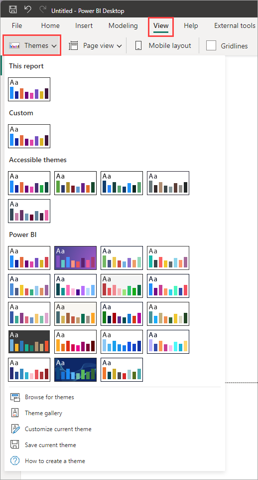
A report theme is an efficient starting point because it supplies coordinated default colors and fonts across the page. Open View on the ribbon and select Themes. For this first report, choose either the default theme or one of the built-in accessible themes, then stop there. Applying a theme before extensive manual formatting makes later choices more consistent.
Use this restrained palette for your healthcare report:
| Element | Suggested treatment | Purpose |
|---|---|---|
| Page background | White or very light gray | Keeps attention on the data |
| Main titles | Dark gray or near-black | Provides clear hierarchy |
| Bar and line for the same measure | The same blue or teal | Signals that both charts show one measure from different perspectives |
| Secondary text and gridlines | Soft gray | Supports reading without competing with data |
| Alert colors | Reserve red, amber, and green for meaningful status | Prevents color from becoming visual noise |
Do not give every department bar a different color merely because Power BI allows it. When the purpose is comparing values across departments, a common bar color makes the differences in height easier to see. Distinct category colors are more useful when categories must be tracked across several visuals.
Arrange the page before polishing the charts
Your page currently contains a slicer, a bar chart, and a line chart. A simple, reliable layout is:
- A page title and short instruction at the top.
- The slicer directly below the title or in the upper-right corner.
- The bar chart and line chart aligned beneath the controls.
- Equal outer margins and a consistent gap between the two charts.
Turn on View > Gridlines temporarily if that helps you position objects. Then resize the bar chart and line chart so they have similar visual weight. If both charts are intended to be side by side, give them the same height and align their top edges.
For precise adjustments, select a visual and open Format visual > General > Properties. You can set its height, width, and position numerically. You can also select more than one visual with Ctrl-click, then use the ribbon’s alignment and distribution options to line them up.
Power BI Tutorial for Beginners (Step-by-Step in 30 Minutes)
Watch Guy in a Cube’s “Power BI Tutorial for Beginners (Step-by-Step in 30 Minutes)” for a compact demonstration of report-design thinking and display-format choices.
Watch design logic first. Focus on the advice to start with the decisions a reader needs to make, keep related visuals together, and avoid crowding the page. Then watch formatting demo. Notice the distinction between changing a number’s display units and changing its decimal places; you do not need to add the card visuals shown in the demonstration.
Add a page title
Insert a Text box from the Insert ribbon and place it at the top-left of the canvas. Use a clear, descriptive page title such as:
Healthcare Operations Overview
Below it, add one smaller line of supporting text, such as:
Compare average wait time by department and track the trend over time.
Use only information that is true for your own report. If your line chart tracks admissions rather than wait time, revise the subtitle accordingly.
Treat the page title as the main heading. It should be larger and bolder than any chart title. A reasonable beginner rule is:
- Page title: approximately 22–28 pt, bold
- Chart titles: approximately 14–16 pt, bold or semibold
- Axis labels, slicer text, and supporting text: approximately 10–12 pt
Avoid placing a border, shadow, or colored rectangle around every object. White space and alignment do more for readability than decoration.
Make titles and labels answer the reader’s first question
Every chart title should answer: what measure is shown, and how is it organized?
Generic titles such as Bar Chart 1, Department Analysis, or Trend force the reader to inspect axes before they understand the visual. Replace them with titles built from this pattern:
[Measure] by [category or time field]
For example:
| Visual | Weak title | Stronger title |
|---|---|---|
| Bar chart | Wait Time | Average Wait Time by Department |
| Line chart | Admissions Trend | Patient Admissions by Admission Date |
| Slicer | Facility | Filter by Facility |
To change a visual title:
- Select the visual.
- Open Format visual.
- Select the General tab.
- Expand Title.
- Turn the title on if necessary, then enter your text.
- Use the same font family, dark text color, and title size for both charts.
The General tab also holds the controls for sizing, positioning, visual effects, and display formatting.
Format pane General tab overview - Power BI | Microsoft Learn
Read Microsoft Learn’s “Format pane General tab overview” as a reference while you set chart titles, align your visuals, and format values without changing the underlying data.
Begin with the introduction and the “Open the General tab” section. Read the General-tab setup. Then read the full “Properties,” “Title,” “Effects,” and “Data format” descriptions. Focus on the distinction between visual properties such as title and position, and Data format, which changes how a value displays in this one visual.
Format axes and labels deliberately
Titles tell the reader the message; axes provide the measurement details. Keep axes readable but do not repeat information unnecessarily.
For the bar chart:
- Keep category labels readable. If department names are long, make the chart wider before reducing label font size.
- Ensure the value axis reveals units. For example, use Average Wait Time (minutes) if wait time is measured in minutes.
- Start the value axis at zero for a bar or column chart unless there is a compelling analytical reason not to. A truncated axis can exaggerate small differences.
- Use data labels only when there are few categories and the labels will not overlap.
For the line chart:
- Use a title such as Average Wait Time by Admission Date.
- Keep the date axis labels concise. Power BI may automatically group dates; that is acceptable for now if the trend remains understandable.
- Do not automatically enable labels on every point. On a busy line chart, labels compete with the line itself. Tooltips provide precise values when the reader hovers.
If you intentionally made a visual ignore the slicer in the previous lesson, make that scope explicit. For example:
Average Wait Time by Department — All Facilities
Otherwise, readers may incorrectly assume that every chart responds to the visible filter.
Apply color consistently
Next, set the color of the data marks. Select your bar chart, open Format visual > Visual, then expand the card named Columns, Bars, or Colors. Set the default color to your chosen blue or teal.
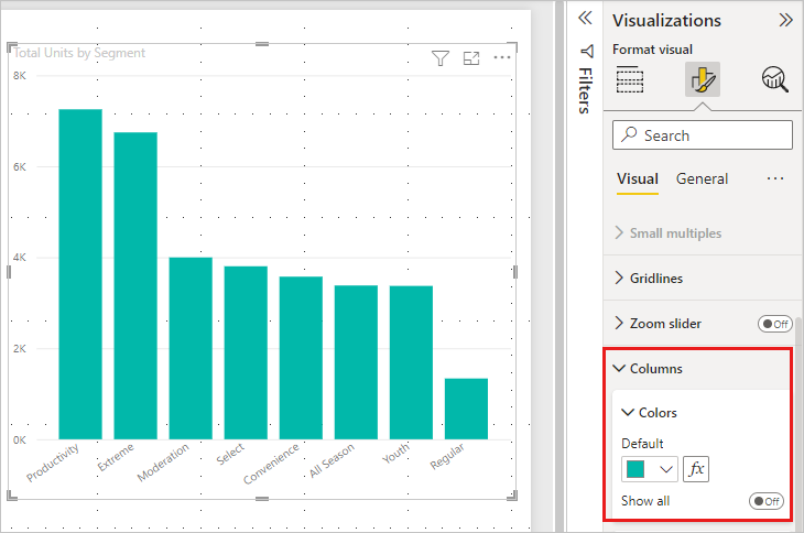
Repeat the process for the line chart, choosing the same main color if it displays the same healthcare measure. This creates a useful visual promise: the reader sees that the bar chart and line chart are two views of the same metric.
Use Show all only when you have a specific reason to format individual data points differently. For example, later you might use it to emphasize a target breach. At this stage, use a shared default color and keep the report easy to scan.
For the slicer:
- Give it a clear title, such as Filter by Facility.
- Use a simple white or light background.
- Ensure selected values are visibly distinct from unselected values.
- Keep its text size consistent with other supporting text on the page.
If a format change makes the report worse, use Ctrl+Z, or select Reset to default within the relevant formatting card. Experimentation is useful, but consistency is the goal.
Format numbers without changing their meaning
A numeric format communicates meaning. The number 1250 is easier to interpret as 1,250 patients; 34.6667 is clearer as 34.7 minutes; and a rate stored as 0.924 should display as 92.4%, not as 0.924.
Use formats that fit the measure:
| Measure type | Suitable display | Typical decimal places |
|---|---|---|
| Patient, encounter, or admission count | 1,250 | 0 |
| Average wait time in minutes | 34.7 | 1 |
| Currency, such as cost | £1,250.00 or local currency | 2 |
| Percentage or rate | 92.4% | 1 |
| Date | A readable date or month-year | Depends on the chart |
For your current healthcare report, focus on the metric used in the bar and line chart. If it is Average Wait Time, use one decimal place in both visuals. If it is Patient Count, use zero decimal places and thousand separators in both.
There are two related formatting choices to check:
- The value format controls how the number itself appears, such as decimals, currency, percentage, or date.
- Display units controls axis abbreviation, such as showing
2Krather than2,000.
For an introductory report, avoid abbreviating a modest patient count if the full number fits comfortably. If your values are large, display units such as Thousands can make the axis easier to read, but ensure the axis title makes that clear.
To set a format for one visual, select it and use Format visual > General > Data format. Choose the field under Apply settings to, then select the required number, currency, percentage, or date format.
This is a visual-level override: it changes the presentation in that particular chart, not the stored data. Later, when you create formal DAX measures, you will usually set their number format at the model level so every visual begins with the correct format. For this report, inspect both charts manually and make sure the same measure does not appear as 34.7 in one visual and 35 in another.
Do not multiply or divide values merely to make them “look like” percentages or thousands. Formatting changes the display; calculations change the data. Keep those decisions separate.
Final one-page review
Before considering the page complete, clear the slicer selection and read the report as someone seeing it for the first time.
Check the following:
- The page title explains the report’s overall purpose.
- Each chart title states the measure and its grouping.
- The slicer title tells the reader what can be filtered.
- The two charts are aligned, with similar spacing and no overlaps.
- Related metrics use the same color.
- Text is readable at normal zoom.
- Axes and titles identify units where necessary.
- The same measure uses the same decimal precision in every visual.
- A slicer selection visibly changes both intended visuals.
- Any visual intentionally unaffected by the slicer says so in its title.
The result should be calm rather than crowded: one page, two purposeful charts, one clear control, and formatting that supports the healthcare question instead of competing with it.
Key takeaways
A professional Power BI page is built from consistent decisions, not from many formatting options:
- Use the Visual formatting tab for chart colors, axes, and labels; use General for titles, properties, and per-visual data formatting.
- Give the page a descriptive heading and give each visual a title that names its measure and grouping.
- Use one primary data color for the same metric across related visuals.
- Prefer alignment, equal sizing, and white space over heavy borders or decorative effects.
- Format counts, durations, currency, percentages, and dates so readers can interpret them immediately.
- Test the completed page with the slicer applied and cleared.
You have now completed a first interactive healthcare report in Power BI Desktop. Next, the course moves upstream to Power Query, where you will inspect source data for missing, invalid, and unusual values before building further analysis.
Can't find a good explanation? Sign up and we'll make it for you
Sign up