
Hello. In the previous lesson, you practised choosing the right measurement, matching units, and checking whether an answer made sense. Those habits transfer directly to charts and graphs: first identify exactly what each label and scale means, then select only the numbers needed for the calculation.
In this lesson, you will learn to read values accurately from tables, bar charts, and line graphs, and to show calculations that are clearly justified. These questions are rarely testing difficult arithmetic. They test whether you can avoid extracting the wrong number.
Plan for about minutes.
Start with the question, not the picture
A table, chart, or graph can contain far more information than you need. In an exam, begin by reading the question carefully and deciding what it asks you to find.
Look for command words:
| If the question says… | You will probably need to… |
|---|---|
| How many altogether? | Add selected values. |
| How many more / fewer? | Subtract one value from another. |
| What is the difference? | Subtract. |
| What is the average / mean? | Add all relevant values, then divide by how many values there are. |
| What percentage / proportion? | Divide the selected amount by the total, then multiply by . |
| Which is greatest / least? | Compare values; no calculation may be needed. |
Before calculating, check four things:
- Title: What is the data about?
- Labels: What does each axis, row, or column represent?
- Units: Are values people, pounds, miles, degrees, percentages, or something else?
- Scale: What does each marked interval represent?
A clear answer includes the calculation, relevant unit, and a short statement that answers the question. For example:
There were 14 more cars carrying three people than cars carrying one person.
The last sentence matters: it shows what the number means in context.
GED EXAM Learn and Understand Chart and Graph Questions
Watch “GED EXAM Learn and Understand Chart and Graph Questions” from TabletClass Math. Although it refers to the GED, the method of reading axes, extracting values, and then using basic calculations applies to most exam questions.
Watch the section on bar graphs, focusing on how the vertical scale supplies the values and how selected bars can be totalled for a percentage calculation. Then watch line graphs, where the presenter reads two points and subtracts them to find change over time. Pause whenever a value is read and check that you can trace it from the category to the scale yourself.
Bar charts: categories and frequencies
A bar chart compares separate categories. The horizontal axis usually names the categories, while the vertical axis gives the frequency or amount. In a frequency chart, “frequency” means the number of times something was observed.
Read the chart carefully:
| Number of people in a car | Frequency of cars |
|---|---|
Notice the distinction:
- The category “ people” tells us how many people were in each car in that group.
- The frequency tells us how many cars were in that group.
Example 1: finding a difference
Suppose the question asks: How many more cars had three people than one person?
Select the frequencies for the two requested categories:
So, 14 more cars had three people than one person.
We subtract because “how many more” asks for the gap between two frequencies.
Example 2: finding a total
Suppose the question asks: How many cars were observed altogether?
Here, every category is relevant, so add every frequency:
A total of 64 cars were observed.
A common trap: frequency is not always the total being asked for
Now consider a different question: How many people were observed in all the cars?
Adding the frequencies gives , but that is the number of cars, not the number of people. Each frequency must be multiplied by its category value:
So, 174 people were observed in total.
The wording determines the calculation:
- “How many cars?”: add the frequencies.
- “How many people?”: multiply each group size by its frequency, then add.
Example 3: percentage from a bar chart
Suppose we want the percentage of cars carrying at least four people. “At least four” includes both four and five people:
There are qualifying cars out of cars in total:
Rounded to one decimal place:
Therefore, approximately of the cars carried at least four people.
Line graphs: values changing over time
A line graph is commonly used when the categories have a natural order, particularly time: days, months, years, or ages. The plotted point gives the value at each category, and the line makes the overall pattern easier to see.
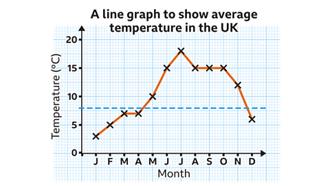
To read a point accurately:
- Find the required category on the horizontal axis.
- Move vertically to the plotted point.
- Move across to the vertical axis to read the value.
- Check the unit before writing your answer.
For example, the graph shows an average temperature of about in January and in July.
If asked, How much warmer was July than January?, subtract:
July was warmer than January.
The word “warmer” makes the subtraction meaningful. Writing only “15” would lose the unit and context.
Read the scale, not just the shape
A steep-looking line does not automatically mean a large numerical change. Graphs can be drawn with stretched or compressed axes. Always use the numbered scale.
The temperature graph also includes a dashed horizontal line at . This is a reference value. It helps you compare each month with without doing a separate calculation each time.
For instance, months whose points are above the dashed line have an average temperature greater than . This is a comparison question, so you may only need to count or identify months rather than calculate a new value.
Changes over time: subtraction order matters
If a quantity falls, subtract the later value from the earlier value.
From November to December, the temperature falls from to :
The average temperature decreased by .
For a question asking “how much did it change?”, give a positive amount and state whether it increased or decreased. A negative answer can be mathematically valid, but the sentence “decreased by ” is usually clearer in an exam response.
Tables: locate the correct row and column
Tables can feel more crowded than graphs because several types of information are shown at once. The key skill is to trace from the correct row heading to the correct column heading.
For example, a travel table might include:
- a person’s initials;
- their distance travelled;
- their transport method.
Do not scan randomly. Turn the question into a route through the table:
- Which person, month, place, or category? Find the correct row.
- Which measurement is needed? Find the correct column.
- Does the question require more than one row or column? Collect only those values.
[PDF] Travelling in the UK - Functional Maths practice - Skills Workshop
Read the opening survey table in “Travelling in the UK – Functional Maths Practice,” contributed by Nikki Gilbey via Skills Workshop. It provides useful practice in separating the information you need from information you do not need.
On page 1, read the Page 1 survey, including the staff table and the instructions below it. Stop before the “Using a distance chart” material on page 2. Trace one row at a time: identify the staff initials, then the distance, then the transport mode. Notice that a question about transport needs the final column, while a question about total distance needs the numerical middle column.
Worked table example
Using the survey table, suppose the question is:
What total distance was travelled by staff who travelled by car?
First, select only the rows labelled Car. Their distances are:
Then add:
Staff travelling by car covered a total of miles.
The justification is not just the addition. It is the choice of data: those four distances were selected because their transport mode was “Car.”
When tables contain percentages
Some tables give a total and a percentage, rather than the actual number in a category. In that case, extract both pieces of information before calculating.
For example, if a table states that a company has employees and work in sales:
So, 165 employees work in sales.
Do not mistake the percentage itself for a number of people. Percentages describe a share of a total.
A reliable exam method: select, calculate, justify, check
Use this routine for any data question.
1. Select
Write down the values you actually need. If useful, copy them into a small list before calculating.
For a question about the difference between two months:
For a percentage:
This step prevents a common error: including every value simply because it appears in the graph.
2. Calculate
Match the calculation to the question:
- total: add;
- difference: subtract;
- mean: total divided by number of values;
- percentage: selected amount divided by total, then multiplied by .
3. Justify
Show working and write a complete conclusion with the correct unit. A strong answer has this structure:
Therefore, a sentence that directly answers the question.
For example:
Therefore, approximately of cars carried at least four people.
4. Check
Ask whether your answer is reasonable:
- A difference should not be larger than the two values being compared.
- A percentage of a whole should normally be between and .
- A mean should usually lie between the smallest and largest values.
- Your final unit should match the graph or table: people, cars, miles, pounds, or degrees Celsius.
You can now extract relevant values from bar charts, line graphs, and tables; choose an appropriate calculation; and justify your answer with working, units, and context.
The central habit is simple: read what the number represents before using it. Next, you will bring these skills together to translate multi-step word problems into calculations and check whether final answers are reasonable.
Can't find a good explanation? Sign up and we'll make it for you
Sign up