
Hello! Welcome to your next lesson in advanced performance marketing.
In our last session, we focused on the principle of marginal ROI, establishing it as the key metric for deciding where to spend your next marketing dollar. We learned that the goal is to shift budget from channels with low marginal ROI to those with high marginal ROI, aiming for an equilibrium that maximizes your total return.
Today, we're going to zoom in on the primary tool that makes this analysis possible: the marketing response curve. These curves are the visual representation of a channel's performance and are the foundation from which marginal ROI is calculated.
Our learning outcome for this lesson is to interpret marketing response curves to identify channel saturation points and opportunities for growth. Mastering this will enable you to look at the output from a Marketing Mix Model (MMM) and instantly diagnose the health and potential of each channel in your portfolio, providing a solid, data-driven basis for your strategic budget decisions.
1. What is a Marketing Response Curve?
At its core, a marketing response curve is a graph that shows the relationship between the money you spend on a marketing channel (the input) and the business outcome you get from it (the output, like incremental sales or conversions). It's a visual depiction of the law of diminishing returns we discussed in the last lesson.
These curves are a key output of Marketing Mix Models (MMM). The model analyzes historical data to estimate how much incremental revenue was generated at different levels of spending for a single channel, assuming all other factors (like spending on other channels, seasonality, etc.) are held constant.
Incremental Outcome, ROI, mROI & Response Curves
To start, let's get a clear definition and a simple example. This document from Google's Meridian MMM project provides an excellent overview.
Please read the 'Marketing Example' and 'How Response Curves Are Generated' sections. Focus on how the curve visualizes the connection between spend and incremental outcome.
The key idea is that by plotting spend versus incremental outcome, you can see exactly how a channel responds to investment and, crucially, where it starts to lose efficiency.
2. The Anatomy of a Response Curve
A typical response curve isn't a straight line; its shape tells a story about the channel's performance. By understanding its key points, you can extract powerful strategic insights.
The most common and useful type of curve is the S-shaped curve, which captures the full lifecycle of channel investment. Let's break down its three critical points.
A typical S-shaped response curve, illustrating how sales respond to increasing marketing spend. The key strategic points—threshold, optimum, and saturation—are marked.
Crafting Media Guidelines with Response Curves in Market Mix Modeling
This article from Medium provides a fantastic breakdown of the key points on a response curve. As you read, think about a channel you manage and where its current spending might fall on a curve like this.
Please read from the beginning down to the section 'Understanding Media Response Curves'. Pay close attention to the definitions of the 'Threshold Point', 'Optimum Point', and 'Saturation Point'.
Let's solidify those definitions from a strategic perspective:
-
Threshold Point: This is the minimum spend required to generate a meaningful impact. Below this point, your investment is likely too small to overcome market noise.
- Strategic implication: If a channel is funded below its threshold, you face a choice: either increase the budget to a meaningful level or cut the channel entirely and reallocate those funds.
-
Optimum Point (Point of Maximum Efficiency): This is where the curve is steepest. At this point, your marginal ROI is highest. It's the "sweet spot" where each additional dollar you spend generates the largest possible return. Note: This is not the point of maximum sales, but maximum efficiency.
-
Saturation Point: This is where the curve begins to flatten significantly. Your marginal ROI is now very low (approaching 1 or even lower). Each additional dollar you spend generates very little, if any, additional return.
- Strategic implication: Spending beyond this point is inefficient. This is a strong signal to cap the budget for this channel and move funds to channels that are less saturated.
3. Common Shapes of Response Curves
While the S-curve is a great general model, different channels exhibit different behaviors. The shape of the curve itself provides clues about the channel's dynamics. The Medium article you just read also introduces these, but let's summarize them here:
- S-shaped Curve: As we saw, this is common for channels that require a certain level of initial investment to build awareness or critical mass before they become effective. Think of a new product launch or entering a new market.
- Concave Curve: This shape shows diminishing returns from the very first dollar spent. It's steep at the beginning and then flattens. This is typical for high-intent, direct-response channels like Branded Search. The first few dollars capture people already looking for you (high ROI), and as you spend more, you move to less relevant keywords and audiences, reducing efficiency.
- Linear Curve: This would imply a constant return on investment—every dollar spent produces the same return. This is highly unrealistic at scale and usually indicates a model might be misspecified or is only valid over a very narrow range of spending.
- Convex Curve: This curve starts slow and then gets steeper, implying increasing returns. This is rare but could happen in channels with strong network effects, where more spending dramatically increases the value for everyone (e.g., building an initial user base for a social app).
Understanding these shapes helps you set realistic expectations for a channel's performance and scalability.
Test your understanding!
Your analytics team presents you with response curves for three channels.
- Channel A is operating on the very steep, middle part of an S-shaped curve.
- Channel B is operating on the flat, top part of a concave curve.
- Channel C is operating on the very beginning, almost flat part of an S-shaped curve.
Based on this, where would you recommend investing your next $100,000 of incremental budget? And what recommendation would you have for Channel C's budget?
Show answer
- Incremental Budget: You should invest the next $100,000 in Channel A. It is on the steepest part of its curve, meaning it has the highest marginal ROI and the most room to grow efficiently.
- Channel B is saturated; investing more here would be wasteful.
- Channel C is currently underfunded and operating below its threshold. Investing a small amount might still yield no return. Your recommendation for Channel C should be to either commit a significantly larger budget to push it past the threshold into the efficient part of the curve, or to defund it completely and reallocate the resources to Channel A.
4. From Interpretation to Strategy
Your role as a leader isn't just to interpret these curves but to use them to make and defend strategic decisions. Response curves are the visual proof supporting the marginal ROI principle we discussed.
Let's look at two examples.
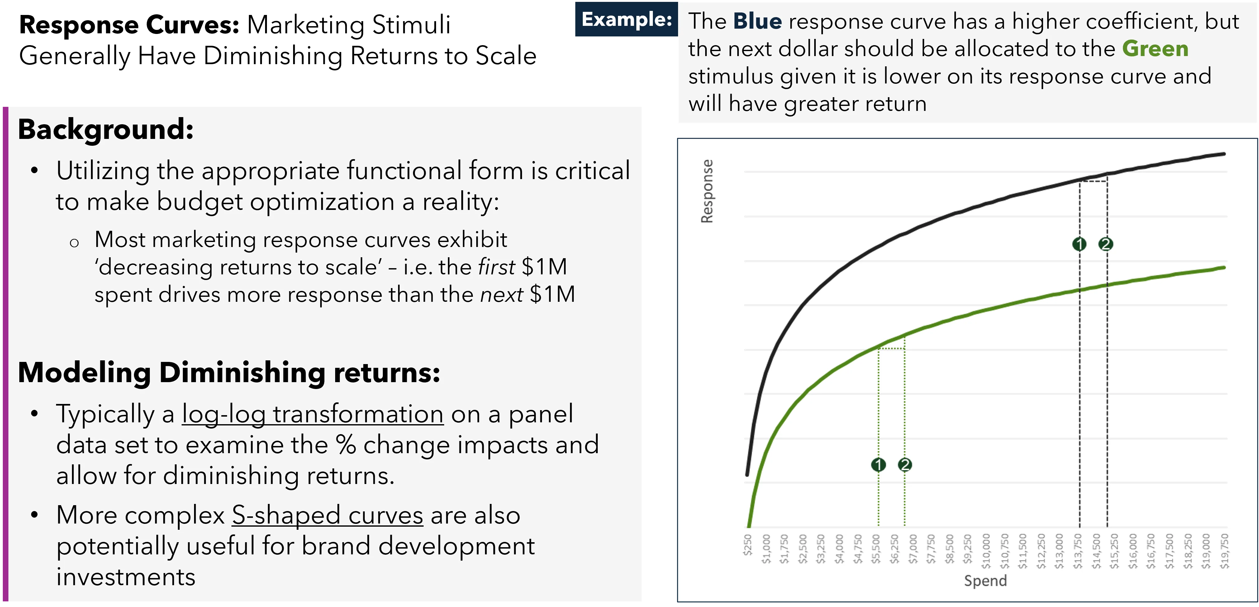
Now, let's look at a portfolio of channels.
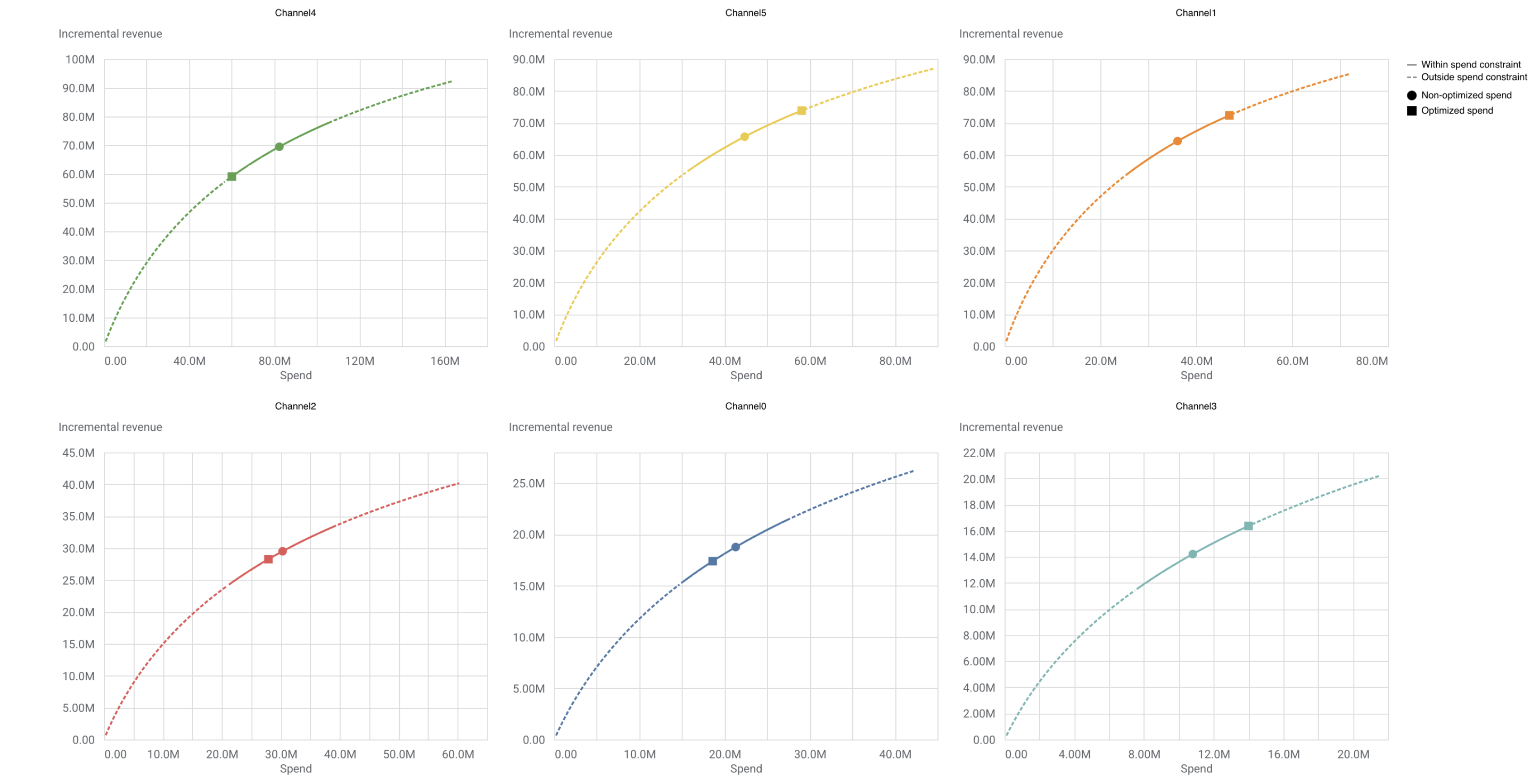
This image perfectly visualizes the strategic goal: move your spending from the flat parts of curves to the steep parts. By looking at a dashboard like this, you can immediately see:
- Opportunities for Growth: Channels where the current spend (circle) is on a steep part of the curve (e.g., Channel 4, Channel 5). These are underinvested.
- Points of Saturation (and Waste): Channels where the current spend is on a flat part of the curve (e.g., Channel 0, Channel 1). These are overinvested.
A Word of Caution: Question the Model
As a leader, you also need to bring a healthy dose of skepticism. These curves are estimates based on a model. Before reallocating millions of dollars, you need to question the output.
Incremental Outcome, ROI, mROI & Response Curves
Let's revisit the Google Meridian document to consider some important caveats. A model is only as good as its data and assumptions.
Please read the section 'Considerations for interpreting ROI and response curves'. Focus on 'Lagged effects' and especially 'Extrapolation risk'.
The point on extrapolation risk is critical. If you have always spent between $100k-$150k on a channel, the model's prediction of what will happen at $300k is an educated guess. As a leader, you should de-risk this by implementing budget changes incrementally and using other methods (like geo-lift experiments, which we'll cover later) to validate the model's predictions.
Conclusion
Today we've unpacked the marketing response curve, the engine behind modern budget allocation. You are now equipped to go beyond surface-level metrics like average ROAS and engage in a much more sophisticated, strategic conversation about marketing investment.
Key Takeaways:
- Curves Visualize Returns: Response curves plot marketing spend against incremental outcomes, making the concept of diminishing returns tangible.
- Anatomy is Strategy: Identifying a channel's position relative to its threshold, optimum, and saturation points is key to diagnosing its health and potential.
- Shape Tells a Story: The shape of the curve (S-shaped, concave) gives you insight into a channel's fundamental dynamics and scalability.
- Optimize by Shifting: The goal is to shift budget from channels operating on the flat, saturated part of their curve to those operating on the steep, high-growth part.
Preview of the Next Lesson:
Knowing how to interpret these curves is step one. The next logical step is to use them to play out "what if" scenarios. In our next lesson, we will learn how to construct a scenario model to forecast business outcomes based on different budget allocation plans. We'll explore how modern MMM platforms provide interactive tools that use these very curves to let you simulate the impact of budget shifts before you commit a single dollar.