
Welcome back. Last time, you learned to treat a correlation as a pattern to investigate rather than proof of a cause. That same discipline matters when a report uses numbers: a figure can be accurately calculated and still be easy to misread if you ignore its denominator, time period, comparison group, or uncertainty.
This lesson gives you a practical toolkit for interpreting percentages, rates, averages, and risk statements in public-service data. The aim is not to turn every report into a maths exam. It is to let you read a headline, dashboard, or briefing and ask: What exactly is being counted? Out of whom? Over what period? Compared with what?
Percentages: always identify the whole
A percentage expresses a part of a stated whole out of 100:
If 128 of 1,000 eligible people use a service, then:
So 12.8% means about 13 out of every 100 people in the defined group. It does not mean 12.8% of everyone in a town, region, or country unless that is the group used as the denominator.
The denominator, the “whole” beneath the fraction, does much of the intellectual work. Compare:
- “300 burglaries were recorded.” This is a count.
- “300 burglaries per 100,000 residents were recorded in one year.” This is a rate with a population and time frame.
- “3% of households reported burglary victimisation in the past year.” This is a percentage risk or proportion among households surveyed.
Each may be relevant, but they answer different questions. A count helps a service understand workload. A rate helps compare places of different sizes. A victimisation percentage focuses on people or households affected, which may differ from offences recorded by police.
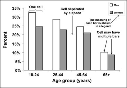
The annotated grouped-bar chart below shows another common presentation: percentages split into categories. Each age group is a cell, and the two bars in each cell represent men and women.
Read such charts methodically:
- Check the vertical axis and its unit. Here it is percentage, ranging from 0% to 35%.
- Check the horizontal categories. Here they are age groups.
- Use the legend before comparing bars. The unshaded bars represent men; the shaded bars represent women.
- Compare like with like. In the 18–24 group, the men’s bar is about 32% and the women’s bar about 25%, a gap of roughly 7 percentage points.
- Avoid inventing an explanation. The chart describes a difference; it does not tell us why the difference exists.
A visible gap can look dramatic when the axis is narrow or when labels are missing. Conversely, a small-looking gap might matter if it represents many people or a serious outcome. Interpret the numbers before reacting to the visual impression.
Young people not in education, employment or training (NEET), UK - Office for National Statistics
Read the Office for National Statistics bulletin as an example of a public report that combines percentages, percentage-point changes, and estimated numbers. Notice that it states the population, age range, country, and time period rather than treating “young people” as a vague category.
In Section 3, “Total young people who were not in education, employment or training (NEET),” read the headline estimates. Track the difference between the percentage, the estimated number of people, and change over time. Then read “Strengths and limitations,” especially the discussion of uncertainty. Focus on why a small short-term change should not automatically be treated as a real-world trend.
Percentage change is not the same as percentage points
This is one of the most common sources of numerical confusion.
The ONS bulletin reports an estimated NEET percentage of 12.8%, up 0.3 percentage points on the previous quarter. That implies the previous published percentage was 12.5%.
A percentage-point change is simple subtraction between two percentages:
A relative percentage change instead compares the change with the starting value:
So these two statements can both describe the same shift:
- The percentage rose by 0.3 percentage points.
- The percentage rose by about 2.4% relative to its previous level.
They are not interchangeable. Saying “the rate increased by 0.3%” could be ambiguous. Did it rise from 12.5% to 12.8%, a 0.3-percentage-point change? Or did it increase by 0.3% of 12.5%, which would be a much smaller change?
When official reports say “percentage points,” preserve that wording. It is precise.
Also notice that the ONS reports both 948,000 young people and 12.8%. A count can rise while a percentage stays steady, if the underlying population grows. A percentage can rise even when a count falls, if the population falls faster. Neither measure is automatically more important; the right choice depends on the decision being made.
For planning youth support, a local authority needs the estimated number of people likely to need provision. To compare the scale of a problem across areas with very different populations, it also needs the percentage or rate.
Counts, rates, and the denominator problem
A rate puts a count in relation to a population or amount of exposure. It makes comparisons fairer when the groups are not the same size.
Suppose two areas record vehicle theft over a year:
| Area | Recorded thefts | Population | Theft rate per 100,000 residents |
|---|---|---|---|
| Northside | 30 | 3,000 | 1,000 |
| Southside | 100 | 50,000 | 200 |
The rate calculation is:
Southside has more thefts in total, so it may need more total investigative capacity. But Northside has a much higher theft rate relative to its population. That may signal a concentrated local problem worth investigating.
The multiplier, such as 1,000 or 100,000, does not change the underlying pattern. It makes a small proportion readable. A rate of 2 per 1,000 is the same underlying proportion as 200 per 100,000.
The denominator must fit the issue:
- A road-collision rate may use population, licensed drivers, vehicle miles travelled, or journeys made. Each denominator answers a different question.
- A hospital infection rate may use patients admitted or procedures performed.
- A school-exclusion percentage should normally use the number of pupils eligible to be excluded, not the town’s entire population.
- A crime figure may use residents, households, businesses, or footfall, depending on the offence and question.
There is an additional caveat for recorded crime. “Recorded offences per 1,000 residents” is not identical to an individual resident’s chance of being victimised. One person can experience repeated victimisation, one incident can involve multiple offences, and some crime is never reported or recorded. The label tells you what the statistic actually measures.
Principles of Epidemiology: Lesson 5, Section 5|Self-Study Course SS1978|CDC
This CDC self-study section explains why public-health analysts prefer rates to raw counts when comparing places or time periods. Its central lesson transfers directly to crime, emergency response, and local-service data: the denominator must be appropriate to the question.
At the opening of Lesson 5, Section 5, before the subsection “Analyzing by time,” read the discussion of rates. Pay particular attention to the examples of an infant mortality denominator and a surgical infection denominator. Ask what population or exposure would be the meaningful denominator in each case.
In formal public health, a rate can also include time directly in the denominator, such as cases per 10,000 person-years. This is useful when people are observed for different lengths of time. For basic public reporting, though, the practical habit is the same: inspect the unit. “Per 100,000 residents per year” is not the same kind of measure as “per 100,000 residents this month.”
Watch “Risk, Rate and Odds” from Global Health with Greg Martin for a compact distinction between risk and a person-time rate. The examples are medical, but the distinction applies whenever people or places are tracked over unequal periods.
Watch defining risk to identify its three components: a specified group, a time period, and new occurrences. Then watch person time to see why a rate may use accumulated observation time rather than merely the number of people at the start.
Averages: useful summaries, incomplete pictures
An average compresses many values into one number. That can be helpful, but it also hides variation. Before accepting a statement such as “the average response time was 15 minutes,” establish which average is being used.
The three common forms are:
| Measure | What it is | Best use |
|---|---|---|
| Mean | Total of all values divided by number of values | Overall arithmetic average |
| Median | Middle value after ordering values | Typical value when extreme values matter |
| Mode | Most frequent value | Most common category or value |
Suppose six call-response times, in minutes, are:
The mean is:
The median is the midpoint between the third and fourth values:
The mode is 6 minutes.
The mean is not wrong. It accurately includes the 60-minute response. But describing 15.3 minutes as the “typical” experience would be potentially misleading, because five of the six calls were handled in eight minutes or less.
This matters in public services. A mean can be pulled upward by a small number of long waits, complex incidents, or severe weather disruptions. A median can hide those long waits. A responsible report may therefore give both a median and information about the slowest cases, such as the percentage responded to within a target time.
Another trap is taking a simple average of subgroup percentages. Suppose:
- In a small group of 10 people, 2 are affected: 20%.
- In a larger group of 90 people, 9 are affected: 10%.
A simple average gives:
But that is wrong for the combined population. There are 11 affected people out of 100:
The larger group must carry more weight. When combining percentages, return to the underlying counts and denominators whenever possible.
Risk: ask “how likely, for whom, and by when?”
In everyday language, risk means danger. In data, it usually means the probability that a specified outcome occurs in a specified population during a specified period.
If 3 of 10 people develop a condition during a year, the one-year risk is:
A clear risk statement includes:
- the outcome, such as a collision, illness, repeat victimisation, or equipment failure;
- the group being considered;
- the time period;
- the baseline comparison, if it claims a change.
Risk language can become misleading when it uses only a relative risk.
Imagine a report says a product “doubles the risk” of a rare outcome. That sounds alarming, but doubling must be anchored to the starting risk. If the risk rises from 1 in 7,000 people to 2 in 7,000 people:
- Relative risk has doubled, a 100% relative increase.
- Absolute risk has increased by 1 in 7,000.
- In percentage terms, it rose from about 0.014% to 0.029%.
- The absolute change is about 0.014 percentage points.
The relative figure is mathematically true. It is incomplete without the absolute risk.
By contrast, if a risk rises from 20% to 40%, it has also doubled. But the absolute change is 20 percentage points, which is a very different practical situation. The word “doubled” alone hides that distinction.
Relative vs Absolute risks: Why Relative Risks Are Misleading, and How To Communicate Absolute Risks
Watch “Relative vs Absolute risks: Why Relative Risks Are Misleading, and How To Communicate Absolute Risks” from The Winton Centre. It shows why dramatic relative-risk headlines should be translated into an absolute change and then into expected numbers of people.
Watch the pill example, which contrasts a doubled relative risk with a small absolute change. Continue with the bacon example and calculate mentally what an 18% increase is 18% of. Finish with expected frequencies, focusing on the clearer framing of “out of 100 people.”
An expected frequency translates a percentage into a group size. If a lifetime risk changes from 6% to 7%, then in groups of 100 similar people, we would expect roughly:
- 6 people in the first group to experience the outcome;
- 7 people in the second group to experience it.
That does not mean exactly 6 or exactly 7 people will be affected in every real group of 100. It is an expected long-run pattern, not a prophecy about named individuals.
For practical reading, translate a risk claim into four forms where possible:
| Form | Example |
|---|---|
| Percentage | 6% |
| Natural frequency | 6 out of 100 |
| Fraction | 6 out of 100 |
| Absolute comparison | 6 out of 100 compared with 7 out of 100 |
Be cautious with odds, too. Risk uses the number experiencing an event divided by the total group. Odds compare the number experiencing the event with the number not experiencing it. At very low probabilities they look similar, but at higher probabilities they diverge. A headline about “odds” should not be casually restated as a percentage risk.
A field routine for public-service statistics
When you encounter a numerical claim in a briefing, news report, campaign leaflet, or social-media post, work through this short routine.
- Name the measure. Is it a count, percentage, rate, average, risk, or odds statement?
- Find the numerator. What events or people are being counted?
- Find the denominator. Out of which population, households, journeys, procedures, or period of exposure?
- Check the time and place. A monthly local rate and a national annual rate are not directly comparable.
- Specify the comparison. Is the change in percentage points, relative percentage, raw numbers, or all three?
- Inspect the baseline. A claim that risk “doubled” needs the original risk.
- Look for uncertainty and data changes. Is this a survey estimate? Did reporting practices, definitions, detection, or population size change?
- State only what the data support. A rise in recorded incidents may justify further attention, but it does not independently establish why incidents rose.
The final two steps connect directly to the previous lesson. A numerical increase can be genuine and still have several explanations. In public health, a reported rise might result from a new diagnostic test, altered reporting practice, greater awareness, or a revised definition. Similar issues arise in crime data when recording rules, reporting routes, or police activity change.
A careful conclusion sounds like this:
“The recorded rate was higher this quarter than in the same quarter last year. The increase should be examined alongside population changes, recording practices, and longer-term trends before concluding that underlying offending has increased by the same amount.”
That is not evasive language. It separates what has been measured from what remains uncertain.
Key takeaways
A percentage is a part of a specified whole. Always identify the denominator, population, time period, and definition behind it.
A percentage-point change is the difference between two percentages. A relative percentage change compares that difference to the starting value. They can describe the same data but communicate very different impressions.
Counts reveal workload and scale; rates allow fairer comparisons across populations or exposure levels. Neither is meaningful without knowing what the denominator represents.
The mean, median, and mode are different forms of average. A single average can conceal uneven experiences, especially when a few extreme cases pull the mean upward.
Risk statements need a population, outcome, and time period. Treat “doubles the risk” or “reduces risk by 30%” as incomplete until you know the baseline absolute risk. Natural frequencies, such as “7 out of 100,” often make the real scale clearer.
Next, you will use these quantitative tools to construct a justified conclusion while clearly stating the limits of the available evidence.
Can't find a good explanation? Sign up and we'll make it for you
Sign up