
Hello. In the previous lesson, you translated workplace activities, culture, visual tasks, and operational change into zone-specific lighting priorities. You should now have a clear distinction between a priority—such as low-glare screen work or inviting social interaction—and a premature fixture decision.
This lesson turns those priorities into a spatial composition. You will learn to layer light for focused work, collaboration, circulation, social areas, and the vertical surfaces that hold a workplace together visually. The central question is not “Which fixtures should this office contain?” but: Which surfaces, people, and activities should be visually supported, at what relative importance, and under which independent controls?
Layering means assigning light distinct jobs
A layered scheme is not simply a room with several fixture types. It is a deliberate composition in which each layer performs a visual role, and where the layers can be moderated independently when the use of the space changes.
The core workplace layers are:
| Layer | Primary job | What it makes visible |
|---|---|---|
| Ambient | Establish a usable overall visual field and aid orientation | The room as a whole, general movement, shared background |
| Task | Support a specific visual activity | Screens, documents, keyboards, models, worktops, shared tables |
| Vertical | Reveal walls, displays, people, and architectural depth | Wall planes, whiteboards, brand surfaces, faces, room boundaries |
| Accent | Direct attention and create focal hierarchy | Artwork, a project display, reception identity, a material feature |
| Decorative | Contribute visual identity through the luminaire itself | A social table, reception, lounge, café, or meeting setting |
| Indirect | Create soft brightness through reflected light | Ceilings, upper walls, spatial volume |
These are functions, not a catalogue of products. A direct-indirect pendant above a shared desk may provide task illumination downward, ambient brightness through its uplight, and a visible design rhythm across the plan. A track spotlight may be an accent light when aimed at a display wall, but a task light when aimed at a project table. Always identify the job before naming the fitting.
A useful principle is:
Layer light by visual purpose, then coordinate luminaires so the architecture reads as one composition.
The workplace should not look like five independently lit zones placed beside each other. It should feel coherent while allowing each zone to support its own activity.
Workspitality: Lighting for Modern Work Environments
Read this short article from TRILUX for a practical vocabulary of workplace layers and for its argument that functional and atmospheric light must coexist.
In the “Place” section, read from the discussion of layered light. Focus on the distinction among task, ambient, accent, vertical, decorative, and indirect light. Then read the “Programming” section, beginning with flexible use and spatial activation. Note that zoning is a response to changing use, not an excuse to add complexity without purpose.
The article’s six-layer list is useful, but it does not mean every space requires every layer. A focused desk area may need a strong ambient and vertical framework with local task adjustment, while a circulation route may need primarily ambient and vertical light with only a small accent at a destination. Layering is selective.
Build the composition from the visual field outward
A practical sequence begins with the surfaces people experience continuously, rather than isolated points of light.
1. Establish the ambient field
Ambient light gives the workplace a baseline of legibility. It supports movement, helps people locate colleagues and objects, and prevents task islands from feeling isolated in darkness.
Ambient light does not require uniform brightness across every square metre. A uniformly luminous ceiling or repeated grid of downlights can make an office technically bright but visually flat. Instead, seek a calm background with enough continuity that people can move comfortably between zones.
For focused work, ambient light should help the eye move between screen, desk, face, and surroundings without severe jumps in brightness. For circulation, it should provide safe, continuous orientation. For social areas, it may be reduced relative to a table or feature wall so that the space feels more intimate without becoming dim or confusing.
2. Add task support precisely where the activity occurs
Task lighting is not synonymous with a desk lamp. It is the light that makes a task appropriately easy and comfortable to perform.
At an open workstation, task support may come from a carefully shielded direct component from a pendant, a low-glare linear system, or a personal task light. At a collaboration table, the task plane is larger and shared: documents, sketches, prototypes, and faces all need attention. At a café counter, the task may be serving or preparing food, whereas at a lounge table it may simply be reading or conversation.
Do not use task lighting to compensate for a weak overall composition. If every desk receives intense local light while surrounding walls and circulation remain dull, the result can feel fragmented. Task light works best when it sits within an adequately bright ambient and vertical setting.
3. Illuminate vertical surfaces to make the space understandable
Vertical illumination is often the missing layer in generic office schemes. Yet walls, partitions, shelving, acoustic panels, whiteboards, doors, and people’s faces occupy much of the normal field of view.
A well-considered vertical layer can:
- make a deep plan feel less tunnel-like;
- establish orientation by revealing a destination wall or a change of zone;
- make meeting-room and collaboration backgrounds more legible;
- support facial visibility in social and client-facing areas;
- give daylight-facing work areas an interior visual counterweight;
- reveal material, brand, art, and architectural texture.
Vertical illumination need not mean washing every wall evenly. Choose surfaces that carry spatial importance: a central core wall, a wall at the end of a circulation route, a collaboration pin-up surface, a reception backdrop, or the upper portions of a lounge enclosure.
4. Use focal light sparingly to signal importance
Accent and decorative lighting establish punctuation. They tell the eye where to look first: a welcome desk, a social table, an important display, a model shelf, a project wall, or a material detail.
Accent is effective because it is selective. If every wall, table, and object receives the same emphasis, there is no hierarchy. Preserve areas of lower visual intensity so that the focal light has meaning.
5. Use reflected and indirect light to unify the volume
Indirect light is especially valuable where you need spaciousness, ceiling brightness, and low apparent source brightness. It can be delivered through coves, uplighting from pendants, concealed linear details, or luminaires aimed at a ceiling or upper wall.
However, indirect light cannot solve every problem on its own. A room lit only by a broad diffuse ceiling glow may feel flat and provide weak modelling on faces and objects. In most workplaces, it is strengthened by a controlled directional component at tasks, tables, or selected vertical planes.
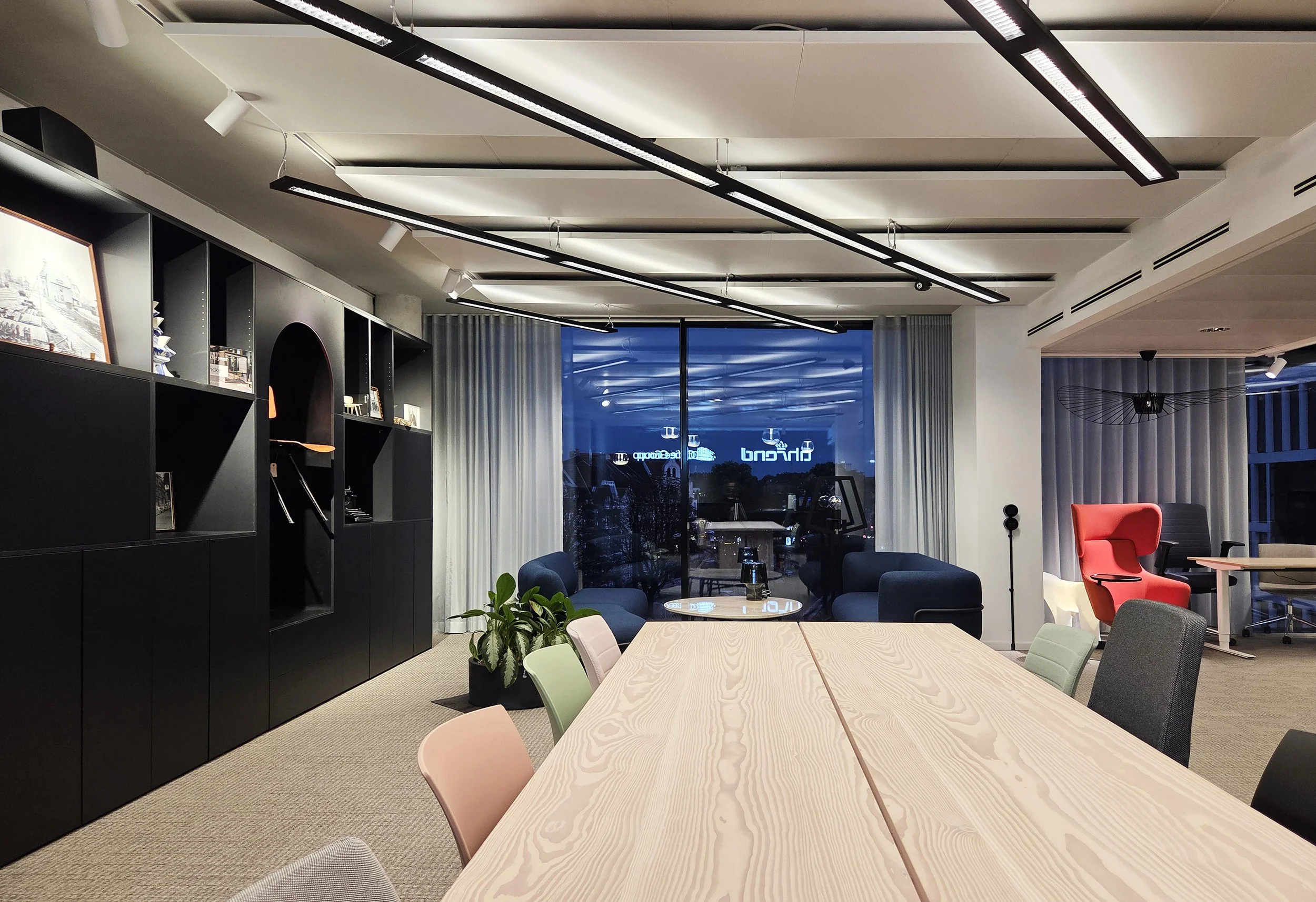.jpg)
In this image, the long table is the strongest task zone, the lounge reads as a softer social destination, and the ceiling’s linear luminaires create a continuous visual order across both. The important lesson is not to replicate the fixture arrangement. It is to observe how a repeated architectural lighting language can unify different levels of activity and emphasis.
Compose each workplace zone as a set of relationships
The following patterns translate the five workplace zones in this lesson into lighting layers. Treat them as design starting points, not universal templates.
Focused work
Focused work, particularly sustained screen work, needs visual comfort before visual drama. Begin with a calm ambient field and controlled source brightness in likely lines of sight. Then provide an appropriate task-plane component, preferably with some degree of local adjustment when the workplace model permits it.
The vertical layer is essential here. A lit wall, perimeter surface, or interior architectural plane reduces the sensation that the user is working between a bright screen and an undefined dark background. Near glazing, the goal is not to overpower daylight. It is to keep interior surfaces from becoming perceptually insignificant when the eye moves away from the window.
Avoid placing strong bright sources where they reflect in monitor screens or sit directly in the worker’s forward view. The next lesson will examine glare diagnosis in detail; for now, treat screen orientation, source shielding, and brightness balance as early compositional constraints.
Collaboration
Collaboration spaces need light on people and shared content. The table should be legible, but lighting directly above it is not sufficient if it leaves faces shadowed, vertical presentation surfaces dull, or screen backgrounds distracting.
A robust collaboration composition often includes:
- a direct task component for the shared table;
- ambient or indirect light that keeps the room volume calm;
- a vertical layer for whiteboards, display walls, or video-call backgrounds;
- independent scenes for discussion, presentation, remote meeting, and cleaning or reset.
For a flexible project zone with movable tables, do not tie the entire design to a single furniture arrangement. Consider distributed, adjustable, or track-based task and accent positions, while retaining a stable ambient and vertical framework. The permanent architecture should provide order; the adaptable layer should accommodate change.
Circulation
Circulation lighting is frequently treated as leftover ambient light. In a well-designed workplace, circulation does more: it connects destinations, enables informal encounters, and helps unfamiliar visitors understand where to go.
A circulation route needs continuity, but its identity often comes from vertical emphasis rather than a brighter floor. Light on an end wall, doorway reveal, column, sign, or shared display can make a route legible. At a junction, stair, or transition from public to staff space, a carefully brighter vertical cue can be more effective than increasing every ceiling luminaire.
Keep brightness transitions gradual. A dramatic social lounge beside a dim corridor may look attractive in a rendering but can make orientation and visual adaptation uncomfortable in use.
Social areas
Cafés, lounges, and informal meeting points benefit from a more hospitable hierarchy than the workstation field. They need faces, table surfaces, and key architectural materials to read well, but they can tolerate more contrast and a greater role for decorative luminaires.
Decorative light belongs here when it reinforces the spatial idea: pendants that establish the scale of a communal table, a visible feature luminaire at a reception lounge, or a warm pool of light at a banquette. The decorative fitting must still perform visually. A striking pendant that produces glare, obstructs sightlines, or leaves the table unusable has not fulfilled its role.
The social zone should be distinguishable from a work zone, but not disconnected from it. Repeating one material, mounting logic, linear direction, or colour-quality standard can retain identity across the workplace while changing the relative brightness and focus.
Vertical surfaces
Vertical light is a cross-cutting layer rather than a separate “room type.” Map the surfaces that organize perception:
| Surface | Why it matters | Possible lighting role |
|---|---|---|
| Reception backdrop | Establishes arrival and identity | Accent or wall-wash layer, coordinated with facial light at reception |
| Collaboration wall | Supports sketches, displays, whiteboards, and video calls | Uniform, glare-controlled vertical lighting |
| Central core wall | Adds depth and balances a deep floor plate | Ambient-vertical layer that acts as a spatial anchor |
| Perimeter columns or reveals | Gives rhythm and helps connect interior to glazing | Restrained vertical emphasis, especially where the view is very bright |
| Project display or art wall | Makes work and culture visible | Accent layer, independently controllable where exhibitions change |
| Wayfinding surface | Helps people locate routes, exits, and destinations | Clear, continuous vertical illumination rather than theatrical spotlighting |
Vertical light has a major role in accessibility as well. Legible doors, signs, faces, changes of level, and spatial boundaries support people with differing visual abilities. It also reduces dependence on floor illuminance as the sole measure of whether a space feels adequately lit.
A workplace layer map: apply the method before selecting products
Imagine the open-plan workplace from the previous lesson: perimeter desks by glazing, an internal project-table zone, a café near reception, and a circulation route leading to meeting rooms.
First, draw five overlays on the furniture and reflected ceiling plans. These are conceptual maps, not fixture layouts:
-
Activity map
Mark sustained desks, shared tables, client arrival, café seating, routes, and presentation walls. -
Ambient map
Identify where a continuous base visual field is necessary. The open work area and circulation route may share an ambient family, but perimeter and internal areas may need separate daylight-responsive control. -
Task map
Mark desk planes, project tables, meeting tables, reception counter, and any preparation surfaces. Identify whether task light needs to move with furniture. -
Vertical map
Select the walls and surfaces that establish depth, orientation, video-call quality, identity, and visual balance near windows. -
Focal map
Identify only the moments that deserve emphasis: arrival wall, café communal table, project display, or a social lounge feature.
At this stage, write a one-sentence instruction for each layer. For example:
Ambient: Establish a calm, low-glare field across work and circulation areas, with separately controlled perimeter and internal zones.
Task: Provide adaptable local support for desk and project-table work without requiring a uniformly bright ceiling across the floorplate.
Vertical: Illuminate the central collaboration wall and selected core surfaces to give depth, orientation, and a legible background for shared work.
Focal: Make the arrival-café threshold and project display visible as social and cultural destinations, while preserving a quieter workstation field.
Only after those statements are clear should you test distributions, mounting positions, fixture forms, and controls.
How I Design + Draw Architectural Lighting Plans
Watch selected extracts from How I Design + Draw Architectural Lighting Plans by 30X40 Design Workshop. Although the demonstrated project is residential, the design method is transferable: start from contrast and activity, then coordinate the light with architectural surfaces and structure.
Watch the opening principle for the argument that a lighting layout is more than uniform illumination. Then watch the lighting categories, paying attention to the relationship among ambient, task, and accent light and the warning against indiscriminate ceiling grids. Finally, watch the spatial application: focus on how the presenter uses wall and ceiling surfaces, furniture position, and architectural alignment to decide where light belongs.
The exact recessed-light spacing rule shown in the video is not a workplace design rule. Workplace luminaire spacing must be based on the chosen optic, mounting height, photometry, glare control, target surfaces, furniture layout, and calculation results. The more transferable lesson is this: a lighting plan must be composed in plan and section, in relation to architecture and use.
Directional and diffuse light: avoid the false choice
A common mistake is to oppose diffuse light and directional light as though a good office must choose one. In practice, they perform different visual work.
- Diffuse light can create a broad, calm ambient field and reduce the dominance of visible point sources.
- Directional light can reveal form, create useful modelling on people and objects, and give a task or table a clear visual identity.
Research described by the Illuminating Engineering Society explores this combination as “double dynamic lighting,” inspired by the relationship of diffuse sky light and directional sunlight. Its specific recommendations arise from a particular research context, so treat them as a design precedent rather than a universal prescription. The useful general insight is that a workplace can feel more visually alive when diffuse ambient light is supplemented by a controlled directional component rather than made uniformly diffuse.
Bringing Qualities of Natural Light into the Office
Read this IES article by Ellen Kathrine Hansen and Mihkel Pajuste as a research-based precedent for combining directional task light and diffuse ambient light in offices.
In the “Concept” section, read from the explanation of double dynamic lighting. Focus on the ideas of light flow, modelling, and personalized work areas. Then read the “Direct/diffuse lighting components” and “Light levels” recommendations, beginning with the design guidance. Do not treat the quoted percentages, angles, colour temperatures, or illuminance values as defaults for every project; identify instead which design intent each recommendation is trying to serve.
For example, a collaborative design studio might use a broad indirect ceiling layer for overall visual comfort, then add controlled directional light over project tables to make physical models and materials read three-dimensionally. A workstation area might provide a restrained direct component and personal adjustment while preventing reflected glare at screens. In both cases, the composition depends on viewing direction and surface reflectance, not merely the quantity of light delivered.
Let control boundaries reinforce the layers
A layer is most valuable when it can respond to actual use. This does not mean every luminaire needs an individual control point. It means luminaires that serve different purposes should not automatically be forced to operate together.
For a typical open workplace, consider these control intentions:
| Lighting group | Why it should be independently controllable |
|---|---|
| Perimeter workstation ambient light | Daylight varies significantly through the day and by orientation |
| Internal workstation ambient light | Remains necessary when perimeter lighting is dimmed or off |
| Desk or personal task layer | Supports individual preference and varied visual needs |
| Collaboration table layer | Can change for discussion, workshop, presentation, or reset |
| Presentation-wall vertical layer | Must be balanced differently for viewing material and video calls |
| Café or lounge decorative layer | Allows a social atmosphere without changing workstation conditions |
| Circulation and wayfinding layer | Maintains orientation outside core working hours |
| Accent and display layer | Can be adjusted for events, changing exhibits, or cleaning |

The hot-desking diagram usefully highlights a key compositional issue: when desks are shared and occupants vary, the task layer must be more adaptable than in a fixed workstation layout. Daylight is beneficial, but desk orientation and screen position still matter. Where possible, arrange screens so bright windows are to the side rather than directly behind or in front of the user, then use shading, local adjustment, and vertical brightness to support a balanced field.
Controls should be understandable. A complex scene system that users cannot predict or override will undermine the design. In the next lessons on adaptability and evidence-based justification, you will develop control zoning in greater depth. For now, ensure that your proposed layers correspond to a real operational reason for separate control.
Review a proposed layered scheme
Before you place products, test your composition against five questions:
-
Does each major workplace activity have appropriate visual support?
Check sustained screen work, shared tables, presentation, movement, social interaction, and arrival. -
Are the important vertical surfaces intentionally lit?
Identify the walls that define depth, orientation, identity, and communication. If none are deliberately lit, the scheme may rely too heavily on horizontal illuminance. -
Is hierarchy visible?
A visitor should be able to perceive where to arrive, gather, move, work quietly, and find shared resources. If all planes are equally bright, hierarchy is weak. -
Does the scheme preserve visual comfort?
Check visible source brightness, screen reflections, glare at sitting and standing viewpoints, facial shadows, and transitions near glazing. -
Can the layers adapt without losing the architectural idea?
The plan should still make sense when daylight changes, the project table moves, a team area becomes vacant, or the café hosts an event.
A strong answer to these questions produces a concept that can later be developed into distributions, fixture integration, calculations, controls sequences, and mock-ups. It also provides a basis for critique: rather than saying that a proposal “needs more lighting,” you can identify the missing function, surface, relationship, or control response.
Key takeaways
Workplace layering is the intentional combination of ambient, task, vertical, accent, decorative, and indirect light. The aim is neither a uniformly bright office nor a collection of decorative fittings: it is a legible visual hierarchy that supports different kinds of work.
For focused work, begin with glare-controlled ambient and vertical brightness, then add appropriate task support. For collaboration, light shared tables, faces, and presentation surfaces together. For circulation, prioritize continuity and vertical wayfinding cues. For social areas, use selective focal and decorative light to establish invitation and identity. Across all zones, vertical illumination is the layer that makes walls, people, destinations, and architectural depth perceptible.
Next, you will examine discomfort glare in workplace schemes: how to identify likely glare sources and make targeted corrections without flattening the lighting composition.
Can't find a good explanation? Sign up and we'll make it for you
Sign up