
Hello, and welcome to the Workplace Experience and Visual Comfort module. Workplace lighting is not simply a matter of giving every desk the same illuminance. It is a way of making an organization’s intended ways of working tangible: concentrated individual work, quick conversations, formal presentations, client encounters, quiet recovery, and movement through the workplace all ask different things of light.
In this lesson, you will learn a repeatable method for translating a workplace brief into lighting priorities for each zone. The result is not yet a fixture layout; it is a defensible design brief that tells the later lighting design what it must accomplish.
Begin with activity, not a lighting product
Before selecting downlights, linear systems, pendants, or controls, establish what people actually do in the space. A furniture plan is especially useful here: it locates the places where visual tasks, encounters, and pauses occur. But it is only a starting point. The lighting brief should also account for duration of use, time of day, daylight, screen use, mobility, privacy, and whether the activity is individual or shared.
How I Design + Draw Architectural Lighting Plans
Watch “How I Design + Draw Architectural Lighting Plans” by 30X40 Design Workshop for a compact introduction to designing from use and visual hierarchy rather than from an even fixture grid.
Watch contrast first to frame lighting as the relationship of brightness and shadow, not uniform illumination. Then watch use and layers, noting how ceiling conditions and furniture locations reveal activities, and how ambient, task, and accent light serve different purposes. Transfer this principle to a workplace: locate the work modes before deciding the lighting response.
The three broad lighting functions provide useful vocabulary:
- Ambient light establishes the base visual environment and helps people move, orient themselves, and perceive the overall room.
- Task light supports a particular activity, such as reading a document, writing, reviewing samples, or preparing for a video call.
- Accent light establishes attention and hierarchy: it can reveal a wall, artwork, material, reception sign, shared display, or a social destination.
These are functions, not fixture types. A pendant may provide ambient light, task light, or both depending on its optical distribution and position. The question is always: what must this light enable or communicate here?
A uniform office grid can provide a measurable level on desks while still producing a visually flat, tiring, and anonymous space. Conversely, an atmospheric workplace may be visually memorable but fail if people cannot read, see a colleague’s face, or work comfortably on screens. The aim is to establish a hierarchy in which each activity has enough support without making every surface equally bright.
Read organizational culture as evidence, not as a slogan
“Collaborative,” “creative,” “premium,” and “people-centred” are common words in workplace briefs. On their own, they are not lighting instructions. Convert each into observable behavior and then into a lighting consequence.
For example, a workplace that claims to value collaboration may mean any of the following:
- people frequently gather spontaneously at project tables;
- teams need rooms that change between discussion, presentation, and video calls;
- informal encounters at cafés and circulation nodes are important;
- leadership wants visual openness and few enclosed offices;
- the organization actually needs quiet, individual work to balance its highly social culture.
Each condition has a different implication. A project table needs faces and drawings to be legible. A flexible team room needs scenes and simple controls. An informal social point needs invitation and visual identity. A deep-focus setting needs glare control, lower distraction, and personal adjustment rather than visual spectacle.
A practical way to investigate culture is to ask for evidence in five areas.
| Brief question | What you are trying to discover | Lighting implication |
|---|---|---|
| Who works here, and how? | Screen work, paper review, model making, client meetings, shift work, hybrid calls | Task demand, glare sensitivity, duration, control needs |
| Where do interactions happen? | Scheduled meeting rooms, open tables, café, circulation, reception | Social focal points, facial visibility, hierarchy |
| How fixed is the plan? | Assigned desks, hot-desking, movable partitions, future growth | Flexible zoning, accessible controls, adaptable infrastructure |
| What represents the organization? | Brand, craft, hospitality, seriousness, transparency, local identity | Reception emphasis, material illumination, restrained or expressive character |
| What does inclusion require? | Varied age and visual needs, neurodiversity, visitors, mobility and wayfinding needs | Luminance balance, low glare, intuitive navigation, local user choice |
Notice that “culture” does not override visual comfort. A dramatic dark workplace may suit a hospitality-oriented brand, but it cannot make screen work or circulation uncomfortable. Nor is a brightly lit open office automatically inclusive. Good translation identifies conflicts early and assigns priorities.
Understanding the importance of human-centric lighting ...
Read this workplace-lighting case-study discussion from Consulting-Specifying Engineer. It shows how a multiuse program, corporate identity, daylight, screen use, user control, and future reconfiguration can become concrete lighting decisions. Treat “human-centric” here as a design approach to comfort and user needs, not as a promise of guaranteed health outcomes.
In the subsection “Innovative workplace lighting,” read the Spheres example. Focus on how retail, dining, meeting, and communal uses required an adaptable, automatic strategy rather than one uniform lighting condition. Then, in “Functional office spaces,” read the office response. Identify the stated problems: bright views, computer screens, and eye fatigue; then note the response through low-brightness apertures, vertical illumination, wall grazing, and local dimming. Finally, in “Improving user control,” read the shared-control discussion. Pay particular attention to the distinction between supporting a shared environment and reserving personal control for spaces where it is meaningful.
The Balyasny office example in the reading is especially instructive. Large windows and views were assets, but they also created a brightness challenge beside screens. The response was not simply “add more light.” It used restrained ceiling apertures, perimeter-column illumination, and a brighter core wall plane to manage the eye’s movement between sky, screen, desk, and surrounding architecture. This is a good model for the reasoning you want in a brief: condition, risk, design priority.
Make a zone map before making a lighting plan
Divide the workplace into zones according to use, not merely according to room names. One large “open office” may contain focused work areas, touchdown benches, project tables, circulation paths, and informal discussion points. Treating it as a single zone is usually the first cause of a generic scheme.
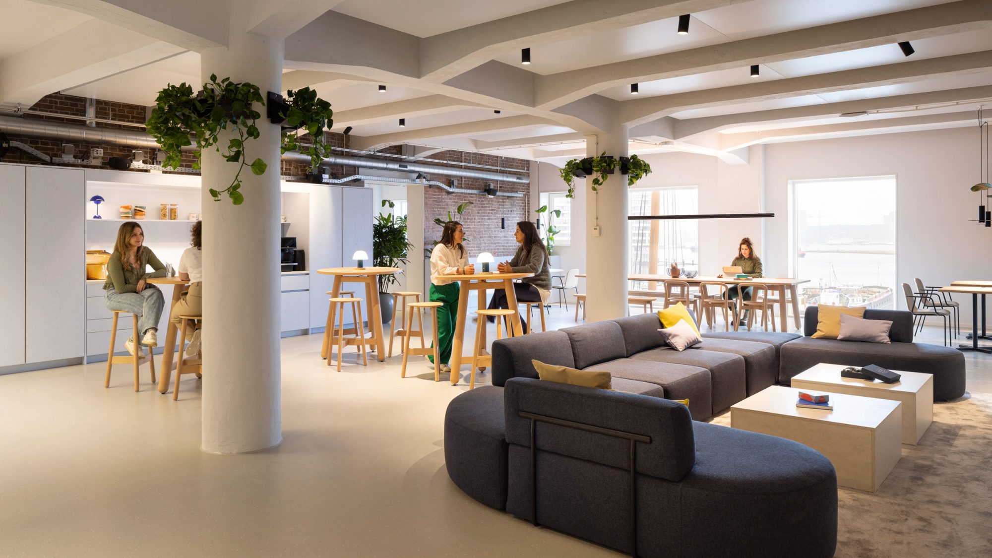
The image shows a useful principle: activity zones can be created by furniture, material, spatial enclosure, and light together. The lounge does not need to read exactly like the high tables; the individual window-side workspace should not be treated as though it were a social café. Yet the whole image can still feel like one workplace because the architectural language is consistent.
For every zone, write a compact zone card with six fields:
-
Primary activity
Use verbs: concentrate, read, make, converse, present, welcome, pause, navigate. -
Secondary activity and change over time
What else happens there, and when? A project table may become a meeting space, lunch table, or video-call setting. -
Users and duration
Are people passing through for 30 seconds, working for six hours, or arriving as unfamiliar visitors? -
Visual conditions
Consider paper, screens, faces, vertical displays, models, whiteboards, artwork, windows, and reflective finishes. -
Desired character
Use precise experiential terms: calm, energetic, focused, hospitable, legible, private, civic, or informal. -
Priority criteria
State what must be protected: low glare, facial modelling, vertical brightness, local adjustment, orientation, flexibility, energy restraint, or architectural integration.
A zone card is successful when another designer can read it and understand what the lighting must achieve before seeing a luminaire schedule.
Translate common workplace zones into priorities
The following table is not a list of fixed solutions. It is a starting logic for turning a workplace program into lighting priorities.
| Zone | Activity and culture question | Lighting priorities |
|---|---|---|
| Focused workstations | Is sustained screen work the dominant activity? Are desks assigned or shared? | Comfortable brightness around screens; low direct glare; adequate task-plane light; visually lit walls or other vertical surfaces; task-light option where ambient levels are restrained; small control zones where practical. |
| Project tables and collaboration areas | Are conversations spontaneous? Are drawings, samples, or physical models used? | Legibility of faces and shared work; flexibility for discussion and display; visual focus without creating a theatrical spotlight; simple scene changes if the use varies. |
| Enclosed meeting and hybrid rooms | Are presentations, video calls, workshops, or confidential conversations expected? | Adjustable light for faces, display screens, and shared tables; glare control at screens; straightforward controls; a calm background for video calls; scenes tied to real modes of use. |
| Phone booths and quiet rooms | Is privacy, decompression, or short independent work important? | Personal control; comfortable local illumination; low visual distraction; good facial light for calls without harsh reflections on screens. |
| Reception and client-facing areas | Should the organization appear formal, hospitable, technical, playful, or discreet? | Clear arrival sequence; faces visible to visitors and staff; selective emphasis on identity elements or materials; a brightness relationship that makes the destination readable from the entry. |
| Café, tea point, and social hub | Is informal connection a stated part of the workplace culture? | Invitation and visual warmth in the sense of social comfort; light on tables and faces; a recognisable focal point; enough distinction from workstations to signal permission to pause. |
| Circulation and stairs | Do visitors need orientation? Are routes also informal encounter zones? | Continuous legibility, safe brightness transitions, visibility of vertical cues and destinations, and emphasis at intersections or changes in level rather than indiscriminate brightness. |
| Display walls and brand moments | Are project work, art, material samples, or company identity part of the experience? | Deliberate vertical illumination and accent hierarchy; sufficient contrast to be noticed without making adjacent work areas appear dim. |
A key skill is to distinguish priority from solution.
- A priority is: “In the open work area, screen comfort and the perception of daylight views take precedence over a luminous ceiling pattern.”
- A premature solution is: “Use recessed downlights at a fixed grid spacing.”
The first statement leaves room for design exploration while clearly defining the performance test. The second commits too early and says little about whether users will be comfortable.
Establish visual priorities with measurable reference points
Workplace lighting combines qualitative judgment with measurable criteria. Measurements do not design the experience, but they prevent vague claims from concealing weak visual conditions.
Visual lighting design | WELL Standard - v6
Read the workstation and brightness-management criteria in the WELL Building Standard as a useful reference framework for task light, ambient light, control zoning, and luminance balance. These requirements are not a replacement for applicable local codes, project specifications, or a complete lighting design.
In “Part 1: Visual Acuity for Focus,” read the workstation guidance. Focus on the distinction between general ambient illumination and targeted task light, the stated 215 lux ambient capability, the 300 to 500 lux task-light provision where ambient light is below 300 lux, and independently controlled lighting banks. Then read “Part 2: Brightness Management Strategies,” from the luminance-balance criteria. Use its categories as a review checklist: main versus ancillary spaces, task surfaces and screens, remote surfaces in the room, and ceiling brightness.
Three ideas from this guidance are particularly valuable at briefing stage.
1. Illuminance is only one part of visual comfort
Illuminance, measured in lux, describes light arriving on a surface such as a desk. It matters for reading and detail work, but it does not describe the whole visual scene. A desk can meet a target while its surrounding walls are gloomy, the ceiling is a distracting field of bright apertures, or a window produces excessive contrast beside a monitor.
Therefore, write both horizontal and vertical priorities. For example:
Provide appropriate desk illumination for focused work while maintaining sufficiently bright adjacent surfaces and controlled ceiling brightness so that screens, desks, walls, and views can be seen without abrupt visual contrast.
This is more useful than saying only “provide 300 lux at desks.”
2. Background brightness matters around screens
In screen-based work, the user repeatedly shifts gaze among monitor, desk, colleague, and room. Extreme differences in brightness increase adaptation demand and can contribute to discomfort. The design response can include controlled window treatment, restrained luminous apertures, illuminated perimeter or core surfaces, and task lighting where it reduces the need to raise all ambient lighting.
Avoid treating screens as a reason to make the entire office dim. Instead, create a balanced field in which the display is not competing with glare sources or surrounded by visual darkness.
3. Control zones should follow occupancy and use
A large open office does not necessarily operate as one visual environment. Daylight changes by perimeter depth and orientation; teams work different hours; furniture changes; some areas may be temporarily vacant. Independent control zones allow the scheme to respond to these differences.
However, finer zoning is not automatically better. Controls must remain understandable, commissioned, and maintainable. A useful brief states both the reason for a zone and the intended user or automatic response. For example:
Separate the perimeter workstations from the internal workstations for daylight response, while retaining a consistent visual relationship between the two areas.
A worked translation: from a generic brief to design priorities
Imagine a 250-person technology workplace with an open-plan floor, large perimeter glazing, several small meeting rooms, a café at the entrance, and movable team tables. The client describes its culture as “collaborative, focused, adaptable, and welcoming to visitors.”
That is not enough to design from. Reframe it through evidence:
- Most staff perform sustained screen work, with occasional paper review.
- Project teams gather at movable tables several times a day.
- Visitors are received near the café and may move through the open work area.
- Meeting rooms are heavily used for hybrid calls.
- Perimeter desks have strong daylight and city views.
- Internal areas are deeper and depend more on electric light.
- The client expects the furniture layout to change over the next five years.
Now convert those findings into priorities.
| Finding | Design priority |
|---|---|
| Long periods of screen work | Prioritize glare control, luminance balance around monitors, appropriate desk illumination, and options for local adjustment. |
| Frequent project-team discussions | Give project tables clear facial and work-surface visibility, with flexibility for changing table positions. |
| Client arrival through café | Establish an intelligible arrival sequence and social focal point, using light to reveal people, materials, and identity without overpowering the work floor. |
| Hybrid meetings | Provide adjustable scenes that support faces, presentation surfaces, and screens. |
| Bright perimeter daylight | Coordinate electric light with daylight and ensure interior vertical planes do not appear excessively dark against the glazing. |
| Deeper interior zones | Use architectural surfaces to create visual depth and orientation, not merely higher desk illuminance. |
| Future layout change | Organize lighting and controls around adaptable zones and avoid rigid alignment only to today’s desk positions. |
A concise concept-level conclusion might be:
The workplace will support concentrated digital work within a visually calm, glare-controlled field, while making collaboration and arrival points legible through selective vertical illumination and social focal light. Flexible zoning and accessible controls will allow perimeter, internal, and enclosed rooms to respond to changing occupancy, daylight, and furniture arrangements.
This is not yet a detailed concept statement for the whole project; that is developed elsewhere. But it is a strong zone-priority brief because it connects activities, culture, visual comfort, and adaptability.
Test your translation before moving forward
Before proceeding to lighting layers and fixture decisions, review each zone against four questions:
-
Does the priority arise from an observed activity or operational need?
If not, it may be an aesthetic preference disguised as a requirement. -
Does it express the desired experience clearly?
“Good lighting” is not testable. “A calm screen-work setting with legible perimeter walls and low-glare light sources” is. -
Does it acknowledge conflicts?
A bright reception display may conflict with nearby screen work. A flexible team area may need stronger user control than an assigned desk zone. -
Can it later be checked?
You should be able to verify it through drawings, mock-ups, calculations, controls review, and on-site observation.
The strongest workplace schemes do not try to make every zone equally collaborative, equally bright, or equally expressive. They recognize that a productive workplace contains different kinds of attention, and they make those differences legible without fragmenting the architectural whole.
Key takeaways
A workplace lighting brief should begin with activities, users, duration, visual tasks, daylight conditions, and operational change, then interpret organizational culture through observable behavior rather than slogans.
For each spatial zone, define the activity, desired character, visual risks, and priorities such as glare control, task support, facial visibility, vertical brightness, orientation, user control, and adaptability. Use illuminance criteria as reference points, but assess the full luminance composition around desks, screens, windows, walls, and ceilings.
Next, you will build on these zone priorities by learning to compose layered lighting for focused work, collaboration, circulation, social areas, and vertical surfaces.
Can't find a good explanation? Sign up and we'll make it for you
Sign up