
Hello! Welcome to your next lesson in our module on "Leveraging Predictive Analytics for Performance."
In our last lesson, we focused on turning churn scores into action. You learned how to move from a simple list of at-risk users to designing sophisticated, ROI-driven retention campaigns, culminating in a clear campaign brief for your team. We figured out who to target and how to engage them.
But a crucial question remains: why are these customers likely to churn in the first place? Answering this question is the key to moving from reactive retention (like offering discounts) to proactive, long-term strategies that can even influence product development and core messaging.
Today's lesson is dedicated to that "why." We will explore how to use feature importance outputs from a predictive model to understand the key drivers of customer behavior. This is a powerful skill that allows you as a leader to look "under the hood" of a model and extract strategic business insights.
By the end of this lesson, you'll be able to interpret these outputs to generate hypotheses about customer behavior, inform your marketing strategy, and communicate more effectively with both your team and other departments like product and finance.
1. What is Feature Importance? The 30,000-Foot View
When a data science team builds a predictive model (for churn, conversion, LTV, etc.), the model sifts through dozens or even hundreds of customer attributes—or "features"—to find patterns. Feature importance is, simply put, a measure of which of these features had the biggest impact on the model's predictions.
It's typically presented as a ranked list with percentages. To understand how to interpret this, especially when the percentages seem small, the following article provides an excellent, business-focused explanation.
Making sense of feature importance: Why 3% matters more ...
This article, 'Making sense of feature importance,' from Faraday.ai, is a fantastic non-technical guide to understanding the strategic value of these outputs.
Please read from the beginning down to the section 'What should I look for in the list?'. Pay close attention to the 'choir' analogy, which brilliantly explains why a seemingly small percentage can be very significant.
As the article explains, in a model with 200 features, a feature with 3% importance is doing 6 times its "fair share" of the work (3% vs. an average of 0.5%).
The key takeaway for a leader isn't to focus on the absolute numbers, but on the patterns and relative spread.
- Look for clusters: Are the top drivers related to user engagement (e.g.,
sessions_per_week,features_used), customer value (e.g.,plan_type,total_spend), or acquisition source? - Identify the top 5-10 features: These are the "lead vocalists" carrying the melody. They give you the main story of what the model has learned.
A simple importance score tells you what mattered, but a more advanced technique is needed to tell you how it mattered. This is where SHAP values come in.
2. SHAP Values: A Powerful Lens into Model Behavior
SHAP (SHapley Additive exPlanations) is a state-of-the-art method used to explain the output of any machine learning model. Think of it as a universal translator for data science models. It doesn't just give you a single importance score for each feature; it tells you how much each feature contributed to each individual prediction.
This is incredibly powerful. It allows you to answer two types of questions:
- Global: Overall, what are the most important drivers of churn for our entire customer base?
- Local: For this specific high-value customer, what specific factors are putting them at risk?
Let's watch a brief introduction to the concept.
This video, 'SHAP Values: An Overview' by RichardOnData, provides a clear, high-level introduction to what SHAP values are and why they are useful for moving beyond pure prediction to inference and understanding.
Please watch the first 3 minutes and 10 seconds of the video. Focus on the distinction between 'prediction' and 'inference' and the basic definition of SHAP values.
To recap the video: a positive SHAP value for a feature means it pushed the prediction higher (e.g., towards "churn"), while a negative value means it pushed the prediction lower (e.g., towards "not churn").
3. Interpreting SHAP Visualizations
SHAP's real power comes from its visualizations, which summarize these complex values into interpretable charts. Let's focus on the two most common ones you'll encounter.
Global Importance: The Beeswarm Plot
The beeswarm (or summary) plot gives you a bird's-eye view of feature importance across all your customers. It's dense, but it packs a ton of information.
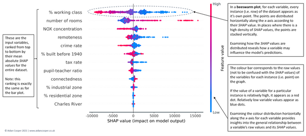
Let's break down how to read this:
- Feature Importance: Features are ranked top-to-bottom by their overall impact. In this example,
% working classis the most important feature. - Impact on Prediction (SHAP Value): The horizontal location of a dot shows its effect. Dots to the right push the prediction higher (e.g., a higher house price); dots to the left push it lower.
- Original Feature Value: The color shows whether the feature's value for that dot was high (red) or low (blue).
Let's apply this to our churn model. Imagine time_since_last_purchase is a top feature. You would likely see a pattern where red dots (high time since last purchase) are on the right side of the plot, indicating they have a high positive SHAP value, pushing the churn prediction higher. This visually confirms a business intuition: customers who haven't bought in a while are more likely to churn.
This next video segment provides a great walk-through of a similar plot.
Let's return to the RichardOnData video to see an explanation of the swarm plot in action.
Please watch from 7:18 to 8:59. The narrator does an excellent job of explaining how to interpret the interplay between feature value (color) and prediction impact (position).
Local Importance: The Waterfall Plot
While the beeswarm plot is great for overall strategy, sometimes you need to explain why a single customer was flagged. This is crucial for building trust with sales or customer success teams who might question why they need to contact a specific account. This is where the waterfall plot shines.
SHAP values for beginners | What they mean and their applications
This video, 'SHAP values for beginners,' uses a simple, relatable example of predicting an employee's bonus to explain a waterfall plot.
Watch from 2:01 to 3:27. Focus on how the final prediction f(x) is built up from the average prediction E[f(x)] plus the contributions from each feature.
The waterfall plot tells a story. For a churn model, it might look like this:
- The average churn probability is 10%.
- But for this customer, their
time_since_last_purchaseadded +30% to their risk. - Their
number_of_support_ticketsadded another +15%. - Their
plan_typewas 'Premium', which subtracted -10% from their risk. - Final Prediction: 10% + 30% + 15% - 10% = 45% churn risk.
This provides a clear, defensible explanation for why a specific action is being recommended for that customer.
Test your understanding!
You are looking at a beeswarm plot for your company's conversion model. One of the features is pages_viewed. You notice that the red dots (high pages_viewed) are clustered on the right side of the plot (positive SHAP values), and the blue dots (low pages_viewed) are on the left (negative SHAP values).
What business hypothesis can you form from this observation?
Show answer
The plot suggests that users who view more pages are more likely to convert. The high number of pages viewed is pushing the model's prediction towards "convert." This indicates high engagement is a strong positive signal for conversion. A potential strategic action could be to find ways to encourage users to explore more content or products during their session.
4. From Insight to Action: Strategic Use Cases in Marketing
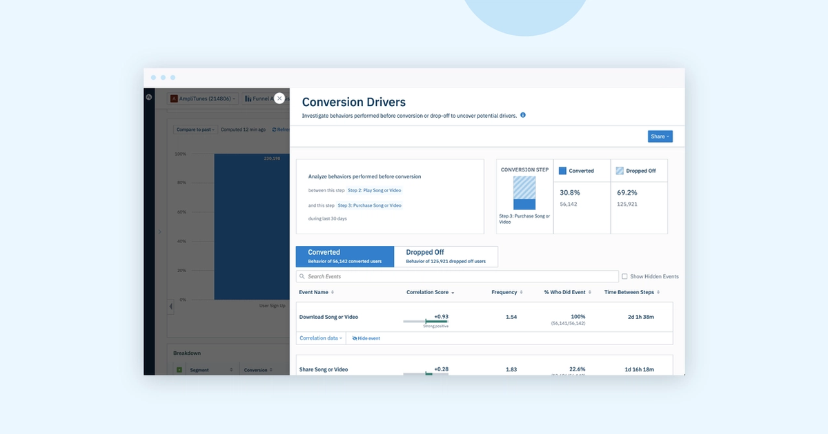
Understanding feature importance is an academic exercise unless you use it to drive business value. Here are some of the most impactful ways you can leverage these insights in your leadership role.
-
Inform Creative and Messaging Strategy: If the model shows that customers who use "Feature X" are much less likely to churn, your onboarding and lifecycle marketing should heavily promote the benefits of using Feature X. You have data-driven evidence for what makes your product "sticky."
-
Guide Product Development: This is where you can have a massive impact beyond the marketing department. If the #1 driver of churn is
number_of_failed_logins, no marketing campaign can fix that. You can take this data to the product and engineering teams as powerful evidence that a core user experience issue needs to be prioritized. -
Optimize Upstream Channel Strategy: If your churn model's top feature is
acquisition_source = 'Display Network Campaign Y', it's a huge red flag. Even if that campaign has a low CPA, it's bringing in low-quality users who don't stick around. This insight allows you to evaluate channels based on long-term value (LTV), not just short-term acquisition cost. -
Debug Models and Build Trust: If a model produces a strange prediction, SHAP values can help your analytics team find out why. And by providing clear explanations, you build trust in the model's outputs with stakeholders who may be skeptical of a "black box."
This next resource highlights these applications perfectly.
SHAP values for beginners | What they mean and their applications
Let's return to the 'SHAP for beginners' video, which has an excellent section on the strategic benefits of using these techniques.
Please watch from 4:24 to 6:39. Focus on the three key benefits mentioned: debugging, building trust, and data exploration.
5. A Critical Warning: Correlation is Not Causation
This is the single most important caveat. Feature importance tells you what attributes the model found to be predictive, not what causes an outcome.
For example, a model might find that "owning a luxury car" is a predictive feature for having a high LTV.
- Incorrect (Causal) Conclusion: "We should give our customers luxury cars to increase their LTV." This is obviously absurd.
- Correct (Correlational) Conclusion: "The kind of customer who owns a luxury car also tends to be a high-spender with us. This feature is a proxy for wealth or a certain lifestyle. We can use this to identify other similar high-potential customers."
Getting this distinction wrong can lead to expensive and ineffective strategies. Feature importance gives you powerful hypotheses that you can then validate through experimentation (like A/B testing).
The RichardOnData video has a dedicated section that explains this crucial point clearly.
Please watch from 8:59 to 10:49. The example about median income and home prices is an excellent illustration of this concept.
Conclusion
Today, you've learned how to peek inside the "black box" of a predictive model. By understanding feature importance, you can uncover the "why" behind customer behavior, moving your role from overseeing campaigns to shaping fundamental business strategy.
Key Takeaways:
- Feature importance reveals the key drivers a model uses to make predictions. Look for patterns and relative importance, not just absolute numbers.
- SHAP values are a powerful tool that provides both a high-level summary (beeswarm plot) and a specific, local explanation for a single prediction (waterfall plot).
- Translate insights into action: Use these drivers to inform messaging, guide product improvements, and optimize your channel mix.
- Remember the golden rule: Feature importance shows correlation, not causation. Use it to generate strong hypotheses that you can then test.
Preview of the Next Lesson:
We've seen how a model works and what it looks at. But when should we trust it? A model is a powerful tool, but it's not infallible. In our next lesson, we'll address a critical leadership skill: "Assess when a predictive model is reliable versus when human judgment and business context are needed." This will help you understand the boundaries of AI and where your own expertise is most valuable.