
Good to see you again. In the previous lesson, you worked with equations, inequalities, exponents, logarithms, and sequences—tools for expressing and solving numerical relationships. Data-interpretation questions use the same arithmetic, but the first challenge is different: extracting the right quantities from a visual representation before calculating.
In GATE General Aptitude, a table, chart, or graph can look information-heavy while the required computation is often short. This lesson develops a dependable method to read the display, identify the requested comparison, calculate only what is necessary, and state the answer with the correct unit. You will work with tables, bar graphs, line graphs, pie charts, and the distinction between exact readings and estimates.
1. Start with the data, not the calculation
Every data-interpretation question has two layers:
- The representation: rows and columns, bars, points, slices, labels, and axes.
- The question: the specific quantity requested from that representation.
A useful first-pass routine is:
| Check | What to look for |
|---|---|
| Title | What is being measured? |
| Categories or time axis | Dealers, years, companies, products, regions, and so on |
| Vertical axis or scale | Units and interval size |
| Legend | Which colour, symbol, or line corresponds to which series? |
| Qualification | “In thousands,” “percentage,” “average,” “approximately,” or “per month” |
| Question verb | Find, compare, estimate, calculate, increase, decrease, maximum, ratio |
A data display does not automatically demand a calculation. If the question asks “Which year had the highest sales?”, identify the highest relevant value directly. Computing totals first is wasted effort.
Keep the unit attached
If the vertical axis says cars sold (in thousand), a plotted value of means:
If all answer choices are expressed in thousands, keep calculations in thousands. Convert only when the wording or options require absolute counts.
A reliable habit is to write the unit once beside a value:
This avoids a frequent error: reporting cars instead of cars.
2. Reading tables: locate before you calculate
A table gives exact values, but it can create errors when several rows and columns look similar. Read a table by identifying the row condition and the column condition separately.
For example, suppose a table has rows for departments and columns for years. “Revenue of the Systems department in 2025” means:
- select the Systems row;
- select the 2025 column;
- use their intersection.
Before performing arithmetic, copy just the necessary values into rough work. This is especially useful in a dense GATE question.
Standard calculations from a table
If the relevant values are and , typical requests translate as follows:
| Wording | Calculation |
|---|---|
| “How much more?” | |
| “How many times?” | |
| “What is the ratio?” | , simplified |
| “What percentage is of ?” | |
| “Percentage increase from to ” | |
| “Average of values” |
The denominator in a percentage question deserves special attention. “ is what percent of ?” always means:
The phrase after of identifies the base quantity.
A quick distinction: percentage change versus percentage points
Suppose a rate rises from to .
- The rise is 5 percentage points.
- The percentage increase in the rate is:
Do not use “ increase” unless that is genuinely what the question asks.
3. Bar charts, histograms, and line graphs
A bar chart compares separate categories. The bars are separated because the categories are distinct: brands, departments, cities, or programming languages.
A histogram also uses bars, but its horizontal axis represents numerical intervals, such as ages –, –, and so on. Its bars normally touch because the intervals form a continuous scale. A histogram tells you the count within a range, not the exact values inside that range.
A line graph commonly shows how a quantity varies across time or another ordered scale. The key objects are the plotted points; the joining lines make the direction and size of changes easier to see.
Data representations | Lesson (article)
Read Khan Academy’s “Data representations” lesson for a clear visual grounding in bar graphs, histograms, and line graphs. It is particularly useful for separating direct readings from conclusions about trends and changes.
In the section “How do I read bar graphs, dot plots, and histograms?”, read from the explanation that introduces bar graphs, then continue through the histogram discussion, focusing on why a histogram reports ranges rather than exact individual values. Next, in “How do I read line graphs?”, read the line graph examples. Pay attention to the difference between the highest value and the greatest change between two consecutive values.
Value, change, and rate of change are different questions
Consider a line graph with values at successive years.
- Highest value: find the largest plotted .
- Greatest increase: compare positive differences such as .
- Greatest decrease: find the most negative difference.
- Greatest change: compare the magnitudes:
A steep downward segment may represent the greatest change even though it is a decrease.
Also, avoid extending a plotted line beyond its observed range unless the question explicitly states a trend rule. A graph records data; it does not itself guarantee a future pattern.
4. Worked example: a multi-series line graph
Use the following line graph carefully.
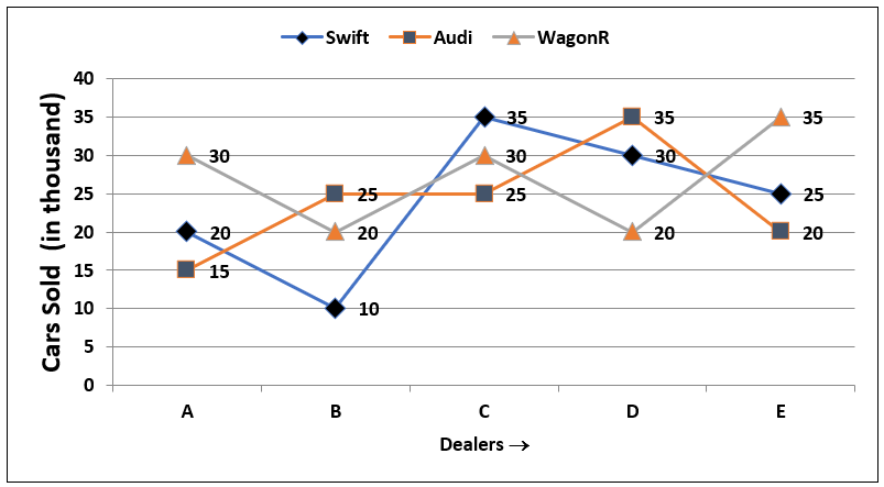
First extract its information into a compact table. This takes a few seconds and prevents errors in questions that require several comparisons.
| Dealer | Swift | Audi | WagonR |
|---|---|---|---|
| A | 20 | 15 | 30 |
| B | 10 | 25 | 20 |
| C | 35 | 25 | 30 |
| D | 30 | 35 | 20 |
| E | 25 | 20 | 35 |
All figures are in thousands.
Example 1: Compare two values directly
At dealer C:
So Swift sales exceed Audi sales by:
The correct conclusion is 10,000 cars, not merely 10 cars.
Example 2: Find a maximum difference
For each dealer, calculate the difference between Swift and WagonR sales:
| Dealer | Difference |
|---|---|
| A | |
| B | |
| C | |
| D | |
| E |
The maximum difference is thousand, occurring at A, B, D, and E. Notice that a “maximum” need not be unique.
Example 3: Compute a percentage from graph values
Audi sales at dealer D are thousand, while Audi sales at dealer A are thousand. The increase from A to D is:
The percentage increase is based on the original value, :
Thus, Audi sales at D are approximately higher than at A.
A common incorrect denominator would be . That would answer a different question: what fraction of D’s sales is the difference?
5. Pie charts: parts of one whole
A pie chart represents a complete total divided into categories. The entire circle corresponds to:
If a category represents of a total , then its value is:
Its central angle is:
For example, if a category accounts for of annual expenditure, its central angle is:
If total expenditure is Rs. , that category’s amount is:
Add shares before converting when appropriate
Suppose Food is and Rent is of an income of Rs. . Their combined expenditure is:
Combining percentages first is usually faster and reduces arithmetic.
Pie-chart caution
A pie chart supports part-to-whole reasoning. Do not compare slice areas casually when exact labels are present. Read the percentage or angle, then calculate. Visual impression is useful for an estimate, not for an exact response.
DATA INTERPRETATION SCORE 5 MARKS IN JUST 2 MINUTES | BEST & UNIQUE TECHNIQUES By Chandan Sir
Watch “DATA INTERPRETATION SCORE 5 MARKS IN JUST 2 MINUTES” by Chandan Logics - English for a focused review of the arithmetic that turns chart shares into quantities, differences, and angles.
Watch the core tools for the percentage, ratio, and average language that appears in data questions. Then watch the pie chart example, concentrating on the order: identify the share, translate it into a value using the total, and then compare only the values requested.
6. Estimation: be accurate about precision
Some graphs label every point exactly; others provide only a scale. Your answer should match what the display supports.
Exact reading
If a bar reaches a labelled tick of , reporting is justified.
Reasonable estimate
If a point lies between and , roughly halfway, report approximately , provided the question permits approximation.
Words such as approximately, closest to, and estimate explicitly allow an estimate. Without them, check whether the graph provides labels, a table, or answer choices that let you infer an exact result.
Watch the scale
The distance between horizontal gridlines matters. If labels rise as , one grid interval represents , not . Also inspect whether the vertical axis starts at zero. A truncated vertical axis can make small differences look visually dramatic.
For a bar chart, the exact comparison should be based on axis values, not apparent bar height alone.
7. A time-efficient GATE method
Under time pressure, use a three-stage approach.
Stage 1: Decode the display
In roughly ten seconds, identify:
- quantity and unit;
- categories or time period;
- legend and series;
- whether the values are exact or approximate.
Stage 2: Translate the wording into an operation
| Question wording | Action |
|---|---|
| Largest / least | Inspect the relevant series only |
| Difference | Subtract |
| Total | Add only named categories |
| Average | Add specified values, divide by count |
| Ratio | Form and simplify a ratio |
| Percent of | Divide requested part by stated base |
| Percent increase or decrease | Divide change by original value |
| Greatest change | Compare absolute consecutive differences |
Stage 3: Sanity-check the result
Ask three questions:
- Did I select the right series and category?
- Did I use the correct base in the percentage?
- Does the unit match the question?
This final check is especially valuable in multi-line graphs, where choosing the wrong colour or marker is more likely than making difficult arithmetic mistakes.
Line Graph & Table Data -Shortcuts & Tricks for Placement Tests, Jobs & Exams | Data Interpretation
Watch CareerRide’s “Line Graph & Table Data” example to see how a short question can sometimes be answered from the meaning of a ratio, without unnecessary calculations.
Watch the ratio line graph. Focus on the interpretation of a ratio below 1, equal to 1, or above 1, and on how the wording “girls to boys” determines which quantity is in the numerator. The shortcut is sound only because the graph explicitly plots that ratio.
8. A complete line-graph analysis
The solved line-graph example in the following resource combines the major operations you need: extracting values, computing an average, comparing differences, and finding a percentage.
Data Interpretation - Solved Questions and Answers - GeeksforGeeks
Read the line-graph problem in GeeksforGeeks’ “Data Interpretation – Solved Questions and Answers.” It demonstrates a disciplined way to turn a graph into a short list of values before answering average, maximum-difference, and percentage questions.
Navigate to Question 7, “Study the following line graph and answer the questions based on it.” Read the questions beginning with the three prompts, then study the solutions through the completed analysis. For each part, identify the values selected from the graph before looking at the arithmetic.
When reviewing the example, notice its underlying structure:
- The average uses all values of one company.
- The maximum gap requires differences for each year.
- The percentage comparison uses the named company’s value as the denominator.
That structure transfers directly to unfamiliar data sets.
Common mistakes to record in your error log
When you begin timed General Aptitude practice, classify data-interpretation errors precisely.
| Error type | Typical cause | Correction |
|---|---|---|
| Reading error | Wrong line, row, colour, or scale | Mark the legend and required category first |
| Unit error | Treating “thousands” as individual units | Carry units beside extracted values |
| Operation error | Finding ratio when difference was requested | Underline the action word |
| Base error | Dividing by final rather than initial value | Identify “percent of” or original value |
| Precision error | Giving false exactness from an unlabeled graph | Use “approximately” where appropriate |
| Time-management error | Calculating every value in the display | Extract only data used by the question |
Key takeaways
- Decode the title, units, scale, categories, and legend before calculating.
- Tables provide exact row–column intersections; copy only the needed values into rough work.
- In line graphs, distinguish a highest value from the greatest increase, decrease, or absolute change.
- In pie charts, the whole is or ; convert a share to an amount only when a total is given.
- For percentage change, divide the change by the original value.
- Use estimates only when the graph’s scale or wording calls for them, and always retain the correct unit.
The next lesson turns from quantitative displays to logical structure: drawing valid conclusions from arrangements, arguments, and conditional statements.
Can't find a good explanation? Sign up and we'll make it for you
Sign up