
Hello. In the previous lesson, you learned to identify a dataset’s grain and classify columns as identifiers, dimensions, dates, and measures. Those ideas answer what each field means. This lesson focuses on how those fields must be arranged so that Excel can filter, calculate, summarize, and later feed reliably into PivotTables, SQL, and Power BI.
The central rule is simple: a useful analysis dataset has one observation per row, one variable per column, and one value per cell. This is often called tidy data. It may look less like a polished management report, but it is far more useful for analysis.
The structure analysts need
Start with the distinction between a report layout and a data layout.
A report is designed for a person to read quickly. It may have titles, merged cells, blank space, subtotals, bold formatting, and months spread across columns. A data layout is designed so Excel and other tools can interpret every record consistently.
In an analysis-ready dataset:
- Each row is one observation at a clearly defined grain.
- Each column is one variable measured or recorded for every observation.
- Each cell contains one value for that variable and observation.
- The first row contains the column headers.
- The dataset is one continuous rectangular block, without blank spacer rows or columns inside it.
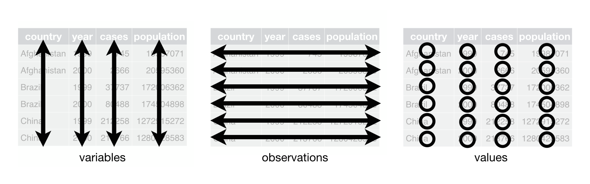
The Tidy-data illustration makes the relationship visible: vertical columns are variables, horizontal rows are observations, and individual cells are values.
Use the grain statement from the last lesson as a test. If you can honestly complete the sentence below, your rows are likely well designed:
“Each row represents one ________.”
For example:
| Dataset | Good grain statement |
|---|---|
| Sales transactions | Each row represents one order line. |
| Customer file | Each row represents one customer. |
| Support log | Each row represents one support ticket. |
| Monthly sales dataset | Each row represents one product’s sales in one month and region. |
The fourth example matters. If sales are recorded by product and month, then one row must preserve both the product and month that give a sales number its meaning.
Data Organisation in Spreadsheets - The Turing Way
Read the “Tidy Format For Spreadsheets” section from The Turing Way for the concise underlying rules that make spreadsheet data reusable beyond Excel.
In Section 2, “Tidy Format For Spreadsheets,” read from the paragraph beginning “There are very simple rules” through the four bullet-point rules. Focus on the tidy-data rules, especially the distinction between a variable, an observation, and a value. The resource also notes why tidy structure makes filtering and sorting easier.
A row is an observation, not a visual line in a report
A row is not automatically an observation just because it is horizontal. It must represent one consistent type of business event or entity.
Consider this sales report:
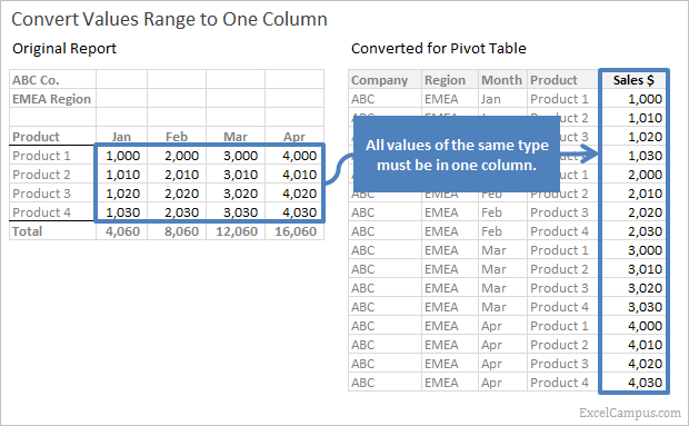
| Product | Jan | Feb | Mar | Apr |
|---|---|---|---|---|
| Product 1 | 1,000 | 2,000 | 3,000 | 4,000 |
| Product 2 | 1,010 | 2,010 | 3,010 | 4,010 |
| Total | 2,010 | 4,010 | 6,010 | 8,010 |
It is readable, but it is not the best source structure for analysis:
Jan,Feb,Mar, andAprare values of the same variable: Month. They should not be separate variables.- The sales figures all represent the same measure: Sales. They should be in one
Salescolumn. - The
Totalrow is a calculated summary, not an observation. It should not sit among source records. - If the company and region appear only in title cells above the table, Excel cannot attach those values to each sales record.
The analysis-ready version is long format:
| Company | Region | Month | Product | Sales |
|---|---|---|---|---|
| ABC | EMEA | Jan | Product 1 | 1,000 |
| ABC | EMEA | Feb | Product 1 | 2,000 |
| ABC | EMEA | Mar | Product 1 | 3,000 |
| ABC | EMEA | Apr | Product 1 | 4,000 |
| ABC | EMEA | Jan | Product 2 | 1,010 |
| ABC | EMEA | Feb | Product 2 | 2,010 |
Now the grain is explicit:
Each row represents sales for one product, in one month, in one region.
This structure supports questions such as:
- What were total sales by month?
- Which product had the highest sales in EMEA?
- How did sales change between months?
- What were sales by region and product?
The values ABC and EMEA repeat across several rows. That is correct. Repetition is often necessary because each row needs the dimensions that describe its observation.
A useful practical rule is:
If a column header contains a value of a category, rather than the name of a variable, the table may need reshaping.
For example, Jan, Feb, and Mar are values of Month; they are not variable names. Likewise, separate columns named North, South, and West may actually be values of a Region variable.
Watch “Tidy Data and Why We Need It!” by yuzaR Data Science for a short visual explanation of tidy-data rules and the common wide-to-long restructuring pattern.
Start with the three rules for the essential definition. Then watch wide versus long, which shows why dates or years spread across headers prevent time from functioning as a proper variable. Finish with the cleanup checklist; note the guidance on blank rows, merged cells, repeated headers, and formatting that encodes information only visually.
One variable per column
A variable is an attribute that can take a value for each observation. From the previous lesson, variables can be identifiers, dimensions, dates, or measures.
For an order-line dataset, these might be the variables:
| Order ID | Order Date | Customer ID | Region | Product | Quantity | Sales |
|---|
Each column has one clear meaning and one expected kind of value:
Order ID: an identifierOrder Date: a dateCustomer ID: an identifierRegion: a dimensionProduct: a dimensionQuantity: a measureSales: a measure
A column should not mix different concepts. Consider these problematic fields:
| Problematic column | Why it causes problems | Better structure |
|---|---|---|
Customer / Region containing “Amina Khan — West” | Two variables occupy one cell. | Customer Name, Region |
Product and Quantity containing “Mouse, 3” | Product and quantity cannot be independently summarized. | Product, Quantity |
Sales ($) containing “$1,250 estimated” | A number and a status note are mixed. | Sales, Sales Status |
Contact containing “email; phone” | Two distinct contact attributes are combined. | Email, Phone |
Jan, Feb, Mar sales columns | One measure is split across several columns; month is hidden in headers. | Month, Sales |
The goal is not to split text into tiny fragments unnecessarily. A Product Description can remain a single text field if the whole description is the business attribute you need. But if a cell combines values you need to filter, calculate, group, or compare separately, create separate columns.
Keep one data type and unit within a column
A well-structured column also has a consistent type and meaning.
Good examples:
| Sales_USD | Quantity | Order_Date | Order_Status |
|---|---|---|---|
| 1250.00 | 3 | 2025-03-04 | Shipped |
| 85.50 | 1 | 2025-03-05 | Pending |
Problematic examples:
| Sales | Delivery_Date | Quantity |
|---|---|---|
| $1,250 | 4 March 2025 | 3 units |
| 85.50 estimated | 2025/03/05 | two |
Excel can more reliably sum, sort, filter, and chart a numeric Sales_USD column than a mixed text column containing currency symbols, comments, or words such as “estimated.” Put that extra information in a separate field, such as Sales_Estimated_Flag or Data_Quality_Note.
Similarly, use one unit in a measure column. If some values are in kilograms and others in pounds, convert them to a standard unit or include a separate Unit column before analysis.
One value per cell
The “one value per cell” rule protects you from subtle analytical errors.
A cell should contain a single value for one variable. A blank cell can be valid, but it should mean missing or unknown, not visual spacing. A zero is an actual recorded value and is different from missing data.
For instance:
| Customer ID | Number of returns |
|---|---|
| C102 | 0 |
| C103 | (blank) |
0means the customer had no returns.- A blank means the number of returns is unknown or was not recorded.
Do not use blank rows to separate regions, months, or teams. Add a Region, Month, or Team column instead. Do not write “exclude” through cell color alone; create an explicit field such as Include_In_Analysis with values like Yes and No.
The same principle applies to summary rows. A manual row such as “Total Sales” belongs in a separate report area or PivotTable, not inside the raw source dataset. If it stays in the data table, it can be counted as a real transaction and inflate totals.
Common spreadsheet layouts that prevent analysis
Many spreadsheets are built as documents first and data sources second. The following features are useful for presentation but harmful inside the source-data area.
Titles, merged cells, and labels above the headers
A report might begin like this:
| A | B | C |
|---|---|---|
| ABC Company Sales Report | ||
| EMEA Region | ||
| Product | Jan | Feb |
The first two rows are titles, not data. They also hide company and region values outside the records they describe.
For a source dataset, use a single header row at the top:
| Company | Region | Product | Month | Sales |
|---|
Do not merge cells in the data area. A merged cell visually looks like one value spanning several columns, but it leaves some of the underlying cells empty. Excel and downstream tools cannot reliably interpret that structure.
Multiple tables in one block
Avoid placing two different datasets side by side in the same sheet area, such as sales in columns A–E and employee data in columns G–J. Each dataset should have its own clearly separated worksheet or its own separate Excel Table.
It is perfectly reasonable for a workbook to contain multiple related tables, such as:
OrdersCustomersProductsRegions
However, each one needs its own consistent grain and its own uninterrupted header-and-row structure. Later, you will connect related tables using lookups, SQL joins, and Power BI relationships.
Repeated headers and subtotal rows
Do not repeat headers halfway down a long dataset. Excel may interpret the words Order Date or Sales as values in the relevant columns, causing sorting and formulas to fail.
Instead:
- Keep one header row.
- Use Freeze Panes or an Excel Table so headers remain visible while scrolling.
- Produce subtotals and summaries separately with formulas or PivotTables.
Formatting as data
Color, bold text, indentation, and borders are not reliable data values. If a red row means “cancelled,” store Cancelled in a Status column. If yellow highlights indicate questionable records, create a Quality_Flag field.
This is especially important in job tasks: another analyst should be able to open the workbook, export the table to CSV, and understand the dataset without needing you to explain the colors.
Turn a tidy range into an Excel Table
A tidy layout is the foundation. An Excel Table is a feature that makes that layout safer and easier to work with. It does not fix a messy structure automatically, but it gives a well-structured range useful behavior.
Before creating one, check that your dataset has:
- one header row;
- unique, meaningful column names;
- no blank rows or blank columns inside the range;
- no merged cells;
- no manual total rows included as records.
Then create the table:
- Click any cell inside the continuous dataset.
- Press Ctrl + T, or select Insert > Table.
- Confirm that the selected range includes the full dataset.
- Ensure My table has headers is selected.
- Click OK.
- In Table Design, give the table a clear name such as
Orders,Sales_Data, orCustomer_List.
Watch the selected portions of “All About Excel Tables” by Technology for Teachers and Students to see the structure of an Excel Table and the quick conversion process.
Watch table components to see how headers, records, filtering, and automatic expansion work. Then watch creating a table and follow the conversion process, paying particular attention to the “My table has headers” option.
Excel Tables provide several immediate benefits:
| Feature | Why it matters in analysis |
|---|---|
| Filter buttons in each header | Lets you inspect categories, dates, blanks, and unusual values. |
| Automatic expansion | New rows added at the bottom can become part of the table. |
| Clear table name | Makes formulas and later references easier to understand. |
| Consistent formulas in calculated columns | Reduces the risk of copying a formula to some rows but not others. |
| Compatibility with PivotTables | Makes it easier to summarize an expanding dataset. |
A Table’s optional Total Row is useful for a quick check, but it is a report feature, not a raw-data record. Keep your analytical source focused on the actual observations.
A practical audit before you analyze
Before using formulas or building a PivotTable, inspect the dataset in this order:
-
State the grain.
Write one sentence describing exactly what one row represents. -
Check the header row.
Make sure every column has one distinct, descriptive name. -
Scan for non-data rows.
Remove titles, subtitles, repeated headers, notes, and manual totals from the source range. -
Inspect each column’s meaning.
Confirm it contains one variable only: notCity / State, notSales + Comment, and not multiple dates in one cell. -
Inspect each row.
Verify that it represents one observation at the stated grain, rather than a mixture of detail records and summary records. -
Check for hidden variables in headers.
When months, regions, or product categories are used as separate headers, consider whether they belong in one categorical column instead. -
Convert the clean range to an Excel Table.
Use a descriptive table name and retain the original data logic as the table grows.
This audit is a strong job habit. It prevents a common failure mode: producing a technically correct formula from a structurally incorrect dataset.
Key takeaways and next step
A dataset becomes analysis-ready when its structure makes every value interpretable:
- One row represents one clearly defined observation at a consistent grain.
- One column represents one variable, such as
Order_Date,Region,Product, orSales. - One cell contains one value, not a value mixed with a note, unit, second variable, or visual formatting instruction.
- Reporting elements such as merged titles, blank separators, repeated headers, and manual subtotal rows do not belong inside the source-data block.
- Wide monthly reports are often better converted to long format, with
MonthandSalesas explicit columns. - Turning a tidy range into an Excel Table adds filtering, consistent expansion, and a stronger foundation for analysis.
Next, you will build on this structure by learning how Excel’s relative, absolute, and mixed cell references control formulas as they are copied across a dataset.
Can't find a good explanation? Sign up and we'll make it for you
Sign up