
Hello! Welcome to the third lesson in our module on cognitive biases.
Introduction
In our previous lesson, we explored loss aversion and the endowment effect, focusing on how the perceived value of an item or service changes based on ownership and the fear of loss. We saw how this makes free trials and subscription models particularly effective.
Today, we shift our focus from the value of choices to their quantity. This lesson addresses choice overload, a phenomenon where having too many options can lead to decision paralysis and dissatisfaction. Your goal for this lesson is to explain choice overload and propose design solutions to mitigate it on a feature comparison or settings screen.
We will cover:
- The definition of choice overload, often called the "paradox of choice."
- The psychological reasons why too much choice can be demotivating.
- Actionable design strategies to simplify complex choices for users.
- An application exercise to apply these strategies to a realistic design scenario.
This concept is highly relevant to your work in product design, where you constantly decide how many features, options, or plans to present to users.
1. The Paradox of Choice
Common sense might suggest that more choice is always better, as it gives people more freedom and a higher chance of finding exactly what they want. However, psychological research reveals a counterintuitive reality: an abundance of options can overwhelm us, leading to anxiety, indecision, and even regret. This is the paradox of choice.
The most famous demonstration of this is the "jam study." Let's start with a short video that introduces this experiment and the core idea.
Why Simple is Better — The Paradox of Choice
This video from The Futur provides a great overview of the paradox of choice, starting with the classic jam study and connecting it directly to user experience design.
Please watch from the beginning to 03:46. Pay attention to the description of the jam study, the definition of decision fatigue, and the Cheesecake Factory example, which illustrates the feeling of being overwhelmed.
As the video explains, while more options attracted more initial interest, the smaller selection led to a tenfold increase in actual purchases. This happens because too many choices increase our cognitive load—the mental effort required to make a decision.
To deepen our understanding, let's read about the psychologist who popularized this concept and the mental processes behind it.
Paradox of Choice: Why less is often more
This article, 'Paradox of Choice: Why less is often more,' introduces the work of psychologist Barry Schwartz and details the psychological factors at play.
Please read the first three sections: 'Definition and origin of the paradox of choice,' 'Psychology behind the paradox: What happens in the mind?,' and 'Scientific studies and experiments.' Focus on the key psychological factors: decision-making effort, FOMO (Fear of Missing Out), and the distinction between 'Maximizers' and 'Satisficers.'
To summarize, choice overload occurs due to a combination of factors:
- Decision Fatigue: Evaluating numerous options is mentally exhausting.
- Anticipated Regret & FOMO: With many alternatives, we worry more about making the wrong choice and missing out on a better one.
- Increased Expectations: When presented with many options, we expect to find the perfect one, making us more likely to be disappointed with a merely "good" choice.
- Paralysis: The sheer effort and anxiety can lead us to make no decision at all.
2. How to Mitigate Choice Overload in Design
As a product designer, you can't always eliminate complexity, but you can structure choices to make them manageable. The goal is to create a clear path for the user, reducing their cognitive load and helping them feel confident in their decision.
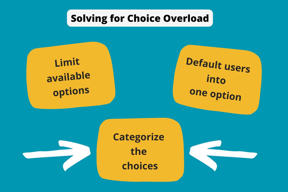
Here are four key strategies to combat choice overload.
Strategy 1: Limit and Reduce
The most direct method is to simply offer fewer choices. In a famous example, Procter & Gamble reduced the number of Head & Shoulders shampoo varieties from 26 to 15 and saw a 10% increase in sales.
- In Practice: On a pricing page, instead of offering five or six plans, limit them to three or four distinct options that cater to your primary user personas.
Strategy 2: Categorize and Group
When you must present many options, group them into logical, distinct categories. This helps users quickly ignore irrelevant sections and focus on what matters to them.
- In Practice: A complex settings screen can be overwhelming. Instead of a single long list of toggles, group settings under clear headings like "Notifications," "Account Security," and "Privacy."
Strategy 3: Sequence and Chunk (The Wizard Pattern)
Break a single, complex decision into a series of smaller, simpler steps. This is often implemented as a "wizard" or a multi-step form. It guides the user through the decision-making process one question at a time.
8 Practical Ways to Simplify Your User Interface
This brief clip explains how breaking down complex tasks into smaller chunks, using a wizard pattern, can mitigate choice overload.
Please watch from 03:38 to 04:25. The video directly addresses choice overload and proposes the wizard pattern as a solution.
This approach is highly effective for onboarding flows or complex configurations.

Strategy 4: Highlight and Recommend
Guide users by highlighting a recommended option. This can be done using visual cues ("Most Popular" tags), social proof ("Used by 80% of teams"), or by setting a sensible default. Defaults are powerful because they leverage our tendency to stick with the pre-selected choice (status quo bias).
The 'Actionable Takeaways' section of this article provides a great summary of these strategies and more.
Please read the 'Actionable Takeaways' section. Notice how it reinforces the strategies of reducing choice, providing clear pathways (sequencing), and using social proof (highlighting).
3. Application Task: Redesigning a Screen
Now, let's apply these concepts to a practical scenario. Your experience designing for data analytics and business innovation platforms is very relevant here, as these tools often have complex feature sets and settings.
Scenario: Imagine you are redesigning the notification settings screen for a collaborative project management tool. The current screen is a single, long page with over 30 individual on/off toggles for every possible event (e.g., "When a task is assigned to you," "When a comment mentions you," "When a file is uploaded," "When a project deadline is approaching," etc.), with separate toggles for email, push, and in-app notifications for each event. Users complain that it's "too much" and they don't know what to turn on or off.
Your Task:
Based on the strategies we've discussed, propose a design solution to mitigate choice overload for this settings screen. In your response, please:
- Identify at least two distinct strategies you would use (e.g., Categorization, Sequencing, Highlighting/Defaults).
- Briefly describe how you would implement them in your redesign. For example, what would the categories be? What would a "default" setting look like? How would you "sequence" the choices?
This exercise will help solidify your understanding of how to translate psychological principles into concrete design improvements.
Conclusion
Today we've deconstructed the "paradox of choice" and armed you with practical methods to address it in your design work.
Key Takeaways:
- Choice Overload is the phenomenon where too many options lead to decision paralysis, dissatisfaction, and regret.
- It's caused by increased cognitive load, anticipated regret (FOMO), and escalating expectations.
- You can mitigate choice overload through four key design strategies:
- Limit: Offer fewer, more distinct options.
- Categorize: Group options logically to make them easier to scan.
- Sequence: Break down complex decisions into smaller, manageable steps (wizards).
- Highlight: Guide users with defaults, recommendations, or social proof.
By thoughtfully architecting choices, you can reduce user frustration and guide them toward decisions that feel both easy and satisfying.
In our final lesson for this module, we will address a crucial topic that underlies all the biases we've discussed: the ethical line between persuasive design and manipulation. We'll discuss how to use these powerful psychological principles responsibly in your practice.
Can't find a good explanation? Sign up and we'll make it for you
Sign up