
Hello! Welcome back to our course.
In our last lesson, we focused on getting data into Excel, using tools like Power Query and the STOCKHISTORY function. Now that you can acquire the raw materials, our next step is to prepare them for analysis. Think of it as a chef performing mise en place—organizing and preparing all ingredients before starting to cook.
This lesson is all about that preparation. We will cover how to format and structure your financial data tables to make them clean, professional, and ready for the analysis and visualization you want to perform. Properly structured data is the non-negotiable foundation for reliable charts and insights.
By the end of this lesson, you'll know the principles of a well-organized data table and have the practical Excel skills to format numbers, dates, and cells for maximum clarity.
1. The Principles of Well-Structured Data
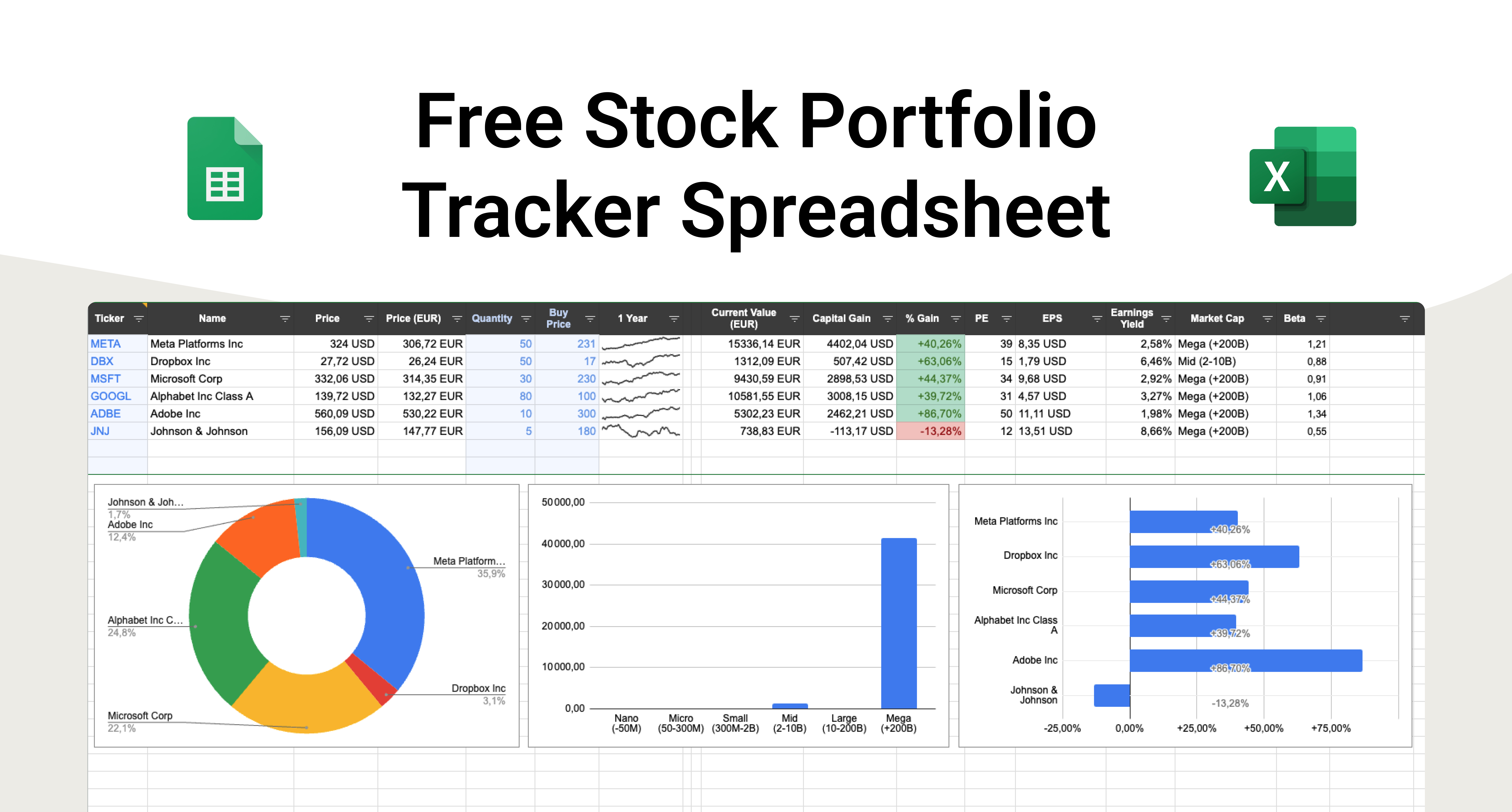
Before we dive into the "how," let's understand the "what" and "why." Most of Excel's powerful features—sorting, filtering, PivotTables, and charting—expect your data to be arranged in a simple, predictable format called tabular data.
When data is well-structured:
- Each row represents a single, unique record (e.g., one day of price data for a stock, or one transaction).
- Each column represents a specific attribute of that record (e.g., Date, Open Price, High Price, Ticker Symbol).
- The first row contains clear, descriptive headers.
- There are no empty rows or columns interrupting the data set.
To get a detailed understanding of these core principles, let's turn to a helpful guide.
Creating and Designing Basic Excel Reports: A Simple ...
This article from BunkerTech outlines the essential first step of organizing your data. It provides clear, actionable rules for creating a solid data foundation.
Please read the section titled 'Step 1: Organizing Data for Excel Reports'. Pay close attention to the points about using a tabular format and, importantly, why you should avoid merging cells.
The point about avoiding merged cells is critical. While it might seem like a good way to center a title, it breaks sorting, filtering, and formula-filling capabilities. A better alternative is the "Center Across Selection" alignment option, which gives the same visual effect without merging the cells.
2. Essential Formatting Techniques in Excel
With the principles of structure in mind, let's learn the practical skills for applying formats to make your data readable and professional. For financial data, correctly formatting numbers, currencies, and dates is not just about aesthetics—it's about accuracy and clarity.
The following video provides a beginner-friendly walkthrough of the most important formatting tools in Excel.
Excel for Finance and Accounting Beginner Tutorial
This tutorial from Learn Skills Daily covers the fundamentals of formatting cells in Excel. It's a great practical guide to the tools we'll be using.
Please watch these three consecutive segments: The first segment (starting around 12:28) covers basic formatting like colors, alignment, and borders. The second (around 16:30) is crucial; it explains how to format numbers as currency and how to handle date formats. The third (around 19:21) introduces the 'Format Painter,' an incredibly useful tool for quickly copying formatting from one area to another.
Let's recap the key takeaways from the video:
- Number Formatting: Use the tools in the
Home > Numbergroup to apply formats like Currency ($), Percentage (%), and to control the number of decimal places. - Date Formatting: Excel stores dates as numbers, so you can display them in different ways (e.g., "10/25/2023" vs. "Wednesday, October 25, 2023") without changing the underlying value.
- Cell Formatting: Use fill colors, font styles, and borders to distinguish headers from data and to improve readability.
- Format Painter: This tool (the paintbrush icon on the Home tab) saves a huge amount of time by letting you copy the format of a cell and "paint" it onto others.
Test your understanding!
Imagine you have a column of stock returns that look like this: 0.025, -0.01, 0.0512. How would you format this column to be easily readable as percentages with two decimal places?
Show answer
- Select the entire column of data.
- Go to the Home tab on the ribbon.
- In the Number group, click the Percent Style button (
%). This will convert the numbers to3%,-1%,5%. - Still in the Number group, click the Increase Decimal button twice to show two decimal places. The final result will be
2.50%,-1.00%,5.12%.
3. Structuring Data for Financial Charts
A primary reason for structuring data correctly is to prepare it for visualization. Different charts require data to be laid out in specific ways. Since your goal is to visualize financial markets, let's look at a classic example: the stock chart.
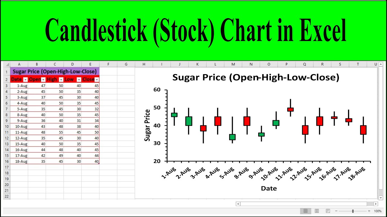
To create a standard candlestick or OHLC (Open-High-Low-Close) chart, you need your data organized in precise columns.
How to Create Stock Charts in Excel: Quick Guide
This guide from Coefficient provides a clear example of how to lay out your data specifically for creating stock charts in Excel.
Read the sections 'Organizing stock data in Excel' and 'Required data points for different chart types'. Note the required column order: Date, Open, High, Low, Close, and (optionally) Volume.
As the article shows, the structure is rigid. The charting tool needs to know which column is which to draw the chart correctly. When you arrange your data properly, Excel can instantly generate a powerful visualization like a candlestick chart.
4. Best Practice: Using Excel Tables
So far, we've been formatting a plain range of cells. However, the best practice for working with any structured data set in Excel is to convert it into an Excel Table.
An Excel Table (created by selecting your data and pressing Ctrl + T) is a special object that supercharges your data range with new capabilities. It's the most important step you can take to formalize the structure of your data.
Key benefits of using an Excel Table include:
- Dynamic Range: Charts and formulas that reference the table automatically include new rows or columns you add. No more manually updating your chart's data source!
- Easy Formatting: You can apply professional, alternating-row styles with one click.
- Built-in Tools: Tables come with sort and filter controls enabled on the header row by default.
- Readability: Formulas that use table data are much easier to read (e.g.,
SUM(SalesTable[Revenue])instead ofSUM(C2:C5000)).
The article you read earlier briefly mentions this. For a refresher, you can review the point "Convert Data into Excel Tables (Ctrl + T)" in the article "Creating and Designing Basic Excel Reports". This single step is a gateway to more advanced and efficient analysis.
Conclusion
Excellent work today! You've moved beyond simply importing data and have learned the crucial discipline of preparing it for analysis. This foundational skill will pay dividends in every future step of your data visualization journey.
Here are the key takeaways from this lesson:
- Structure is King: Always organize your data in a tabular format with unique rows, distinct columns, and clear headers. Avoid merged cells.
- Formatting for Clarity: Use number, date, and cell formatting to make your tables professional and easy to interpret at a glance.
- Structure Enables Visualization: Specific charts, like stock charts, require a precise data layout.
- Use Excel Tables (
Ctrl+T): This is the best practice for managing structured data in Excel, providing dynamic updates, easy formatting, and more.
In our next lesson, we will build directly on this foundation. Now that our data is well-structured and formatted, we'll tackle data cleaning, learning how to find and fix common problems like missing values and incorrect data types to ensure the absolute accuracy of your analysis.
Can't find a good explanation? Sign up and we'll make it for you
Sign up