
Welcome. This course treats handwriting as a trainable physical skill, not as a fixed personal trait. In this first module, you will establish a clear starting point, improve the mechanics that support writing, and build control before working systematically through print and cursive letterforms.
Today’s aim is to make your handwriting observable. Rather than deciding that a page looks “good” or “messy,” you will score five specific features: baseline alignment, size, slant, spacing, and letterforms that could be misread. This first score is not a judgment; it is a baseline you can compare against later.
Plan for about 40 minutes: a short video overview, a brief reading, then a careful self-assessment of one writing sample.
Legibility is more important than style
Clear handwriting does not need to look like anyone else’s. It may be upright or slanted, narrow or broad, print or cursive. What matters is that a reader can recognize letters quickly, distinguish words, and follow each line without effort.
How to Improve Your Handwriting | PRINT Writing | Drill Exercises for BEGINNERS
Watch “How to Improve Your Handwriting | PRINT Writing | Drill Exercises for BEGINNERS” from DorufaVSArt. The relevant sections give a concise checklist for judging legibility without treating one visual style as the only “correct” style.
Watch the legibility checks, focusing on the three questions about letter size, baseline position, spacing, and closed letter shapes. Then watch the style distinction: the key point is that style can vary, while clear forms, regular spacing, and baseline control remain essential.
A useful assessment separates the causes of illegibility. If your letters are recognizable but your words run together, you do not need to relearn the alphabet. You need spacing practice. If spacing is sound but letter bodies float above the line, your priority is alignment. A rubric prevents “practice everything” from becoming the plan.
Read this PrintableHandwriting guide for the logic behind separating handwriting into individual, observable features and using a consistent four-point scale.
In “What are the five key components of a handwriting rubric?”, read the five components. Notice that legibility is assessed feature by feature rather than as a general impression. Next, in the section beginning “Handwriting Scoring Calculator,” read the diagnostic rationale. In “How do you score each handwriting component?”, read the four-point scale, then scan the operational guidance for spacing, alignment, and sizing. Focus on the difference between occasional slips and a repeated pattern.
Create a useful starting sample
Use lined paper if possible, a pen or pencil you normally use, and your usual writing style. Avoid writing unusually slowly or trying to make the sample perfect; the point is to capture what happens in everyday writing.
Copy the following two sentences once, at a comfortable natural pace:
The quick brown fox jumps over the lazy dog.
Pack my box with five dozen liquor jugs.
These sentences contain every letter of the alphabet, including tall letters, descending letters, narrow letters, round letters, and diagonals.
Keep the original passage visible while copying, but do not erase, trace over letters, or rewrite individual words. At the top of the page, record:
- the date;
- whether you used print or cursive;
- the writing tool;
- whether the paper was lined, grid, or blank.
Save this page. Later comparisons only mean something when the samples are made under roughly similar conditions.
The rubric image below illustrates the principle of scoring separate categories instead of assigning a vague overall judgment.
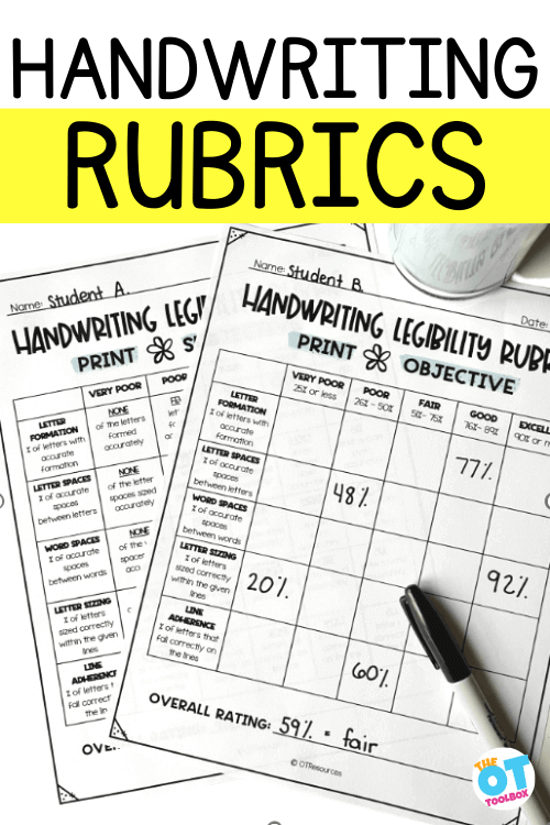
The five-feature self-assessment rubric
Score each feature from 1 to 4. Make the score describe the whole sample, not one unusually neat or untidy word.
| Feature | Score 4 — consistent | Score 3 — minor slips | Score 2 — repeated problem | Score 1 — major barrier |
|---|---|---|---|---|
| Baseline alignment | Nearly all letter bodies sit on the writing line. | A few letters float or sink, but the line remains easy to follow. | Floating, sinking, or drifting occurs regularly. | The line of writing is frequently difficult to follow. |
| Letter size | Lowercase bodies are similar in height; tall letters and descenders are clearly distinct. | A few letters are unusually tall, short, or oversized. | Size varies often enough to disrupt the visual rhythm. | Letter-size categories are largely indistinguishable. |
| Slant | Stems and repeated strokes lean in one consistent direction, or remain consistently upright. | Small changes in angle occur, without making words look unstable. | Slant repeatedly shifts within or between words. | Letter angles are erratic enough to reduce readability. |
| Spacing | Letter gaps are regular, and word gaps are visibly wider than letter gaps. | A few crowded or overly wide gaps occur. | Crowding, collisions, or large gaps happen frequently. | Word boundaries or individual letters are often hard to separate. |
| Ambiguous letterforms | Letters are immediately recognizable; closed forms are closed when needed. | A few letters need context to identify. | Several letters repeatedly resemble other letters. | Many letters cannot be confidently identified without guessing. |
Two cautions make this rubric fairer:
-
Do not score a chosen style as an error. A rightward slant, leftward slant, or upright hand can all be legible. For slant, score consistency, not whether your writing matches a particular angle.
-
Do not count purposeful descenders as baseline errors. In letters such as , , , , and , the main body should meet the baseline; the tail is supposed to extend below it.
The size category is about a hierarchy. In ordinary lowercase print, letters such as , , , , , , , , , , , , and form the main body height. Ascenders, such as , , , , and , should rise above that body. Descenders should fall below it. Capitals should also be clearly distinguishable from lowercase letters.
Inspect the sample one feature at a time
Do not try to inspect everything at once. Make five separate passes through the same sample. Use a different small annotation mark for each category, such as for baseline and for spacing. Circle only representative mistakes rather than covering the page in corrections.
1. Baseline alignment
Place a ruler along the ruled line beneath your writing and look at one word at a time. Are the lower edges of the letter bodies returning to the line? Do words gradually climb uphill or sag downward?
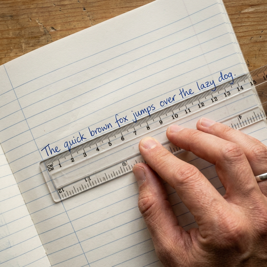
If you are using blank paper, lightly draw a horizontal reference line below your sample or hold a ruler against the lower edge of the letter bodies. Score the repeated pattern, not the occasional letter that dips slightly.
2. Letter size
Compare the body height of repeated lowercase letters. For example, in “brown,” “over,” and “dozen,” do the short letters occupy a similar vertical space? Then compare ascenders and descenders to those bodies.
A size issue is not simply “large handwriting.” Large writing can be perfectly readable. The concern is whether letters that should belong to the same height group change size unpredictably, or whether short and tall letters become indistinguishable.
3. Slant
Look especially at stems in letters such as , , , , , , and . Imagine a set of parallel guide lines running through them. Are those strokes broadly parallel, or does each letter lean at a different angle?
JetPens’ handwriting guide uses a fixed slant as a visual aid, but you do not need to adopt that particular angle. Your immediate goal is simply a stable direction.
4. Spacing
Inspect letter spacing and word spacing separately.
- Letter gaps naturally vary a little because an is narrower than an . Still, letters should not touch accidentally or spread so far that a word breaks apart.
- Word gaps must be clearly larger than the gaps inside words. A lowercase , or the width of the tip of a small finger, can be a rough visual reference for a word gap, but consistency matters more than exact measurement.
Narrow-letter sequences often reveal spacing problems: look closely at areas containing , , , , and .
5. Ambiguous letterforms
For this category, briefly cover the source passage and inspect your copied letters as if you were a reader encountering them for the first time. Circle forms that could plausibly be another letter.
Common examples include:
- an open that could look like or ;
- an open that resembles ;
- , , , and blending into one another;
- , , and becoming hard to distinguish;
- a poorly placed dot or cross stroke changing what a letter appears to be.
This is not a call for decorative perfection. The question is practical: “Could a reader identify this letter immediately, without relying on the sentence’s meaning?”
Record the result and choose a priority
Write your five scores in a compact record:
| Date | Style | Baseline | Size | Slant | Spacing | Letterforms | Notes |
|---|---|---|---|---|---|---|---|
| Today | Print or cursive |
You may add the five scores for a number out of 20, but do not let the total hide the useful information. A profile of baseline 4, size 2, slant 4, spacing 2, and letterforms 3 is far more informative than simply calling the writing “15 out of 20.” It identifies size and spacing as the two highest priorities while showing that slant is already stable.
If two categories receive the same lowest score, choose the one that creates the greatest reading difficulty. In general, unclear letterforms and missing word boundaries affect readability more directly than a mild change in slant.
Keep this first scored sample with its notes. During the course, you will return to the same rubric to see whether changes are actually improving everyday legibility rather than merely producing a neater-looking practice page.
Key takeaways
A productive handwriting assessment is specific:
- Score features separately rather than rating the page as simply neat or messy.
- Judge baseline, size, slant, spacing, and ambiguous letterforms on consistency across a representative sample.
- Treat slant as a matter of stability, not a requirement to lean in one particular direction.
- Preserve today’s sample and scores as your starting benchmark.
- Focus practice on the lowest one or two categories, not every visible imperfection.
Next, you will improve the physical conditions behind all five scores: a relaxed grip, stable posture, and a repeatable paper position.
Can't find a good explanation? Sign up and we'll make it for you
Sign up