
Good to see you again. In the previous lesson, you established a comfortable, repeatable writing setup: supported posture, a light grip, and a paper position that lets your forearm move without forcing your wrist. Now we use that setup to train the movements beneath every letter.
This lesson focuses on four families of movement: straight strokes, connected curves, ovals, and loops. The immediate goal is not decorative calligraphy or perfect-looking practice pages. It is to make the pen travel in a controlled, repeatable way with a consistent amount of pressure and a pace that feels smooth rather than hurried or hesitant. These are the raw materials you will use for lowercase print letters in the next module.
What “even pressure and steady rhythm” actually mean
With an ordinary pencil, ballpoint, rollerball, or gel pen, even pressure means using roughly the same light contact force throughout a stroke. Your line does not need to look mechanically identical everywhere; different pens and paper naturally create small variations. But it should not become suddenly darker at turns, gouge the page at the start, or fade because you are lifting away before the stroke is finished.
Use a pressure level that makes a reliable mark while keeping your fingers and thumb soft. If you turn the page over and see deep grooves, reduce pressure. If a line is pale or skips, first check whether the pen is working properly; pressing harder is not always the answer.
Rhythm means repeating a movement at a consistent, comfortable tempo. It does not mean writing quickly. In fact, writing very slowly often creates a shaky line because the hand keeps making tiny corrective movements. Aim for a moderate pace: deliberate enough to control the shape, but continuous enough that the pen glides.
A useful principle is:
Let the fingers guide fine detail, while the wrist and forearm help carry the pen through the larger motion.
For a short crossbar or a tiny correction, finger movement is appropriate. For a row of lines, ovals, or waves, allow the hand and forearm to participate. You do not need to adopt a rigid “whole-arm” style of writing; the point is simply not to make the fingertips do all the work.
The first practice sheet in this lesson uses movements that are larger than normal handwriting. That is intentional. A slightly enlarged movement makes tension, uneven pressure, and wobbles easier to see. Once the movement is dependable, it can become smaller without losing its smoothness.
See the movement families
The following practice sheet comes from brush-lettering instruction, so its example lines intentionally vary from thin on upward strokes to thick on downward strokes. Do not copy that contrast if you are using an ordinary pen or pencil. For this course, use one light, consistent pressure in both directions. The useful part of the sheet is its clear set of movement patterns.
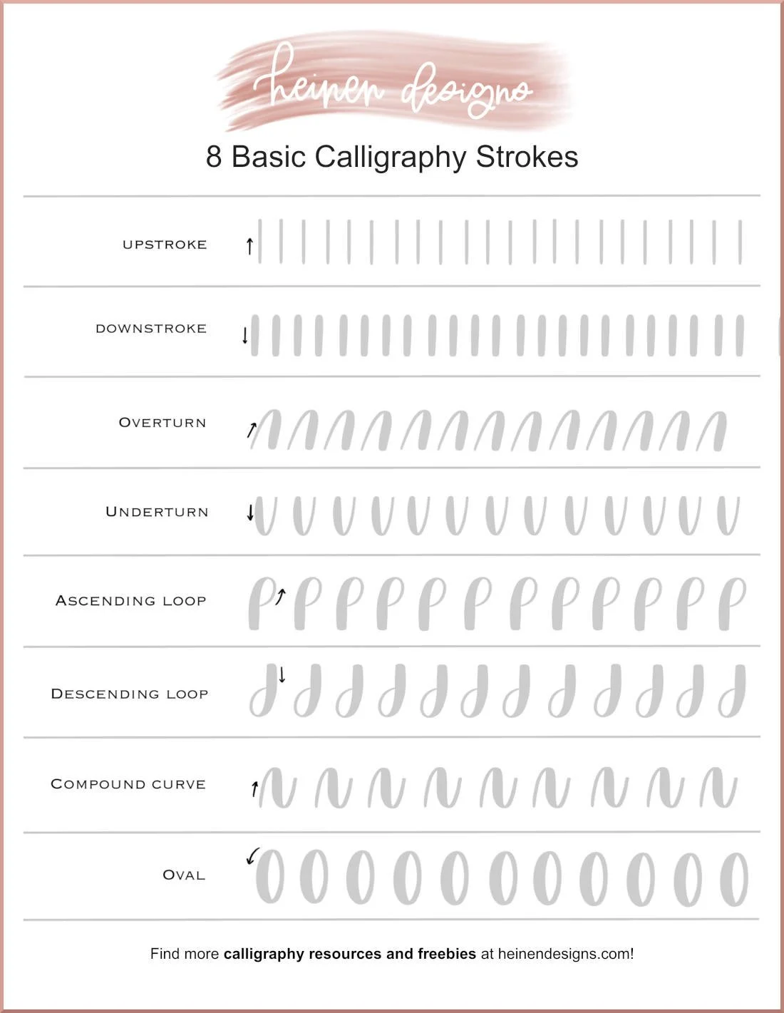
Notice that the rows are built from a small number of shapes:
- Straight strokes train direction and stability.
- Overturns and underturns are the hill and valley curves that later appear in many lowercase letters.
- Ovals train a continuous curved path and a clean closing point.
- Loops extend the oval motion vertically and develop controlled changes of direction.
The most valuable comparison is not between your page and an ideal model. Compare one repetition with the next: are the heights, widths, darkness, and spacing becoming more consistent?
The basic drills that will teach you to write with your arm
Watch “The basic drills that will teach you to write with your arm” from Perfect Biscuits for a visual demonstration of ovals, straight push-pull strokes, and horizontal curves. The presenter uses a historical whole-arm approach; use it as a demonstration of relaxed, larger movement rather than a rule that your fingers must never move.
Watch running ovals to see why a repeated oval is a useful warm-up. Do not copy the stated high stroke rate; use a pace at which every oval remains controlled. Then watch straight and retraced drills, focusing on the distinction between moving across the page and practising a shape in one place. Finish with horizontal curves to see the overturn and underturn motions that make smooth transitions possible.
The four movements: what to feel and what to watch
Before beginning, use lined paper if you have it. A baseline and a second horizontal guide make it easier to see whether your strokes remain the same height. Use the comfortable posture, light grip, and paper angle you established last time.
1. Straight strokes: move decisively, then stop
Start with short vertical lines, about the height of a lowercase letter. Place the pen, make one clean downward movement, then lift. Leave a small and fairly even gap before the next line.
A straight line tends to wobble for one of three reasons:
- You are moving so slowly that you correct the line continuously.
- Your fingers are gripping tightly to prevent any movement.
- Your wrist is held in an awkward bend instead of allowing a small, natural forearm movement.
Keep the line short enough to control. A good stroke has a calm start, one uninterrupted movement, and a clean finish. Do not retrace a line to “repair” it; the retracing usually makes pressure heavier and teaches hesitation.
After vertical strokes, make a row of short horizontal strokes. Keep the forearm supported and allow it to glide sideways a little. Horizontal movements reveal whether you are locking the wrist or rotating the paper enough to work comfortably.
2. Curves: avoid braking at the turn
An overturn is a hill-shaped curve: it rises, rounds over, and comes down. An underturn is a valley-shaped curve: it descends, rounds at the bottom, and rises again. Joined together, these form waves.
The difficult moment is not the long side of the curve; it is the turning point at the top or bottom. Many writers press harder there because the hand instinctively brakes before reversing direction. Instead, think of the curve as a single continuous sweep. Keep the contact pressure light as you round the turn.
For a row of hills or valleys, choose a modest width and repeat it. Your goal is for each curve to have:
- a similar height;
- a similar width;
- a rounded, rather than pointed, turn;
- the same visual darkness from beginning to end.
If curves develop sharp corners, make them slightly larger and slow only enough to maintain continuity. If they flatten out, avoid dragging sideways at the top or bottom; let the pen travel through the turn rather than pausing there.
3. Ovals: a curve that returns home
An oval is a continuous closed curve, usually a little taller than it is wide in ordinary handwriting. It is the underlying movement for many round lowercase forms you will meet next.
Begin each oval at the same point, such as near the top. Travel smoothly around the shape and return to that point without stopping halfway. Choose whichever rotational direction feels more natural and keep it consistent for the row. At this stage, direction matters less than maintaining a single, fluid path.
Look for three features:
| Feature | A useful oval | A sign to adjust |
|---|---|---|
| Height and width | Similar proportions across the row | One oval becomes narrow, the next broad |
| Curve | Smooth on both sides | Flat sides, pointed ends, or sudden kinks |
| Closure | The start and finish meet lightly | A visible gap, heavy overlap, or dark blob |
| Pressure | Similar darkness around the whole shape | Dark turns and pale side strokes |
Do not chase a perfectly geometric oval. In handwriting, a functional oval is one you can repeat reliably. Ten consistent, slightly imperfect ovals teach more than one perfect oval followed by nine corrections.
4. Loops: preserve the oval’s smoothness while changing height
A loop is essentially an oval that is stretched upward or downward and kept open where the stroke enters or leaves. Loops train you to travel through a narrow space, reverse direction smoothly, and maintain a dependable slant.
For an ascending loop, begin near the baseline, travel upward in a narrow curve, round at the top, and return down beside the first stroke. For a descending loop, make the same controlled motion below the baseline. Keep the loop narrow enough that its two sides relate to one another, but not so narrow that they collide.
The common loop problems are informative:
- A loop that becomes a balloon is too wide for its height.
- A loop that looks pinched is probably being squeezed by tense fingers or an abrupt reversal.
- A loop with a dark top or bottom signals that you are pressing while turning.
- Loops that lean in changing directions often indicate that the page or forearm position needs a small reset.
In this lesson, loops are movement drills, not cursive letters. You are building control now; later lessons will apply the same motion to readable letterforms.
11 Hand-Lettering Warm-up Exercises + FREE Download
Read the selected middle exercises from Heinen Designs for visual descriptions of consistent line width, ovals, loops, and waves. The article is aimed at brush lettering, so retain its advice about smoothness, repeated shape, and rhythm, but keep pressure even with your ordinary handwriting tool rather than making deliberately thick downstrokes and thin upstrokes.
In “Exercise Consistent Line Widths,” read the line-width guidance and apply its idea of repeated, comparable strokes. In “Exercise Oval Shapes & Circles,” read the subsection from its beginning, paying particular attention to the oval practice. Continue through “Exercise Overlapping Loops,” including the loop guidance, then read the “Exercise Waves & Hills” directions, especially the wave and hill drill. Focus on maintaining each shape’s size and spacing, not on creating a calligraphic thick-and-thin effect.
A 25-minute control-and-rhythm session
Use this as your first complete movement practice. Work on one row at a time. After every short row, lift the pen, relax your fingers, and inspect the page before beginning the next one. Do not fill a page automatically; feedback between small sets is what makes repetition useful.
Minutes 1–3: reset and pressure calibration
Recreate your preferred setup from the previous lesson: supported feet, low shoulders, paper angled toward the writing hand, non-writing hand steadying the sheet.
Make five short vertical strokes with your normal pressure. Then make five more using noticeably less pressure while still producing a clear line. Choose the lighter of the two levels that remains reliable. That is your practice pressure.
Minutes 4–8: straight-stroke rows
Make two short rows of vertical strokes, then one row of horizontal strokes.
For each row:
- Decide the intended length before the first stroke.
- Make six to ten strokes at one calm, repeatable pace.
- Keep the gaps approximately equal.
- Stop and compare the first three strokes with the last three.
A slight wobble is normal. The correction is usually to release your grip and make the next set more continuous, not to force the pen along a rigid path.
Minutes 9–13: hills, valleys, and waves
Make one row of overturns, one row of underturns, and one row of connected waves. Keep each curve about the same height as the vertical strokes you just made.
For connected waves, quietly use a simple beat in your mind: one beat for each rise and one for each fall. The beat is not a command to hurry. It prevents lingering at the turning points and helps each curve occupy comparable space.
Minutes 14–19: controlled ovals
Make three small groups of six ovals. Pause between groups.
In the first group, focus only on closing each shape lightly. In the second, focus on matching height and width. In the third, focus on keeping the darkness even around the entire oval. This single-focus approach is more effective than trying to correct every feature simultaneously.
Minutes 20–23: loops
Make one row of ascending loops and one row of descending loops. Keep them moderately large at first, with enough space between them to see each shape. Aim for a consistent height and a smooth rounded turn at the top or bottom.
If the line darkens at the turn, loosen your thumb and let the pen continue moving through the curve. If your loops drift across the line, pause and adjust the paper rather than twisting the wrist farther.
Minutes 24–25: choose one “best repeat”
Circle one straight stroke, one curve, one oval, and one loop that best show the control you want. Then make one final row of that movement, trying to reproduce its qualities.
This is not a test of artistic neatness. It is a way to identify what worked physically: perhaps a lighter grip, a more continuous motion, a better paper angle, or a more realistic pace.
Diagnose the pattern, not a single imperfect mark
At the end of practice, scan each row rather than scrutinizing individual strokes. One odd mark may simply be a slip. A repeated pattern tells you what to practise next.
| Repeated pattern | Likely cause | Next adjustment |
|---|---|---|
| Lines get darker toward the end of a row | Grip tightens with effort | Pause sooner; loosen the thumb and index finger before each short set |
| Curves have dark, heavy turns | You are stopping to reverse direction | Keep the motion continuous and use less pressure at the turn |
| Ovals vary widely in size | Your pace or movement range changes | Make a smaller set and use the same visual “container” between guide lines |
| Loops lean unpredictably | Wrist or paper position is changing | Reposition the paper and let the forearm guide the repeated motion |
| Strokes wobble despite effort | You are moving too slowly or correcting too much | Use a slightly more continuous pace and make the movement a little larger |
| The hand becomes sore quickly | Excess pressure or sustained tension | Stop, reset the grip, and return to shorter practice sets |
If discomfort becomes sharp, persistent, or produces numbness, stop rather than practising through it. Ordinary motor training may feel unfamiliar, but it should not require pain.
Key takeaways
Straight strokes, curves, ovals, and loops are not separate tricks: they are a small movement vocabulary from which readable letters are built.
- Use light, reliable pressure rather than pressing into the paper.
- Keep a moderate, continuous pace; rhythm is repeatability, not speed.
- Let the wrist and forearm assist larger repeated movements instead of clamping the pen and relying only on the fingertips.
- Practise in brief rows, inspect patterns, and adjust one feature at a time.
- Treat smooth curves, stable ovals, and controlled loops as movement skills before treating them as letter shapes.
Next, you will apply this control to the round-family lowercase print letters, where the oval and curved-stroke practice begins to turn directly into clear, consistent handwriting.
Can't find a good explanation? Sign up and we'll make it for you
Sign up