
Hello! Welcome to the third lesson in our capstone module.
In our previous lessons, we laid the strategic groundwork for our project. We started by defining the audience and the key questions our dashboard will answer (the "why"), and then we learned how to identify and source the necessary data to address those questions (the "what").
Now, before we jump into Power BI and start building, we need to address the "how" and "where". How will the visuals be arranged? Where will each piece of information live? This is the design and planning phase. Today's learning outcome is to create a storyboard or low-fidelity wireframe for a financial dashboard layout. Think of this as creating an architectural blueprint for a house before you start construction. It's a crucial step that ensures the final product is logical, user-friendly, and effective.
1. Why We Plan: The Power of a UX-First Approach
It's tempting to open Power BI, connect to your data, and start dragging charts onto the canvas. However, this often leads to cluttered and confusing dashboards. The professional approach is to plan the layout and user experience (UX) first. This is called storyboarding or wireframing.
- A wireframe is a low-fidelity visual guide that represents the skeletal framework of a dashboard. It focuses on structure and layout.
- A storyboard maps out the narrative flow and user journey, showing how a user will interact with the dashboard to get from a high-level overview to a specific insight.
In practice, we combine these ideas to create a visual plan for our dashboard. Let's explore why this is so important.
Power BI UX: Best Practices for Storyboarding Dashboards
This article from Aufait UX, a firm specializing in user experience, clearly explains why starting with a visual plan is a best practice in modern dashboard design.
Please read the introduction and the section titled 'Why Power BI Dashboards Need Visual Storyboarding'. Pay close attention to the benefits mentioned, such as creating a logical narrative, prioritizing metrics, and aligning with business goals.
As the article highlights, wireframing helps prevent the most common reasons dashboards fail: misaligned expectations, information overload, and a poor user experience. By creating a shared visual plan upfront, you ensure that what you build is exactly what your audience needs.
2. Planning the Narrative: What's Your Data Story?
A great dashboard doesn't just present data; it tells a story that guides the user toward a decision. As someone interested in documenting media, you know that effective stories follow a familiar structure. One of the most powerful structures is Setup, Conflict, and Resolution.
- Setup: The current state or baseline. e.g., "The stock market has been trending upwards for the last six months."
- Conflict: A change or challenge to that reality. e.g., "However, our technology-heavy portfolio has started to underperform the S&P 500 index."
- Resolution: The new reality or the action to be taken. e.g., "This suggests a rotation out of overvalued tech stocks and into the industrial sector is needed."
Your dashboard layout should visually walk the user through this kind of narrative.
Telling Stories with Data in 3 Steps (Quick Study)
Before we sketch the layout, let's solidify the concept of data storytelling. This short video from Harvard Business Review provides an excellent framework for turning data into a compelling narrative.
Watch from the beginning to 01:06 to understand the 'Setup, Conflict, Resolution' structure. Then, watch from 02:57 to 04:16 to see how this translates into a visual presentation. Notice how the presenter uses titles and highlights specific data to focus the audience's attention on the story—this is a key technique for effective dashboard design.
3. The Wireframing Process: From Idea to Blueprint
Now let's get practical. How do you actually create a wireframe? It's a process of layering and arranging components logically.
A. Establish the Information Hierarchy
A user should be able to understand the main message of your dashboard in seconds. This is achieved by structuring information in layers, a concept known as information hierarchy.
Power BI UX: Best Practices for Storyboarding Dashboards
The Aufait UX article we looked at earlier outlines a great process for this. Let's focus on the crucial step of structuring your dashboard's information.
Please read the section 'Step 3: Establish a Logical Information Hierarchy'. This will introduce you to the three key layers: the overview (KPIs), analytical trends, and granular details.
This layered approach—from the "what" to the "why"—is fundamental to good dashboard design. Your wireframe should reflect this, typically with high-level summaries at the top and more detailed charts below.
B. Sketch the Layout: Key Components
With the hierarchy in mind, you can start sketching the layout. Think of your dashboard as being composed of several distinct zones.
How to Design Effective Business Dashboards with Wireframes
This comprehensive article from Medium provides a fantastic breakdown of the essential components, or 'zones,' to include in your wireframe.
Read the section 'Essential Components of Business Dashboard Wireframes'. This gives you a clear blueprint: a Header for context, a KPI Summary for the overview, a Visualization Zone for analysis, and a Filter Panel for interaction. These are the building blocks of your layout.
Now, let's see what this looks like in practice.
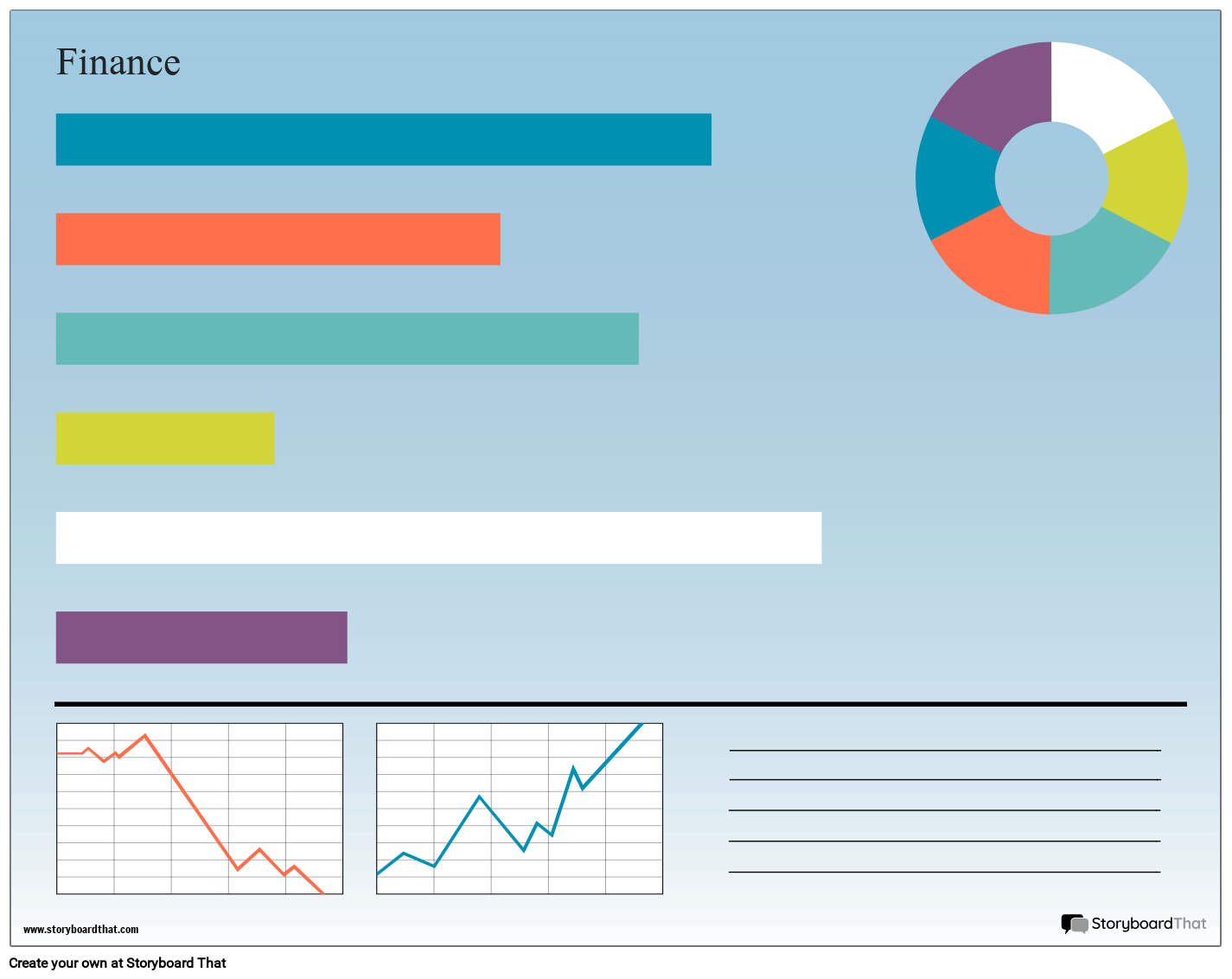

C. Choose Your Tool
You don't need complex software. Your goal is to quickly translate your ideas into a visual plan.
- Pen and Paper: The fastest way to get ideas down.
- PowerPoint/Google Slides: Excellent for creating clean, easily shareable digital wireframes. You're already familiar with these.
- Specialized Tools: Apps like Balsamiq, Figma, or Mokkup.ai are designed for this, but can have a learning curve.
For your purposes, PowerPoint is a fantastic and accessible option. The following video shows this process in action.
Power BI Wireframe - Data God Tools - Everyone
Let's see how a simple tool like PowerPoint can be used to create a professional wireframe.
Watch the first minute (00:00-01:00) to see how a PowerPoint file can serve as a powerful wireframing tool. Then, jump to 04:03-05:50 to watch a demonstration of laying out visual elements and using placeholders. This shows you how to apply the 'component' ideas we just read about.
4. Specifics for Financial Dashboards
While the principles of wireframing are universal, financial dashboards have unique patterns and requirements. Given your studies in Global Financial Markets, these considerations should resonate with the types of analysis you're used to.
How to Design Effective Business Dashboards with Wireframes
Let's focus on your specific goal of visualizing financial markets. The article on designing effective dashboards has a section with patterns specifically for financial services.
Read the subsection titled 'Financial Services Dashboards'. Pay close attention to the key patterns (e.g., prominent risk indicators, hierarchical drill-downs, comparison periods) and the wireframing considerations. This is direct, actionable advice for your capstone project.
Your Turn: Sketch Your Dashboard
Now it's time to apply what you've learned. This activity is the core of this lesson and will become the blueprint for the dashboard you'll build next.
Activity: Wireframe Your Capstone Project
Let's assume your capstone project will be a "Portfolio Performance Dashboard" for an individual investor.
Primary Question: "How is my portfolio performing against the market, and which specific holdings are driving this performance?"
Your Task:
On a piece of paper, in PowerPoint, or using another simple tool, sketch a low-fidelity wireframe for the main page of this dashboard. Don't worry about making it pretty; focus on structure and clarity.
Your wireframe should include placeholders for:
- KPI Summary Section: Key metrics like 'Total Portfolio Value', 'Overall Return %', and 'Benchmark Return %' (e.g., S&P 500).
- Main Visualization: A line chart comparing the portfolio's value over time against the benchmark index.
- Breakdown Visuals:
- A chart showing portfolio allocation (e.g., a treemap or donut chart for asset allocation by sector or individual stock).
- A table or bar chart showing the top 5 and bottom 5 performing stocks in the portfolio.
- Filter Panel: Controls to change the time period (e.g., YTD, 1 Year, All Time).
There is no single "correct" layout. The goal is to practice arranging these components logically based on the principles of information hierarchy and data storytelling. This sketch will be your guide in the next lesson.
Conclusion
Congratulations! You've just completed the "architectural design" phase of your project. By creating a wireframe, you've built a solid plan that will make the actual construction in Power BI faster, easier, and more effective.
Key Takeaways:
- Plan Before You Build: Wireframing is a strategic step that prevents rework and ensures your dashboard meets user needs.
- Tell a Story: Structure your dashboard's narrative using frameworks like "Setup, Conflict, Resolution" to guide your audience to an insight.
- Use a Hierarchy: Arrange information in layers, with high-level summaries (KPIs) at the top and detailed charts below.
- Know Your Components: A typical dashboard includes a header, KPI cards, visualizations, and filters. Arrange them logically on your canvas.
You have now defined your project's purpose, sourced its data, and planned its visual layout. You are fully prepared for the final construction step. In our next lesson, we will take your wireframe and bring it to life as we build a complete, interactive financial dashboard in Power BI based on your project plan.
Can't find a good explanation? Sign up and we'll make it for you
Sign up