
Hello! Welcome to the fourth lesson of our capstone module.
So far in this project, we have defined our audience and key questions (the why), sourced the necessary data (the what), and created a wireframe to plan our dashboard's layout (the how and where). You've completed all the architectural and planning work.
Today, we move from blueprint to construction. Our learning outcome is to build a complete, interactive financial dashboard in Power BI based on the project plan. We will take the wireframe you designed in the last lesson and bring it to life, transforming static boxes and placeholders into a dynamic, interactive report.
This is where all your skills from the previous modules come together. Let's start building!
1. From Wireframe to Canvas: Setting Up Your Workspace
Before we add any visuals, we need to prepare our Power BI canvas to match the professional and structured look of our wireframe. A clean setup makes the building process much smoother.
For inspiration, here is an example of a polished, interactive stock market dashboard built in Power BI. This is the level of quality we are aiming for.
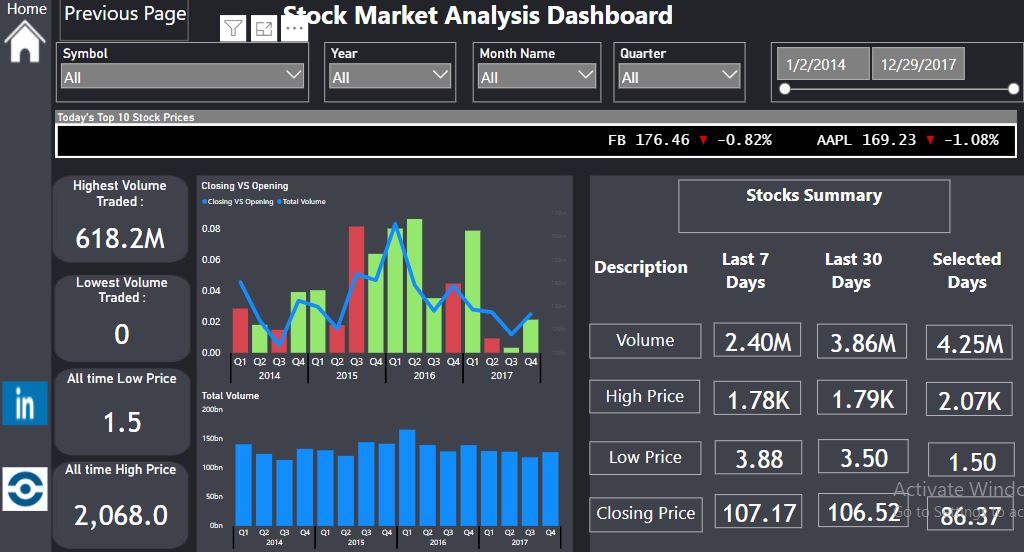
The key steps to set up your canvas are:
- Set the Theme: Financial dashboards often use a dark theme to make colors and data points stand out. You can do this via View > Themes.
- Establish the Background: A great technique, especially when working from a wireframe, is to create a background image in a tool like PowerPoint that defines the layout zones. This ensures your visuals are perfectly aligned.
- Connect Your Data: You've already sourced your data. Now, load it into Power BI and establish the relationships in the Model view, especially ensuring you have a dedicated Date table connected to your fact tables. This is critical for all time-based analysis.
The following video provides an excellent walkthrough of building a complete stock dashboard. We will refer to different parts of it throughout this lesson.
Stock Research Dashboard in PowerBI: 20 Minute Tutorial
Let's watch the initial setup phase of this 'Stock Research Dashboard' tutorial from the Ptarmy channel. The presenter does a great job of explaining the data model and preparing the canvas.
Watch from 00:28 to 02:20. Pay attention to two key things: The simple but effective data model: two fact tables (stock and overview) connected to a Date table. How the presenter imports a pre-built PowerPoint image as the canvas background to perfectly match his wireframe. This is a powerful technique for creating polished layouts.
2. Building the Core Visuals: Populating Your Layout
With the canvas ready, we can start adding the visuals from your wireframe. We'll follow the information hierarchy we discussed: KPIs at the top, followed by the main trend chart, and finally the detailed breakdowns.
Let's use the "Portfolio Performance Dashboard" wireframe from our last lesson as our guide.
A. KPI and Summary Cards
The top of your dashboard should immediately answer the most important questions with KPIs. In Power BI, we use Card, Multi-row card, or the new Card (new) visual for this. These will display metrics like 'Total Portfolio Value', 'Overall Return %', and 'Benchmark Return %'.
Stock Research Dashboard in PowerBI: 20 Minute Tutorial
The 'Stock Research Dashboard' video demonstrates how to create several types of cards to display key information.
First, watch from 02:20 to 04:12 to see how basic cards are created for the company name and description. Then, continue from 04:12 to 06:34 to see the creation of a Multi-row card for key stock metrics. Notice how the presenter uses simple DAX measures to calculate values like Today's Close and 52-Week High. This is the same method you'd use to calculate your portfolio KPIs.
B. The Main Trend Chart
Your wireframe's primary visual was likely a line chart comparing your portfolio's value over time against a benchmark (e.g., the S&P 500). This is the centerpiece of your data story.
- Create a Line chart.
- Drag your
Datefield to the X-axis. - Drag your
Portfolio ValueandBenchmark Valuemeasures to the Y-axis.
C. Breakdown Visuals
These visuals provide the next layer of detail, explaining why the main trend is happening.
- Asset Allocation: For showing allocation by sector or stock, a Treemap is often more effective than a pie chart, as it handles a larger number of categories gracefully. Drag your category field (e.g., 'Sector') to the 'Category' field well and your value field (e.g., 'Market Value') to the 'Values' field well.
- Top/Bottom Performers: A Bar chart or Table is perfect for this. Drag the stock name to the axis/rows and the performance metric (e.g., 'Return %') to the values. You can then use the Filters pane to apply a "Top N" or "Bottom N" filter.
Test your understanding!
Imagine you're building the "Top 5 Performers" bar chart. You've dragged 'Stock Name' to the Y-axis and 'Return %' to the X-axis. How would you use the Filters pane to show only the top 5?
Show answer
- In the Filters pane, find the 'Stock Name' field.
- Expand it and change the 'Filter type' from 'Basic filtering' to 'Top N'.
- Set 'Show items' to 'Top' and enter '5' in the box.
- Drag your 'Return %' measure into the 'By value' field well.
- Click 'Apply filter'.
3. Adding Powerful Interactivity
A static dashboard is just a report. An interactive dashboard is an analytical tool. The most important interaction for financial analysis is almost always time-based filtering.
While a default date slicer works, a more professional approach is to offer pre-defined time periods like '1M', '6M', 'YTD', '1Y', etc. The video from Ptarmy shows a brilliant, clean way to achieve this using a DAX-generated table.
Stock Research Dashboard in PowerBI: 20 Minute Tutorial
This is one of the most valuable techniques for building financial dashboards. Let's learn how to create a custom time-period slicer that controls our charts.
Watch this section carefully from 08:34 to 14:45. It's dense but incredibly powerful. The key steps are: Create a new DAX table (Data table function) with the desired time periods (e.g., "1. 1 Month", "2. 3 Month"). The numbers are for sorting. Create a Slicer visual using this new table and format it as a Tile to look like buttons. Write a master DAX measure that uses SWITCH() to detect which button is selected and determines the correct start date for the filter. Modify your existing chart measures (e.g., for the line chart) to use this new master date filter.
This technique elevates your dashboard from basic to advanced, giving users the exact controls they need for time-series analysis.
4. Integrating Specialized Financial Visuals
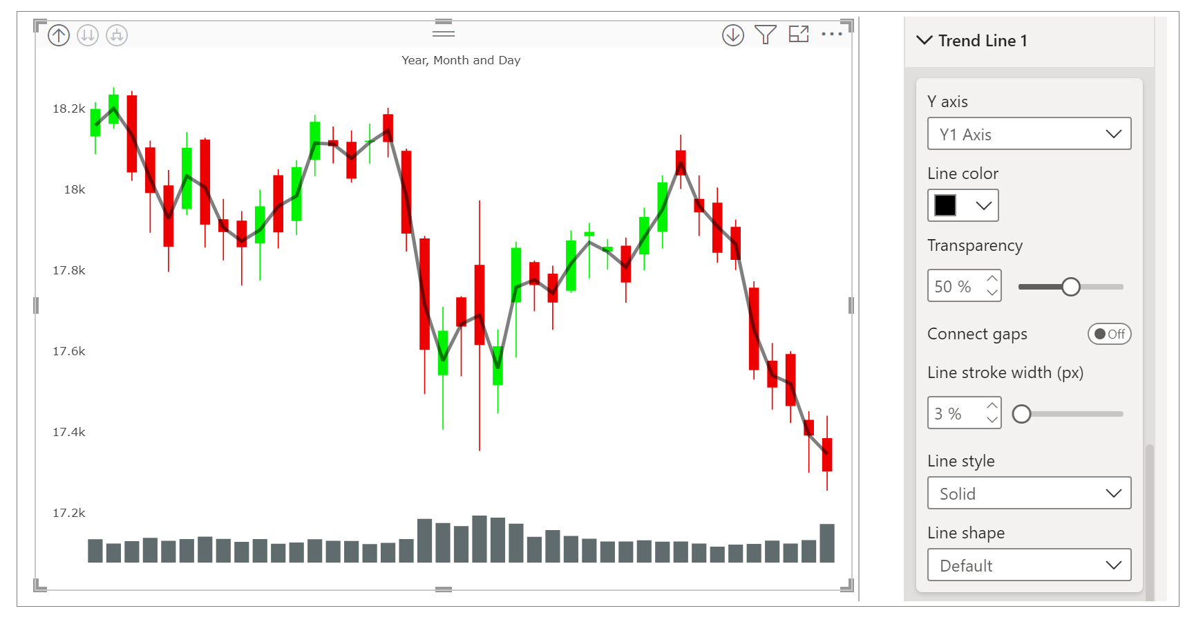
Your background is in financial markets, so let's incorporate a visual that is fundamental to stock analysis: the Candlestick chart. This is not a standard visual in Power BI, so you'll need to get it from AppSource.
Stock Research Dashboard in PowerBI: 20 Minute Tutorial
The 'Stock Research Dashboard' video also covers how to add and configure a candlestick chart.
Watch from 14:45 to 18:21. Note how the presenter: Gets the custom visual (Candlestick by OKVIZ) from the marketplace. Drags the Date, Open, High, Low, and Close fields into the visual. Creates a separate, dedicated slicer just for the candlestick chart with shorter timeframes (2W, 4W, 8W). This is a fantastic design pattern, as candlestick analysis is typically done over shorter periods than portfolio trend analysis.
5. Assembling and Polishing the Final Dashboard
Now you have all the components. The final step is to arrange them on the canvas according to your wireframe, ensure they interact correctly, and apply finishing touches.
This process involves:
- Arranging and Resizing: Position each visual in its designated zone from your wireframe. Use the Format > Align tools to ensure they are perfectly lined up.
- Formatting: Apply consistent formatting (titles, fonts, colors, borders, shadows) to all visuals for a professional look. The LINK article provides a good checklist for this in Step 7 ("Formatting, Themes, and Branding").
- Enhancing Interactivity with Bookmarks: For a truly polished user experience, you can use bookmarks to show or hide elements like a filter pane. This keeps the primary view clean.
Power BI Dashboard Tutorial | Stock Market Dashboard
This second tutorial from the Data Space channel focuses heavily on UI/UX and shows how to use bookmarks to create a slide-out slicer pane.
Watch from 14:36 to 23:25. This is an advanced but very impressive technique. The presenter shows how to: Add buttons (hamburger icon, 'X' icon). Use the Selection pane to show/hide the slicer pane. Create two Bookmarks: one for the 'open' state and one for the 'closed' state. Assign the bookmarks to the buttons to create the interactive hide/show effect. This is a great way to add more detail to your dashboard without cluttering the main view.
Conclusion
You have now walked through the entire process of turning a plan into a functional, interactive dashboard. By following your wireframe, you've ensured a logical and user-friendly layout. By integrating advanced techniques like custom time slicers and specialized visuals, you've created a powerful tool for financial analysis.
Key Takeaways:
- Build on a Blueprint: A wireframe is your guide. Set up your canvas to match it before adding visuals.
- Layer Your Information: Build your dashboard starting with high-level KPIs, then trend charts, and finally detailed breakdowns.
- Interactivity is Key: Use slicers—especially custom DAX-driven ones—to empower users to explore the data.
- Use the Right Tool for the Job: Don't be afraid to use custom visuals from AppSource, like candlestick charts, for specialized needs.
- Polish for Professionalism: Use themes, alignment, and advanced features like bookmarks to create a clean, professional user experience.
In our next lesson, we will focus on the final step of the project lifecycle: developing a compelling narrative around the data insights you can now discover in your completed dashboard.
Can't find a good explanation? Sign up and we'll make it for you
Sign up