
Hello! Welcome to the final lesson in our module on Strategic Measurement Frameworks.
In our last lesson, we focused on how to present your own analytical findings with intellectual honesty by communicating data limitations and confidence levels. This skill is crucial for building trust and managing expectations as a leader.
Now, we shift our focus from presenting your own work to evaluating the work of others. As a marketing leader, you will be constantly presented with reports and dashboards from your team, other departments, and external vendors. Your ability to quickly assess their quality is paramount for good decision-making.
This lesson addresses the learning outcome: Critique a marketing report or dashboard for its clarity, relevance, and actionability. We will establish a simple but powerful three-part framework to help you diagnose the strengths and weaknesses of any report and provide constructive feedback to elevate your team's analytical capabilities.
1. The Three Pillars of an Effective Report
Every marketing report or dashboard, regardless of its complexity, should be judged on three fundamental criteria:
- Clarity: Is it easy to understand? Can the audience grasp the main points quickly?
- Relevance: Does it answer the right business questions for the intended audience?
- Actionability: Does it drive a decision or inspire a specific next step?
A report that fails on any one of these pillars is a missed opportunity. A report that fails on all three is just noise.
To start, let's explore some common pitfalls and best practices that relate to these pillars.
5 of the best marketing report examples
The team at Funnel.io has a great article that outlines common mistakes in marketing reporting and the key characteristics of a great dashboard. As you read, map their points to our three pillars.
Please read the sections titled 'Common mistakes in marketing reporting' and 'What makes a great marketing analytics dashboard?'. Pay attention to how 'Misleading data visualizations' affects Clarity, how 'Clear goals and KPIs' speaks to Relevance, and how 'Contextualized for your audience' enhances Actionability.
Distinguishing Audience: The Executive vs. Operational View
A major component of relevance is tailoring the report to its audience. The data and level of detail you'd show your social media marketing team are vastly different from what you'd present to the C-suite. Your team needs granular, operational data to optimize campaigns. Executives need a high-level, strategic view to assess business health and make budget decisions. Mistaking one for the other is a common reporting failure.
Best Executive Marketing Dashboard Examples
This article from AgencyAnalytics provides an excellent breakdown of the differences between a typical operational dashboard and a strategic executive dashboard.
Read the first few sections, from 'What Is an Executive Marketing Dashboard, Anyway?' down to the comparison table in 'Benefits of Regular Marketing Dashboards vs. Executive Marketing Dashboards'. Focus on the pitfalls of showing too much granular detail to executives and the importance of a clear, high-level story.
One of the most powerful ideas from that article is the "5-second rule": an executive should be able to understand the overall state of performance within five seconds of opening a dashboard. This is a brilliant test for both clarity and relevance.
2. A Framework for Critique: Reverse-Engineering a Great Dashboard
Now that we have our three pillars, how can we apply them systematically? A great way to critique a dashboard is to reverse-engineer the process that should have been used to build it in the first place.
This video from Maven Analytics provides a simple, six-step framework for designing effective dashboards. We can use these steps as a checklist for our critique.
Telling a Story with Data | Dashboard Build Demo
Watch this video to understand a best-practice framework for creating a dashboard. We will then use these steps as our guide for critiquing existing reports.
First, watch from 01:07 to 02:55 to learn the six-step framework. Then, watch the final 'storytelling' part of the demo from 08:59 to 12:49. Notice how the final product uses descriptive titles and a logical layout to tell a clear story, moving from a simple report to an actionable analysis.
Here is that six-step process, reframed as a critique checklist for you as a leader:
- Define Purpose: Did the creator have a clear audience and business question in mind? (Critiques Relevance)
- Choose Metrics: Are these the right KPIs to answer that question? Are they tied to business goals? (Critiques Relevance)
- Present Data: Are the chart choices appropriate? Is a line chart used for trends, a bar chart for comparisons, etc.? (Critiques Clarity)
- Eliminate Clutter: Is the dashboard clean and easy to read, or is it cluttered with unnecessary borders, colors, and information? (Critiques Clarity)
- Use Layout: Does the layout guide my eye from the most important, high-level information to more granular details? (e.g., following a 'Z' or 'F' pattern). (Critiques Clarity)
- Tell a Story: Does the report have clear titles, annotations, and summaries that explain what the data means? Does it offer insights or recommendations? (Critiques Actionability)
If a report you're reviewing feels confusing or unhelpful, walking through these six questions will almost always reveal exactly where it went wrong.
3. From "What" to "Why": The Key to Actionability
The single biggest failing of most marketing reports is that they are strong on clarity (they show data) but weak on actionability (they don't provide insight). They tell you what happened, but not why it happened or what to do next.
As a leader, your most important job is to push your team to move from "what" to "why."
Your extensive experience with platforms like Meta Ads makes this the perfect ground to explore this concept. You know the standard metrics, but a great report digs deeper.
How to Analyze Facebook Ads Data the Right Way (The 2026 Guide)
Dara Denney provides a masterclass in how to analyze Meta Ads data. She perfectly articulates the difference between reporting 'what' happened and analyzing 'why' it happened. This mindset is the core of an actionable critique.
Please watch three key segments: Mindset Shift (10:46 - 11:51): Focus on the two core questions: 'What is working?' and 'Why is it working?'. Primary vs. Storytelling Metrics (11:51 - 14:20): Understand the distinction she makes. 'Primary' metrics (ROAS, CPA) tell you what is working. 'Storytelling' metrics (Hook Rate, Hold Rate, CPM) help you understand why. Advanced Creative Analysis (21:21 - 31:08): This is a fantastic example of going beyond platform metrics to find real, actionable insights by incorporating qualitative data (messaging, format, creator) into the analysis. It's a template for what 'good' looks like.
Dara's framework is a powerful tool for your critique. When you see a report, ask:
- Does this report only show primary metrics (the "what")?
- Or does it also include diagnostic and storytelling metrics (the "why")?
- Does it combine quantitative data with qualitative analysis of the marketing activities themselves (e.g., the creative, the messaging, the audience)?
Let's look at two examples.
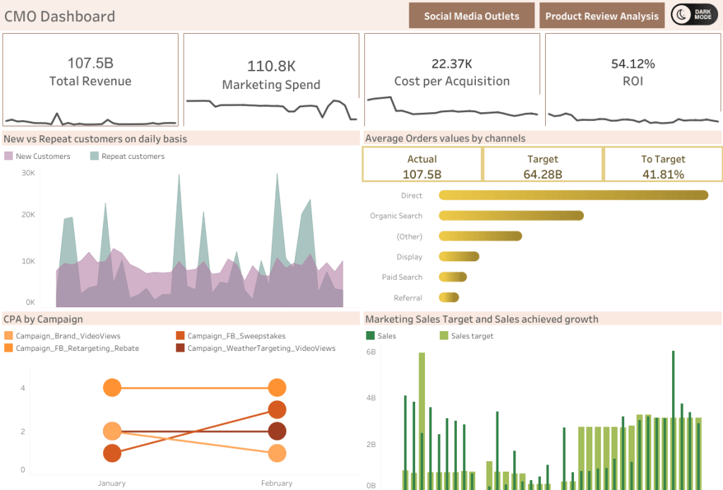
Now, contrast that with a dashboard designed for deep insights.
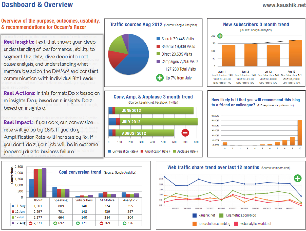
While not every report needs this level of detail, it represents the ideal you should be pushing your team toward.
Test your understanding!
Imagine one of your campaign managers sends you a weekly performance report. It's a simple, clean spreadsheet showing each campaign's name, total spend, impressions, clicks, conversions, and ROAS.
Using the three pillars, how would you critique this report and what feedback would you give your manager to improve it?
Show answer
Here's a structured way to give feedback:
"Thanks for sending this over. The data is clear and accurate, which is a great start. I have some thoughts on how we can make this report even more valuable for driving decisions.
-
On Clarity: It's very clean, which is good. To make it even clearer, could you add a small summary at the top that calls out the top 1-2 wins and the biggest challenge or surprise from the week? That would help me see the main story in 30 seconds.
-
On Relevance: The metrics you've included are the right primary KPIs. To add more relevance, could we also include the primary audience segment each campaign is targeting? This will help us see which segments are responding best.
-
On Actionability: This is where we can make the biggest improvement. Right now, this report tells us what happened (e.g., 'Campaign X had a high ROAS'). I want us to start digging into why. For the top and bottom performing campaigns each week, could you add a few bullet points with your hypothesis? For example: 'Campaign X performed well; we believe this is due to the new UGC creative which has a 25% higher hook rate than our previous assets. Recommendation: Let's double down on this creative style.'
This moves the report from being a summary of the past to a tool for planning the future."
Conclusion
As you transition into a more strategic role, your ability to critique the analytical work of your team becomes as important as your own ability to perform analysis. You are no longer just an individual contributor; you are a force multiplier, responsible for elevating the data literacy and strategic thinking of your entire function.
By consistently evaluating reports through the lens of Clarity, Relevance, and Actionability, you will guide your team away from creating simple "data dumps" and toward producing powerful, insight-driven analyses that lead to smarter business decisions.
Key Takeaways:
- Critique every report using the three pillars: Clarity, Relevance, and Actionability.
- Always consider the audience. An effective report for an executive is different from one for a campaign manager. A good report is relevant.
- A visually appealing dashboard is good, but it's not enough. A report must be easily understood to be effective. It must have clarity.
- The most common failure of marketing reports is a lack of insight. Push your team to move beyond reporting what happened to explaining why it happened and recommending what to do next. This is true actionability.
Preview of the Next Lesson:
This lesson concludes our module on Strategic Measurement Frameworks. You've learned how to develop a measurement plan, translate objectives into KPIs, communicate uncertainty, and now, critique the final output.
In our next module, we will dive into Designing and Interpreting Experiments. We'll move from analyzing past performance to proactively testing hypotheses to find future growth. Our first lesson will be "Evaluate A/B test designs for validity and potential biases," where you'll learn the fundamentals of setting up experiments you can trust.