
Good to continue from the Vite and ES-module foundation you set up previously. Your browser code now has a sensible project structure; this lesson gives that project a user-facing structure: a responsive video-library application shell that will later hold React components, API data, authentication controls, and uploads.
You will build the shell in plain HTML and CSS first. That is deliberate: React will eventually express the same ideas in JSX, but it cannot make an unclear document structure accessible for us. By the end, you will have a mobile-first page with semantic landmarks, keyboard-visible focus, a skip link, responsive video cards, and a layout that remains logical when viewed, zoomed, or navigated with a keyboard.
Start with the document, not the decoration
An application shell is the repeated frame around a product’s pages: branding, primary navigation, the main content area, and a footer. In a video platform, that frame might surround the library, upload page, account settings, processing jobs, and playback pages.
The important distinction is this:
- HTML describes meaning and structure.
- CSS controls layout and appearance.
- JavaScript adds behavior when behavior is needed.
A visually polished collection of generic <div> elements can be difficult to navigate with a screen reader or keyboard. By contrast, a semantic document supplies useful information to the browser’s accessibility tree: this is navigation; this is the main content; this item is a link; this is a heading.
 A browser accessibility-tree outline showing a document divided into landmarks, headings, links, sections, and paragraphs. Semantic HTML gives assistive technology this navigable structure even when the visual design is styled with CSS.
For this shell, use the elements whose meaning already matches the interface:
| Interface purpose | Prefer | Why |
|---|---|---|
| Site-level introductory area | <header> | Identifies introductory content for the page or site |
| Primary navigation | <nav> with a <ul> | Announces navigation and its list of related links |
| Unique page content | <main> | Gives assistive technology a direct destination |
| Distinct titled grouping | <section> | Groups content under a heading |
| Self-contained video record | <article> | Represents a reusable, independently meaningful content unit |
| Complementary guidance | <aside> | Marks supplementary content |
| Site-level ending content | <footer> | Holds repeated support, legal, or secondary links |
| Navigation to a URL | <a href="..."> | Works with keyboard, opening in a new tab, history, and copying URLs |
| An in-place action | <button> | Has native keyboard behavior and correct control semantics |
Do not turn every wrapper into a <section>. A section should normally have a heading and represent a meaningful region. Ordinary layout grouping is still a valid use of <div>.
MDN Web Docs HTML: A good basis for accessibility - Learn web development | MDN
Read MDN’s accessibility guide to connect semantic HTML with screen-reader navigation, native keyboard behavior, and skip links. These are the structural decisions that make the shell usable before CSS is added.
Read “HTML and accessibility” through “Good semantics,” then focus on “Use well-structured text content,” “Structure page sections logically,” and “Use semantic UI controls where possible.” Read the semantic HTML rationale, then follow the heading structure discussion. In the controls subsection, read the native controls explanation. Finally, in “More on links,” read the “Skip links” subsection and its skip link rationale.
A few decisions in the shell below follow directly from this:
- There is one clear
<h1>: “Your video library.” - The navigation items are a list because they are a related collection.
- “Upload a video” is a link because it leads to another page or route.
- The “Ready” and “Processing” labels use text as well as color.
- The skip link appears first in the source so keyboard users can bypass repeated navigation.
Build the semantic shell
Continue inside the Vite project from the prior lesson. In src/main.js, retain only the stylesheet import for now:
import "./style.css";
Replace the body of index.html with the following. The paths such as /uploads/ are placeholders for routes you will implement later; they are still real destination-style URLs, not pseudo-links such as href="#".
<body>
  <a class="skip-link" href="#main-content">Skip to main content</a>

  <header class="site-header">
    <div class="site-header__inner">
      <a class="brand" href="/">StreamShelf</a>
      <a class="button button--primary" href="/uploads/">Upload a video</a>
    </div>
  </header>

  <nav class="primary-nav" aria-label="Primary navigation">
    <ul>
      <li><a href="/" aria-current="page">Library</a></li>
      <li><a href="/uploads/">Uploads</a></li>
      <li><a href="/processing/">Processing jobs</a></li>
      <li><a href="/account/">Account</a></li>
    </ul>
  </nav>

  <main id="main-content" class="page-shell" tabindex="-1">
    <div class="content-grid">
      <section class="library" aria-labelledby="library-title">
        <p class="eyebrow">Library</p>
        <h1 id="library-title">Your video library</h1>
        <p class="intro">
          Track uploaded videos and their processing status in one place.
        </p>

        <section aria-labelledby="recent-videos-title">
          <div class="section-heading">
            <h2 id="recent-videos-title">Recent videos</h2>
            <a href="/videos/">View all videos</a>
          </div>

          <ul class="video-grid">
            <li>
              <article class="video-card">
                <div class="video-card__meta">
                  <span class="status status--ready">Ready</span>
                  <time datetime="2026-05-18">May 18, 2026</time>
                </div>
                <h3>PostgreSQL joins for application data</h3>
                <p>12 minutes · 1080p rendition available</p>
                <a href="/videos/postgresql-joins/">Open video details</a>
              </article>
            </li>

            <li>
              <article class="video-card">
                <div class="video-card__meta">
                  <span class="status status--processing">Processing</span>
                  <time datetime="2026-05-19">May 19, 2026</time>
                </div>
                <h3>FFmpeg transcoding pipeline</h3>
                <p>Upload received · Creating HLS renditions</p>
                <a href="/videos/ffmpeg-pipeline/">Open video details</a>
              </article>
            </li>

            <li>
              <article class="video-card">
                <div class="video-card__meta">
                  <span class="status status--ready">Ready</span>
                  <time datetime="2026-05-20">May 20, 2026</time>
                </div>
                <h3>React state and user interaction</h3>
                <p>18 minutes · 720p and 1080p renditions available</p>
                <a href="/videos/react-state/">Open video details</a>
              </article>
            </li>
          </ul>
        </section>
      </section>

      <aside class="processing-guide" aria-labelledby="guide-title">
        <h2 id="guide-title">Processing guide</h2>
        <ol>
          <li>Upload a source file.</li>
          <li>Wait while renditions are created.</li>
          <li>Review the ready-to-play stream.</li>
        </ol>
        <a href="/help/video-processing/">Read the processing documentation</a>
      </aside>
    </div>
  </main>

  <footer class="site-footer">
    <div class="site-footer__inner">
      <p><small>StreamShelf video platform</small></p>
      <ul>
        <li><a href="/help/">Help center</a></li>
        <li><a href="/privacy/">Privacy</a></li>
      </ul>
    </div>
  </footer>

  <script type="module" src="/src/main.js"></script>
</body>
Read the markup from top to bottom, as a keyboard or screen reader will encounter it:
- The skip link comes first.
- The site header and primary navigation follow.
- The main content contains the page’s only
<h1>. - Recent videos form a list, where each list item contains one video
<article>. - The supplementary processing guide follows the main library content.
- The footer completes the page.
The desktop layout will eventually put the processing guide beside the library. But it remains after the library in the HTML. This source order is coherent both on a narrow screen, where it stacks below the videos, and on a wide screen, where it appears to the right.
Notice what has not been added:
- No ARIA
role="button"on links or buttons. - No positive
tabindexvalues that force an artificial tab order. - No JavaScript-built fake controls.
- No visual-only heading text made from styled paragraphs.
Native elements already supply most of the required semantics and keyboard behavior.
Design mobile first and preserve user control
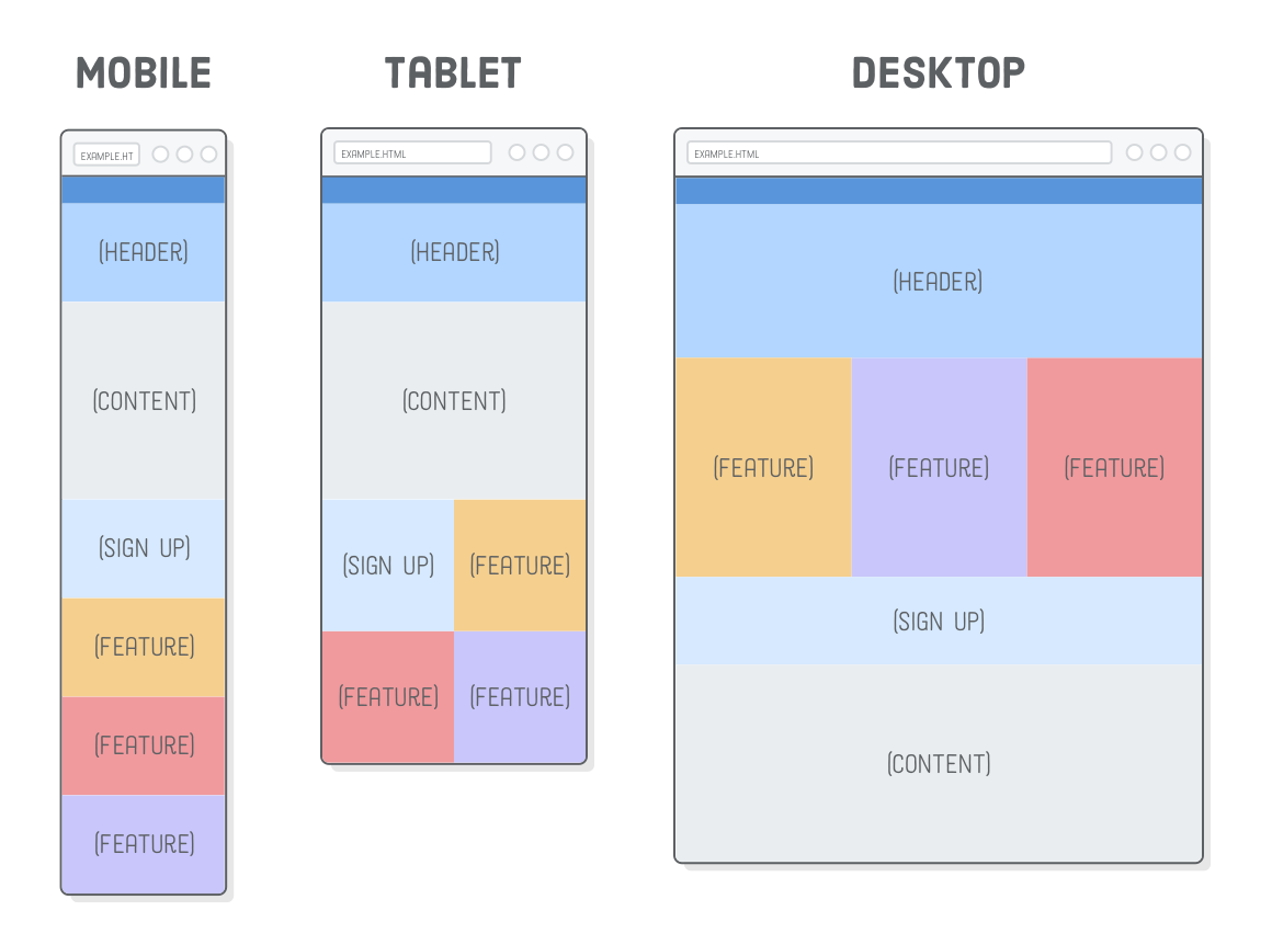
Responsive design is more than making a desktop design smaller. The layout must continue to work when the viewport is narrow, when a user increases browser zoom, or when their preferred text size is larger than yours.
The mobile-first responsive layout below has a simple base state:
- One column.
- Navigation that wraps naturally rather than overflowing.
- Video cards arranged in a flexible grid.
- A processing guide below the library.
At a larger available width, a media query adds a second column for the guide. This progression is more resilient than attempting to target every phone, tablet, and desktop model.
Accessible responsive design | web.dev
Read web.dev’s concise guidance on responsiveness as an accessibility requirement: correct viewport configuration, scalable text, logical source order, and usable touch targets.
In “Use the viewport meta tag” and “Allow users to zoom,” focus on why the browser needs to fit content to the device and why zoom must remain available. Read the viewport explanation. Then read “Use relative units for text,” especially relative text sizing. In “Avoid disconnecting the visual view from the source order,” read the source order warning. Finish with “Ensure tap targets are large enough on touchscreen devices,” including the touch target guidance.
Your <head> should retain the viewport tag from the Vite template:
<meta name="viewport" content="width=device-width, initial-scale=1.0" />
Do not add maximum-scale=1 or disable zoom. A user may need to zoom for readability, and a good layout should reflow rather than forcing horizontal scrolling.
Use rem for type-related spacing and sizing. A rem is relative to the root text size, so it respects many user text-size preferences. Pixel units still have suitable uses—such as a 1-pixel border—but text and most spacing benefit from scalable relative units.
Style the shell with flexible CSS
Replace src/style.css with this stylesheet:
:root {
  color: #172033;
  background: #f8fafc;
  font-family:
    Inter, ui-sans-serif, system-ui, -apple-system, BlinkMacSystemFont, "Segoe UI",
    sans-serif;
  line-height: 1.5;
}

* {
  box-sizing: border-box;
}

body {
  min-block-size: 100vh;
  display: grid;
  grid-template-rows: auto auto 1fr auto;
  margin: 0;
  background: #f8fafc;
}

a {
  color: #075985;
  text-decoration-thickness: 0.125em;
  text-underline-offset: 0.16em;
}

a:hover {
  color: #0c4a6e;
}

a:focus-visible {
  outline: 0.1875rem solid #f59e0b;
  outline-offset: 0.1875rem;
}

/* Skip link: hidden visually until a keyboard user focuses it. */
.skip-link {
  position: fixed;
  inset-block-start: 1rem;
  inset-inline-start: 1rem;
  z-index: 10;
  transform: translateY(-200%);
  padding: 0.75rem 1rem;
  border-radius: 0.375rem;
  background: #ffffff;
  color: #172033;
  box-shadow: 0 0.25rem 1rem rgb(15 23 42 / 20%);
}

.skip-link:focus {
  transform: translateY(0);
}

.site-header {
  background: #0f172a;
  color: #ffffff;
}

.site-header__inner,
.site-footer__inner,
.primary-nav ul,
.page-shell {
  inline-size: min(100%, 70rem);
  margin-inline: auto;
  padding-inline: 1rem;
}

.site-header__inner {
  display: flex;
  flex-wrap: wrap;
  align-items: center;
  justify-content: space-between;
  gap: 0.75rem;
  min-block-size: 4.5rem;
}

.brand {
  color: #ffffff;
  font-size: 1.25rem;
  font-weight: 750;
  text-decoration: none;
}

.button {
  display: inline-flex;
  align-items: center;
  justify-content: center;
  min-block-size: 3rem;
  padding-inline: 1rem;
  border-radius: 0.375rem;
  font-weight: 700;
  text-decoration: none;
}

.button--primary {
  background: #ffffff;
  color: #0f172a;
}

.primary-nav {
  border-block-end: 0.0625rem solid #cbd5e1;
  background: #e0f2fe;
}

.primary-nav ul {
  display: flex;
  flex-wrap: wrap;
  gap: 0.25rem;
  margin-block: 0;
  padding-block: 0.25rem;
  list-style: none;
}

.primary-nav a {
  display: inline-flex;
  align-items: center;
  min-block-size: 3rem;
  padding-inline: 0.75rem;
  border-radius: 0.25rem;
  font-weight: 650;
}

.primary-nav a[aria-current="page"] {
  background: #075985;
  color: #ffffff;
  text-decoration: none;
}

.page-shell {
  padding-block: 2rem;
}

.content-grid {
  display: grid;
  gap: 2rem;
}

.eyebrow {
  margin: 0;
  color: #475569;
  font-size: 0.875rem;
  font-weight: 750;
  letter-spacing: 0.08em;
  text-transform: uppercase;
}

h1,
h2,
h3 {
  color: #0f172a;
  line-height: 1.15;
}

h1 {
  margin-block: 0.25rem 0.75rem;
  font-size: clamp(2rem, 6vw, 3.25rem);
}

h2 {
  margin-block: 0;
  font-size: 1.5rem;
}

h3 {
  margin-block: 0.875rem 0.5rem;
  font-size: 1.125rem;
}

.intro {
  max-inline-size: 42rem;
  margin-block: 0 2rem;
  color: #475569;
}

.section-heading {
  display: flex;
  flex-wrap: wrap;
  align-items: baseline;
  justify-content: space-between;
  gap: 0.75rem;
  margin-block-end: 1rem;
}

.video-grid {
  display: grid;
  grid-template-columns: repeat(auto-fit, minmax(min(100%, 16rem), 1fr));
  gap: 1rem;
  margin: 0;
  padding: 0;
  list-style: none;
}

.video-card,
.processing-guide {
  border: 0.0625rem solid #cbd5e1;
  border-radius: 0.75rem;
  background: #ffffff;
  box-shadow: 0 0.125rem 0.375rem rgb(15 23 42 / 8%);
}

.video-card {
  padding: 1.25rem;
}

.video-card p {
  color: #475569;
}

.video-card__meta {
  display: flex;
  flex-wrap: wrap;
  align-items: center;
  gap: 0.75rem;
  color: #475569;
  font-size: 0.875rem;
}

.status {
  display: inline-flex;
  align-items: center;
  min-block-size: 1.75rem;
  padding-inline: 0.625rem;
  border-radius: 999rem;
  font-weight: 750;
}

.status--ready {
  background: #dcfce7;
  color: #14532d;
}

.status--processing {
  background: #fef3c7;
  color: #78350f;
}

.processing-guide {
  align-self: start;
  padding: 1.25rem;
}

.processing-guide ol {
  padding-inline-start: 1.25rem;
}

.processing-guide li + li {
  margin-block-start: 0.5rem;
}

.site-footer {
  border-block-start: 0.0625rem solid #cbd5e1;
  background: #ffffff;
}

.site-footer__inner {
  display: flex;
  flex-wrap: wrap;
  align-items: center;
  justify-content: space-between;
  gap: 0.5rem 1rem;
  padding-block: 1rem;
}

.site-footer p {
  margin: 0;
  color: #475569;
}

.site-footer ul {
  display: flex;
  flex-wrap: wrap;
  gap: 0.5rem 1rem;
  margin: 0;
  padding: 0;
  list-style: none;
}

.site-footer a {
  display: inline-flex;
  align-items: center;
  min-block-size: 3rem;
}

/* Wider layout only when there is enough room for two useful columns. */
@media (min-width: 48rem) {
  .content-grid {
    grid-template-columns: minmax(0, 1fr) 18rem;
  }
}
Several CSS choices deserve attention.
The layout expands without fixing the page height
The body uses:
min-block-size: 100vh;
grid-template-rows: auto auto 1fr auto;
The header, navigation, and footer each take the height their content needs (auto). The main row consumes the remaining viewport space (1fr), so a short page does not leave the footer floating halfway up the screen. min-block-size, rather than a fixed height, still lets the document grow when it contains more videos.
The grid is content-oriented
The video grid is not “three columns on desktop, two on tablet, one on mobile.” Instead, it says:
grid-template-columns: repeat(auto-fit, minmax(min(100%, 16rem), 1fr));
Each card should be at least about 16rem wide when space permits. The browser chooses how many fit, then distributes leftover space. This avoids tying the design to a catalogue of device widths.
The surrounding content-grid starts as one column. Only at 48rem does it introduce the supplementary right column. Because the <aside> follows the main library section in source order, the keyboard sequence remains sensible at every width.
How to create RESPONSIVE Layouts with CSS GRID
Watch Coding2GO’s “How to create RESPONSIVE Layouts with CSS GRID” for a compact visual demonstration of semantic layout regions, grid tracks, and a responsive column change.
Watch semantic regions to reinforce why nav, main, aside, and footer are more meaningful than generic wrappers. Then watch the grid layout, focusing on fractional tracks and the min-height plus auto 1fr auto row pattern. Finally, watch the media query to see a two-column layout become a single flexible column on smaller screens.
Focus is part of the interface
The :focus-visible rule is not a decorative extra. Keyboard users need to know exactly which link or control will activate next. Avoid global rules such as:
*:focus {
  outline: none;
}
That removes a critical navigation cue. If you restyle focus, replace it with an outline that is clearly visible against the surrounding background, as this shell does.
The skip link is also visually hidden without using display: none or visibility: hidden, either of which would prevent keyboard focus. When it receives focus, its transform moves it into view. Activating it navigates to #main-content.
Verify the shell as a user would
Before treating the work as complete, run the Vite server:
npm run dev
Then perform a short manual accessibility and responsive check:
- Keyboard: Reload the page, press
Tab, and confirm that “Skip to main content” appears first. Continue tabbing through the navigation, upload link, video-detail links, guide link, and footer links. Every focused item should have a conspicuous outline. - Skip-link destination: Activate the skip link with
Enter. The page should move directly to the main content region. - Responsive reflow: Use responsive mode in browser developer tools. At a narrow width, navigation should wrap and the guide should move beneath the library without horizontal scrolling.
- Zoom: Increase browser zoom substantially. Text should remain readable, cards should reflow, and controls should remain reachable.
- Meaning without color: Confirm that the status badges remain understandable if you ignore their green and amber backgrounds. “Ready” and “Processing” provide the actual information.
- Target size: On a touch-sized viewport, the primary navigation and action links should be comfortably separable. Their
3remminimum block size is approximately 48 CSS pixels at the common default root size.
When you add real thumbnails later, each image needs an alt decision based on context. A thumbnail that distinguishes a video should receive useful alternative text; an image that adds only decoration should use alt="". Do not use a file name as a substitute for a description.
Wrap-up
You now have a reusable application shell that is ready to become the frame of the video platform:
- Semantic landmarks—
header,nav,main,aside, andfooter—make the page easier to navigate with assistive technology. - A coherent heading hierarchy and semantic lists/articles describe the library’s information structure.
- Native links are used for navigation, preserving built-in keyboard behavior.
- The skip link and visible focus styles support keyboard navigation.
- Mobile-first CSS, relative units, flexible Grid sizing, and a restrained media query create responsive reflow without changing the logical HTML order.
- Status text, sufficiently sized interactive areas, and scalable content make the shell more robust across input methods and viewing conditions.
Next, you will make this static shell communicate with a server: using fetch, async/await, response validation, and error handling to load application data safely.
Can't find a good explanation? Sign up and we'll make it for you
Sign up