
Hello! In our previous work on class and entity-relationship diagrams, we focused on modeling the static structure of a system—its components and their relationships. Now, we'll shift our focus to dynamic behavior. This lesson introduces UML sequence diagrams, a powerful tool for visualizing how different parts of a system interact over time to accomplish a task.
Our goal is to learn how to translate a description of a runtime scenario, such as an API call flow, into the fundamental elements of a sequence diagram: the participants involved and the messages they exchange in chronological order. We'll concentrate on the "what" and "why" of these diagrams, establishing a solid conceptual foundation before we dive into the specific Mermaid syntax in our next lesson.
From Static Structure to Dynamic Interaction
While class diagrams show you the blueprints of your application's objects, sequence diagrams show those objects in action. They answer the question: "To achieve a specific goal, which components talk to which other components, and in what order?"
To understand the core purpose of sequence diagrams and how they differ from other behavioral diagrams you may have seen, like activity diagrams, watch this brief segment from the "Learn UML Sequence Diagram" video by Passionate Business Analyst.
Learn UML Sequence Diagram Under 10 minutes [Tutorial] for Business Analyst
Start by watching the section from the introduction. The speaker effectively contrasts sequence diagrams with activity diagrams, highlighting the former's focus on object communication over time.
The Anatomy of a Sequence Diagram
A sequence diagram has two dimensions that organize its information. The horizontal axis lists the participants in the interaction, while the vertical axis represents the passage of time, flowing from top to bottom.
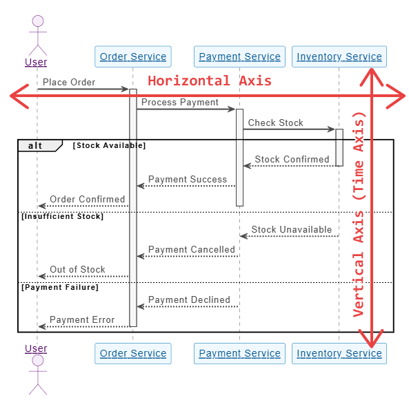
Let's break down the core components you see here:
- Participants: These are the entities involved in the interaction. They are placed along the horizontal axis. A participant can be a human user (often shown as an actor with a stick figure icon), a software component, a service, or any object.
- Lifelines: The dashed vertical lines extending down from each participant are called lifelines. They represent the existence of the participant throughout the duration of the sequence.
- Messages: The arrows between lifelines represent communication, such as a function call or an API request. The order of messages follows the time axis from top to bottom.
- Activation Bars: The thin rectangles on a lifeline (like the ones on the
Order ServiceandPayment Servicelifelines in the image above) indicate the period during which a participant is active or processing a task. This is also known as the "focus of control."
For a more detailed explanation of these core symbols, please read the following section from the "Sequence Diagram Tutorial" by Creately.
Sequence Diagram Tutorial - Complete Guide with Examples | Creately
This reading covers the fundamental notation used in sequence diagrams. It will solidify your understanding of the components we've just discussed.
Focus on the first part of the article, starting from the section on lifelines. Pay attention to the different stereotypes mentioned (entity, boundary, control), as these can be useful for classifying components in system design. Then, read the short descriptions of Activation Bars and Message Arrows. Don't worry about memorizing every message type; for now, focus on the distinction between a synchronous call (sender waits) and an asynchronous one (sender doesn't wait).
A Practical Example: API Login Flow
With the basic components in mind, let's analyze a simple, concrete example. The diagram below shows the message flow for a user logging into an application.
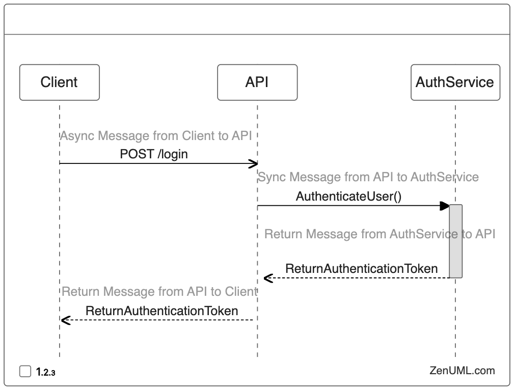
Let's interpret this diagram step-by-step:
- Asynchronous Message: The
Clientsends an asynchronous (POST /login) message to theAPI. The open arrowhead signifies that the client doesn't block and wait for a response; it can continue performing other tasks (like showing a loading spinner). - Synchronous Message: The
APIthen sends a synchronous (AuthenticateUser()) message to theAuthService. The solid arrowhead indicates that the API is now waiting and cannot proceed until it receives a response from theAuthService. The gray activation bar on theAuthServicelifeline shows it is now active and processing this request. - Return Message: The
AuthServicecompletes its work and sends a return message (ReturnAuthenticationToken) back to theAPI. The activation bar on theAuthServicelifeline ends, and the API is no longer waiting. - Return Message: Finally, the
APIforwards the token back to theClientin another return message.
This simple diagram effectively communicates the sequence, timing, and nature of the communication between three distinct components.
Translating a Scenario into a Sequence Diagram
The main skill in creating a sequence diagram is translating a narrative description of a process into this visual format. Your experience designing and interacting with APIs will make this process quite natural. Let's walk through it with a typical front-end development scenario.
The Creately article you read earlier provides a formal, step-by-step method for this translation.
Sequence Diagram Tutorial - Complete Guide with Examples | Creately
This section outlines a structured approach to creating a sequence diagram from a use case or scenario.
Read the section "How to Draw a Sequence Diagram," focusing on Steps 1 through 4. This process of identifying the scenario, listing the participants, and ordering the interactions is the core of this lesson's objective.
Now, let's apply that process to our own scenario.
Scenario: A user is on their profile page in a web application and clicks the "Refresh" button to get the latest data.
Here's a narrative of the resulting interaction:
The front-end client, upon the button click, sends a
GETrequest to the backend'sAPI Gatewayto fetch the user's profile. TheAPI Gatewayfirst calls theUser Serviceto retrieve core user information (like name and email). Once it receives the user data, it then calls thePreferences Serviceto get the user's UI settings (like theme and language). After receiving the preferences, theAPI Gatewayaggregates the information into a single JSON object and sends it back to the front-end client as a200 OKresponse. The client then uses this data to update the display.
Following the steps from the article:
-
Identify the Participants:
User(The actor initiating the event)Frontend Client(The web application running in the browser)API Gateway(The backend service that orchestrates requests)User Service(A microservice for user data)Preferences Service(A microservice for user settings)
-
Sequence the Interactions (Messages):
User->Frontend Client: Clicks "Refresh"Frontend Client->API Gateway:GET /profileAPI Gateway->User Service:getUserData(userId)User Service->API Gateway: Returns user dataAPI Gateway->Preferences Service:getPreferences(userId)Preferences Service->API Gateway: Returns preference dataAPI Gateway->Frontend Client: Returns aggregated profile objectFrontend Clientupdates its view (this is an internal action, often shown as a note).
This logical sequence of participants and messages forms the blueprint for our diagram. The visual result would look something like this:
Don't worry about the specific arrow syntax (->>, -->>) or the activate/deactivate commands for now. The key is to see how our structured list of participants and messages directly translates into the diagram's layout.
Conclusion
In this lesson, we explored the fundamentals of UML sequence diagrams. We've established that they are essential for modeling the dynamic behavior of a system, showing how objects and components communicate over time.
Here are the key takeaways:
- Sequence diagrams visualize interactions with participants on the horizontal axis and time on the vertical axis.
- They capture the chronological order of messages exchanged between participant lifelines.
- Translating a scenario into a diagram is a methodical process: first identify the participants, then list the messages in the order they occur.
In our next lesson, we will get practical and write the Mermaid code for diagrams like the one above. You'll learn the syntax to define participants, represent synchronous and asynchronous messages, and control activation bars to precisely model API interactions.
Can't find a good explanation? Sign up and we'll make it for you
Sign up