
Welcome back. In the previous lesson, you learned to identify what scientists change, what they measure, and how control groups and constants make an experiment fair. Those ideas now become tools for reading graphs: a graph is a compact picture of the evidence from an experiment or observation.
This lesson develops two connected skills. First, you will learn to extract a biological claim accurately from a graph. Second, you will learn why seeing two things change together is not, by itself, enough to say that one caused the other.
A graph is evidence, not the conclusion
Graphs make a set of measurements easier to see, but they do not interpret themselves. Before deciding what a graph “shows,” establish four basics:
- Read the title. It tells you the organisms, conditions, and variables being compared.
- Read both axes. The horizontal -axis and vertical -axis tell you what was measured.
- Check units and scale. Height in millimeters and height in centimeters differ by a factor of ten. Also notice whether the axis begins at zero or has a shortened scale.
- Read the key or legend. Different colors, symbols, or lines often represent different experimental groups.
The next distinction is especially important. In many controlled experiments, the independent variable appears on the -axis and the dependent variable on the -axis. But this is a common graphing convention, not a rule that proves causation. A graph may place time on the -axis while showing several treatment groups in its legend. In an observational study, neither axis may be a variable deliberately changed by a scientist.
Watch this short segment from Biology 101: How to Understand Graphs by Nucleus Biology. It introduces scatter plots and connects graph axes to the independent and dependent variables from the previous lesson.
Biology 101: How to Understand Graphs
In Biology 101: How to Understand Graphs, Nucleus Biology shows how axes organize evidence and how patterns can be described without jumping to a conclusion.
Watch axes and variables to review how an XY graph displays two measured variables. Then watch correlation patterns for positive, negative, and absent correlations. Focus on the direction of the overall pattern, rather than expecting every individual point to fit perfectly.
Common graph types in biology
A graph type is chosen to fit the question and data.
| Graph type | Best used for | What to look for |
|---|---|---|
| Bar graph | Comparing separate groups, such as treated versus untreated plants | Differences in bar heights; labels and error bars |
| Line graph | Showing change over time, such as population size over several days | Overall trends, peaks, declines, and comparisons among lines |
| Scatter plot | Examining a possible relationship between two numerical variables | Whether points tend to rise together, fall in opposite directions, or show no clear pattern |
An error bar, when present, shows some measure of variation or uncertainty in the data. It is a reminder that organisms and measurements naturally vary. A graph may show a visible difference between average values, but scientists normally use statistical tests to judge whether that difference is likely to reflect a real effect rather than chance.
A reliable method for interpreting a biology graph
Use this sequence every time. It prevents the most common error: noticing a pattern and making a claim that is broader than the data support.
1. State what was measured
Identify the variables precisely, including their units.
For example, “plant growth” is vague. “Plant height in millimeters, measured on days 4 through 11” is precise.
2. Identify the comparison
A comparison might be between:
- treatment groups and a control group,
- different species,
- different time points,
- or pairs of observations from many individuals.
Find which line, bar, or symbol belongs to each group by using the legend.
3. Describe the pattern before explaining it
Start with a factual observation:
- “Average height was greater in the 9-hour sunlight group than in the 1-hour sunlight group on most days.”
- “The percentage of cells in mitosis rose sharply between 36 and 48 hours in one group.”
- “As one variable increased, the other tended to decrease.”
Avoid beginning with words such as “therefore caused.” Description comes first; explanation comes after.
4. Compare specific values when possible
A strong interpretation includes evidence from the graph. Use approximate values if the graph does not provide an exact data table:
On day 11, plants exposed to 9 hours of sunlight were about 160 mm tall, whereas plants exposed to 1 hour were only about 15 mm tall.
This is more useful than simply saying, “More sunlight was better.”
5. Decide what kind of claim the design supports
A graph can support different levels of conclusion:
- Observation: “These two variables are associated in this data set.”
- Experimental result: “Under these controlled conditions, changing the treatment was associated with a difference in the outcome.”
- Causal claim: “The treatment caused the difference,” which requires a well-designed experiment and appropriate analysis.
The final level is the strongest, so it needs the strongest evidence.
Reading a line graph: sunlight and plant growth
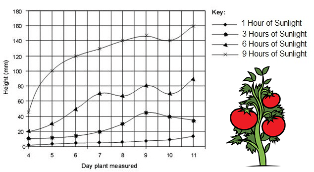
Start with the title information contained in the axes and key:
- The -axis is day plant measured, from day 4 through day 11.
- The -axis is height in millimeters.
- The legend identifies four groups receiving different durations of sunlight.
This graph contains two kinds of information at once:
- Time is displayed along the horizontal axis.
- Sunlight duration is the treatment being compared, shown by the four separate lines.
The broad pattern is clear: plants given more hours of sunlight generally grow taller. By day 11, the approximate heights are:
| Daily sunlight | Approximate height on day 11 |
|---|---|
| 1 hour | 15 mm |
| 3 hours | 35 mm |
| 6 hours | 90 mm |
| 9 hours | 160 mm |
There are also smaller fluctuations. For example, the 9-hour group appears slightly shorter on day 10 than on day 9. Do not ignore a result just because it is not perfectly smooth. Organisms vary, measurements can vary, and one unusual value does not erase the overall comparison.
Now consider causation carefully. If the researchers assigned otherwise similar tomato plants to the four sunlight conditions, kept water, soil, plant variety, temperature, pot size, and measurement method consistent, and used enough plants in each group, this would be a controlled experiment. In that case, the results would provide evidence that sunlight duration affects plant height under these conditions.
However, the graph alone does not tell us all of that. It does not state how many plants were tested, whether the groups were assigned fairly, or whether conditions other than sunlight were held constant. It also does not clearly identify a control group. The 1-hour condition is a comparison group, but it is not automatically a control group unless the experiment defines it as the baseline condition.
That distinction matters: a clear pattern on a graph is valuable evidence, but the study design tells you how confidently you can explain the pattern.
Correlation: a relationship, not automatically a cause
A correlation is a consistent relationship between two variables. It describes a pattern in data.
- A positive correlation occurs when the variables tend to increase together or decrease together. Plant height and hours of sunlight show a broadly positive association in the graph above.
- A negative correlation occurs when one variable tends to increase while the other decreases.
- No correlation means there is no consistent overall relationship visible in the data.
Correlation does not mean that one variable is responsible for the other. Three explanations can produce a correlation:
- A causes B. More sunlight may contribute to more plant growth.
- B causes A. The assumed direction may be backwards.
- A third factor affects both A and B. This third factor is called a confounding variable.
- The pattern is coincidental. With enough possible comparisons, some unrelated variables will appear to track together by chance.
For a biological example, suppose a survey finds that children who wear larger shoes tend to have stronger reading skills. It would be unreasonable to conclude that shoe size improves reading. Age is a confounding variable: as children grow older, their feet tend to grow and they generally gain more reading experience.
Watch the following portion of Correlation vs Causation Explained: Why Patterns Can Mislead Us by Sprouts. It gives visual examples of confounders, reverse direction, coincidence, and the evidence needed for a causal claim.
Correlation vs Causation Explained: Why Patterns Can Mislead Us
Sprouts’ Correlation vs Causation Explained focuses on the reasoning errors that can turn a real pattern into a false explanation.
Watch causal traps for the three main alternatives to a causal explanation: a confounding variable, reverse direction, and coincidence. Then watch controlled trials to see why random assignment and comparison groups strengthen causal evidence.
From a graph pattern to stronger causal evidence
A well-designed experiment can do more than reveal correlation because it deliberately changes one factor while keeping other important factors comparable across groups.
The strongest basic design includes:
- a clearly defined independent variable;
- a measurable dependent variable;
- a baseline control group when appropriate;
- relevant constants;
- multiple organisms or samples in each group;
- random assignment to groups when feasible;
- statistical analysis to evaluate whether differences might reasonably occur by chance; and
- repetition by other researchers.
Read the selected parts of Chapter 1: The Science of Biology from Human Biology. The first passage shows why raw data are summarized in graphs; the next two explain why visual differences alone are not enough and why correlation needs careful interpretation.
Chapter 1: The Science of Biology – Human Biology
Read these sections from the Human Biology textbook to connect graph reading with statistical uncertainty and the difference between correlation and causation.
In the subsection “Collecting and Analyzing the Data,” read the algae example. Compare the raw pond measurements with the bar graph of their averages. Then, under “Other Important Aspects,” locate the paragraph beginning “Third, analyzing data often requires more than just visualization on a graph.” Read the statistics discussion, focusing on why a difference between averages may need formal testing. Finally, in the same “Other Important Aspects” section, find the paragraph beginning “Fifth, there is a crucial issue.” Read the correlation discussion. Pay attention to the distinction between a chance association, a third-variable explanation, and a repeatable experimental result.
Scientists rarely say that one graph “proves” a claim forever. More careful language is:
The data support the hypothesis that the treatment affected the outcome under the conditions tested.
That wording is not weakness. It reflects the fact that later experiments can test other organisms, doses, environments, mechanisms, and possible confounding variables.
Reading an experimental graph: p53 and cell division

This graph concerns mitotic index, the percentage of cells that are actively undergoing mitosis, or cell division, at a particular time.
Read the graph systematically:
- The -axis shows time after gamma radiation, in hours.
- The -axis shows mitotic index, as a percentage.
- The symbols represent human cells with different numbers of working p53 gene copies.
- All groups were exposed to gamma radiation. The intended difference among groups was the number of p53 gene copies.
The cells with both p53 copies, the normal condition, remain near a mitotic index of zero after the radiation exposure. The cells with one p53 copy also remain low. In contrast, cells with both p53 copies deleted show a large increase in mitotic index, reaching roughly at 48 hours before declining.
A precise conclusion is:
After gamma radiation, cells lacking p53 were much more likely to enter mitosis than cells with one or two copies of p53.
Because the experiment selectively changed p53 gene copy number and compared otherwise similar cells under the same radiation exposure, it provides substantially stronger causal evidence than an observational correlation would. The data support the idea that p53 normally helps prevent damaged cells from proceeding into mitosis.
But the graph does not show every part of the story. It does not reveal the molecular mechanism by which p53 affects the cell cycle, nor does it establish that every cell type in every organism responds identically. Good graph interpretation matches the size of the claim to the evidence actually shown.
Key takeaways
A biological graph is a summary of evidence. To interpret it well:
- Read the title, axes, units, scale, and legend before drawing a conclusion.
- Describe the pattern with specific comparisons before attempting an explanation.
- Remember that time can occupy the -axis while the experimental treatment is shown in the legend.
- A positive correlation means two variables tend to change in the same direction; a negative correlation means they tend to change in opposite directions.
- Correlation alone does not establish causation because of confounding variables, reverse causation, and coincidence.
- Controlled experiments with comparable groups, replication, and statistical analysis provide stronger evidence for causal claims.
In the next lesson, you will move from interpreting whole experiments and graphs to the molecular level: the chemical bonds that hold biological molecules together.
Can't find a good explanation? Sign up and we'll make it for you
Sign up