
Hello. Your repository now has a clean Next.js, TypeScript, Tailwind, linting, formatting, and pull-request baseline. This lesson turns that foundation into something a recruiter can open: a responsive, accessible application shell for the job-application workspace, published at a public URL.
The goal is not to implement application data or form behavior yet. Instead, you will establish the visual and navigational frame that later features will inhabit: persistent navigation, purposeful routes, usable mobile behavior, and a professional first deployment. This is an important distinction in portfolio work: a small, coherent preview is stronger than a half-built system with many disconnected screens.
What the first public preview should prove
By the end of this lesson, a visitor should be able to:
- understand the product in a few seconds;
- navigate among Overview, Board, and Add application routes;
- use the navigation at narrow and wide viewport widths;
- use the keyboard to reach the menu and visible links;
- open a stable public deployment from your GitHub repository.
Treat this as a deliberately static preview. The Overview route can show mock metrics and an empty-state message, while the Board and Add application routes communicate what is coming next. In Module 2, those placeholders will become typed data, accessible forms, reusable views, and stateful workflows.
In the App Router, a page supplies route-specific content, while a layout supplies shared structure. Watch this short explanation before implementing the shell.
Next.js 15 Tutorial - 14 - Layouts
Watch “Next.js 15 Tutorial - 14 - Layouts” by Codevolution. It gives a concise visual explanation of why shared navigation belongs in a layout rather than being copied into every page.
Watch the layout idea for the distinction between pages and layouts. Then watch the root layout to see how the required layout receives route content through children. Finish with the shared frame, focusing on why a header and footer remain present as routes change.
The shell will use the root layout because every route in this MVP shares the same workspace frame. Later, if the product gains an unauthenticated marketing page or a distinct settings area, nested layouts or route groups can provide different shells without duplicating common markup.
Plan the shell before styling it
A shell is the stable spatial structure around changing content. For this project, use a simple responsive pattern:
| Viewport | Navigation pattern | Main content |
|---|---|---|
Mobile, below md | Top header with a Menu button that reveals navigation | Full width with compact padding |
Tablet and desktop, md and above | Persistent left sidebar | Content offset to the right of the sidebar |
| All sizes | Skip link, visible focus styles, semantic <nav> and <main> landmarks | Route-specific page content |
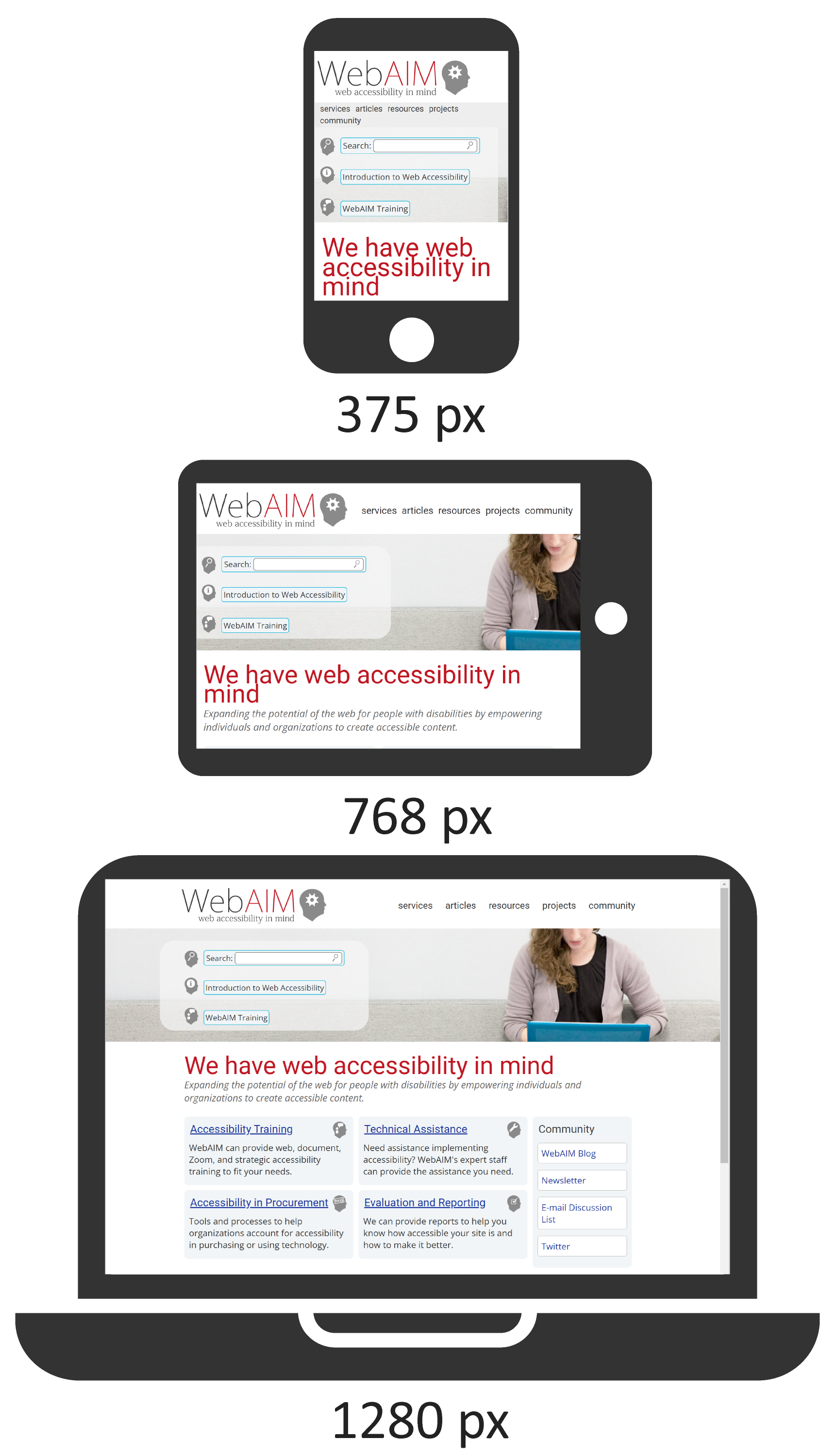
The responsive behavior should reorganize the interface, not merely shrink it. A fixed sidebar that consumes most of a narrow screen is not a mobile design. On a phone, the menu button keeps the primary task visible; on a desktop, the sidebar makes frequent route switching efficient.
Create a feature branch before changing the shell:
git switch main
git pull --ff-only origin main
git switch -c feat/responsive-application-shell
Your relevant source structure will look like this:
src/
  app/
    applications/
      new/
        page.tsx
    board/
      page.tsx
    globals.css
    layout.tsx
    page.tsx
  components/
    app-shell.tsx
    navigation.tsx
The folders are intentional:
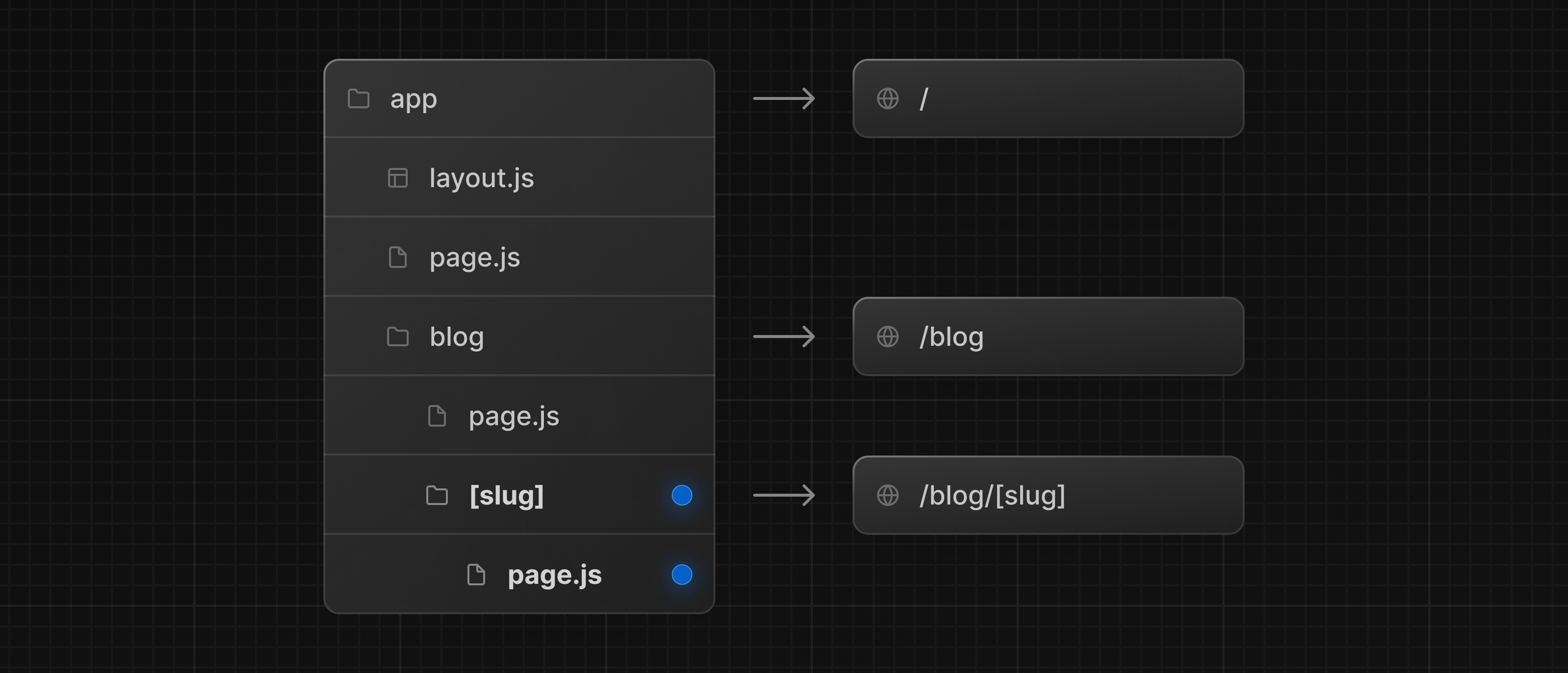
src/app/page.tsxrenders the/Overview route.src/app/board/page.tsxrenders/board.src/app/applications/new/page.tsxrenders/applications/new.src/app/layout.tsxwraps all of those pages.src/components/contains reusable UI that is not itself a route.
Do not create a separate layout.tsx inside every route folder. That would be duplication without a current need. One root layout is sufficient for this first application shell.
Build the shared layout and responsive navigation
Start by replacing src/app/layout.tsx. Keep the global CSS import in the root layout, and set useful metadata for the public preview.
import type { Metadata } from 'next';

import { AppShell } from '@/components/app-shell';
import './globals.css';

export const metadata: Metadata = {
  title: 'Job Application Workspace',
  description: 'A focused workspace for tracking job applications.',
};

export default function RootLayout({
  children,
}: Readonly<{
  children: React.ReactNode;
}>) {
  return (
    <html lang="en">
      <body>
        <AppShell>{children}</AppShell>
      </body>
    </html>
  );
}
The root layout should own the document-level structure: <html>, <body>, global styles, metadata, and the application-wide shell. Individual route pages should not add a second <main> landmark or repeat navigation.
Now create src/components/app-shell.tsx:
import type { ReactNode } from 'react';

import { Navigation } from '@/components/navigation';

type AppShellProps = {
  children: ReactNode;
};

export function AppShell({ children }: AppShellProps) {
  return (
    <div className="min-h-screen bg-slate-50 text-slate-900">
      <a
        className="sr-only fixed left-4 top-4 z-50 rounded-md bg-slate-900 px-4 py-2 text-sm font-semibold text-white focus:not-sr-only focus:outline-none focus:ring-4 focus:ring-sky-300"
        href="#main-content"
      >
        Skip to main content
      </a>

      <Navigation />

      <div className="md:pl-64">
        <main
          className="mx-auto min-h-screen w-full max-w-7xl px-4 py-8 sm:px-6 lg:px-8"
          id="main-content"
        >
          {children}
        </main>
      </div>
    </div>
  );
}
There are three accessibility decisions here worth retaining:
- The skip link is visually hidden until it receives keyboard focus. It lets keyboard users bypass repeated navigation.
<main id="main-content">gives the page’s unique content a landmark and gives the skip link a real destination.- The layout owns spacing around all page content, so individual pages only decide their internal structure.
Add an interactive navigation component
The mobile menu needs React state and access to the current route. That is why this one component is a Client Component. Keep the client boundary small: the root layout and pages can remain Server Components by default.
Create src/components/navigation.tsx:
'use client';

import Link from 'next/link';
import { usePathname } from 'next/navigation';
import { useState } from 'react';

const navigationItems = [
  { href: '/', label: 'Overview' },
  { href: '/board', label: 'Board' },
  { href: '/applications/new', label: 'Add application' },
];

type NavigationLinksProps = {
  onNavigate?: () => void;
};

function NavigationLinks({ onNavigate }: NavigationLinksProps) {
  const pathname = usePathname();

  return (
    <ul className="space-y-1">
      {navigationItems.map((item) => {
        const isActive = pathname === item.href;

        return (
          <li key={item.href}>
            <Link
              aria-current={isActive ? 'page' : undefined}
              className={`block rounded-md px-3 py-2 text-sm font-medium transition focus:outline-none focus:ring-2 focus:ring-sky-500 focus:ring-offset-2 ${
                isActive
                  ? 'bg-sky-100 text-sky-900'
                  : 'text-slate-700 hover:bg-slate-100 hover:text-slate-950'
              }`}
              href={item.href}
              onClick={onNavigate}
            >
              {item.label}
            </Link>
          </li>
        );
      })}
    </ul>
  );
}

export function Navigation() {
  const [isMobileMenuOpen, setIsMobileMenuOpen] = useState(false);

  return (
    <>
      <header className="sticky top-0 z-30 border-b border-slate-200 bg-white md:hidden">
        <div className="flex items-center justify-between px-4 py-3">
          <Link
            className="font-semibold text-slate-950 focus:outline-none focus:ring-2 focus:ring-sky-500 focus:ring-offset-2"
            href="/"
          >
            JobTrack
          </Link>

          <button
            aria-controls="mobile-navigation"
            aria-expanded={isMobileMenuOpen}
            className="rounded-md border border-slate-300 px-3 py-2 text-sm font-medium text-slate-800 hover:bg-slate-50 focus:outline-none focus:ring-2 focus:ring-sky-500 focus:ring-offset-2"
            onClick={() => setIsMobileMenuOpen((currentValue) => !currentValue)}
            type="button"
          >
            Menu
          </button>
        </div>

        {isMobileMenuOpen ? (
          <nav
            aria-label="Primary navigation"
            className="border-t border-slate-200 bg-white px-4 py-3"
            id="mobile-navigation"
          >
            <NavigationLinks onNavigate={() => setIsMobileMenuOpen(false)} />
          </nav>
        ) : null}
      </header>

      <aside className="fixed inset-y-0 left-0 hidden w-64 border-r border-slate-200 bg-white md:flex md:flex-col">
        <div className="border-b border-slate-200 px-6 py-5">
          <Link
            className="text-lg font-semibold text-slate-950 focus:outline-none focus:ring-2 focus:ring-sky-500 focus:ring-offset-2"
            href="/"
          >
            JobTrack
          </Link>
          <p className="mt-1 text-sm text-slate-600">
            Application workspace
          </p>
        </div>

        <nav aria-label="Primary navigation" className="p-4">
          <NavigationLinks />
        </nav>
      </aside>
    </>
  );
}
A few implementation details are especially valuable in a portfolio review:
- A
<button>controls the mobile menu because it changes UI state. A link would be semantically incorrect. aria-expandedexposes whether the menu is open.aria-controlsconnects the button to the controlled navigation region.aria-current="page"announces the active route to assistive technology.- The
onNavigatecallback closes the mobile menu after a route selection. Because the shell persists across navigation, relying on navigation alone would leave the menu open.
The desktop and mobile navigation both use the same NavigationLinks component. This is a small but meaningful example of avoiding duplicated UI logic while still presenting the navigation differently at different breakpoints.
Add purposeful route previews
Replace src/app/page.tsx with an Overview screen. The numbers are intentionally mock values; this lesson is about shell and deployment, not persistence.
import Link from 'next/link';

export default function OverviewPage() {
  return (
    <div className="space-y-8">
      <header>
        <p className="text-sm font-semibold text-sky-700">Workspace overview</p>
        <h1 className="mt-2 text-3xl font-bold tracking-tight sm:text-4xl">
          Keep your job search organized.
        </h1>
        <p className="mt-3 max-w-2xl text-base leading-7 text-slate-600">
          Track applications, follow-ups, and interview progress in one focused
          workspace.
        </p>
      </header>

      <section aria-labelledby="summary-heading">
        <h2 className="text-xl font-semibold" id="summary-heading">
          Current summary
        </h2>

        <dl className="mt-4 grid gap-4 sm:grid-cols-2 lg:grid-cols-3">
          <div className="rounded-xl border border-slate-200 bg-white p-5 shadow-sm">
            <dt className="text-sm font-medium text-slate-600">
              Applications
            </dt>
            <dd className="mt-2 text-3xl font-bold">0</dd>
          </div>

          <div className="rounded-xl border border-slate-200 bg-white p-5 shadow-sm">
            <dt className="text-sm font-medium text-slate-600">
              Interviews
            </dt>
            <dd className="mt-2 text-3xl font-bold">0</dd>
          </div>

          <div className="rounded-xl border border-slate-200 bg-white p-5 shadow-sm">
            <dt className="text-sm font-medium text-slate-600">
              Follow-ups due
            </dt>
            <dd className="mt-2 text-3xl font-bold">0</dd>
          </div>
        </dl>
      </section>

      <section
        aria-labelledby="recent-applications-heading"
        className="rounded-xl border border-slate-200 bg-white p-6 shadow-sm"
      >
        <h2 className="text-xl font-semibold" id="recent-applications-heading">
          Recent applications
        </h2>
        <p className="mt-2 text-slate-600">
          No applications have been added yet. Start by recording one role you
          are interested in.
        </p>
        <Link
          className="mt-5 inline-flex rounded-md bg-sky-700 px-4 py-2 text-sm font-semibold text-white hover:bg-sky-800 focus:outline-none focus:ring-2 focus:ring-sky-500 focus:ring-offset-2"
          href="/applications/new"
        >
          Add an application
        </Link>
      </section>
    </div>
  );
}
Use semantic elements before visual styling:
- The page has one clear
<h1>. - Each meaningful section has an
<h2>. - Summary values use a definition list because each number has a descriptive label.
- The empty state tells the user what is absent and provides the next available action.
Now create src/app/board/page.tsx:
export default function BoardPage() {
  const stages = ['Saved', 'Applied', 'Interviewing'];

  return (
    <div className="space-y-8">
      <header>
        <p className="text-sm font-semibold text-sky-700">Application board</p>
        <h1 className="mt-2 text-3xl font-bold tracking-tight sm:text-4xl">
          See your opportunities by stage.
        </h1>
        <p className="mt-3 max-w-2xl text-base leading-7 text-slate-600">
          This preview establishes the route and layout. A reusable, interactive
          board will be added after application data is modeled.
        </p>
      </header>

      <section
        aria-label="Application stages preview"
        className="grid gap-4 lg:grid-cols-3"
      >
        {stages.map((stage) => (
          <article
            className="min-h-48 rounded-xl border border-slate-200 bg-white p-5 shadow-sm"
            key={stage}
          >
            <h2 className="font-semibold">{stage}</h2>
            <p className="mt-4 text-sm text-slate-600">
              No applications in this stage yet.
            </p>
          </article>
        ))}
      </section>
    </div>
  );
}
Finally, create src/app/applications/new/page.tsx:
export default function NewApplicationPage() {
  return (
    <div className="max-w-3xl space-y-8">
      <header>
        <p className="text-sm font-semibold text-sky-700">New application</p>
        <h1 className="mt-2 text-3xl font-bold tracking-tight sm:text-4xl">
          Record a role you want to pursue.
        </h1>
        <p className="mt-3 text-base leading-7 text-slate-600">
          The accessible validated form will be implemented in the next module.
          This route is ready for that workflow.
        </p>
      </header>

      <section className="rounded-xl border border-dashed border-slate-300 bg-white p-6">
        <h2 className="text-lg font-semibold">Form coming next</h2>
        <p className="mt-2 text-slate-600">
          You will add company, role, application date, status, and application
          link fields with clear validation feedback.
        </p>
      </section>
    </div>
  );
}
This may feel modest, but it is an honest product increment. The project already demonstrates routing, responsive composition, reusable client-side navigation, active-route treatment, semantics, and a clear product direction. It does not pretend to support functionality that has not been built.
Apply minimal global styling
Your Tailwind scaffold should already import Tailwind in src/app/globals.css. Keep global CSS genuinely global and let component-level Tailwind utilities handle most presentation.
A minimal version is:
@import "tailwindcss";

:root {
  color-scheme: light;
}

body {
  background: #f8fafc;
  color: #0f172a;
}
Avoid adding a large global reset, a component-specific CSS file, or a new UI library just for the shell. Tailwind utilities are enough for this focused preview, and the existing design stays easy to inspect during an interview or code review.
Start the development server:
npm run dev
Verify these routes directly:
http://localhost:3000
http://localhost:3000/board
http://localhost:3000/applications/new
At each route, confirm that:
- desktop navigation stays visible at wider viewport widths;
- the current navigation item has a distinct visual style;
- the mobile Menu button opens and closes the route list;
- selecting a mobile navigation link closes the menu;
- the Skip to main content link appears when you press
Tabfrom the top of the page; - no content is hidden behind the mobile header;
- no horizontal scrollbar appears at narrow widths.
Use responsive mode in browser developer tools at 375 px, 768 px, and 1280 px. These are useful representative checkpoints, not the only widths that matter. Slowly drag the viewport between them as well; abrupt layout breaks often appear between named breakpoints.
Commit the preview and deploy it
Run the complete quality check before committing:
npm run format
npm run format:check
npm run lint
npm run typecheck
npm run build
Inspect the changed files before staging them:
git status
git diff
Then commit and push the feature branch:
git add src
git commit -m "feat(shell): add responsive application workspace"
git push -u origin feat/responsive-application-shell
Open a pull request. Its description should be concise and evidence-based:
## What changed
- Added a responsive application shell with desktop sidebar and mobile navigation.
- Added Overview, Board, and Add application routes.
- Added keyboard-visible focus styles, a skip link, and active route indication.

## Verification
- npm run format:check
- npm run lint
- npm run typecheck
- npm run build
- Tested at 375 px, 768 px, and 1280 px
- Tested keyboard navigation and mobile menu behavior

## Screenshots
- Desktop overview
- Mobile menu open
Create the Vercel project
Use Vercel’s GitHub integration so deployment is tied to repository history:
- Sign in to Vercel with your GitHub account.
- Choose Add New and then Project.
- Import the
job-application-workspacerepository. - Confirm that Vercel detects Next.js as the framework preset.
- Leave the default build settings unless you have deliberately changed the project structure.
- Do not add environment variables. This static shell does not need secrets.
- Deploy the project.
Vercel will create a public vercel.app URL. Once the repository is connected, a pushed non-main branch normally receives a Preview Deployment, while a merge to main updates the production deployment. Open the preview URL from your pull request and repeat your core checks there, not only on localhost.
The deployment must be treated as a real environment. Verify:
/,/board, and/applications/newload directly when pasted into a new browser tab;- refreshing each route works;
- the layout works in a mobile-sized viewport;
- navigation remains keyboard reachable;
- there are no browser-console errors;
- no personal application data, access token, or local environment file has entered Git history.
After verification, merge the pull request using Squash and merge. Then check the production URL generated from main:
git switch main
git pull --ff-only origin main
git branch -d feat/responsive-application-shell
Add the public production URL to the repository’s GitHub About section or the top of the current README. A recruiter should not need to search through commits to find the deployed application.
Definition of done
Before moving forward, your project should meet this checklist:
- The application uses a root layout to render one shared shell.
- Desktop users see a persistent sidebar at
mdwidths and above. - Mobile users see a header and a working Menu button below
md. - Navigation uses real Next.js
Linkcomponents and includes active-route indication. - The mobile menu button exposes its state with
aria-expanded. - A keyboard-visible skip link moves focus to the main content.
- Overview, Board, and Add application URLs render successfully.
- The shell is tested at 375 px, 768 px, and 1280 px without horizontal overflow.
- Formatting, linting, type checking, and the production build succeed.
- The pull request contains verification notes and interface screenshots.
- A public Vercel Preview Deployment and production deployment are available.
- The repository and deployment contain no secrets or real personal job-search data.
Key takeaways
You now have the project’s first public-facing increment:
- Next.js layouts provide the durable shared frame around route-specific pages.
- File-based route folders make the application structure legible to both Next.js and reviewers.
- A responsive shell changes navigation behavior for available screen space rather than merely compressing desktop UI.
- Semantic landmarks, a skip link, visible focus styles, and correctly labeled controls belong in the first implementation, not in a final accessibility cleanup.
- A Vercel deployment connected to GitHub makes your pull-request history and live work mutually reinforcing portfolio evidence.
Next, you will begin the application’s real workflow by modeling job applications, contacts, and status stages with precise TypeScript types.
Can't find a good explanation? Sign up and we'll make it for you
Sign up