
Hello again. In the previous lesson, you used the mean, median, and range to summarize a small set of measurements. Those summaries are especially useful when a table contains many values. This lesson focuses on the next step: reading what a table or graph actually shows, identifying meaningful comparisons or trends, and keeping conclusions proportional to the data.
Forensic reports often condense measurements into tables, bar charts, line graphs, or histograms. These displays help an examiner communicate clearly, but they are not conclusions by themselves. A careful reader first identifies what was measured, how it was displayed, and what limitations remain.
Plan for about 40 minutes, including a short video and two focused readings.
Begin with the question the display can answer
A table or graph is a structured way of presenting data. Its purpose is usually to help answer a specific question more efficiently than a long list of numbers would.
For example, a laboratory might ask:
- Did a control measurement remain stable across several days?
- Which evidence category had the largest number of submissions?
- How many measurements fall within each size range?
- Did the average amount of a substance change over time?
Before interpreting any display, identify four essentials:
-
The title or caption
What is the stated subject of the table or graph? -
The measured quantity
Is it a length, mass, concentration, count, time, temperature, or something else? -
The units
A number such as is incomplete unless you know whether it means millimeters, nanograms, minutes, or another unit. -
The group or period represented
Does the display summarize one item, several samples, a laboratory procedure, a particular year, or a broader population?
A graph makes patterns easier to see, but it can also make differences look larger or smaller than they really are. Read its labels and scale before reacting to its visual appearance.
Reading tables: translate cells into complete statements
A table organizes information into rows and columns. Each cell gains meaning from its row label and column heading.
Consider this simulated laboratory-quality-control table:
| Run date | Measured mass of control sample |
|---|---|
| Monday | |
| Tuesday | |
| Wednesday | |
| Thursday | |
| Friday |
A correct reading of the Wednesday cell is not merely “20.000.” It is:
On Wednesday, the recorded mass of the control sample was .
That complete sentence preserves the measurement, unit, and context.
The values are tightly grouped around . The highest listed measurement is , and the lowest is , giving a range of:
A cautious interpretation is:
The five control measurements are close to , with a small observed range of .
Notice what this statement does not claim. It does not prove that the balance is perfectly accurate, that every future measurement will be the same, or that no error occurred. It describes the displayed data only.
A useful reading routine is:
- Read the title, headers, and units.
- Locate the exact cells relevant to the question.
- Compare values using a stated basis, such as largest, smallest, difference, percentage, or change over time.
- Distinguish the numerical observation from any explanation for it.
- State any important limitation, such as a small sample size or missing contextual information.
The National Institute of Standards and Technology explains why data may be summarized in numerical, tabular, and graphical forms: these are all forms of descriptive statistics. Read the short forensic-statistics overview below before moving to graphs.
[PDF] Intended to Strengthen Use of Forensic Science Evidence
This NIST primer places tables, graphs, and summaries such as the mean and range in a forensic-science context. It reinforces the difference between describing observed data and making broader inferences.
On p. 26, find the subsection “Descriptive and Inferential Statistics.” Read the overview through the examples of graphical, tabular, and numerical summaries. Focus on the idea that a display can make data manageable without automatically supporting a conclusion about a larger population.
Match the graph type to the data
Graphs encode numbers visually. To interpret one well, you need to know what the visual features mean.
Bar charts: compare separate categories
A bar chart compares distinct categories, such as evidence types, case types, laboratory sections, or collection locations. The bars are separated because the categories themselves are separate.
For example, a bar chart could compare the number of items submitted as:
| Evidence category | Number of items |
|---|---|
| Swabs | 24 |
| Clothing items | 13 |
| Glass fragments | 8 |
| Documents | 5 |
The height of each bar represents the count. The appropriate conclusions are comparative:
- Swabs were the most numerous category shown.
- Documents were the least numerous category shown.
- There were more swabs than clothing items.
The order of categories on a bar chart does not usually represent time or a continuous progression. A line joining “swabs” to “clothing items” would imply a relationship that is not actually present.
Line graphs: show change across an ordered scale
A line graph is useful when the horizontal axis has a meaningful sequence, most often time. A laboratory might graph the mean measurement of a control sample over 10 days, with day on the horizontal axis and mass on the vertical axis.
A line graph helps you identify whether the values:
- generally increase,
- generally decrease,
- remain approximately stable, or
- fluctuate without a clear overall pattern.
A trend is an observation about the plotted data, not automatically an explanation. For instance:
The measured control values increased over the final four runs.
This is a data-based statement. By contrast:
The instrument became faulty over the final four runs.
That is an inference requiring further evidence, such as calibration records, repeat measurements, and checks of the procedure.
Histograms: show the distribution of numerical measurements
A histogram summarizes many numerical measurements by placing them into intervals called bins. For instance, fiber diameters might be grouped into ranges such as – micrometers, – micrometers, and – micrometers.
Unlike the bars in a category bar chart, histogram bars touch because the values lie on a continuous numerical scale. The height of each bar typically represents frequency: the number of observations within that interval.
A histogram can help you see:
- where measurements cluster;
- whether a few values are much higher or lower than most;
- whether the distribution is roughly balanced or more spread toward one side.
However, a histogram generally does not show every original value. If six measurements appear in the – bin, you cannot tell the six exact measurements from the graph alone.
Scatter plots: look for relationships between two measurements
A scatter plot uses points rather than bars. Each point represents a paired observation, such as temperature and measured reaction time, or amount of material and instrument response.
A scatter plot can show whether two variables tend to rise together, move in opposite directions, or show no obvious relationship. It does not establish that one variable caused the other. In laboratory work, a visible relationship may require controlled experiments and validation before it is used to support a conclusion.
This video gives a concise visual review of tables, bar charts, line graphs, and graph scales.
Watch “Math Antics – Data And Graphs” from mathantics to see how labels, axes, scales, bar heights, and plotted points work together. The examples are general science examples, but the reading method applies directly to forensic measurements.
Start with tables to review how row and column headings determine the meaning of a value. Then watch bar charts and scales, focusing on how the vertical scale changes the appearance of a graph. Finish with line graphs, especially the distinction between meaningful ordered data and unrelated categories.
A dependable method for interpreting any graph
When you encounter a forensic graph, do not begin by looking for the tallest bar or steepest line. Use this sequence instead:
-
Read the title and source.
Identify the subject, time period, and population or dataset. Ask whether it is reporting casework, quality-control data, a research sample, or a specific experiment. -
Identify the axes.
The horizontal axis often gives categories, time, or measurement intervals. The vertical axis commonly gives a count, frequency, percentage, concentration, or another numerical quantity. -
Check units and the scale.
Read the lowest and highest values shown, and determine the size of each interval. A graph with labels has a different scale from one with labels . -
Identify the graphical encoding.
Does height represent a count? Does each point represent a measurement? Are bars stacked to show parts of a total? Is the horizontal axis made of equal numerical intervals? -
Make a numerical comparison.
Use approximate values only when the graph supports them. Say “about ” rather than pretending that a visual estimate is exact. -
Write a bounded conclusion.
Describe the pattern shown, then state what the graph cannot establish by itself.
A strong interpretation often follows this structure:
Result: The graph shows that the value was highest in the final period displayed.
Interpretation: Within this dataset, the measured quantity increased across the periods shown.
Limitation: The graph alone does not identify the cause of that increase.
This format separates observation from inference, a distinction introduced earlier in this module.
Worked interpretation: DNA casework supply, demand, and backlog
The following chart contains three bar-chart panels, one each for 2005, 2007, and 2008. Each panel uses the same vertical scale, which allows direct visual comparison across the years.
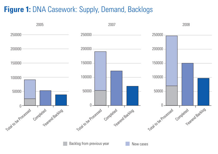
Start by decoding the display:
- The vertical axis is a case count, extending from to roughly .
- Each panel represents a different year.
- The first bar, “Total to be Processed,” is stacked:
- gray represents backlog carried from the previous year;
- light blue represents new cases.
- The second bar represents completed cases.
- The third bar represents year-end backlog.
Several careful observations are possible:
| Feature | Approximate reading from graph |
|---|---|
| Total cases to be processed | Rises from about in 2005 to about in 2008 |
| Cases completed | Rises from about to about |
| Year-end backlog | Rises from about to about |
An evidence-based summary could be:
The total DNA casework to be processed, the number completed, and the year-end backlog all increased from 2005 to 2008. Although completions increased, the displayed year-end backlog was also larger in 2008 than in 2005.
That conclusion is justified by the chart. But the following would go too far:
Laboratories became less efficient from 2005 to 2008.
The graph does not show laboratory staffing, turnaround time, funding, changes in reporting practices, the complexity of cases, or how “completed” was defined. It shows counts, not the reasons behind them.
There is another important practical point: values read from a bar chart are often approximate. If you need to calculate an exact completion percentage or compare small differences, consult the underlying table or report rather than estimating from bar heights.
Read graphs critically: scale and design can distort impressions
Graphs can be clear and honest, but their design choices can also mislead. A reader should inspect the design, not merely the apparent pattern.
Truncated vertical axes
For a bar chart, the vertical axis should normally start at zero because bar length represents the value. Starting at a high number can make a modest difference appear dramatic.
Imagine two results:
The difference is units. On a bar chart beginning at , the bars look very similar. On a bar chart beginning at , the second bar may look several times taller than the first. The numerical difference has not changed; only the visual impression has.
For line graphs, a restricted vertical scale can sometimes be legitimate when the purpose is to examine small variation, such as day-to-day instrument-control readings. But the scale must be clearly labeled, and the reader should recognize that the graphic magnifies small differences.
Unequal histogram bins
In a true histogram, numerical bins should have equal widths. If one bin covers – and another covers “over ,” the latter may cover a much larger interval. Comparing bar heights without noticing this can produce a false impression of the distribution.
Decorative images and area
Infographics sometimes use pictures whose height and width increase with the data. This makes area increase much more quickly than the numerical value. If one picture is twice as tall and twice as wide as another, it occupies four times the area, even if the underlying value was meant to be only twice as large.
The OpenStax reading below provides two concrete examples: a truncated vertical axis and unequal-width bins.
8.2 Visualizing Data - Contemporary Mathematics | OpenStax
This OpenStax section shows how the same data can produce sharply different visual impressions when axis scales, image sizes, or bin widths are chosen poorly. These checks are essential when interpreting forensic or public-policy graphics.
In the subsection “Misleading Graphs,” read Example 8.14. Begin at the axis-scale example, comparing the two bar charts that use the same data. Then continue from the bin-width example to see why histogram bars must represent equal intervals on the horizontal axis. Focus on what you should inspect before drawing a conclusion.
Key takeaways
Tables and graphs make forensic measurements easier to inspect, compare, and communicate, but they must be read with care.
- A table entry only has meaning when read with its row label, column heading, unit, and context.
- Bar charts compare separate categories; line graphs show change across an ordered scale such as time; histograms show how numerical measurements are distributed across intervals.
- Read the title, axes, units, scale, legend, and graph type before interpreting any apparent trend.
- State what the display directly shows, then keep explanations separate unless additional evidence supports them.
- Be alert to truncated axes, unequal histogram bins, and graphics that exaggerate differences through area or decoration.
- Values estimated from a graph are approximate; use the underlying data table for precise calculations.
Next, you will examine why measurements and conclusions can vary by learning to classify sources of uncertainty as random error, systematic error, or cognitive bias.
Can't find a good explanation? Sign up and we'll make it for you
Sign up