
Hello! Welcome back to the course.
In our previous lessons, you've built a solid foundation in Power BI. You've learned to create various charts, write DAX measures for financial analysis, and even design elegant custom tooltips to provide deep context on demand. Now, it's time to bring all these elements together.
Today's lesson addresses the learning outcome: Build a multi-page financial dashboard in Power BI. We'll move beyond single-page reports and construct a cohesive, multi-page dashboard that tells a clear financial story. This is a crucial skill for creating professional-grade reports, allowing you to present a high-level summary to executives while also providing detailed views for analysts, all within a single file.
We'll cover how to structure your report, create separate pages for different purposes (like an overview and a detailed analysis), and, most importantly, how to build intuitive navigation so users can move seamlessly between these pages.
1. The Anatomy of a Multi-Page Dashboard
A well-designed financial dashboard is like a well-structured report. It doesn't put everything on one page. Instead, it guides the user from a broad overview to specific details across multiple, logically organized pages.
A common structure includes:
- Overview/Summary Page: This is the landing page. It features high-level Key Performance Indicators (KPIs) and summary visuals. For a stock dashboard, this might be the current price, market cap, and a recent performance trend.
- Detailed Analysis Pages: Each of these pages focuses on a specific area. You might have one page for historical price and volume analysis, another for company profile and key metrics, and perhaps a third for comparing against competitors.
- Navigation System: This is what ties the pages together. While you can use Power BI's default page tabs at the bottom, a more professional approach uses buttons and other interactive elements to create a custom navigation experience, often in a pane on the side or top.
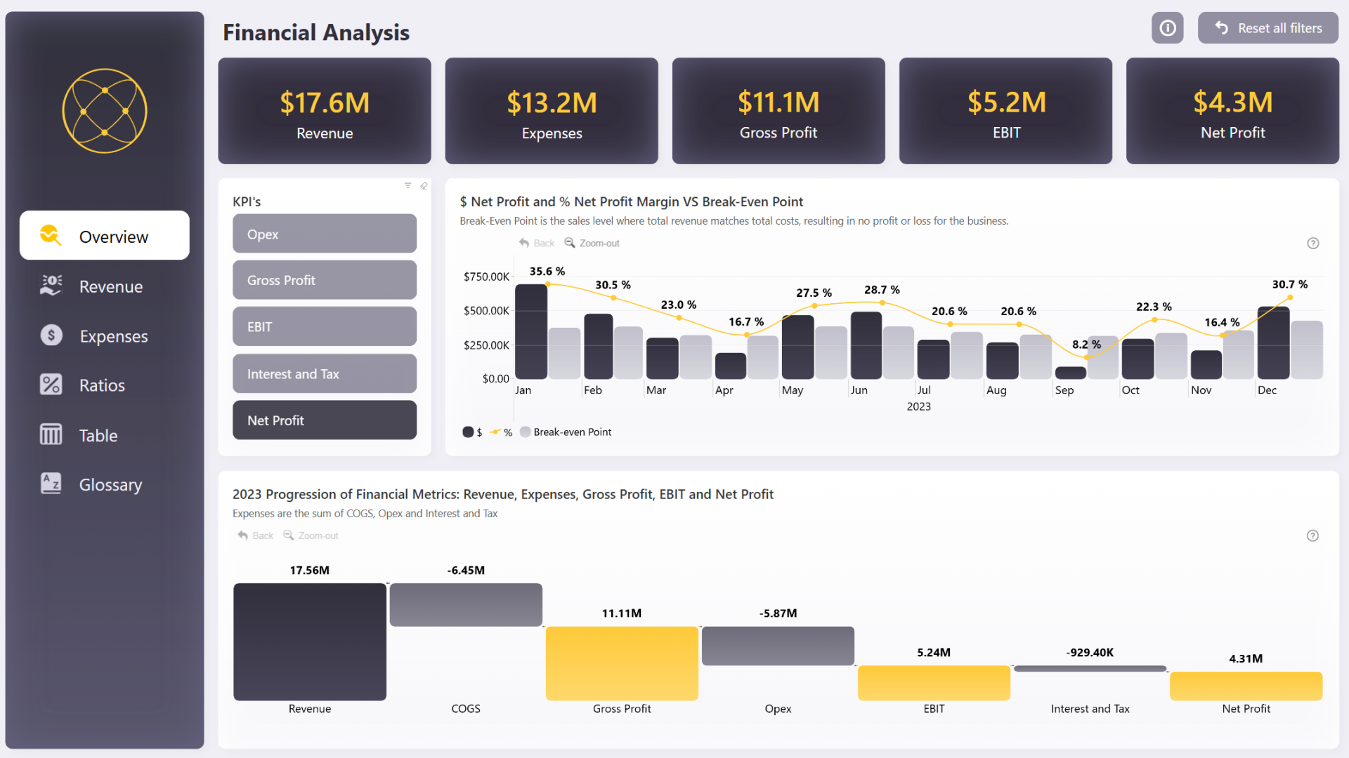
2. Planning and Building Your Dashboard
Let's walk through the process of building a multi-page stock market dashboard. We'll use a comprehensive video tutorial as our guide. This video will show you how to build a dashboard from start to finish, and we'll pause to focus on the key concepts relevant to our learning goal.
Step 1: Setting the Stage (Data, Model, and Theme)
Before building visuals, you need your data and a consistent design. A good dashboard has a unified look and feel across all its pages.
Power BI Dashboard Tutorial | Stock Market Dashboard
The video 'Power BI Dashboard Tutorial | Stock Market Dashboard' by Data Space provides an excellent end-to-end example. We'll use it to guide our build. First, let's see how the author sets up the project.
Watch from the beginning to 08:19. Focus on these three key setup stages: Dashboard Structure (00:11 - 00:59): The author outlines the multi-page structure: an 'Overview', a 'Profile', and a 'Key Metrics' page. Data Modeling (01:18 - 07:24): Observe how multiple data sources (CSVs) are imported and connected in the data model view. You don't need to follow every detail of the Power Query transformations, but understand the goal: to create relationships between tables based on common keys (like the stock ticker symbol). Setting a Theme (07:24 - 08:19): Notice how a dark theme is applied and customized before any visuals are built. This ensures consistency across all pages you create later.
Step 2: Creating and Populating the Pages
Now, with the foundation in place, you can start building the individual pages. In Power BI, you add new pages using the + icon in the page navigation tab at the bottom of the canvas.

The next part of the video shows the process of adding visuals to the different pages that were planned in the intro.
Power BI Dashboard Tutorial | Stock Market Dashboard
Let's continue with the same video to watch how the pages are populated.
Watch the time-lapse from 08:19 to 12:03. As you watch, identify which visuals are placed on which page to fulfill the intended purpose (e.g., card visuals for KPIs on the overview page, a description on the profile page). Pay special attention to the clever image slicer technique shown from 09:30 to 10:45.
Test your understanding!
You are tasked with creating a multi-page dashboard to track the performance of a personal investment portfolio. Your audience is yourself. What pages would you create, and what is the primary purpose of each page?
Show answer
There are many good answers, but a logical structure could be:
- Portfolio Overview: A summary page with KPIs for total portfolio value, overall profit/loss, and daily change. It might include a pie chart showing asset allocation (stocks, bonds, etc.).
- Stock Deep-Dive: A detailed page for analyzing individual stocks. It would have a slicer to select a stock and then show its historical price chart, key metrics (P/E, dividend yield), and recent news.
- Performance History: A page dedicated to historical performance, with charts showing portfolio value over time compared to a benchmark like the S&P 500.
3. Implementing Navigation and Consistency
With your pages built, you need to connect them. As mentioned, using custom buttons is far more professional than relying on the default tabs. This makes your report feel more like a web application.
Creating Page Navigation with Buttons
Power BI's Bookmark and Button features are a powerful combination for creating custom navigation. A button can be configured to perform an action, such as navigating to another page.
The next segment of our video tutorial provides a masterclass in this. The author creates a sleek, icon-based navigation bar on the left side of the report.
Power BI Dashboard Tutorial | Stock Market Dashboard
This is the most critical part of building a user-friendly multi-page dashboard. Watch how the author creates a clean, professional navigation bar.
Watch carefully from 25:52 to 29:27. Focus on the core process: Insert a Blank Button: The process starts with Insert > Button > Blank. Configure the Button: In the Format pane, the author adds a custom icon, a tooltip, and most importantly, an Action. Set the Action: For page navigation, the Action type is set to Page navigation, and the Destination is set to the target page (e.g., 'Profile'). Handling the Active Page: Notice the clever design choice: the button for the current page has a different style (black icon on white) and its navigation action is set to 'None'. Copying to Other Pages: Once the navigation bar is built on one page, it's copied to the others, with adjustments made to the actions and styling for each page's context.
Syncing Slicers for a Consistent Experience
A huge part of a good user experience is consistency. If you have a slicer that lets a user select a company (like the image slicer in the video), that selection should persist when they navigate to another page. You don't want them to have to re-select "Apple" on every single page. This is achieved using the Sync slicers feature.
When you copy a slicer and paste it onto a new page, Power BI will ask if you want to sync the visuals. By agreeing, you ensure that a change to one slicer is automatically reflected in the other.
You can also manage this manually for greater control. The article below provides a clear, step-by-step guide to this essential feature.
How to Sync Slicers in Power BI: Step-by-Step Guide
To ensure your filters and slicers work consistently across all pages, you need to understand the 'Sync slicers' pane. This article from SelectDistinct gives a clear, focused explanation.
Read the section titled 'Final Step – Sync Slicers'. Pay attention to how you can access the 'Sync Slicers' pane from the 'View' ribbon and how slicers are added to a named group to link their behavior.
The "FP&A Dashboard" tutorial article also discusses this in Step 8c, reinforcing its importance in complex financial reports.
Conclusion
Congratulations! You've just learned how to assemble individual visuals and analytics into a single, cohesive, and interactive multi-page dashboard. This moves you from simply creating charts to designing complete reporting solutions.
Key Takeaways:
- Structure is key: Plan your dashboard pages logically, typically moving from a high-level overview to more detailed analysis.
- Build page by page: Create separate pages for each distinct purpose, ensuring a consistent theme and layout.
- Create custom navigation: Use Buttons with "Page navigation" actions to build an intuitive and professional user experience. This is a significant step up from using the default page tabs.
- Sync your slicers: Ensure a seamless analytical flow by syncing slicers across pages, so user selections are remembered as they navigate the report.
In our next lesson, we will explore another powerful way to connect summary and detail views. You will learn how to configure drill-through functionality, which allows users to right-click a data point on a summary chart (like a total sales number) and jump to a pre-filtered detail page that explains what makes up that number.
Can't find a good explanation? Sign up and we'll make it for you
Sign up