
Hello! Welcome to the next lesson in our journey to build powerful financial visualizations.
In the last lesson, we constructed a professional, multi-page dashboard, using buttons and synced slicers to create a seamless navigation experience. We learned how to guide users between a high-level overview and various detailed pages.
Today, we'll dive into a more dynamic way to connect summary and detail, addressing the learning outcome: Configure drill-through functionality to navigate from summary views to detailed data.
Drill-through is a powerful feature that allows you and your users to explore the "story behind the numbers." Instead of just navigating to a static page, you'll be able to click on a specific data point—like the total revenue from a particular sector—and jump to a new page that is automatically filtered to show you only the details that make up that specific number. It's the Power BI equivalent of double-clicking a cell in an Excel PivotTable to see the underlying data.
1. Understanding Drill-through: From "What" to "Why"
In the previous lesson, we used buttons for page navigation. This is great for moving between predefined sections of your report, like from an "Overview" page to a "Company Profile" page.
Drill-through is different. It's about data exploration. It lets a user select a point on a source visual (the "what") and travel to a pre-formatted target page that shows the corresponding details (the "why").
The core components are:
- Source Visual: A chart or table on your summary page (e.g., a bar chart showing portfolio value by asset class).
- Drill-through Page (Target): A dedicated, often hidden, report page designed to display detailed information (e.g., a table listing all the individual stocks within an asset class).
- Drill-through Field: The piece of data that connects the source and target (e.g., the 'Asset Class' field). Power BI uses this to pass the filter context from the source to the target.
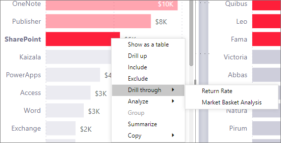
2. Setting Up Your First Drill-through
The process always starts with the target page—the page that will show the details. You'll create this page, add your detailed visuals, and then tell Power BI that it's a drill-through destination.
The video below provides a crystal-clear, step-by-step guide. We'll walk through it together.
How to use Drill Through in Power BI. 👆 ONE click from chart to details
This video, 'How to use Drill Through in Power BI' from Leila Gharani, is an excellent tutorial. We'll start by learning how to set up the detail page and enable the drill-through functionality.
Watch from 01:09 to 05:05. Follow these key steps: Create the Detail Page (01:09 - 02:08): Notice how a new page is created and a visual (a Matrix) is added to display detailed data like daily orders and profit. Enable Drill-through (03:00 - 04:00): This is the most important step. Observe how the 'Store Name' field is dragged into the Drillthrough field well in the Visualizations pane. This action instantly designates the page as a drill-through target for that category and adds a 'Back' button. Test the Functionality (04:00 - 05:05): See how, after setting this up, you can go back to the summary chart, right-click on a store, and use the 'Drill through' option. Pay close attention to the Filters pane on the detail page to see how Power BI automatically applied the filters for 'Year' and 'Store Name'.
As you can see, the setup is straightforward. The key is dragging the correct categorical field (like 'Store Name', 'Sector', or 'Stock Ticker') into the drill-through well on your detail page.
3. Enhancing User Experience with Drill-through Buttons
While right-clicking works, it's not always obvious to a user that this functionality exists. A much better design practice is to use a button that clearly signals the option to drill through for more details.
The brilliant thing about drill-through buttons is that they are context-aware. The button remains disabled (grayed out) until a user makes a valid selection on a source visual. Once they select a data point, the button becomes active. This provides an excellent visual cue.
How to use Drill Through in Power BI. 👆 ONE click from chart to details
Let's continue with the same video to learn how to create a more intuitive user experience with a dedicated button.
Watch carefully from 07:01 to 09:22. Focus on these steps: Insert and Configure the Button (07:10 - 07:45): A blank button is inserted. In the Format pane, under Action, the Type is set to Drill through and the Destination is set to the 'Store Info' page. Observe the Disabled State (08:00 - 08:20): Notice that the button is initially grayed out. It only becomes clickable after a specific store is selected on the bar chart. Customize Button States (08:35 - 09:00): This is great design. You can set different formatting (like color and text) for the button's Default state (when it's active) and its Disabled state. This makes it very clear to the user when they can and cannot click. Improve the Tooltip (09:00 - 09:22): The tooltip is customized to guide the user: "Select a store and then click for details."
Test your understanding!
You have a pie chart on your main dashboard showing your portfolio's asset allocation (e.g., 60% Stocks, 30% Bonds, 10% Cash). You want to enable users to click on the "Stocks" slice and be taken to a page listing all the individual stocks in your portfolio.
Briefly outline the main steps you would take to implement this using a drill-through button.
Show answer
- Create a new page to be the detail page (e.g., name it "Stock Details").
- On this new page, add a table or matrix visual showing the list of individual stocks and their relevant metrics (price, quantity, value).
- In the Visualizations pane for the "Stock Details" page, drag the 'Asset Class' field into the Drillthrough field well.
- Go back to the main dashboard page. Insert a Button.
- Configure the button's Action: set the
TypetoDrill throughand theDestinationto your "Stock Details" page. - Customize the button text (e.g., "View Holdings") and format its
DisabledandDefaultstates for better user feedback. The button will now automatically activate when a user clicks a slice on the asset allocation pie chart.
4. Advanced Technique: Drilling Through by Measure
So far, we've enabled drill-through based on a category (like a store name or asset class). This works only on visuals that contain that specific category.
A more powerful and flexible approach is to enable drill-through on a measure. For example, you could enable drill-through on your [Total Sales] measure. This would make the drill-through option available on any visual in your report that uses that measure, regardless of the categories in the visual.
This is incredibly useful for financial dashboards where a key metric like 'Revenue' or 'Net Profit' might appear in many different charts (by region, by quarter, by product).
The Secrets of Drillthrough in Power BI
The video 'The Secrets of Drillthrough in Power BI' by BI Gorilla explains this advanced technique very well. Watch this segment to understand the difference between drilling by a column versus a measure.
Watch from 06:36 to 08:30. Pay attention to the key distinction: Drilling by Column ('Color'): The drill-through only works on visuals that explicitly include the 'Color' field. Drilling by Measure ('Total Sales'): After removing the column and adding the 'Total Sales' measure to the drill-through field well, the drill-through option becomes available on all visuals that use that measure, including the line chart which didn't have the 'Color' field.
This technique significantly enhances the exploratory capabilities of your dashboards, making them more robust and versatile.
Conclusion
Today you've added a vital skill to your Power BI toolkit. You've gone beyond simple page linking and learned how to create dynamic, context-aware navigation that allows for deep, focused analysis.
Key Takeaways:
- Drill-through provides layered analysis: It lets you connect a high-level summary number to the detailed data that constitutes it.
- Setup is target-first: You build your detail page first, then enable it as a drill-through target by dragging a field or measure into the drill-through well.
- Buttons enhance usability: Use drill-through buttons to provide clear, context-aware visual cues for your users, guiding them to explore the data.
- Drilling by measure is powerful: For maximum flexibility, enable drill-through on key financial measures (like Revenue, Profit, or Portfolio Value) to allow exploration from any chart displaying that metric.
In our next lesson, we'll explore how to expand Power BI's capabilities even further. We will learn to integrate custom visuals from the AppSource for specialized financial charts. While Power BI's standard visuals are excellent, the AppSource marketplace offers a vast library of third-party visuals, including advanced candlestick charts, decomposition trees, and other specialized tools perfect for financial analysis.
Can't find a good explanation? Sign up and we'll make it for you
Sign up