
Welcome. In this first module, you will build a small healthcare report from the ground up. Before importing any data, it is worth becoming comfortable with the Power BI Desktop workspace: where reports are designed, where loaded data can be inspected, and where table relationships are managed.
By the end of this lesson, you should be able to switch confidently among Report, Data, and Model views and identify the core authoring areas: the ribbon, report canvas, page tabs, Data/Fields pane, visual-building controls, Filters pane, data grid, and model diagram. Names and exact positions can vary slightly with Power BI updates, but each area has a stable purpose.
The three views: three ways to look at one Power BI file
A Power BI Desktop file eventually contains three connected things:
- Data: tables and columns loaded from a source such as an Excel workbook.
- A model: the organized tables, relationships, and calculations that make analysis reliable.
- A report: visuals and pages that communicate the results.
The three main views let you work with these different aspects of the same file.
| View | Main purpose | What you work with |
|---|---|---|
| Report view | Design interactive report pages | Canvas, charts, tables, slicers, titles, filters |
| Data view | Inspect loaded tables and work with individual fields | Rows, columns, data types, calculated columns, measures |
| Model view | Organize tables and control how they relate | Table diagrams, relationship lines, model structure |
Microsoft documentation sometimes calls the middle view Table view, while the Power BI Desktop interface commonly labels it Data view. Treat those names as referring to the same basic workspace.
A useful rule for now is:
- Use Report view when you want to show information.
- Use Data view when you want to inspect fields and values.
- Use Model view when you want to understand or manage how tables connect.
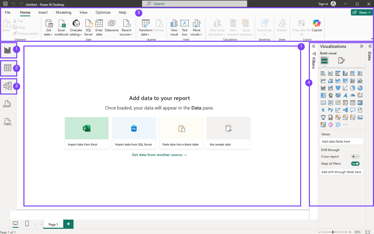
The icons for these views sit vertically on the far left of Power BI Desktop. Their exact artwork can vary, but they are usually recognizable as:
- a small chart for Report view,
- a table/grid for Data view,
- connected boxes for Model view.
You may see additional icons in some versions, such as DAX Query View or TMDL View. Ignore those for now; the course will concentrate on the three core views.
Query Overview in Power BI Desktop
Read Microsoft Learn's short overview to reinforce the purpose of each main Desktop view before you begin navigating it yourself.
In the section “Power BI Desktop Views,” read the three-view overview. Focus on matching each purpose—building visuals, inspecting tables, and managing relationships—to its left-side navigation icon. Notice that the currently selected view is visually highlighted.
Report view: the report-design workspace
When you open a blank report, Power BI normally begins in Report view. This is where most visible report-building happens.
The largest central area is the report canvas. Think of it as a page you will arrange for your audience. Later, you will place charts, KPI cards, tables, and slicers on it. At the bottom of the canvas are page tabs. One Power BI report can contain several pages, much like a slide deck, but each page can have its own visuals and purpose.
Around the canvas, locate these authoring areas:
The ribbon
The ribbon runs across the top of the application. It organizes commands into tabs such as Home, Insert, Modeling, View, and sometimes Optimize.
For the next lesson, the important Home-tab command will be Get data, which starts the process of importing a healthcare workbook. Also notice Transform data. That button opens Power Query Editor, the separate environment used to clean and reshape data before reporting.
Do not confuse Power Query Editor with Data view:
- Data view lets you inspect data already loaded into the model.
- Power Query Editor prepares data before it is loaded or refreshed.
We will work extensively with Power Query in Module 2.
The Data pane
On the right, look for a pane labeled Data. In older tutorials and versions, it may be called Fields. Its job is the same: it lists your tables and the fields inside them.
After data is imported, you will typically:
- expand a table to see its columns,
- drag a field onto a visual,
- search for a field by name,
- identify measures and calculated columns.
At this stage, with no dataset loaded, this pane may be empty. That is expected.
Visualizations or visual-building controls
In many Power BI Desktop layouts, the Visualizations pane appears beside the Data pane. It contains icons for charts, cards, maps, tables, and slicers, along with areas where you assign fields to a visual.
In newer versions using on-object interaction, Power BI may show controls such as Build visual and Format visual closer to the selected visual rather than keeping every control in one permanent Visualizations pane. The concept remains unchanged:
- Build controls determine which fields a visual uses.
- Format controls determine how the visual looks: title, colors, labels, axes, and so on.
You do not need to memorize chart icons today. Just locate the area where visual types and visual settings are available.
Filters pane
The Filters pane controls which data a report or visual includes. Depending on your layout, it might be visible on the right, collapsed to a narrow vertical tab, or hidden until needed.
Later, you will encounter three common levels:
- filters affecting one visual,
- filters affecting the current page,
- filters affecting the entire report.
For now, identify the pane and recognize its purpose: it limits the data shown without changing the original source file.
Data view: checking what Power BI actually loaded
Select the table/grid icon on the left navigation bar to open Data view. Once a table is loaded, this view shows its rows and columns in a grid.
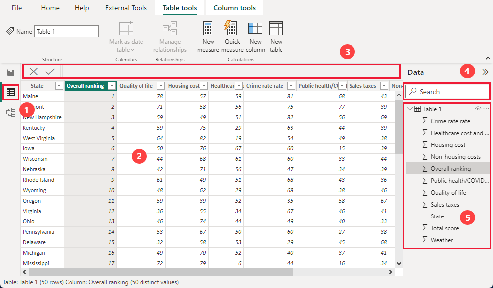
Data view is especially useful when you need to verify basic facts before trusting a visual:
- Are the expected columns present?
- Do date values look like dates rather than text?
- Are amounts displayed as numbers?
- Does a category field contain inconsistent spellings?
- Are there unexpected blanks or errors?
The image shows several elements worth locating:
- The Data view icon on the left, used to enter this view.
- The central table grid, where you inspect records and columns.
- The top formula bar/contextual tools area, which changes when a table or column is selected.
- The Data pane search box, useful when a model eventually has many fields.
- The expanded field list for a table.
You may also see Table tools or Column tools on the ribbon after selecting a table or column. These contextual tabs offer commands relevant to what is selected. For example, when you select a column, Power BI may expose its data type, formatting, category, and sort settings.
Data view is not meant to replace Excel as a general-purpose spreadsheet editor. You inspect and model data here; you generally clean source problems in Power Query and build report visuals in Report view.
Model view: seeing the structure behind the report
Select the connected-boxes icon on the left to enter Model view. Once your report has more than one table, this view becomes essential.
Model view presents each table as a small card containing its fields. Lines between table cards represent relationships. A relationship tells Power BI how to connect related records. For example, a future healthcare report might have:
- a table of patient encounters,
- a date table,
- a department lookup table,
- a clinician lookup table.
A department selected in a report slicer should filter the relevant encounter records. The relationship structure is what makes that filtering work correctly.
For this lesson, simply recognize the main areas:
- the model canvas, where tables are arranged,
- table cards, which list fields within each table,
- relationship lines, which show table connections,
- model-related panes or properties, whose exact position depends on your version.
Avoid making or changing relationships just yet. A relationship that looks plausible can still be wrong if the columns do not represent the same kind of identifier. In Module 4, you will learn how to define table grain, distinguish fact and dimension tables, and validate relationship behavior systematically.
A short guided tour
The following video gives a compact visual demonstration of the workspace. It uses sales data rather than healthcare data, but the interface and navigation ideas transfer directly.
Power BI Tutorial for Beginners (2025)
Kevin Stratvert’s “Power BI Tutorial for Beginners (2025)” shows the opening workspace, then briefly demonstrates the Model and Report views after data has been loaded.
If Power BI Desktop is not installed, watch Desktop setup to distinguish Power BI Desktop from Report Builder and reach a blank report. For the core orientation, watch Model view and observe the imported tables and their relationship. Then watch Report panes; focus on the central canvas and the distinct jobs of the Data and Visualizations areas on the right.
Your first navigation routine
Spend about 10 minutes with Power BI Desktop open. Do not worry about creating a polished report or importing data yet. The purpose is to make the interface feel familiar.
- Open Power BI Desktop and choose Blank report if the welcome screen appears.
- In Report view, identify the ribbon, blank canvas, page tab at the bottom, Data/Fields pane, visual-building area, and Filters pane.
- Select Data view from the left navigation. With a blank file, it may contain no table data. Confirm that the central area is designed as a grid rather than a report canvas.
- Select Model view. Again, an empty model is normal before importing data. Notice that this workspace is a diagram area, not a page for charts.
- Return to Report view. Locate Home on the ribbon and find, without selecting them yet, Get data and Transform data.
- Save the blank file somewhere easy to find, perhaps as
PowerBI_Orientation.pbix.
This small routine is valuable because it separates three tasks that beginners often mix together:
| If you need to... | Start in... |
|---|---|
| Add or arrange a chart | Report view |
| Check a column’s loaded values | Data view |
| Inspect how tables are connected | Model view |
| Clean or reshape imported data | Power Query Editor through Transform data |
Key takeaways
Power BI Desktop is organized around three core views:
- Report view is the canvas for visual storytelling and interactive report pages.
- Data view is where you inspect loaded tables, fields, and values.
- Model view is where you see and manage table relationships.
In Report view, learn to orient yourself using the ribbon, canvas, page tabs, Data/Fields pane, visual-building controls, and Filters pane. Interface layouts can differ across versions, but the purpose of each area remains consistent.
Next, you will use Get data to import a de-identified healthcare workbook into Power BI Desktop.
Can't find a good explanation? Sign up and we'll make it for you
Sign up