
Good to see you again. In the previous lessons, you inspected tabular data, encoded cleaning rules, and created enriched summaries with validated joins and explicit aggregation definitions. Visualization is the next diagnostic layer: before fitting a model, you need to see the shapes, gaps, extremes, clusters, and relationships that summary statistics alone can conceal.
This lesson focuses on choosing and producing statistical plots for numerical data with pandas, Matplotlib, and Seaborn. You will use distributions to understand one variable at a time, scatter and density-style plots to inspect relationships, and line plots for aggregated time-based metrics. The practical goal is not decorative charts; it is evidence for data-quality decisions and later feature/model choices.
Choose the plot from the question
A plot is useful when its visual encoding matches both the data type and the question. Start by stating what one mark represents: an individual row, a bin of rows, or an aggregation such as a daily mean.
| Question | Data involved | Strong first plot | What it helps reveal |
|---|---|---|---|
| What values occur, and how often? | One continuous numerical column | Histogram | range, modes, skew, gaps, outliers |
| What fraction of requests meets an SLO? | One continuous numerical column | ECDF | percentile and threshold comparisons |
| Do two numeric columns move together? | Two numerical columns | Scatter plot | direction, nonlinearity, clusters, outliers |
| Are many scatter points overlapping? | Two numerical columns, large dataset | 2D histogram | dense regions and joint structure |
| Does a metric change over time? | Time plus numerical metric | Line plot | trend, seasonality, regressions |
| Does a distribution differ by version, cohort, or segment? | Numerical column plus a small categorical column | Histogram or ECDF with hue | subgroup differences and mixture structure |
A few rules avoid many misleading plots:
- Check the data frame used by each plot. Plotting functions generally omit rows missing a plotted value. If two plots use different pairs of columns, they can be based on different subsets of rows.
- Preserve measurement units. Label axes as
latency_ms,payload_kb, ormonthly_spend_usd, not merelyvalue. - Do not treat identifiers as measurements. Numeric IDs, hashes encoded as integers, and row indexes rarely have meaningful distributions.
- Visual association is not causation. A visible relationship can be caused by confounding, a mixed population, a logging artifact, or a genuine mechanism. The plot tells you what to investigate next.
Set up a consistent plotting environment:
import matplotlib.pyplot as plt
import pandas as pd
import seaborn as sns

sns.set_theme(style="whitegrid", context="notebook")
For the examples that continue from the prior lesson, suppose enriched contains one row per request and has at least request_id, event_time, model_version, plan, and latency_ms.
Inspect one numerical distribution
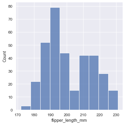
A histogram divides a numerical axis into intervals called bins. The bar height is the number of observations in each interval. It is usually the right first plot for a continuous feature or operational metric.
Matplotlib Tutorial (Part 6): Histograms
Watch Matplotlib Tutorial (Part 6): Histograms by Corey Schafer for a compact explanation of what bins represent and why a histogram is different from a bar chart.
Watch histogram basics. Focus on the fact that each bar represents a range of numerical values, not one category, and on the difference between supplying a number of bins and explicit bin edges.
Visualizing distributions of data - Seaborn - PyData |
Read Seaborn's distribution-visualization tutorial to connect histogram choices with KDEs, ECDFs, subgroup comparisons, and dense two-variable displays.
In “Plotting univariate histograms”, read the histogram introduction. Then read all of “Choosing the bin size”, especially the warning about bins. Continue through “Conditioning on other variables” to see how hue supports subgroup analysis. In “Kernel density estimation pitfalls”, focus on the limitations. Finally, read the introductions to “Empirical cumulative distributions” and “Visualizing bivariate distributions”, including the ECDF rationale.
Here is a defensible first pass on request latency:
latency = enriched.loc[
    enriched["latency_ms"].notna(),
    ["request_id", "latency_ms", "model_version", "plan"],
].copy()

print(f"Rows available for latency plot: {len(latency):,}")
print(latency["latency_ms"].describe())

fig, ax = plt.subplots(figsize=(9, 4))

sns.histplot(
    data=latency,
    x="latency_ms",
    bins=30,
    edgecolor="white",
    ax=ax,
)

median_latency = latency["latency_ms"].median()
ax.axvline(
    median_latency,
    color="crimson",
    linewidth=2,
    label=f"median = {median_latency:.1f} ms",
)

ax.set(
    title="Distribution of request latency",
    xlabel="Latency (ms)",
    ylabel="Request count",
)
ax.legend()
plt.tight_layout()
Read a histogram systematically
When viewing the result, work through these questions in order:
- Range: What are the smallest and largest plausible values?
- Typical region: Where are observations most concentrated?
- Shape: Is the distribution symmetric, right-skewed, left-skewed, or split into multiple modes?
- Gaps and spikes: Do empty ranges, unusually sharp peaks, or repeated round values suggest data-entry conventions, clipping, or mixed populations?
- Extreme values: Are they valid but rare cases, or likely invalid measurements?
For latency, a long right tail is often real: occasional requests may be slower because of cold starts, large inputs, retries, cache misses, or external-service delays. A histogram cannot establish the cause, but it tells you that a mean alone may be inadequate for the operational question.
Bin choice is part of the analysis
Changing bin width can hide a pattern or create a noisy-looking one. Do not select bins because one setting tells the most convenient story. Check whether your conclusion remains stable across a few reasonable values:
bin_options = [15, 30, 60]

fig, axes = plt.subplots(
    nrows=1,
    ncols=len(bin_options),
    figsize=(15, 3.5),
    sharey=True,
)

for ax, bins in zip(axes, bin_options):
    sns.histplot(
        data=latency,
        x="latency_ms",
        bins=bins,
        edgecolor="white",
        ax=ax,
    )
    ax.set_title(f"{bins} bins")
    ax.set_xlabel("Latency (ms)")

axes[0].set_ylabel("Request count")
plt.tight_layout()
If an apparent second peak exists only with one unusually fine binning choice, treat it cautiously. If it persists across several choices, it may indicate a mixed population worth segmenting by model version, endpoint, region, input size, or customer plan.
Do not use bin limits merely to conceal extreme values. If you need a zoomed view of the typical region, create a second, clearly labeled plot and report how many observations fall outside its displayed range.
Skew and transformed scales
For strictly positive values that span orders of magnitude, such as file size or latency across heterogeneous workloads, a logarithmic x-axis can reveal structure in the dense low-value region:
fig, ax = plt.subplots(figsize=(9, 4))

sns.histplot(data=latency, x="latency_ms", bins=40, ax=ax)
ax.set_xscale("log")
ax.set(
    title="Request latency on a logarithmic scale",
    xlabel="Latency (ms, log scale)",
    ylabel="Request count",
)
plt.tight_layout()
Only do this after confirming that all displayed values are greater than zero. A log scale changes visual distance: it is appropriate for multiplicative ranges, but must be stated plainly in the axis label or title.
Compare distributions across meaningful groups
A distribution that looks complicated in the full data often becomes clear after segmentation. For example, model versions may have different latency profiles, and mixing them together can create a false appearance of multiple modes.
For a small number of groups, begin with a histogram using outline-style bars:
fig, ax = plt.subplots(figsize=(9, 4.5))

sns.histplot(
    data=latency,
    x="latency_ms",
    hue="model_version",
    bins=30,
    element="step",
    stat="density",
    common_norm=False,
    ax=ax,
)

ax.set(
    title="Latency distributions by model version",
    xlabel="Latency (ms)",
    ylabel="Density",
)
plt.tight_layout()
There are two important choices here:
element="step"reduces the visual confusion caused by filled bars overlapping.stat="density", common_norm=Falsenormalizes each version independently. Each version's total bar area is one, so you compare shapes rather than being dominated by the model version with the most requests.
Density is not a request count. Include a separate count table whenever sample size matters:
version_counts = (
    latency
    .groupby("model_version", as_index=False)
    .agg(requests=("request_id", "size"))
    .sort_values("requests", ascending=False)
)

version_counts
For service-level questions, an empirical cumulative distribution function, or ECDF, is frequently clearer than an overlapping histogram. At an x-value of 200 ms, the curve's height is the fraction of plotted requests with latency at most 200 ms:
fig, ax = plt.subplots(figsize=(9, 4.5))

sns.ecdfplot(
    data=latency,
    x="latency_ms",
    hue="model_version",
    ax=ax,
)

ax.axvline(
    200,
    color="black",
    linestyle="--",
    linewidth=1,
    label="200 ms threshold",
)
ax.set(
    title="Cumulative latency by model version",
    xlabel="Latency (ms)",
    ylabel="Proportion of requests",
)
ax.legend()
plt.tight_layout()
Unlike a histogram, an ECDF does not require choosing bins. It is especially useful for comparisons such as:
- Which version has a larger share of requests below an SLO?
- Does a new version improve the whole distribution or only the median?
- Where do the tails begin to diverge?
A KDE is another smooth view of a distribution, but use it as a supplementary exploratory plot rather than default evidence. KDE smoothing can invent visual structure, and for bounded quantities such as nonnegative latency it may imply density below zero. Avoid it for discrete measurements such as counts, star ratings, or an integer number of retries.
See relationships between two numerical columns
A scatter plot maps one observation to one point. It is the first choice when you want to investigate whether one numerical feature is related to another numerical feature or a numerical target.
Visualizing statistical relationships - Seaborn - PyData |
Read Seaborn's relationship-visualization tutorial for the semantics of scatter plots, lines, and facets. Its distinction between individual observations and aggregated line values is essential for ML exploratory analysis.
In “Relating variables with scatter plots”, read the basic interpretation and then the hue explanation. In “Emphasizing continuity with line plots”, read the plot-selection guidance. Then read “Aggregation and representing uncertainty” through the first examples so that Seaborn's line-plot defaults do not surprise you. Finish with “Showing multiple relationships with facets”, focusing on why several simple panels are often clearer than one overloaded chart.
Suppose request telemetry includes an input-size field such as input_tokens. A scatter plot can reveal whether larger inputs tend to create slower requests:
pair = request_metrics.loc[
    request_metrics["input_tokens"].notna()
    & request_metrics["latency_ms"].notna(),
    ["input_tokens", "latency_ms", "model_version"],
].copy()

fig, ax = plt.subplots(figsize=(8, 5))

sns.scatterplot(
    data=pair,
    x="input_tokens",
    y="latency_ms",
    hue="model_version",
    alpha=0.35,
    s=28,
    ax=ax,
)

ax.set(
    title="Request latency versus input size",
    xlabel="Input tokens",
    ylabel="Latency (ms)",
)
plt.tight_layout()
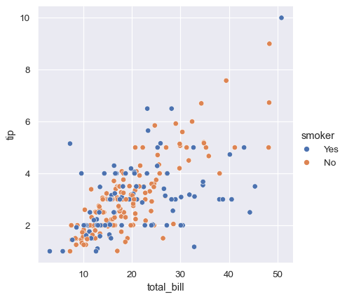
Use transparency through alpha when points overlap. Without it, a dense cluster can look identical to a single observation. Do not use hue for a category with dozens of levels: the legend and the chart will become unreadable. For a small number of important versions or cohorts, it is highly effective.
Read a scatter plot by looking for:
- Direction: Do larger x-values generally coincide with larger or smaller y-values?
- Form: Is the pattern roughly linear, curved, threshold-like, or absent?
- Spread: Does the vertical variability grow with x? This can indicate that predictions or latencies become less predictable for some inputs.
- Clusters: Are there separable groups that may represent different populations or processing paths?
- Outliers: Are isolated points valid exceptional cases, logging errors, or evidence of a failed request path?
A trend in a scatter plot is an association, not a causal claim. For example, input_tokens and latency may be associated because both influence compute work, but model version, queue state, hardware, and batch behavior may also matter.
When scatter plots are too dense
A scatter plot with tens or hundreds of thousands of rows can become an opaque cloud. A 2D histogram bins both axes, using color to show the number of observations in each rectangle:
fig, ax = plt.subplots(figsize=(8, 5))

sns.histplot(
    data=pair,
    x="input_tokens",
    y="latency_ms",
    bins=40,
    cbar=True,
    ax=ax,
)

ax.set(
    title="Density of requests by input size and latency",
    xlabel="Input tokens",
    ylabel="Latency (ms)",
)
plt.tight_layout()
The color bar is important: it tells the viewer what color intensity means. This plot sacrifices individual rows, but it reveals where the dataset is concentrated. Use it for large data; return to a sampled scatter plot when you need to inspect individual extremes.
Plot metrics over time without hiding the aggregation
A line implies continuity and order, which makes it suitable for time. It is usually not appropriate for unsorted individual request rows, because connecting each event with a line invents a path that does not exist.
Instead, aggregate a well-defined metric first. For example, calculate daily mean latency by model version:
events_for_time = enriched.copy()
events_for_time["event_time"] = pd.to_datetime(
    events_for_time["event_time"],
    errors="coerce",
)

daily_latency = (
    events_for_time
    .dropna(subset=["event_time", "latency_ms", "model_version"])
    .assign(day=lambda frame: frame["event_time"].dt.floor("D"))
    .groupby(["day", "model_version"], as_index=False)
    .agg(
        requests=("request_id", "size"),
        mean_latency_ms=("latency_ms", "mean"),
    )
)

fig, ax = plt.subplots(figsize=(10, 4.5))

sns.lineplot(
    data=daily_latency,
    x="day",
    y="mean_latency_ms",
    hue="model_version",
    marker="o",
    estimator=None,
    errorbar=None,
    ax=ax,
)

ax.set(
    title="Daily mean request latency by model version",
    xlabel="Day",
    ylabel="Mean latency (ms)",
)
plt.xticks(rotation=30, ha="right")
plt.tight_layout()
The explicit groupby makes the plotted value auditable: every point is the mean latency for a particular day and model version. estimator=None and errorbar=None tell Seaborn not to aggregate an already aggregated table again.
Interpret this alongside requests. A daily mean based on 15 requests is much less stable than one based on 15,000. If tail behavior matters, create another explicit daily summary using a percentile such as p95 rather than assuming the mean represents user experience.
If the relationship differs across a second important category, prefer facets over adding too many visual encodings:
sns.relplot(
    data=pair,
    x="input_tokens",
    y="latency_ms",
    hue="model_version",
    col="region",
    col_wrap=3,
    alpha=0.3,
    height=3.5,
)
Use this only when each facet has enough observations and region has a manageable number of values. Small multiples make subgroup comparisons easier because each panel has one clear job.
A repeatable plotting loop for an ML dataset
For each numerical column you may later use as a feature, target, or operational metric, follow a short, evidence-driven loop:
- Define the population. State which rows are included and why. For example, all successful requests in a specified date range.
- Quantify availability. Count missing values and inspect basic summaries before plotting.
- Plot a distribution. Start with a histogram; check multiple bin settings. Use an ECDF when percentile or threshold comparisons matter.
- Segment deliberately. Compare by a small number of meaningful groups such as data split, model version, source, or cohort. Always pair normalized comparison plots with counts.
- Inspect key pairs. Use a scatter plot for small or moderate data and a 2D histogram for dense data.
- Write down findings and decisions. Separate what the plot shows from what you plan to investigate. For example: “A large right tail appears only in version B; inspect request payload size and endpoint routing.”
A compact notebook cell that records availability before a plot might look like this:
def numerical_profile(df: pd.DataFrame, column: str) -> pd.Series:
    values = df[column]

    return pd.Series(
        {
            "rows": len(values),
            "missing": values.isna().sum(),
            "observed": values.notna().sum(),
            "min": values.min(),
            "median": values.median(),
            "mean": values.mean(),
            "max": values.max(),
        },
        name=column,
    )

numerical_profile(enriched, "latency_ms")
Keep the plot and this small numerical profile together. If a future chart shows a strange spike, this context helps distinguish a real product pattern from missingness, invalid values, or a changed logging pipeline.
Key takeaways
Statistical plots are tools for forming and checking data hypotheses before modeling.
- Use a histogram to inspect the range, typical values, skew, modes, and outliers of one continuous variable. Check whether conclusions survive reasonable bin choices.
- Use an ECDF for direct threshold and percentile comparisons, particularly for service metrics such as latency.
- Use
huefor a small number of meaningful groups, and normalize distributions deliberately when comparing shapes across unequal group sizes. - Treat KDEs as smoothed exploratory views, not literal evidence, especially for bounded or discrete variables.
- Use a scatter plot to examine row-level numerical relationships; use transparency for overlap and a 2D histogram for very dense data.
- Use a line plot for explicitly aggregated, ordered measures such as daily means, and keep request counts visible alongside aggregate metrics.
- State the population, unit, and aggregation behind every chart. A visually polished plot is not reliable if it silently uses the wrong rows or an unclear denominator.
Next, you will turn the notebook-style preparation work from this module into reusable Python functions and a script. The plotting workflow here will become more reliable once data loading, cleaning, and validation are organized as code that can run consistently outside the notebook.
Can't find a good explanation? Sign up and we'll make it for you
Sign up