
Welcome back. In the previous lesson, you modeled motion and work problems by identifying the governing quantity, maintaining units, and splitting a changing schedule into valid intervals. Data-interpretation questions demand the same discipline, but the information is embedded in a display rather than stated as an equation.
For GATE General Aptitude, the arithmetic is usually familiar: percentages, ratios, averages, and differences. The risk is extracting the wrong values, using the wrong base, or answering a nearby question rather than the one asked. This lesson develops a reliable process for tables, bar charts, pie charts, line graphs, and short textual data sets.
Treat a data display as a structured input
A chart is not a database table, but the same habit of reading a schema before querying data is useful. Before calculating, identify what every visual component represents:
- Title: What phenomenon is measured?
- Unit: Counts, percentages, thousands, lakhs, rupees, or another unit?
- Categories: What do the rows, bars, sectors, or points represent?
- Series or legend: Which color, pattern, or line belongs to which group?
- Scale: What is one major or minor grid interval worth?
- Time reference: Are values annual totals, rates of growth, cumulative values, or values at a point in time?
Then translate the question into an extraction slip:
| Item | What to write |
|---|---|
| Target | The exact quantity requested |
| Required fields | The relevant years, categories, or groups |
| Unit | The unit in which the answer must be stated |
| Base | The denominator for a percentage or ratio |
| Operation | Lookup, sum, difference, ratio, percentage change, or average |
For example, if a question asks:
“By what percentage did sales increase from 2000 to 2001 for Branch B1?”
your extraction slip should be:
- Target: percentage increase for B1
- Required values: B1 in 2000 and B1 in 2001
- Base: B1 in 2000, because it is the original value
- Operation: percentage change
This small pause prevents a common error: dividing by the later value rather than the earlier one.
Data Interpretation and Graphs | Varsity Tutors
Read “Data Interpretation and Graphs” from Varsity Tutors for a compact framework for interpreting displays before calculating.
In Section 2, “Core Principles of Data Interpretation,” first read the opening principle. Then continue through the numbered rules, especially scale and estimation. In Section 4, “Mathematical Framework for Data Interpretation,” review the percent-change explanation beginning with the original value, followed by the pie-chart rule. Focus on matching every operation to its correct base.
A useful order under exam conditions is:
- Read the title, units, legend, and scale.
- Read the exact question and underline its requested quantity mentally.
- Extract only the relevant values.
- Perform the required operation.
- Check whether the unit and direction of comparison make sense.
Do not calculate everything visible in a graph. Most numbers are irrelevant to any one question.
Tables and short textual data sets: align fields before operating
Tables look precise, so they create a particular kind of careless error: selecting the correct row but wrong column, or correctly reading a number but forgetting its header.
Suppose a table contains the following monthly output data.
| Team | January | February | March | Total |
|---|---|---|---|---|
| P | ||||
| Q |
If asked for Team P’s average monthly output, use the three monthly entries:
Do not divide by merely because four numerical cells appear in the row. The “Total” cell is an aggregate, not a fourth month.
If asked for the percentage increase for Team Q from January to March, the relevant values are and :
The denominator is January’s value because the question compares March with January.
Totals versus averages: recognize weighted situations
Consider two branches:
| Branch | Candidates | Candidates who passed |
|---|---|---|
| North | ||
| South |
The pass rates are:
and
The overall pass rate is not the simple mean of and , because the branches have different numbers of candidates. Combine the counts first:
This is a weighted average in disguise. Whenever groups have unequal sizes, aggregate the numerators and denominators rather than averaging group percentages casually.
Nested percentages in a short data set
A textual problem may say that of customers are satisfied, and of the satisfied customers are repeat customers. The phrase “of the satisfied customers” changes the base.
First identify the satisfied group:
Then take of that subgroup:
Equivalently:
The danger is treating the as though it referred directly to all customers.
When reading a prose data set, rewrite each statement in a compact form:
- Population:
- Satisfied: of population
- Repeat and satisfied: of satisfied
That rewrite converts a dense paragraph into a visible hierarchy of quantities.
Bar charts: read height, unit, series, and comparison base
A grouped bar chart normally supports two kinds of comparison:
- Compare different categories within one year.
- Compare the same category across different years.
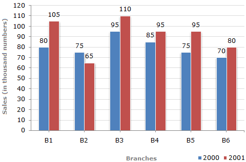
In the Branch Sales chart, the y-axis says sales are measured in thousand numbers. Therefore, the blue bar for B1 represents thousand in 2000, while the red bar represents thousand in 2001.
The absolute increase is:
So, B1 sales increased by thousand.
But a percentage-increase question requires the earlier value as the base:
Notice the distinction:
| Requested form | Correct result for B1 |
|---|---|
| Increase in sales | thousand |
| 2001 sales as a percentage of 2000 sales | |
| Percentage increase from 2000 to 2001 |
These are related but not interchangeable. A distractor option may contain when the question asks for the increase, not the later value as a percentage of the earlier value.
The same chart also allows a fast maximum-change comparison. The absolute changes from 2000 to 2001 are:
| Branch | Change in thousand numbers |
|---|---|
| B1 | |
| B2 | |
| B3 | |
| B4 | |
| B5 | |
| B6 |
Thus B1 has the greatest absolute increase. You did not need to calculate six percentages because the question concerns an absolute difference.
Axis-scale traps
When numerical labels are absent, determine the value of one interval before reading bars. If adjacent major ticks are and , and there are five equal intervals between them, each interval represents:
Also inspect whether the axis starts at zero. A truncated axis can make small differences look visually dramatic. Use the labeled scale, not just the apparent bar height.
Bar Graph - Shortcuts & Tricks for Placement Tests, Job Interviews & Exams | Data Interpretation
Watch CareerRide’s “Bar Graph - Shortcuts & Tricks for Placement Tests, Job Interviews & Exams | Data Interpretation” for a worked demonstration of extracting values, calculating an average, and handling percentage growth from a bar chart.
Watch bar-chart calculations. Focus first on how the title establishes the unit, then on the distinction between the absolute increase and percentage growth. The decimal-handling technique is useful, but the higher-priority habit is selecting the correct bars and the correct comparison base.
Pie charts: proportions are not automatically absolute quantities
A pie chart displays a composition: every sector is a part of one total. A sector marked represents:
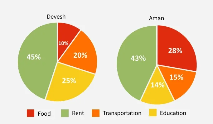
For Devesh:
| Category | Share |
|---|---|
| Food | |
| Rent | |
| Transportation | |
| Education |
For Aman:
| Category | Share |
|---|---|
| Food | |
| Rent | |
| Transportation | |
| Education |
The charts support direct share comparisons. For example, Aman’s food share exceeds Devesh’s food share by:
This is an increase of percentage points.
If the question instead asks for Aman’s food share as a percentage of Devesh’s food share, the calculation is:
Thus, Aman’s food share is of Devesh’s food share, or greater than Devesh’s food share. Keep these three wordings distinct:
| Wording | Meaning |
|---|---|
| Difference in shares | Subtract percentages; answer in percentage points |
| A is what percent of B? | Divide by , then multiply by |
| Percentage increase from B to A | Divide the difference by , then multiply by |
The missing-total trap
Can we conclude that Aman spends more actual money on food than Devesh? Not from these charts alone.
Aman allocates a larger share to food, but the two people may have different total expenditures. If Devesh spends overall and Aman spends , then their food expenditures are:
A larger sector percentage does not guarantee a larger absolute amount when totals differ.
This is an important “cannot be determined” pattern. Before comparing absolute quantities across pie charts, verify that their totals are given or known to be equal.
Line graphs, ratios, and stacked displays
A line graph can show raw quantities, percentages, rates, or ratios. The title tells you which.
Suppose a graph plots the ratio:
If the ratio is below , the number of girls is lower than the number of boys. If the ratio exceeds , girls outnumber boys. No arithmetic is needed for that comparison.
However, a rise in this ratio from to does not by itself prove that the number of girls increased. The denominator, the number of boys, may have changed. To calculate the percentage growth in girls, you would need sufficient absolute information for both years.
This distinction matters because a graph’s line may rise while the underlying quantity you are asked about is indeterminate.
Line Graph & Table Data -Shortcuts & Tricks for Placement Tests, Jobs & Exams | Data Interpretation
CareerRide’s “Line Graph & Table Data - Shortcuts & Tricks for Placement Tests, Jobs & Exams | Data Interpretation” demonstrates two high-value skills: interpreting a plotted ratio and recognizing when a quantity cannot be inferred from incomplete data.
Watch ratio interpretation to see how a value above or below 1 answers a comparison directly. Then watch sufficiency check. Focus on why a ratio across two years does not provide the percentage change in one component unless the required absolute values, or equivalent information, are available.
Stacked bar charts: segment values versus cumulative heights
In a stacked bar, a segment may not begin at zero. Its value is:
If a colored segment begins at and ends at , its value is:
Do not read as the segment’s value; is the total height up to that point. This is one of the most common chart-reading errors because the display visually encourages you to read the top boundary only.
A fast GATE routine and error labels
For a routine data-interpretation question, aim to complete the following checks in about to seconds before lengthy arithmetic:
- Identify the display’s unit. Thousands and raw counts differ by a factor of .
- Identify the requested quantity. Total, difference, average, ratio, percent of, or percent change?
- Locate only relevant values. Mark the category and year mentally before reading.
- Set the denominator deliberately. For “what percent of,” use the quantity after “of.” For “percentage change,” use the original value.
- Check whether the data are sufficient. Do not invent absolute values from proportions alone.
- State the unit. A result may be thousand, , , or percentage points; these are different answers.
For your error log, use specific labels:
| Error type | Typical symptom |
|---|---|
| Schema error | Ignored title, scale, legend, or unit |
| Field-selection error | Read the wrong bar, row, year, or segment |
| Base error | Used the later value as denominator for growth |
| Representation error | Treated a percentage as an absolute amount |
| Sufficiency error | Reached a numerical conclusion when information was incomplete |
| Arithmetic error | Extracted the right values but calculated incorrectly |
A short daily drill can strengthen both accuracy and speed: take five chart questions from a mock or practice set, spend the first pass writing only the extraction slip for each, and solve them afterward. On review, identify whether an error occurred during reading, modeling, or calculation. This is more useful than recording a vague label such as “data interpretation weak.”
Key takeaways
Data interpretation is primarily a disciplined extraction task.
- Read title, units, categories, legend, and scale before calculating.
- Write down the target quantity, relevant fields, operation, and percentage base.
- In tables, align rows and columns; do not mistake totals for additional observations.
- For bar charts, distinguish absolute change from percentage change.
- For pie charts, distinguish percentage points, relative percentages, and absolute amounts.
- Do not compare actual amounts across pie charts unless the totals are known.
- For stacked bars, subtract the lower boundary from the upper boundary.
- For ratio graphs, do not infer changes in one component without enough information.
- Treat “cannot be determined” as a valid conclusion when essential totals or bases are missing.
In the next lesson, you will move from numerical interpretation to verbal accuracy: grammar, sentence completion, and word-relationship questions using contextual clues.
Can't find a good explanation? Sign up and we'll make it for you
Sign up