
Welcome back. In the previous lesson, you used NumPy to summarize numerical data with mean, variance, standard deviation, and covariance. Those summaries compress a dataset into a few values; visualizations let you inspect the structure that summaries can conceal: skewed distributions, outliers, clusters, and nonlinear relationships.
This final micro-challenge in the Month 1 math module introduces two essential EDA views:
- a univariate plot, which examines one variable’s distribution;
- a bivariate plot, which examines the relationship between two variables.
By the end, you will create a compact 12-line Matplotlib–Seaborn figure with a labelled histogram and scatter plot. These conventions will carry directly into the messy-data EDA checkpoint.
What makes a plot informative?
A plot is not merely an output generated by code. It is a claim about data that someone else must be able to inspect. A correctly labelled plot lets a reader answer four questions immediately:
-
What is being measured?
Use readable variable names, not internal column names such asbody_mass_g. -
What are the units?
WriteBody mass (g)rather than justBody mass. -
What does the vertical scale represent?
For a histogram, it might be Count, Proportion, or Density. These are not interchangeable. -
What comparison or relationship is the plot intended to show?
A concise, specific title supplies context.
Matplotlib is the foundational plotting library. Seaborn builds on it and provides statistical plotting functions that work naturally with Pandas DataFrames. A practical pattern for EDA is:
- use Seaborn to map DataFrame columns onto a plot;
- use a Matplotlib Axes object to control titles, labels, legends, and layout.
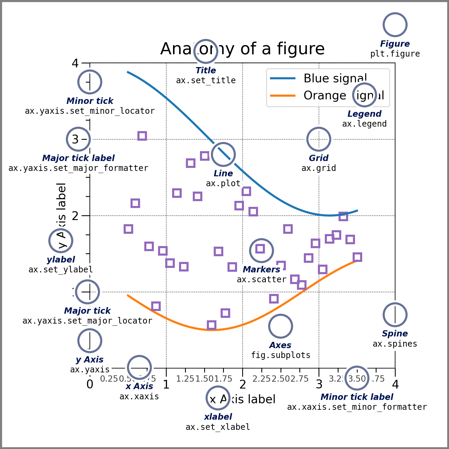
The terminology in the diagram matters:
- A Figure is the overall canvas or complete output.
- An Axes is one individual plotting region, including its x- and y-axes.
- A legend decodes visual encodings such as color.
- Labels and titles make the chart interpretable without reading the code that produced it.
Univariate plots: inspect one variable’s distribution
A univariate plot considers a single feature. For a numerical feature, the histogram is usually the first useful view.
Suppose a dataset contains penguin flipper lengths in millimetres. A histogram groups the observed lengths into intervals, called bins, and counts how many records fall into each interval. It can reveal:
- the typical range of values;
- whether a distribution is symmetric or skewed;
- potential outliers;
- multiple groups or peaks that a single mean would hide.
The previous lesson’s mean and standard deviation still matter, but they are not substitutes for looking. Two features can share the same mean and standard deviation while having visibly different distributions.
A key labelling rule follows directly from the histogram settings:
| Histogram setting | Appropriate y-axis label |
|---|---|
| Default count-based histogram | Count |
stat="probability" | Probability or Proportion |
stat="density" | Density |
If you label a count histogram as “Probability,” the plot is misleading even if the code runs perfectly.
Pyplot tutorial — Matplotlib 3.10.8 documentation
Read the official Matplotlib documentation’s short “Working with text” section. It introduces the title and axis-label functions that turn an otherwise ambiguous plot into a communicative one.
In the “Working with text” section, read from the opening explanation of plot text functions through the histogram example. Notice that the example labels both axes and assigns a title; when you create your own histogram, make the y-axis wording match the statistic you actually plot.
Bivariate plots: inspect relationships without overclaiming
A bivariate plot places two variables together. The most common starting point for two numerical variables is a scatter plot:
- each point represents one record;
- its horizontal position is the record’s value of ;
- its vertical position is the record’s value of .
For the penguin data, we will plot body mass against flipper length. A rising cloud of points suggests a positive association: larger body mass tends to occur alongside longer flippers. That visual observation is consistent with positive covariance from the previous lesson, but it does not establish causation.
Scatter plots add diagnostic detail that covariance alone cannot provide:
- Is the relationship roughly linear or curved?
- Are there distinct clusters?
- Are a few outliers dominating the apparent pattern?
- Does a categorical group behave differently?
Seaborn’s hue parameter encodes a category using color. In our plot, species will determine color, and the legend will tell the reader which color represents which species. That can reveal whether an overall pattern is partly driven by group differences.
Python Seaborn Scatterplot Tutorial | Python Data Visualization Tutorial | Color, Marker and Size!
Watch “Python Seaborn Scatterplot Tutorial” from datagy for a concise explanation of what a scatter plot represents and how Seaborn and Matplotlib work together for labelled plots.
Watch the scatter overview to establish how individual records become points and why Matplotlib is still used alongside Seaborn. Then watch labels and styling, focusing on the use of a title and descriptive x- and y-axis labels rather than default column names.
For a single, self-contained chart, Seaborn’s figure-level functions such as relplot are convenient. But when you want a histogram and scatter plot side by side in one Figure, use Seaborn’s axes-level functions, such as histplot and scatterplot, with a Matplotlib ax= argument.
Overview of seaborn plotting functions
Read the official Seaborn explanation of axes-level plotting. This is the pattern used in the micro-challenge: Matplotlib creates the two plotting areas, and Seaborn draws a different plot into each specified area.
In “Axes-level functions make self-contained plots,” read the axes-level rationale. Then study the following example beginning with f, axs = plt.subplots; focus on how ax = axs[0] and ax = axs[1] prevent each Seaborn plot from being drawn in the wrong location.
The plotting pattern you will reuse
The following structure is worth memorizing:
fig, axes = plt.subplots(1, 2, figsize=(12, 4))
This creates one Figure with two Axes arranged in one row. The axes variable is an array-like container:
axes[0]is the left plotting area;axes[1]is the right plotting area.
Then direct Seaborn explicitly:
sns.histplot(..., ax=axes[0])
sns.scatterplot(..., ax=axes[1])
Finally, use each Axes object to label its own plot:
axes[0].set(title="...", xlabel="...", ylabel="...")
axes[1].set(title="...", xlabel="...", ylabel="...")
This explicit approach avoids depending on whichever plot happens to be “current.” It also scales well once your EDA reports contain several charts.
Two practical choices in the code below deserve attention:
dropna(subset=[...])removes only rows that lack a value necessary for these particular plots. In a real EDA report, you would quantify and document that missingness before deciding how to handle it.alpha=0.7makes points partially transparent. Where points overlap, the darker appearance helps reveal dense regions rather than hiding them.
Concept-Level Micro-Challenge: labelled distribution and relationship views
Type and run this 12-line program. It uses Seaborn’s built-in penguins dataset to create one univariate histogram and one bivariate scatter plot in the same Matplotlib Figure.
import matplotlib.pyplot as plt
import seaborn as sns
sns.set_theme(style="whitegrid")
penguins = sns.load_dataset("penguins").dropna(subset=["flipper_length_mm", "body_mass_g", "species"])
fig, axes = plt.subplots(1, 2, figsize=(12, 4))
sns.histplot(data=penguins, x="flipper_length_mm", bins=18, ax=axes[0])
axes[0].set(title="Distribution of penguin flipper length", xlabel="Flipper length (mm)", ylabel="Count")
sns.scatterplot(data=penguins, x="body_mass_g", y="flipper_length_mm", hue="species", alpha=0.7, ax=axes[1])
axes[1].set(title="Body mass and flipper length by species", xlabel="Body mass (g)", ylabel="Flipper length (mm)")
axes[1].legend(title="Species")
fig.tight_layout()
plt.show()
Your output passes the micro-challenge if all of the following are true:
- The left plot is a histogram of one variable, with Flipper length (mm) on the x-axis and Count on the y-axis.
- The right plot is a scatter plot where each visible point represents one penguin record.
- The scatter plot has readable labels with units and a legend titled Species.
- Both plots have specific titles describing what is shown.
- The two plots do not overlap or clip each other’s labels.
After verifying the output, change bins=18 to bins=8, run the code, and then change it to bins=30. The apparent smoothness of the histogram will change, but the underlying observations do not. This is why bin selection should be treated as a presentation decision, not as a discovery of a new fact.
A short quality check before saving any EDA plot
Before considering a chart finished, check the following:
| Element | Good practice | Common problem |
|---|---|---|
| Title | States the variable or relationship being shown | Generic titles such as Plot |
| X-axis | Reader-facing name and units where relevant | Raw column name such as body_mass_g |
| Y-axis | Identifies the quantity being displayed | A histogram labelled Probability when it shows counts |
| Legend | Explains categories encoded by color or shape | Colors are present but unexplained |
| Plot type | Matches the question and variable types | Using a line plot for unordered records |
| Interpretation | Describes an association or pattern | Treating a visual association as causal proof |
For the scatter plot, an appropriate observation would be: body mass and flipper length appear positively associated, with visible differences among species. It would not be appropriate to conclude that body mass causes flipper length.
Takeaways
A univariate histogram helps inspect the distribution of one numerical feature; a bivariate scatter plot helps inspect the relationship between two numerical features. Matplotlib provides the Figure and Axes structure, while Seaborn provides concise DataFrame-oriented plotting functions.
For reliably composed EDA visuals:
- create your layout with
fig, axes = plt.subplots(...); - use axes-level Seaborn functions with
ax=...; - label every axis with readable names and units;
- ensure the y-axis wording matches the plotted statistic;
- add a legend whenever color encodes a category;
- interpret visible associations without turning them into causal claims.
Next, Month 1 moves from plotting to practical NumPy data manipulation: indexing, boolean masks, reshaping, and broadcasting. Those operations will let you select, transform, and prepare the slices of data that later EDA plots need.
Can't find a good explanation? Sign up and we'll make it for you
Sign up