
Welcome back. In the previous lesson, you learned to justify workplace-lighting decisions through a disciplined chain: identify a condition, propose a response, state the evidence, describe a realistic benefit, and define how it will be verified. That same discipline is essential when critiquing a built or proposed workplace.
This lesson uses a documented advanced-lighting office project as a case study. Rather than asking whether its lighting is simply “good” or “bad,” you will assess what the available evidence supports, what remains unproven, and how the scheme could be improved in three connected areas: visual hierarchy, user control, and architectural integration. By the end, you should be able to write a useful critique that gives the design team specific next actions.
Critique as a design method
A professional lighting critique is not a list of preferences. “I would add feature lighting” is not yet useful; neither is “the controls seem complicated.” A useful critique connects an observation to a consequence and then to a testable recommendation.
Use this four-part structure:
- Finding — What does the drawing, photograph, mock-up, survey, or project report actually show?
- Implication — How could that condition affect task performance, comfort, spatial legibility, operation, or maintenance?
- Recommendation — What specific design or controls change would improve it?
- Verification — What drawing, sample, calculation, site observation, or user-feedback method would confirm success?
For example:
Finding: The open-office luminaires can be individually addressed, but the case description does not show how their control zones relate to workstation clusters.
Implication: A sensor zone may leave part of an occupied team area dimmed or may keep a large unoccupied area active.
Recommendation: Overlay furniture layouts, circulation paths, and sensor coverage on the reflected ceiling plan; align controllable neighborhoods with realistic patterns of occupation.
Verification: Test representative occupied and partially occupied layouts during commissioning, including after-hours use.
The recommendation is neither “add more sensors” nor “make the system smarter.” It identifies the relationship that must be resolved.
Three lenses for a workplace critique
| Lens | Central question | Common weak response | Better design response |
|---|---|---|---|
| Hierarchy | What is visually important, and is it illuminated accordingly? | Raise the general light level everywhere | Strengthen task, face, wall, circulation, and architectural layers selectively |
| User control | Can people make understandable adjustments without disrupting others or wasting energy? | Provide one complex touchscreen | Give controls a clear scope, meaningful labels, predictable automation, and practical override |
| Architectural integration | Does the lighting belong to the architecture, interiors, ceiling, and furniture layout? | Make fixtures visually unobtrusive | Coordinate light distribution, mounting, ceiling modules, acoustic elements, surfaces, maintenance, and sightlines |
Architectural integration does not mean hiding every luminaire. A suspended acoustic luminaire may be deliberately visible and still be well integrated if its scale, position, luminous character, and service coordination reinforce the room. Conversely, a recessed downlight can be poorly integrated if it ignores the furniture arrangement, creates glare on screens, or lands awkwardly across a ceiling grid.
Read the case as evidence, not as publicity
The IMEG project is a useful case because it combines individually addressable lighting, wireless sensors, tunable luminaires, acoustic lighting, daylight response, and a deliberately non-uniform “fractal” layout. It also contains recommendations from the project team that reveal where the scheme needed continued attention.
Read this Integrated Lighting Campaign case study to identify both the design team’s stated intentions and the practical lessons that emerged after use. Treat its reported outcomes as evidence to examine, rather than as conclusions that need no further questioning.
In the section “Lighting and Integration Strategies,” begin with the case description. Note the relationship among tunable lighting, glare-controlled optics, wireless occupancy sensors, acoustic luminaires, and the reported energy target. Then move to “IMEG Recommendations.” Read the recommendations on optics, interfaces, and zoning, followed by the recommendations on training, tunable and static white light, after-hours perception, video calls, and post-occupancy adjustment. Focus especially on recommendations that turn a technical capability into a usable workplace condition.
Before critiquing, separate the report into documented design moves and questions the report does not answer.
What the case documents
The report describes several strong and purposeful decisions:
- A non-uniform luminaire layout intended to create a more visually varied environment than a conventional symmetric grid.
- Micro-optics and glare control intended to improve comfort.
- DALI Type 8 drivers that allow output to be optimized at a fine scale.
- Small-footprint wireless occupancy zones intended to support after-hours use and energy reduction.
- Suspended acoustic luminaires in break and meeting areas, combining illumination with sound absorption.
- Touchscreen control stations that allow employees to override lighting scenes and sequences.
- A reported lighting power density below the referenced IECC 2018 allowance.
These are meaningful assets. A critique should recognize them before proposing changes.
However, the report does not provide everything needed to judge the scheme fully. It does not, for example, show representative seated views of screens and windows, a reflected ceiling plan aligned with all furniture options, control-zone diagrams at workstation scale, or luminance images at daytime and after-hours conditions. Those absences are not proof of failure. They tell you what to request before reaching a final judgment.
A key distinction follows:
- Lighting power density describes installed power per floor area.
- Operational energy use depends additionally on schedules, daylight availability, sensor behavior, tuning, override patterns, and commissioning.
- Visual comfort depends on what people see, including bright sources, walls, windows, reflections, faces, screens, and adaptation between brightness levels.
A low lighting power density is valuable, but it does not by itself demonstrate a coherent hierarchy or comfortable workplace.
Critiquing hierarchy: make the office readable
Workplace hierarchy is the deliberate ordering of visual attention. It should help people understand where to work, meet, move, pause, find colleagues, and orient themselves after dark. It is not achieved by a uniform blanket of ceiling light.
The IMEG case is promising because the layout is intentionally more varied than a standard symmetric grid, and because the team considered glare-controlled optics and vertical luminous presence. Yet “fractal,” “biophilic,” or “non-uniform” is not automatically a hierarchy. The hierarchy must be legible from the employee’s eye level.
A critique should test four layers.
1. Task support
Desk work is not one task. Some employees work almost entirely on screens; others review paper drawings, samples, or physical models. The case-study recommendations acknowledge this variation: users working primarily on screens may prefer substantially less general illumination than those working on paper.
A stronger workplace hierarchy would therefore avoid treating every desk as equivalent. It could provide:
- comfortable, glare-controlled ambient support for the general work neighborhood;
- a lower default output where screen work dominates;
- local task support for detailed paper or model work;
- controllable vertical light at collaboration and review surfaces.
This is more precise than making the entire office brighter to meet the highest task demand.
2. Faces and collaboration surfaces
For meeting zones, project tables, and video calls, the critical visual surface is often vertical: faces, whiteboards, pin-up walls, and backgrounds. The IMEG recommendations are particularly useful here: they note that video conferencing benefits from more light on the participant’s face than on the wall behind them, and that zone-based control may be more useful than a few broad scenes.
A concise hierarchy improvement could be written as:
Create a distinct collaboration layer that supports faces and shared vertical information independently of general workstation lighting. Provide local control so a video-call participant can adjust facial illumination without raising the full room output.
This recommendation is architectural as well as visual. It requires knowing where tables, displays, cameras, writable walls, and participants will actually be located.
3. Architectural and social anchors
The case’s suspended acoustic luminaires in break and meeting areas are a credible example of a social-space layer. Their visible presence can help distinguish a lounge or collaboration setting from a focused work area. But integration depends on their relationship to the architecture: ceiling height, acoustic strategy, table position, structure, sprinkler coverage, and views across the open plan.
At reduced after-hours output, a workplace can feel unsafe or abandoned if every visible surface becomes dark. The IMEG team notes that luminaires with some vertical glow may make a dimmed office feel brighter and more secure. The point is not to keep all lighting fully on. It is to preserve selected cues:
- a visible reception or arrival point;
- readable main circulation;
- controlled brightness at shared surfaces;
- sufficient vertical light for orientation and facial recognition;
- lower-output task light only where people remain working.
4. Darkness and restraint
Hierarchy requires some surfaces to recede. If every wall, ceiling, desk, corridor, and decorative element competes for attention, the office becomes visually flat despite having many lighting layers.
The critique therefore needs an explicit question: Which parts of the workplace may remain quiet or comparatively dark without compromising orientation, safety, or task visibility? In an open office, the answer might be secondary ceiling areas and unused desk neighborhoods, while circulation endpoints, key walls, and occupied work areas retain enough presence to make the environment intelligible.
Critiquing user control: technical flexibility must become usable agency
The IMEG project’s individually controllable luminaire sections and wireless occupancy sensors offer significant flexibility. But a system is not user-centered merely because it is technically granular. Its controls must be understandable, located where they are needed, predictable in operation, and adjustable after occupation.
The lighting-control plan below illustrates the basic discipline. It shows several support spaces—prep/recovery rooms, a staff lounge, locker rooms, and toilet/shower areas—alongside a schedule of control requirements and sequences of operation. The plan does not just place luminaires; it relates devices and operating logic to room type.
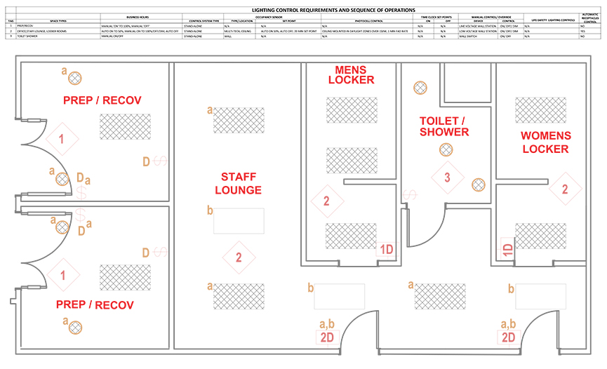
A controls plan becomes useful only when someone can understand both the physical zoning and the behavior of the system. For every zone, establish:
| Control decision | Critique criterion |
|---|---|
| Zone boundary | Does it correspond to desks, rooms, circulation, daylight conditions, or a meaningful architectural layer? |
| Automatic response | Does occupancy or daylight response work predictably for real patterns of use? |
| Local override | Can an occupant make an adjustment without affecting unrelated colleagues? |
| Interface | Are labels, buttons, sliders, or scenes immediately understandable? |
| Recovery | Does the system return to an energy-conscious default after a reasonable interval? |
| Commissioning | Are setpoints, fade times, sensor sensitivity, and time delays tested with occupants present? |
Specific improvements to the IMEG controls strategy
The case already reports touchscreen override capability. That is useful for facility-wide scenes and shared spaces, but it should not be assumed to be the best interface for every everyday adjustment. The project team itself recommends clear raise/lower buttons or sliders over press-and-hold dimming controls.
A robust critique could recommend the following:
-
Provide local raise/lower control for workplace neighborhoods.
A user adjusting a desk cluster needs a quick, reversible change. A familiar slider or paired raise/lower interface is often clearer than navigating a scene menu. -
Coordinate occupancy zones with current and likely furniture configurations.
Overlaying the reflected ceiling plan, furniture plans, partition options, and sensor coverage prevents a workstation from being split across unrelated zones. -
Use control zones for video calls and collaboration.
Broad “presentation” or “meeting” scenes may not allow a participant to correct face-to-background balance. Separate control of face-supporting and background layers is more responsive. -
Define after-hours behavior as a visual condition, not only an energy setting.
Retain low-level circulation and selected vertical illumination while allowing unoccupied workstation areas to reduce or switch off. Then walk through the workplace at night to verify that it still feels readable. -
Plan post-occupancy tuning and training.
Controls should be reviewed after occupants have lived with the office. The case recommends check-ins after six months or a year, reflecting the reality that appropriate output levels, sensor delays, and schedules are often learned in operation.
The last point matters. Commissioning is not merely proving that every device turns on and off. It is checking whether the combined system supports real work.
Critiquing architectural integration: coordinate the effect, not just the equipment
The IMEG case makes a strong architectural move by using acoustic luminaires where people meet and socialise. It also recognizes that optical performance must be reviewed in person: a luminaire with a diffuse, Lambertian appearance may still be uncomfortable in a particular office view.
Architectural integration must operate across at least five coordinated drawings or decisions:
| Coordination topic | Design question | Improvement to seek |
|---|---|---|
| Ceiling and structure | Does the luminaire layout respect grid modules, ceiling changes, beams, and services? | Resolve the reflected ceiling plan with structure, HVAC, sprinklers, acoustic panels, and access routes |
| Furniture | Does each luminaire serve the planned desk, table, wall, or route beneath it? | Review fixed and future furniture layouts before finalizing the control and luminaire plan |
| Optical distribution | Is the source visible from typical seated and standing views? | Review samples, mock-ups, and eye-level views rather than selecting only from a photometric sheet |
| Materials and color | Do adjacent sources make materials and skin tones appear coherent? | Test tunable and static-white sources together against actual finishes, especially near shared surfaces |
| Maintenance | Can drivers, sensors, luminaires, and acoustic components be accessed without damaging the ceiling or disrupting operations? | Coordinate access and replacement strategy before construction |
Tunable and static-white light: a coordination issue
The case team observed that two-channel tunable-white luminaires can appear different from nearby static-white luminaires, even when nominal colour-temperature values are similar. This is a valuable critique finding because it concerns the visual composition of the office, not simply technical compliance.
The correct response is not necessarily to use tunable light everywhere. It is to decide where tunable lighting offers a clear operational purpose, then test its appearance beside adjacent static light and materials. Useful test conditions include:
- the intended daytime and evening settings;
- white walls, wood finishes, acoustic fabric, and graphic surfaces;
- typical viewing distances;
- both occupied and low-output after-hours scenes.
A specified correlated colour temperature alone cannot guarantee that two sources will appear alike. Spectral distribution, colour fidelity, dimming behavior, surface colours, and adaptation all affect perception.
A caution from retrofit evidence
The next reading provides a valuable counterpoint. It examines an advanced LED-controls retrofit in a working office, including occupant survey results, installation constraints, and lessons learned. It is especially useful because it shows why a critique must separate possible trends from firm conclusions.
Evaluation of Advanced Lighting Control Systems in a ...
Read this Pacific Northwest National Laboratory evaluation as a cautionary case. It demonstrates that energy upgrades and advanced controls may still produce questions about glare, perceived warmth, user satisfaction, installation complexity, and value.
In the occupant-survey discussion on p. 25, read the survey analysis. Pay attention to the change in reported comfort, glare awareness, colour appearance, and the limits caused by small response counts. On p. 26, under “Installer Experience,” read the installation findings. Notice how fixture dimensions, ceiling grids, retrofit kits, wiring, and separate controls affect architectural coordination. Finally, in “Lessons Learned and Best Practices” on p. 30, read the design cautions. Focus on light-level tuning, fixture relocation, and the cost implications of add-on controls.
The PNNL study does not establish that LED upgrades inherently make workplaces less comfortable. Its response counts were limited, and the authors carefully avoid treating observed changes as definitive causal results. But it does establish an important critique principle:
Do not judge a proposal only by its predicted energy savings or technology list. Review the actual optic, installed geometry, ceiling compatibility, light-level tuning, and occupant response.
In the retrofit case, certain fixture sizes did not fit the existing grid easily, and separate sensors increased installation effort. These are not reasons to avoid better lighting. They are reasons to resolve ceiling, electrical, controls, and maintenance coordination before procurement rather than on site.
A concise case-study critique
The following model turns the IMEG case into a balanced design review.
| Area | Evidence-supported strength | Improvement to request | How to verify it |
|---|---|---|---|
| Hierarchy | Non-uniform layout, glare-controlled optics, acoustic lighting in social areas, and potential vertical glow at low output | Prepare eye-level views and a hierarchy diagram distinguishing focused work, collaboration, social, circulation, and after-hours layers | Daytime and night mock-ups; seated-view glare review; walk-through with occupants |
| Task variation | Individually addressable luminaire sections can support varied illuminance needs | Set lower screen-work defaults, provide local task support where detailed paper work occurs, and separately control collaboration surfaces | Trial settings with representative users and actual screens, paper, and physical samples |
| User control | Touchscreen override, fine-grain dimming capability, and wireless occupancy sensing | Add intuitive local raise/lower controls; clarify zone boundaries; provide training and scheduled post-occupancy tuning | Commissioning scripts, staff orientation, feedback after occupation, revised settings record |
| After-hours operation | Small occupancy zones intended to support safety and reduced energy use | Maintain selected circulation and vertical-light anchors at reduced output rather than treating the floor as either fully on or fully off | Night-time occupancy and perception survey; sensor and override tests |
| Architectural integration | Acoustic luminaires combine lighting and acoustic function; optical quality was considered | Coordinate ceiling modules, services, furniture, access, and actual visual targets; test tunable beside static-white sources and finishes | Reflected ceiling plan coordination, full-scale sample review, maintenance-access sign-off |
| Energy | Reported low lighting power density and daylight/occupancy strategies | Confirm that zoning and tuning deliver energy reduction without nuisance switching, glare, or inappropriate dimming | Metering where available, commissioning records, operating schedules, occupant feedback |
This critique is balanced because it does not dismiss the project’s achievements. It also does not confuse advanced controls, a low lighting power density, or tunable-white capability with a completed design solution.
Key takeaways
A workplace-lighting critique should be evidence-led and constructive. State what is observed, explain why it matters, propose a targeted improvement, and specify how the change will be tested.
For hierarchy, assess the employee’s visual experience: task support, faces, vertical surfaces, circulation, social anchors, restraint, and after-hours legibility. A varied ceiling pattern becomes a true hierarchy only when it makes the workplace more readable and comfortable.
For user control, distinguish technical capability from usable control. Effective systems have meaningful zones, intuitive interfaces, predictable automation, local override, and post-occupancy tuning.
For architectural integration, coordinate optics, ceiling modules, furniture, acoustic elements, finishes, services, access, and maintenance. A fixture is integrated when its light and physical presence serve the architecture and the work taking place beneath it.
This completes the workplace-experience module. The next module shifts to retail identity and merchandise presentation, where hierarchy remains central but the primary visual task becomes guiding attention toward products, brand cues, and storefront invitation.
Can't find a good explanation? Sign up and we'll make it for you
Sign up