
Welcome back. You can already read an individual candle’s OHLCV information and recognize a few candle formations. The missing context is market structure: what the sequence of meaningful highs and lows says about direction, where price has repeatedly reacted, and whether a candle is appearing at a potentially important location.
This lesson gives you a practical classification system for any selected chart window: uptrend, downtrend, range, or transition. You will also learn to draw support and resistance as zones, rather than pretending that one exact price must always hold. These are descriptive tools, not predictions or trading signals.
Start with swings, not every candle
Price rarely moves in a smooth line. It advances, pulls back, advances again; or it declines, rebounds, then declines again. The meaningful turning points in this movement are called swings:
- A swing high is a prominent local peak before price turns down.
- A swing low is a prominent local trough before price turns up.
The word prominent matters. Every chart contains small fluctuations, especially on short timeframes. If you label each one as a structural swing, you will find a contradictory “trend” every few candles.
Instead, choose a timeframe and a visible chart window first, then identify the highs and lows that separate the larger price legs you can reasonably act on. A daily-chart swing might contain many four-hour-chart swings.
A useful practical rule is:
A swing is confirmed only after price has moved meaningfully away from it. Until then, a possible high or low is simply a candidate.
For example, if price rises from to , pulls back to , then rallies to , the trough becomes meaningful because price subsequently exceeded the prior high. It was not possible to know with certainty that was the swing low while price was still falling toward it.
This is why chart analysis has an unavoidable element of hindsight: a completed swing requires subsequent price action to confirm it. That is not a defect. It is the price paid for avoiding premature labels.
The short video below visualizes this confirmation idea clearly. Use its “break of structure” terminology as a way to organize swings, rather than as a promise that every break produces a reversal.
Market Structure Explained for Beginners | Swing Highs, Lows & Trend Shifts
Watch “Market Structure Explained for Beginners | Swing Highs, Lows & Trend Shifts” by ElevateWithAK for a visual introduction to swing-based structure. It is especially useful for separating a confirmed structural change from a temporary pullback.
Watch trend foundations to see the higher-high/higher-low and lower-high/lower-low definitions, plus why a swing needs later price action for confirmation. Then watch ranges and shifts for the distinction between consolidation and a structural transition. Focus on the sequence of larger pivots, not on copying every terminology choice or treating a single break as an automatic trading signal.
The four chart classifications
With confirmed, relevant swings marked, classification becomes much more disciplined.
| Classification | Swing sequence | Plain-language reading |
|---|---|---|
| Uptrend | Higher highs and higher lows | Buyers are repeatedly pushing to new highs while pullbacks stop at progressively higher levels. |
| Downtrend | Lower lows and lower highs | Sellers are repeatedly pushing to new lows while rebounds fail at progressively lower levels. |
| Range | Highs and lows remain broadly contained within two horizontal areas | Neither side has established a sustained sequence of new directional swings. |
| Transition | The prior structure has failed, but the new structure is not yet established | The market is changing character; direction is uncertain or newly emerging. |
:max_bytes(150000):strip_icc()/StructuredContentArticles-TrendTrading-final-8f1316f1116f49d89c27cb7bc80ec984.png)
Uptrend: higher highs and higher lows
An uptrend is not simply a chart that happens to be above where it started. It is a continuing pattern:
- Price forms a swing high.
- It pulls back, but the next swing low stays above the preceding swing low.
- Price rallies and exceeds the prior swing high.
The two essential labels are:
- HH — higher high
- HL — higher low
Consider this sequence:
The lows progress from to to , while the highs progress from to to . That is a clean uptrend.
A candle that drops sharply inside an uptrend does not, by itself, end the uptrend. The structural question is whether price breaks the latest important higher low and then begins producing lower highs and lower lows.
Downtrend: lower lows and lower highs
A downtrend is the inverse pattern:
- LL — lower low
- LH — lower high
Suppose price moves through:
Each rebound peaks lower than the prior one, and each decline reaches a new low. Sellers retain control of the larger swings.
Notice what is not required: every candle need be bearish, nor must every session make a new low. Countertrend rallies occur in every downtrend. The classification comes from the sequence of prominent pivots.
Range: balance between two boundaries
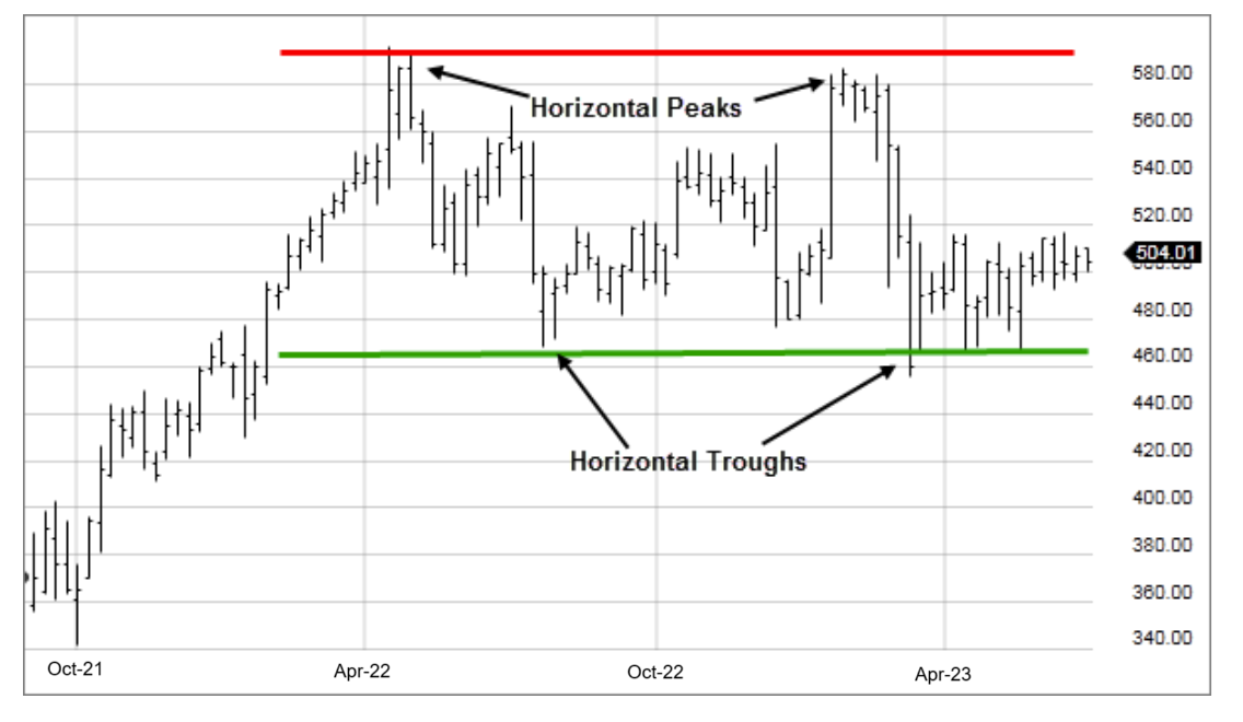
A range, sometimes called consolidation or sideways structure, occurs when price repeatedly turns near an upper area and a lower area without creating a sustained HH/HL or LH/LL sequence.
The boundaries are often called:
- Range resistance at the upper area
- Range support at the lower area
A range is not “nothing happening.” It is a period in which buying and selling pressure are sufficiently balanced that neither side has displaced the other over the selected timeframe.
This timeframe qualification is essential. A daily chart may be in a broad range, while a four-hour chart inside that range can be trending upward or downward. Both observations can be accurate if you label the timeframe: “daily range; four-hour uptrend.”
Transition: structure has changed, but the new trend is not proven
The most useful category for avoiding overconfidence is transition.
Imagine an established uptrend with successive higher lows. If price closes decisively below the most recent important higher low, the old bullish sequence has failed. But that one event alone does not guarantee a durable downtrend. Price may reclaim the level, or it may move sideways.
A careful label is:
“Former daily uptrend; currently in transition after a break below the latest higher low.”
A downtrend becomes more credible only if the market then forms a lower high and continues to a lower low. Similarly, after a downtrend breaks above a key lower high, wait to see whether price can establish a higher low and then a higher high before confidently calling it an uptrend.
This is more conservative than declaring “trend reversal” at the first dramatic candle. It also matches the discipline from the previous lesson: one visually impressive candle is evidence, not a complete argument.
Use completed closes for confirmation, but keep wicks for context
Candles contain two kinds of information:
- The body close shows where the market actually finished the chosen interval.
- The wick shows where price traded temporarily and was rejected or accepted only briefly.
For this course, use the following operational convention:
- Treat a completed candle close beyond a key swing or zone as stronger structural evidence than a wick that merely pokes through it.
- Treat a wick beyond a level as a test. It may represent rejection, but it is not by itself conclusive.
- Look for follow-through. A single close just beyond a level can still fail.
For example, a daily candle may dip below support intraday, leave a long lower wick, and close back above the support area. That is not the same as a daily candle closing clearly below the zone. The first shows rejection of lower prices during the day; the second suggests that sellers held control into the close.
Switching TradingView temporarily to a line chart, which normally plots closing prices, can help you assess whether the important closes have actually crossed a level. Then return to candlesticks to study the wicks, candle shape, and volume.
Support and resistance are areas of prior decision
A support zone is an area where a decline previously paused or reversed because demand became strong enough relative to supply. A resistance zone is an area where an advance previously stalled or reversed because supply became strong enough relative to demand.
They are best understood as historical reaction areas, not invisible barriers that force price to reverse.
Read Investopedia’s “Support and Resistance Basics” for a concise account of the supply-and-demand intuition behind these areas and how their roles can change after a break.
In the sections “What Is Support?”, “What Is Resistance?”, and “Why Support and Resistance Matter,” read the core explanation. Focus on why support and resistance can be zones rather than exact prices, and on the two broad outcomes when price returns to them: rejection or a meaningful break. Then, in “Support and Resistance Reversals,” read role reversal. Note that a former level can change role, but it is a possibility to observe, not a guarantee.
Draw zones, not false precision
A horizontal line is acceptable when reactions cluster tightly around one price. More often, though, different traders place orders at slightly different prices and candles have different wick extremes. A rectangle is usually more honest.
When marking a zone:
- Locate a visible area where price changed direction, paused repeatedly, or began a substantial move.
- Include the cluster of bodies and meaningful wicks rather than anchoring your zone to one isolated extreme.
- Keep it narrow enough to be useful. A zone that spans most of the chart gives no decision-making information.
- Prioritize the most recent, clearly reacted-to zones near current price.
- Mark only a few zones. A crowded chart of every historical turning point is harder to interpret than a clean chart.
The chart below shows this principle in a broad trading range. The green support and red resistance are useful because several separate troughs and peaks occurred in approximately the same price regions.
How zones relate to structure
Support and resistance depend partly on the current structure:
| Current classification | Zones most relevant near price | What to watch |
|---|---|---|
| Uptrend | Recent higher lows as potential support; prior highs as potential resistance | Whether a pullback holds above the latest important higher low |
| Downtrend | Recent lower highs as potential resistance; prior lows as potential support | Whether a rebound fails below the latest important lower high |
| Range | Upper and lower range boundaries | Whether price rejects a boundary or closes beyond it with follow-through |
| Transition | The broken swing area and nearest opposing zone | Whether the break fails, develops into a new sequence, or becomes a range |
A particularly useful event is a role reversal:
- Former resistance may become potential support after price breaks above it and later revisits it.
- Former support may become potential resistance after price breaks below it and later retests it from underneath.
The word potential is necessary. Markets often retest a broken level, but not always. And a retest may fail.
Repeated reactions make a zone more visible to market participants, but no zone becomes invulnerable because it has been tested many times. Every encounter is new information. Price can bounce, consolidate around the zone, break through, or briefly break and reverse.
A repeatable classification workflow
Use this same sequence before adding indicators, discussing a candlestick setup, or considering a paper trade.
1. Fix the timeframe and chart window
Say what you are analyzing: for example, “AAPL, daily chart, last six months.” Without this, “uptrend” has no precise meaning.
Avoid switching timeframes merely to find one that agrees with your preferred direction.
2. Mark only the significant swings
Use TradingView’s Trend Line or Brush tool to connect the prominent turning points at first. Ask whether a pivot produced a meaningful move that exceeded prior structure, not whether it is simply the highest or lowest candle in a tiny cluster.
3. Label the sequence
Write HH, HL, LH, or LL at the swings. Then classify the current state:
- Repeated HH and HL: uptrend.
- Repeated LL and LH: downtrend.
- Horizontal containment: range.
- Failure of the previous pattern without a confirmed new one: transition.
4. Add the nearest useful zones
Use TradingView’s Rectangle tool for zones. Label them support, resistance, range high, range low, or former resistance.
The goal is not to identify every possible level. Your chart should answer: Where is price likely to encounter a historically meaningful decision area next?
5. Write an observational sentence
Finish with one sentence that distinguishes fact from inference:
“On the daily chart, price remains in an uptrend because the most recent confirmed swing low is above the preceding one; price is currently approaching prior resistance near the latest swing high.”
Or:
“On the four-hour chart, price is range-bound between two horizontal zones after the prior downtrend failed to make a new lower low.”
This habit will be valuable later when you build trade hypotheses and journal paper trades.
TradingView chart lab: classify first, predict nothing
Spend about 12–15 minutes on this observation exercise. Do not place an order.
- Open a liquid instrument on a daily chart. Start with one US share, one UK share, or a major cryptocurrency pair from a named exchange. Keep the same instrument and timeframe throughout the exercise.
- Scroll back so that the most recent six to twelve months are visible. Hide indicators for now; leave only price and volume.
- Identify the four to six most important visible turning points. Mark them lightly with the Text tool or short trend lines. Deliberately ignore minor fluctuations inside the larger price legs.
- Label the pivots HH, HL, LH, or LL where applicable. Classify the visible structure as uptrend, downtrend, range, or transition.
- Use rectangles to mark no more than two nearby support zones and two nearby resistance zones. For a range, prioritize its upper and lower boundaries.
- Turn on a line chart briefly to check whether key closes genuinely moved beyond a zone. Return to candlesticks and note whether wicks showed rejection.
- Record the result:
| Symbol, exchange, timeframe | Structure classification | Swing evidence | Nearest support zone | Nearest resistance zone | What would change the classification? |
|---|---|---|---|---|---|
| e.g., HH and HL sequence | |||||
For a more disciplined second pass, use TradingView’s Bar Replay. Stop at a historical point, classify only what was visible then, and reveal later candles gradually. This prevents your eyes from using future data to make the past structure look obvious.
Key takeaways
- A chart’s structure comes from its meaningful swing highs and swing lows, not from every candle fluctuation.
- An uptrend has higher highs and higher lows; a downtrend has lower highs and lower lows.
- A range oscillates between broadly horizontal support and resistance areas. It can occur inside a larger trend on a higher timeframe.
- A transition begins when the prior structural sequence fails, but it is not yet evidence of a fully established new trend.
- Use completed closes beyond a key zone as stronger evidence than a wick alone, while still treating follow-through as important.
- Support and resistance are usually zones of prior reaction, not exact prices. Former support and resistance can change roles after a meaningful break.
Next, you will bring the pieces together: evaluate a candlestick setup using its trend, support or resistance location, volume, confirmation, and invalidation context.
Can't find a good explanation? Sign up and we'll make it for you
Sign up