
Hello Alex,
Welcome back to your UX refresher for edtech strategy.
In our last lesson, we explored how to foster long-term engagement using Self-Determination Theory, focusing on the core psychological needs of autonomy, competence, and relatedness. We established that building a user's sense of competence is fundamental to keeping them motivated.
This lesson dives into the "how." How do we design experiences that make learning feel effective and manageable, not overwhelming? We will explore powerful cognitive theories that provide a blueprint for creating efficient learning paths. By applying these principles, you can directly enhance learning efficacy, which in turn boosts user competence, increases engagement, and ultimately reduces churn.
This lesson will take approximately 55 minutes to complete.
Learning Outcome: By the end of this lesson, you will be able to illustrate how UX patterns derived from cognitive theories (e.g., Cognitive Load, Spaced Repetition) can be used to improve learning efficacy and reduce churn.
Part 1: The Brain's Bottleneck – Understanding Cognitive Load (20 minutes)
As designers, we often want to present users with rich, detailed information. However, the human brain has a built-in bottleneck: our working memory can only process a small amount of new information at once. Overwhelming this bottleneck leads to frustration, a diminished sense of competence, and a higher likelihood of the user giving up. This is the essence of Cognitive Load Theory.
To start, let's get a high-level perspective from a game UX expert on why understanding our mental limitations is so critical for design.
Video Activity (10 minutes):
Please watch the following segment from a talk by game UX consultant Celia Hodent. She provides an excellent, intuitive introduction to the core cognitive limitations that we as designers must respect.

Focus on the section Cognitive Science Basics for UX (03:51 - 16:45). Pay attention to her three key takeaways:
- Perception is subjective.
- Memory is fallible (she introduces the "forgetting curve" here, which we'll revisit).
- Attention is scarce (this is the key link to cognitive load).
Hodent's talk highlights the problem. Now, let's look at the solution framework. Professor Richard Mayer developed 12 principles for multimedia learning, all aimed at designing instruction that respects our cognitive limits.
Reading Activity (10 minutes):
Please read the following article. It not only introduces Mayer's principles but also brilliantly organizes them into a strategic framework based on the three types of cognitive load.
What does UX in education look like? | by Alex Britez
Focus on the section "Design for learning" and specifically the part that introduces Multimedia Learning Theory. Notice how the principles are grouped:
- Minimizing Extraneous Load: Reducing effort spent on non-essential information (e.g., decluttering the UI).
- Managing Intrinsic Load: Making complex material more digestible (e.g., breaking it down).
- Optimizing Germane Load: Encouraging the mental work that leads to true understanding.
This framework shifts the goal from just "reducing cognitive load" to managing it intelligently—eliminating bad friction while encouraging the good friction that leads to learning.
This infographic provides a great visual summary of these ideas in action.
 This infographic visually summarises key principles for managing cognitive load, such as cutting extraneous info and simplifying complex topics—direct applications of Mayer's work.
Part 2: Beating the Forgetting Curve – Spaced Repetition (15 minutes)
Managing cognitive load helps users learn in the moment. But how do we ensure that knowledge sticks? As we saw hinted at in the first video, we are wired to forget. The "forgetting curve" shows that without reinforcement, we lose information exponentially over time.
Spaced Repetition is an evidence-based technique designed to counteract this curve by reviewing information at increasing intervals, precisely when we are about to forget it.
Video Activity (5 minutes):
This short, clear video explains the concept perfectly.
Please watch from the beginning until (02:12). Focus on how spaced repetition flattens the forgetting curve and the logic behind reviewing material you are less familiar with more frequently.
As a UX designer, your role is to embed this process into the user experience. How can the UI facilitate this rhythm of learning and reviewing? This next resource gives concrete examples.
Visual Analysis (5 minutes):
Examine the following image, which shows how Spaced Repetition can be implemented through specific UX patterns, particularly in a mobile context.
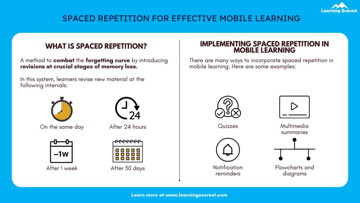 This image illustrates how to apply Spaced Repetition through concrete UX patterns like quizzes, multimedia summaries, and notification reminders, providing a direct link between cognitive theory and design execution.
Notice the practical design ideas:
- Push notifications to prompt a review session.
- Short quizzes or flashcards as the review mechanism.
- Summaries of previous lessons to re-engage the learner.
These patterns don't just happen; they are designed strategically to fight the forgetting curve, improve long-term retention (efficacy), and keep users coming back (reducing churn).
Part 3: Your Turn – Illustrating Theory in Practice (15 minutes)
Now, let's connect these theories to the real-world products you use. Your task is to deconstruct an EdTech app's UI to identify how it applies the principles of Cognitive Load and Spaced Repetition.
Your Task:
- Choose an EdTech product you are familiar with (Duolingo is a great choice, as we've discussed it before).
- Create a simple two-column diagram. Label one column "Managing Cognitive Load" and the other "Applying Spaced Repetition."
- In each column, list 2-3 specific UX patterns or features from the app and briefly explain which principle they demonstrate.
Example using Duolingo:
| Managing Cognitive Load (Mayer's Principles) | Applying Spaced Repetition |
|---|---|
| Segmenting Principle: Lessons are broken into bite-sized exercises (e.g., 5 minutes). This prevents overwhelm and makes it easy to start a lesson. | Visual Cues for Review: Previously completed skills "crack" over time, visually signaling to the user that it's time to review them to restore them to full strength. |
| Coherence & Redundancy Principles: The UI is clean, with no background music or distracting visuals. On-screen text is minimal when audio narration is used. | Personalized Practice Sessions: The "Practice" tab often generates exercises based on words the user has previously struggled with, creating a customized review schedule. |
| Spatial Contiguity Principle: When teaching a new word like "la pomme," the text is placed directly under the image of the apple, creating a clear connection. | Streak & Notifications: The daily streak feature, supported by push notifications, encourages consistent, daily practice, which is a simple, time-based form of repetition. |
Take about 15 minutes to create your own analysis. This will solidify your ability to see the cognitive science behind the pixels.
Conclusion
In this lesson, you've gained two powerful lenses from cognitive science to evaluate and improve EdTech products. By understanding these principles, you can move beyond aesthetics and design experiences that are fundamentally more effective for learning.
Key Takeaways:
- Cognitive Load Theory: Our working memory is limited. Great UX design manages this load by minimizing distractions (extraneous load), simplifying complexity (intrinsic load), and guiding users toward deep thinking (germane load). Mayer's Principles provide an actionable checklist for this.
- Spaced Repetition: Our memory is fallible. Effective EdTech UX builds in systems (like automated reviews, notifications, and practice modes) to strategically fight the forgetting curve, leading to better long-term retention.
- From Efficacy to Business Goals: Applying these principles directly improves learning efficacy. This enhances a user's sense of competence, which we know from our last lesson is a key driver of motivation. Motivated, successful learners are less likely to churn.
Preview of the Next Lesson
We've now covered psychological frameworks for motivation (SDT) and cognitive frameworks for effective learning (Cognitive Load, Spaced Repetition). But how do we prove to stakeholders that our design strategies are working? In the first lesson of our final module, you will create a visual hierarchy that links a high-level product OKR for an EdTech product to specific UX-focused KPIs and the user interactions that influence them. This will equip you to translate design impact into the language of business value.
Can't find a good explanation? Sign up and we'll make it for you
Sign up